Design on a budget – One Room Two Budgets!
Created by Vinithra Amarnathan on August 19, 2015
One of the most common things I hear from clients is…’I have a tight budget or don’t have much to spend!’
And I say you can still have a chic beautiful space!
So today’s post is dedicated to creating a beautiful living room – on 2 budgets!
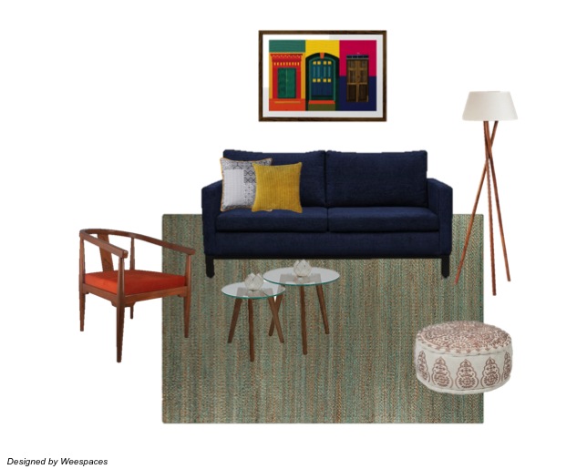
Room 1 – Budget Rs.50000
Lets say Rs.50000 is all you have to spend on your living room. What can it get you?
Here’s a living room designed on a budget of Rs.50000. (Pardon me for not accounting for taxes, VAT and sales going away or coupons ending….I never said I’m good at accounting :))

Shopping List (click on item to buy)
Sofa – Rs. 20,719
Chair – Rs. 5600
Rug – Rs. 4000
Nesting Tables – Rs. 5000
Pouf – Rs. 2800
Floor Lamp – Rs. 7600
Wall Art – Rs. 2795
Throw Pillow 1 – Rs. 300
Throw Pillow 2 – Rs. 150
Grand Total – Rs. 48,964
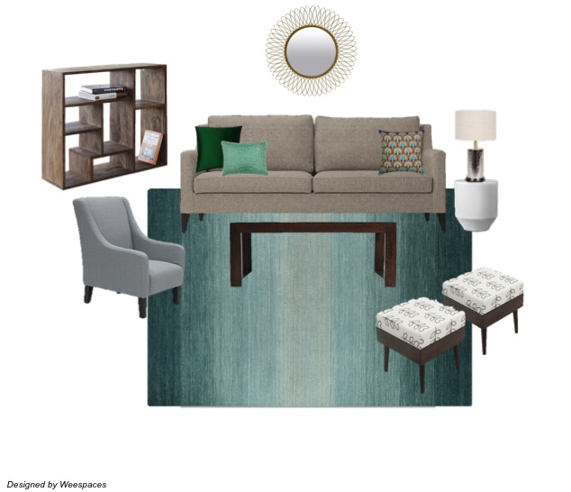
Room 2 – Budget Rs.100,000
A budget of Rs. 100,000 to spend on your living room….Here’s what it can look like!

Shopping List (click on item to buy)
Sofa – Rs. 43,000
Chair – Rs. 14,000
Rug – Rs. 7500
Stools – Rs. 5000 (2)
Coffee Table – Rs. 5000
Shelving unit – Rs.8400
Side Table – Rs. 6000
Table Lamp – Rs. 3800
Mirror – Rs. 2490
Throw Pillow 1 – Rs. 300
Throw Pillow 2 – Rs. 900
Throw Pillow 3 – Rs. 600
Grand Total – Rs. 96,990
It IS possible to design a beautiful space on a tight budget and still make it look chic! We can make it happen☺
What a Wee Makeover can do for your home?
Created by Vinithra Amarnathan on August 9, 2015
One of the common myths of interior decor is that it is expensive, involves a whole lot of buying and is just a tedious process! It has also been thought of as something that is necessary only when you buy homes or redesign your entire home.
At Weespaces we want to make the design process more accessible, more relevant and easier for the customer. We want to dispel the myth that it needs to be time and money intensive.
Good design works towards making a space chic, personal and functional keeping within the constraints of budget, function and your personal needs.
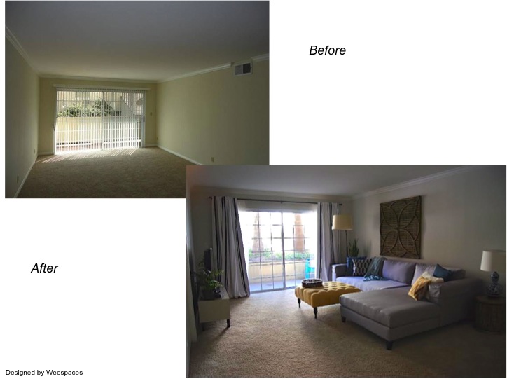
Here is an example of what a simple Wee Makeover can do! Our client in this case was a young family with a toddler. We all know how the clutter that comes along with kids can takeover a space and leave very little room for creativity and design.
When we stepped in we realized the need for organization and creating a functional yet welcoming space. We were low on budget and could invest only in a few pieces of soft furnishings like curtains, rugs, a lamp and an ottoman. Though the changes might seem small you can see the world of difference they have made to the living room!

As we moved along the family fell in love with their home and their living room again 🙂 And then they decided to add some key pieces of furniture like a new sectional and a media cabinet. You can see how the space has transformed with these changes, but all keeping with the budget and constraints of the client.


And when we hear from the family how much they love their new space, its a joy! Get in touch with us if you want to fall in love with your home again 🙂
WeeArt Wednesdays – Todays pick!
Created by Vinithra Amarnathan on August 6, 2015
Wednesday came a day late here…..but this weeks WeeArt pick is such a fun modern piece of art! Something to anchor a kids space around…its colorful, modern and with a muted gray background can work with any color scheme!

Get it here.
Before and After Sunday!
Created by Vinithra Amarnathan on August 2, 2015
Who doesn’t love looking at before and after pictures on a Sunday! So here are my favorite before after projects to give you an eyeful…I hope you love it as much I do 🙂
Bright and sunny california condo
We started with a blank state and ended with a beautiful relaxed bright space for this young family. Their love for organic modern clearly comes through in the lighter textures and an oversized wood carved art! Functional and chic 🙂

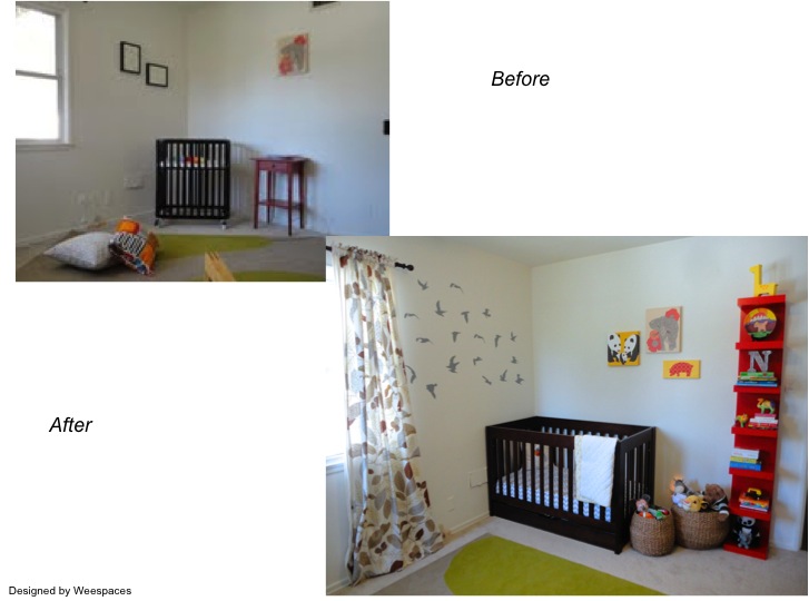
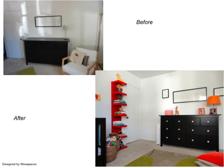
Fun and Playful little boy’s nursery
We had a pretty small space to play with here and some existing pieces to work with. I love how fun and colorful this room turned out….perfect for a little boy! The bright colors against the black and whites in the walls and larger pieces work so well.
