The Reno Journey!
Created by Vinithra Amarnathan on June 10, 2017
From dark, dreary and dysfunctional to modern, bright and functional!
When I met my clients their brief was simple….’we find most of our larger living spaces too dark, too dull and not functional to our needs and what we’re looking to do is make it all bright and inviting!’
They are a lovely warm young family with a 5 yr old daughter and they wanted their home to be warm, welcoming and at the same time functional and modern!
We decided to work on three spaces in the home – the large living dining space, their daughter’s bedroom and the large family living area on the upper level of their duplex!
Living & Dining
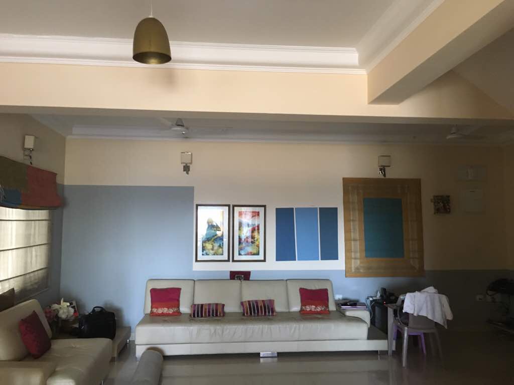
This space though large came with its own set of challenges….there was no clear entryway, the walls were painted in two colors leaving the ceilings looking shorter and the room smaller, the layout of the space didn’t allow for conversations or TV viewing and all in all just a dull, cluttered space!
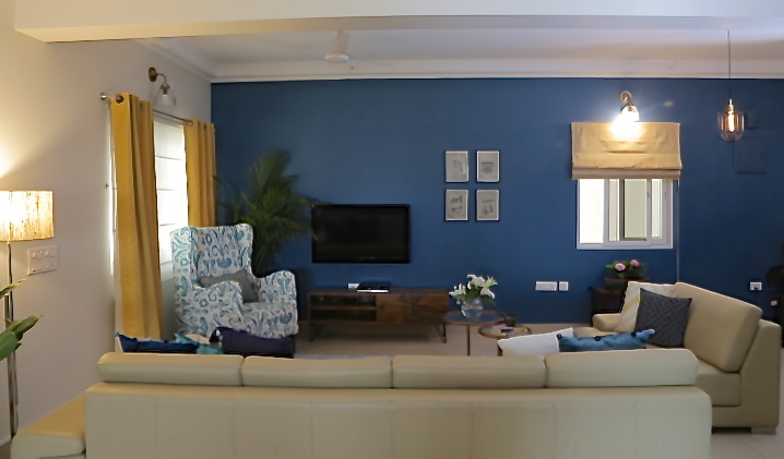
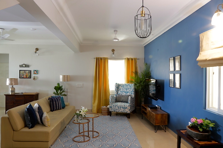
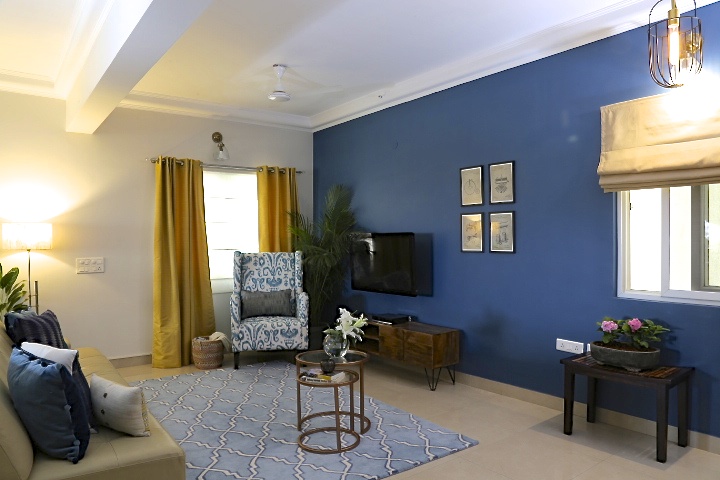
The clients wanted to paint the entire space white for a light and bright look and when I suggested a bold indigo blue wall, there was shock and discomfort! But with time and their trust in my point of view, we plunged right in and had a bold blue wall on the far end of the large space, which made the space look cozier and grounded. The rest of the walls were painted a beautiful shade of white to brighten things up. And voila, we had a completely different space in front of us….what a transformation it was!
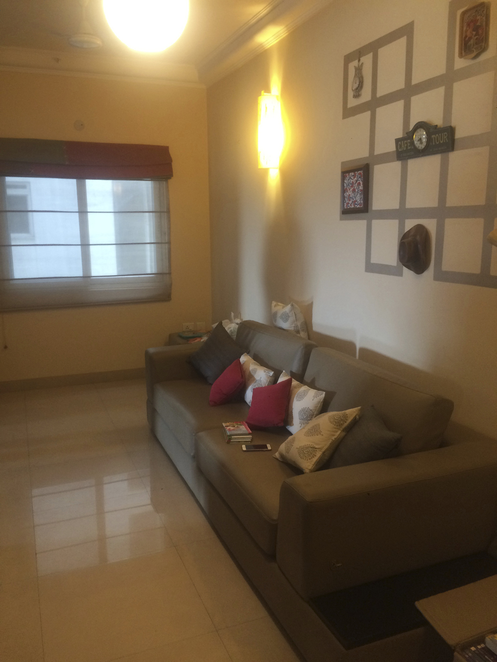
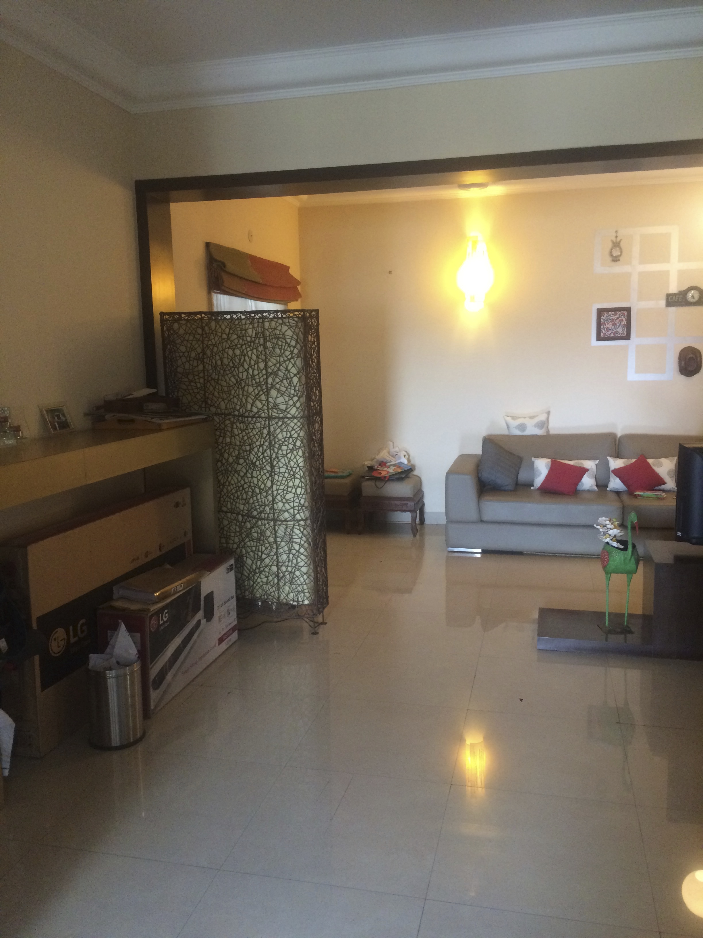
Lighting was a crucial element in this project and we had to work hard to get the right fixtures and look. We went for sleek simple industrial modern lights through the entire space and recessed ceiling lights for a modern look. The black wire drop pendant in the entryway is a favorite and so are the glass sconces.
Mustard drapes to balance the blue wall with simple white sheer blinds for function and a beautiful blue tile pattern wool rug pull together all the colors in this space. We already had a very large beige sofa that the client owned and to break the beige we added a beautiful ikat statement chair in blue and white.
A sleek wood media console, industrial influenced prints as wall art and metallic nesting tables round off this space! Take a look at some of the shots of our living room!
Here’s a picture of how it looked Before
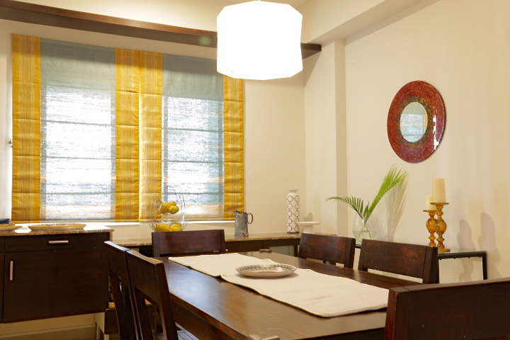
And here are some shots of the After!
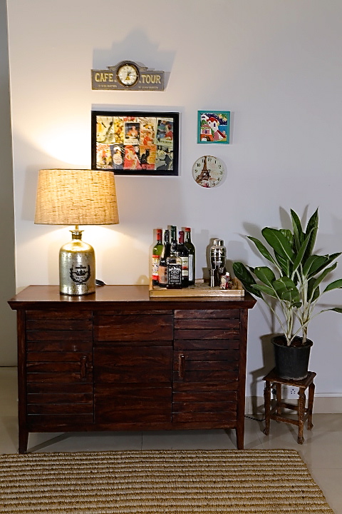
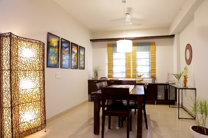
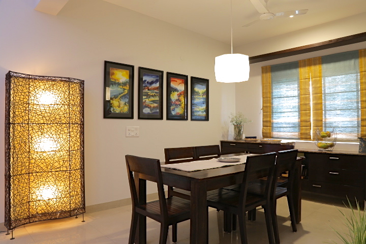
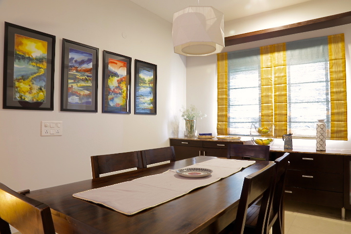
The dining area lacked in lighting and the clients wanted to have a separate functional bar. We used one of their existing wooden cabinets as a bar cabinet and added a beautiful metallic table lamp for some light. I framed some of their travel treasures and made a little gallery wall of sorts using travel memorabilia to give the bar table a Parisian vibe and it makes for such a lovely use of otherwise empty space.
We brought in a sculptural white pendant light to go over the dining table and added a modern glass and black console table to give this space some freshness.
One of my favorite elements in this space, are the four repurposed watercolor paintings (you can see two of them in the ‘before’ pics of the living room) that we framed with a black mount… and lined up together they make for some bold statement art!
Here are some shots of the dining room.
Bedroom
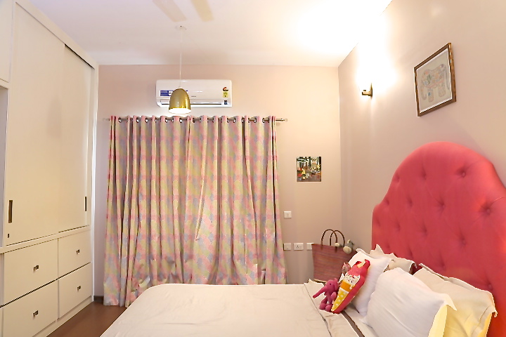
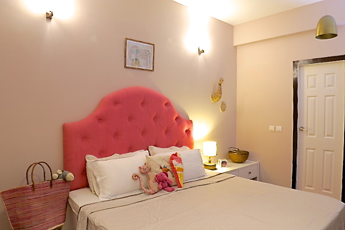
This room had a dark built in bed and a wall full of dark built in wardrobes. The only way to shake things up here was to refinish the wardrobes and the bed!
So we refinished all the wardrobes and the built in bed in bright white and added a custom pink upholstered tufted headboard for some drama!
Brass pendants, simple wall sconces and beautiful hand embroidered drapes pull this space together giving it a fun yet elegant feel.
I love the small elements that we brought in like the basketweave giraffe head, the elephant print, the patterned ikat rug and simple clean bedding that give it a chic but fun vibe!
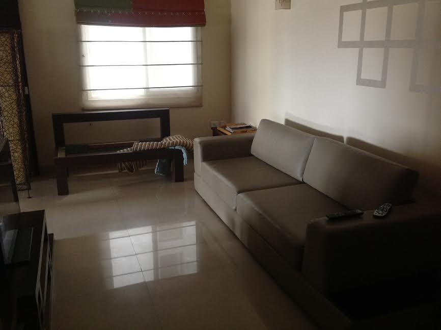
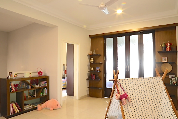
Family Room
By far the biggest challenge in this renovation project was the family space on the upper level. It had a difficult layout with a staircase landing leading into the space and not to mention very little natural light with one window and dull beige paint to further add to the dreary look!
Here are some pictures of how it looked ‘Before’!
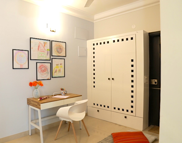
We tore down the dark built ins on the landing and creating gorgeous floor to ceiling white built ins with simple cube shelving. This provides much needed storage for books and all the toys and clutter that comes with having kids!
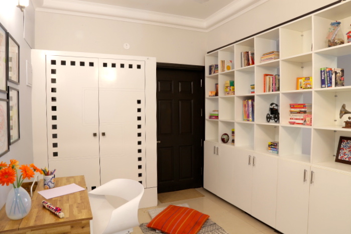
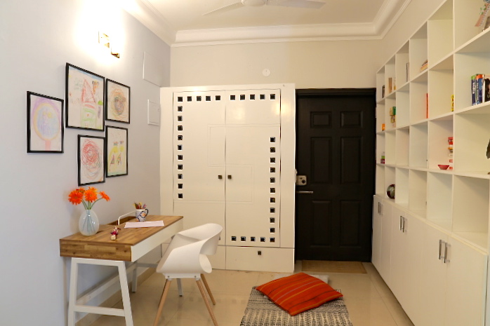
Next we painted the largest wall a light beautiful shade of blue and extended the same white to the rest of the walls from downstairs. Much needed lighting was added through recessed ceiling lights, a beautiful nickel finish white pendant light and sconces on the large wall. We used the clients existing furniture and added a desk and chair to create a small home office. Sheer white blinds and modern chevron pattern rug keep it light and bright.
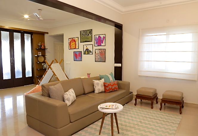
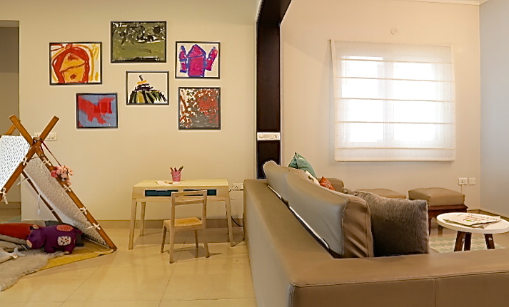
On the far end of the room we created a play space for the little girl by adding an A frame tent, a small kids table and chair and using the clients repurposed shelving unit for some storage.
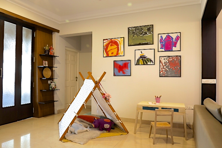
One of my favorite things in this space is all the artwork done by the little girl as wall art. There are pencil sketches and doodles that form a small cluster of art over the desk and bold paintings that are framed and hung in her play area.
This renovation was challenging because of the difficult layout, the amount of change we needed and the tight budget we had! But when you see your clients feeling happy and enjoying their home the way they should, it makes it all worth it!
Hope you enjoyed the pictures as much as I did making these spaces happen 🙂