A picture perfect nursery!
Created by Vinithra Amarnathan on December 10, 2017
When I first met my client and saw what was then a guest bedroom with dark dingy wallpaper and brown curtains covering the only window, the idea of converting it to a nursery for a 3 month old baby seemed rather far fetched!
But when I look at what we’ve achieved and how far this room has come, I couldn’t be more proud! This post is to walk you through the entire design process of how this huge change came along.
To begin with here are some of the before pics of the space. In all it was a small tight room with one large window!
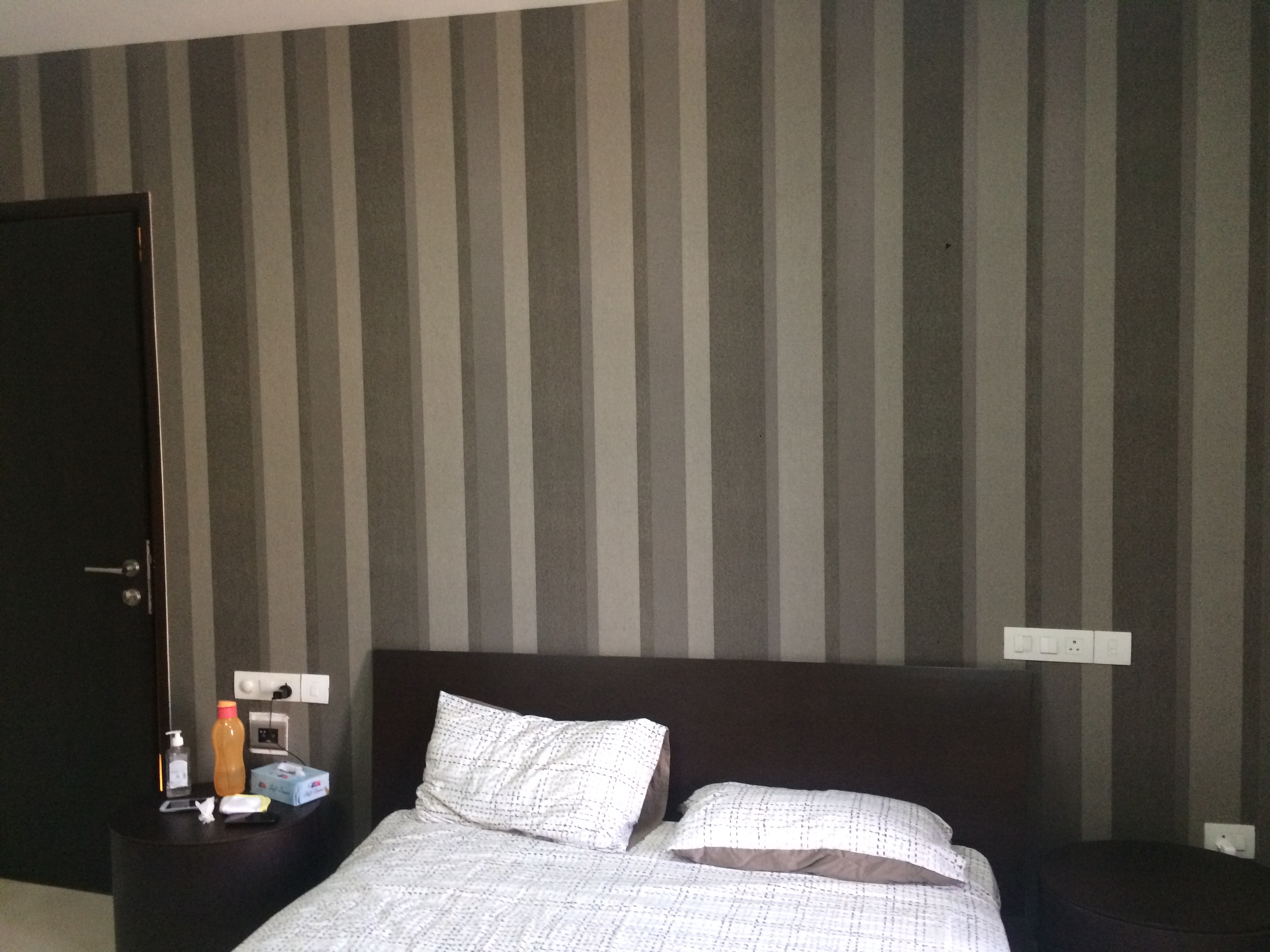
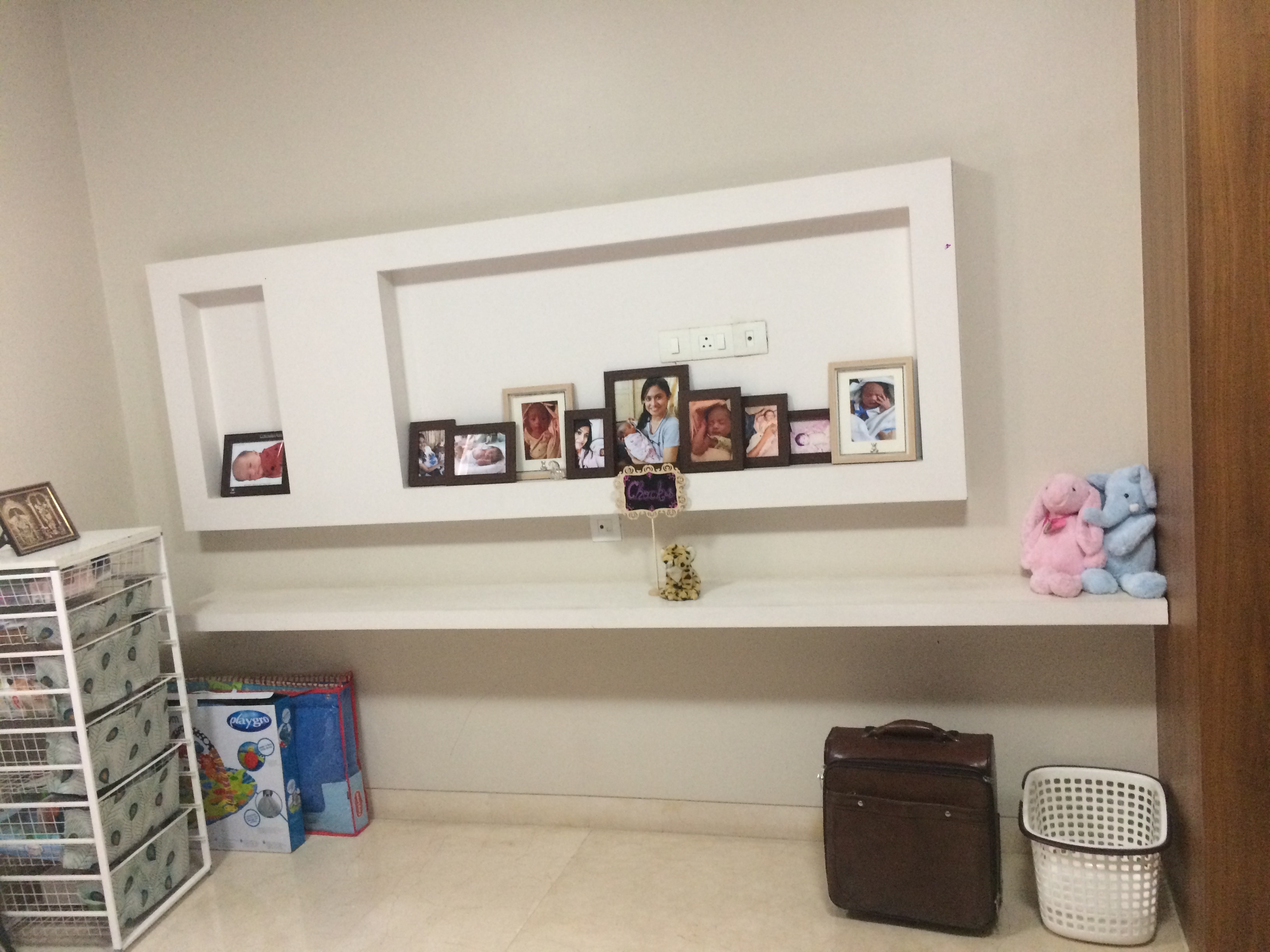
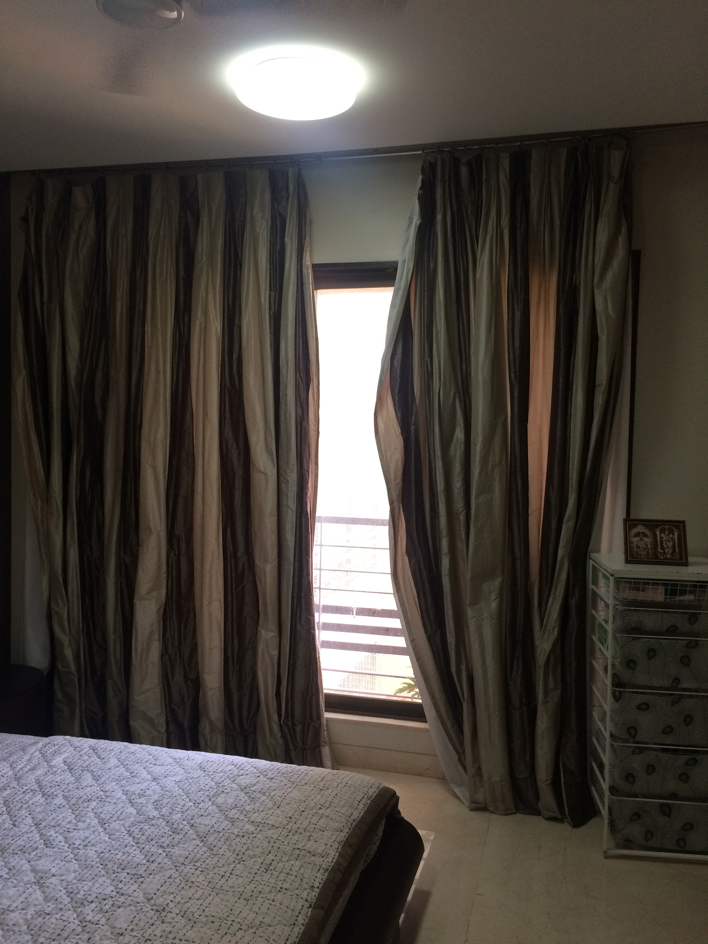
The first thing the clients wanted was a bright, open and cheery room for their little baby girl! White with pops of color and a fun vibrant space is what they were looking for!
One of the my favorite things about this space was we started with an open slate. A lot of kids rooms and nurseries start with ‘I want it pink and butterfly themed or princess themed!’ or ‘Can we do a car themed nursery?’. Not this one and for that I commend my client…..her only brief was ‘I want it to be a fresh and bright and happy place….I don’t even know what my little baby girl likes at this stage and I wouldn’t want to impose my views on her!’
That put us in a great place…to have the ability to truly imagine and be creative! And that is the reason this nursery has turned out to be a space where a child can truly grow and still love the room. It’s fresh, modern, bright and still happy and cheery enough to be a kids room!
Here’s a look at our design board and starting point!
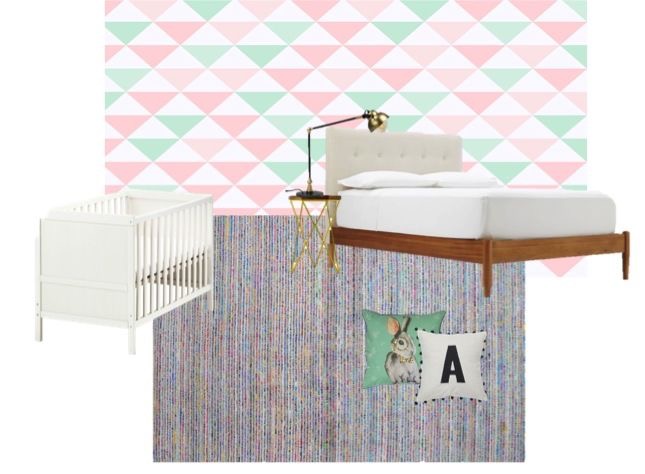
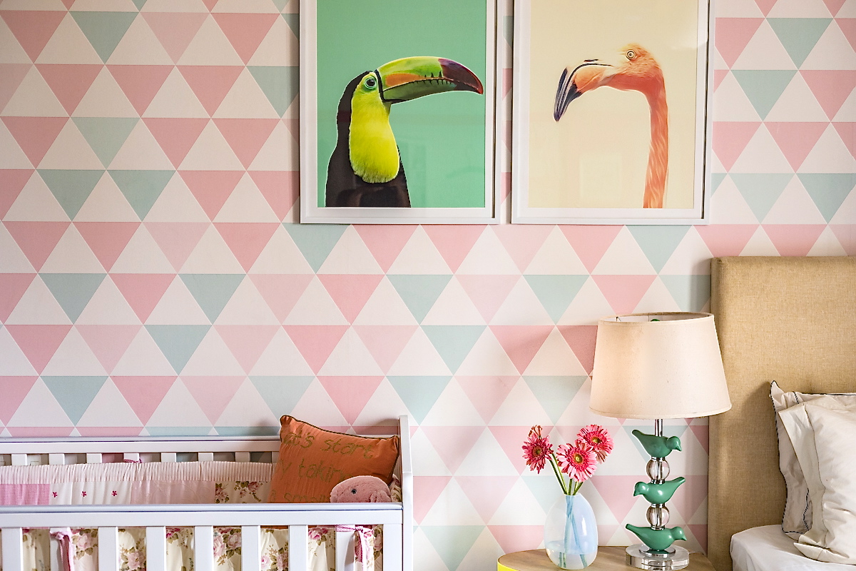
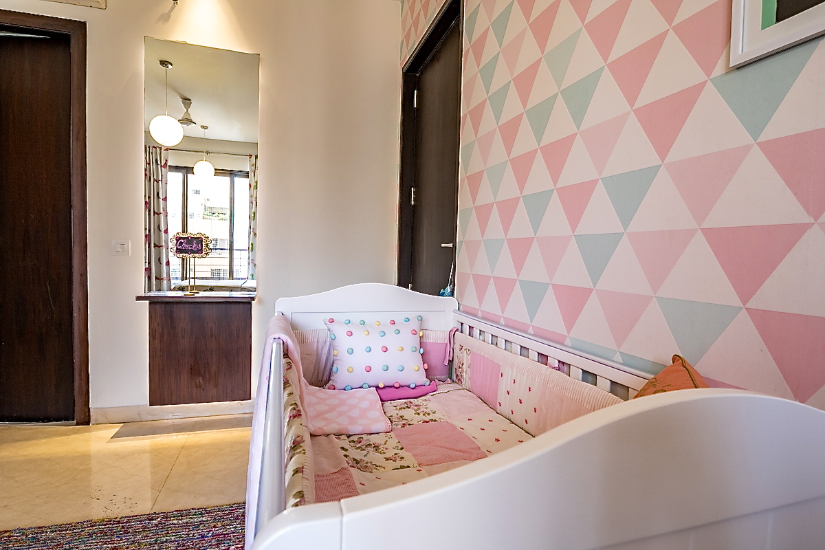
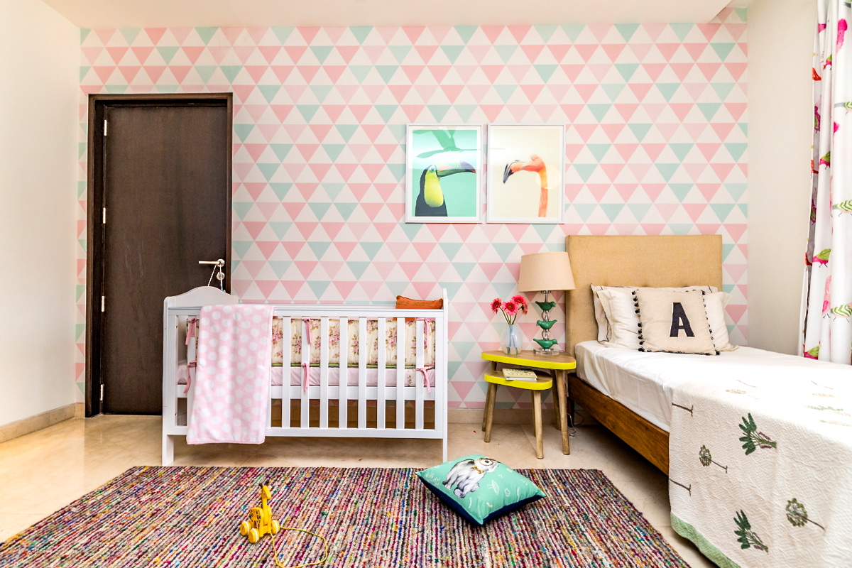
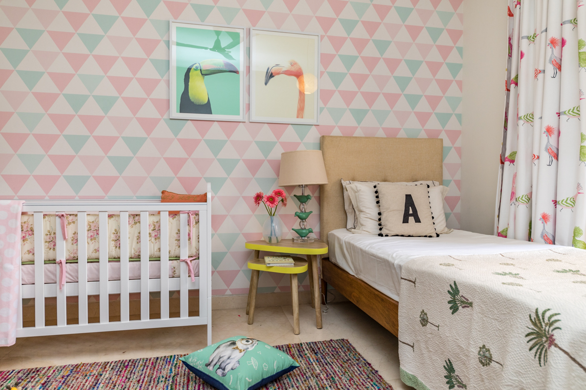
Lets start with the wallpaper….we knew we wanted to have wallpaper on the large wall and most of the wallpaper we saw either had fairies, butterflies and predictable patterns on them or were simply not unique enough. So we decided to make a custom wallpaper in a geometric pattern! We worked with my graphic designer to design this beautiful wallpaper in shades of pastel pink, mint and white! I am so in love with this wallpaper! Totally makes this room! Here are some pictures!
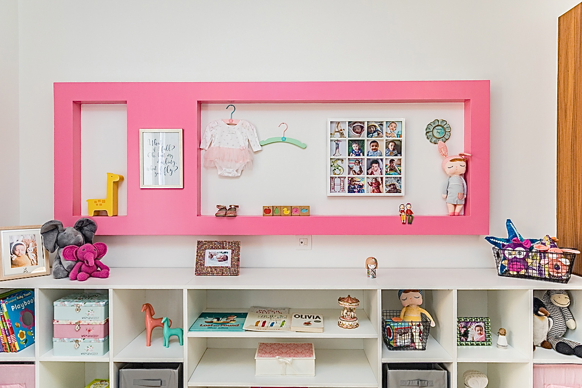
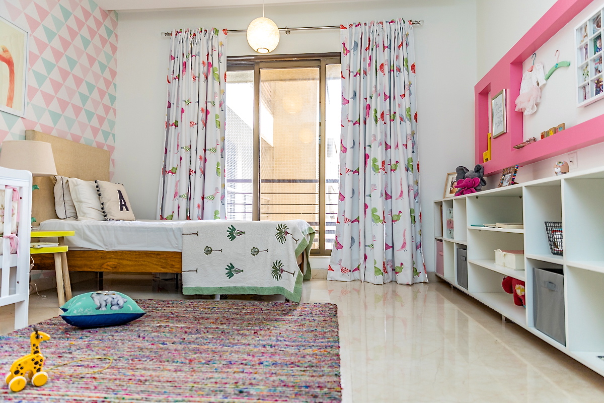
The rest of the walls were to stay a nice crisp white. The wall on the opposite end had a wall nook which we painted pink to create contrast and add a pop of color. Below the wall nook there was a long wall and we decided to create simple built in storage here. Clean and simple shelving in white with chrome legs that not only looks modern but is super functional for storing kids toys, books etc. We added a few bins to carry smaller things and left some open! Here’s a look at the built in unit and the pink wall nook!
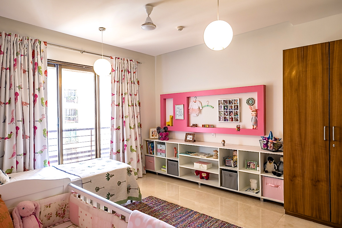
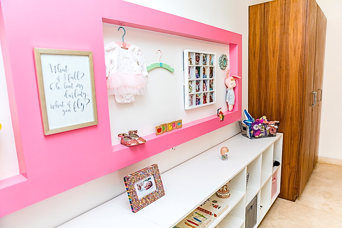
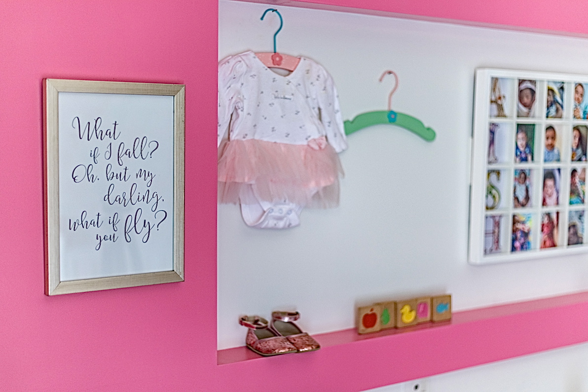
The next step was picking our curtain and rug! I stumbled upon this beautiful curtain with cockatoos and hornbills and we were sold! Such a vibrant yet elegant pattern for a kids room! We kept the rug neutral in gray with subtle multicolor stripes running through in silk threads woven through the wool carpet.
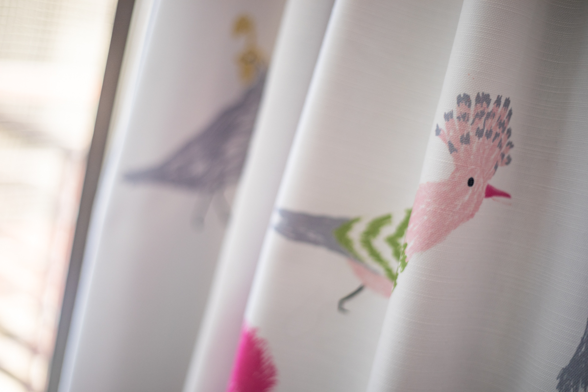
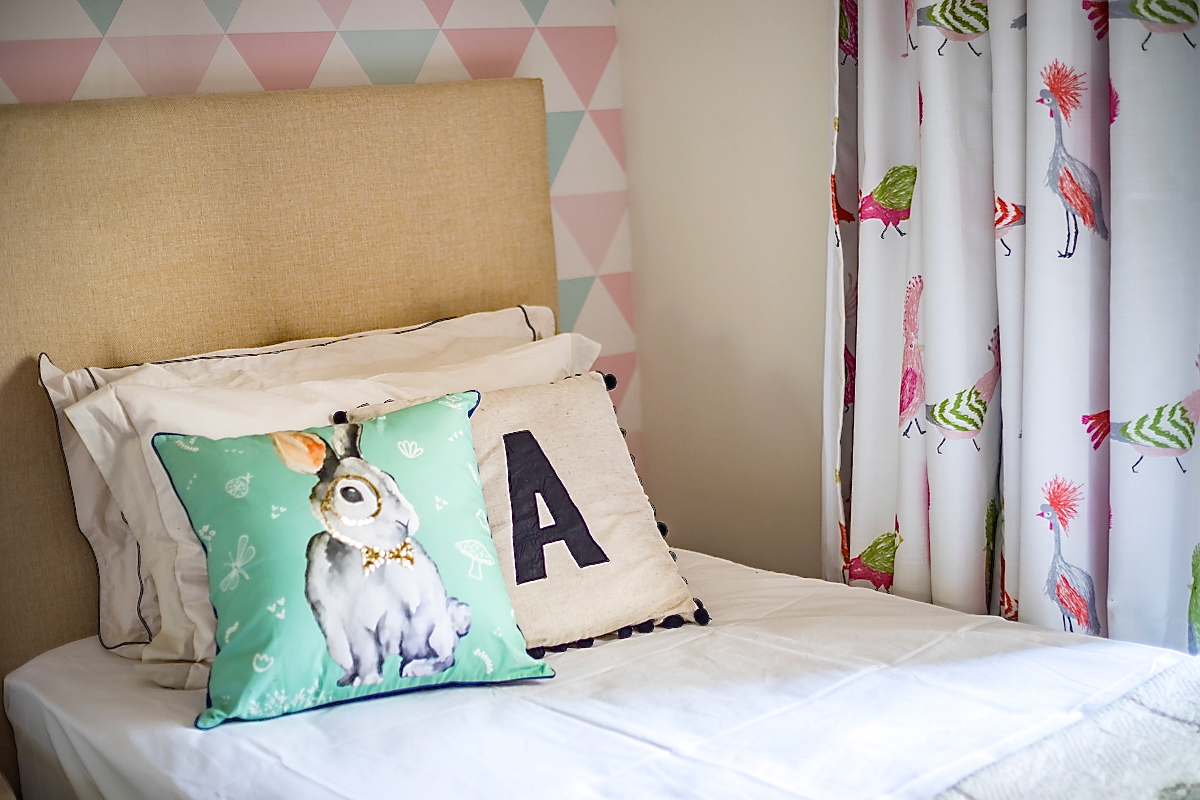
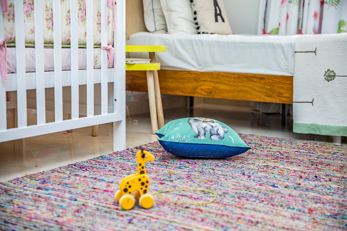
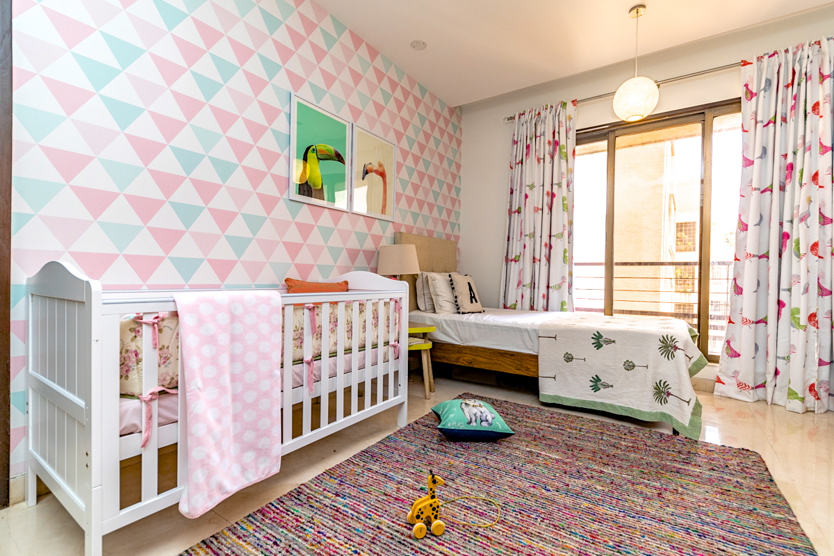
The crib is a simple white crib from mother care and the bed from Asian Arts was a great choice with a comfortable upholstered headboard that’s great for sitting back with baby. The design is modern and clean with a neutral fabric to keep things light and bright.
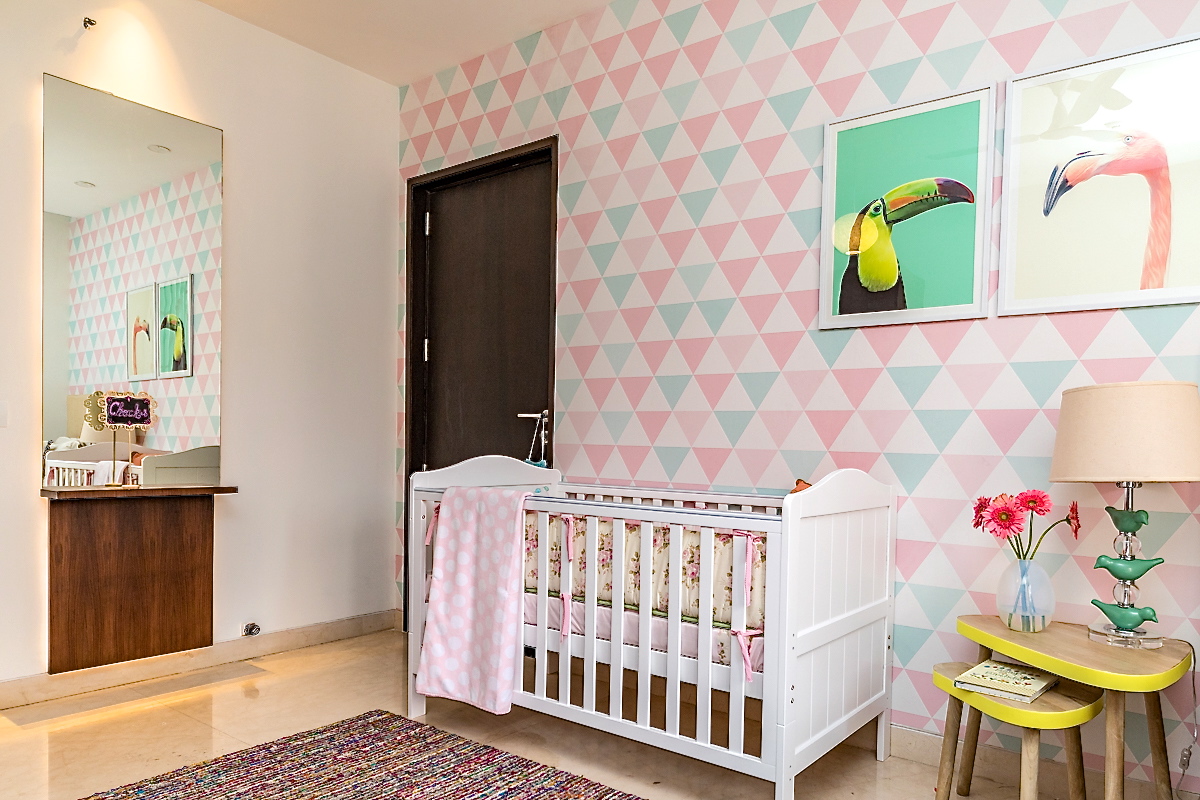
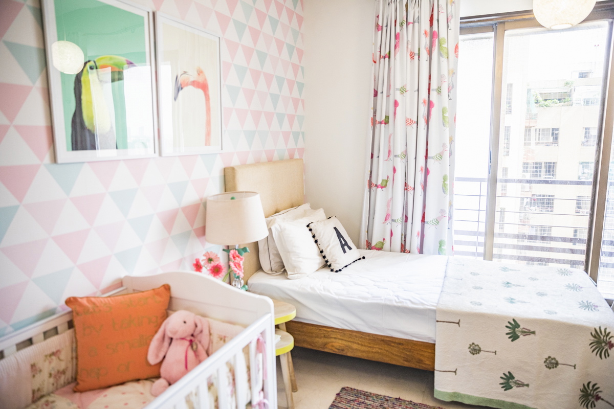
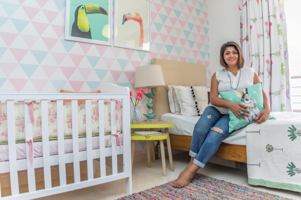
We added a nesting table for the bedside from the Wishing chair and a beautiful bird lamp from Vajor. A few lovely pillows and accessories to round off the look!
Last but not the least, our custom wall art! These prints are from Etsy and we got them printed and framed here. These stunning one of a kind bird prints of a Toucan and a Flamingo are the perfect addition to the wallpapered wall!

Hope you enjoyed a walk through of this renovation. A huge thank you to Katya Matrioshka from Matrioshka Media for the fantastic photographs!
Do share your thoughts with us! And dont forget to call us for your next renovation or interior project 🙂
