Project Reveal – Modern Boho Loft Part II – Upper Level
Created by Vinithra Amarnathan on January 23, 2019
If you’ll saw the first part of this home that we revealed before (click here to see), and thought it to be a black and white or neutral home all through, the upper level will surprise you with its bursts of color in the family room, the richly layered master bedroom and the subtle yet beautiful guest room!
Each of these spaces has their own character and packs in so much detail but fits right in as part of the same home!
Guest Bedroom
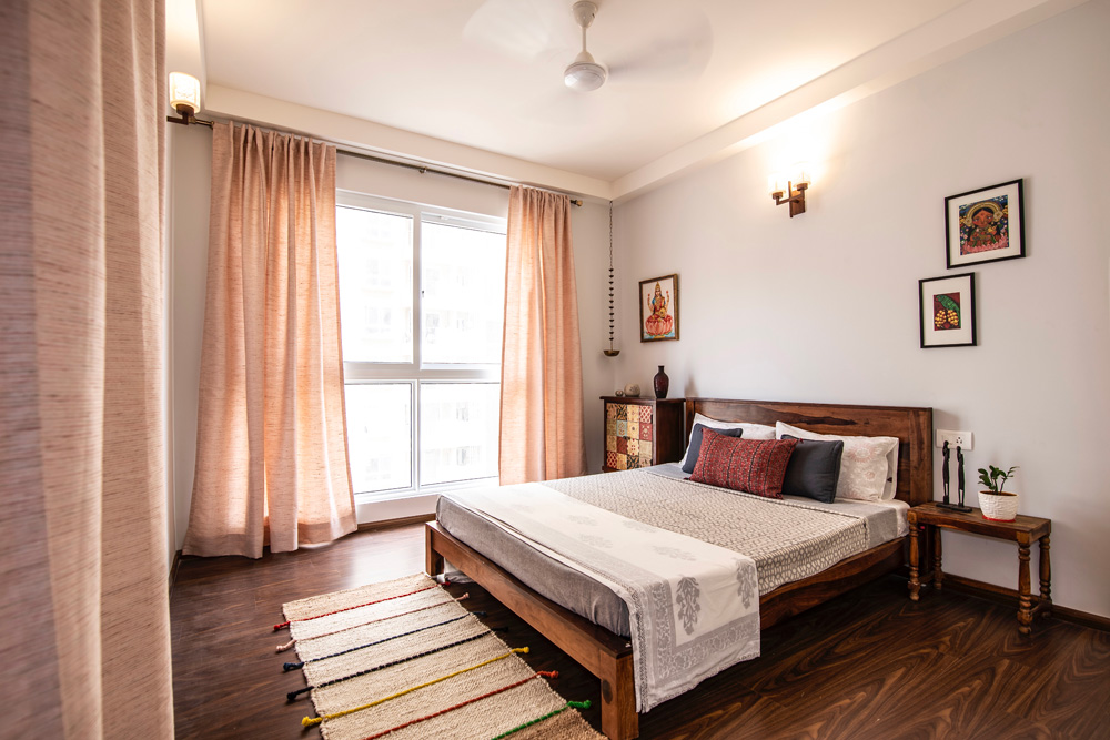
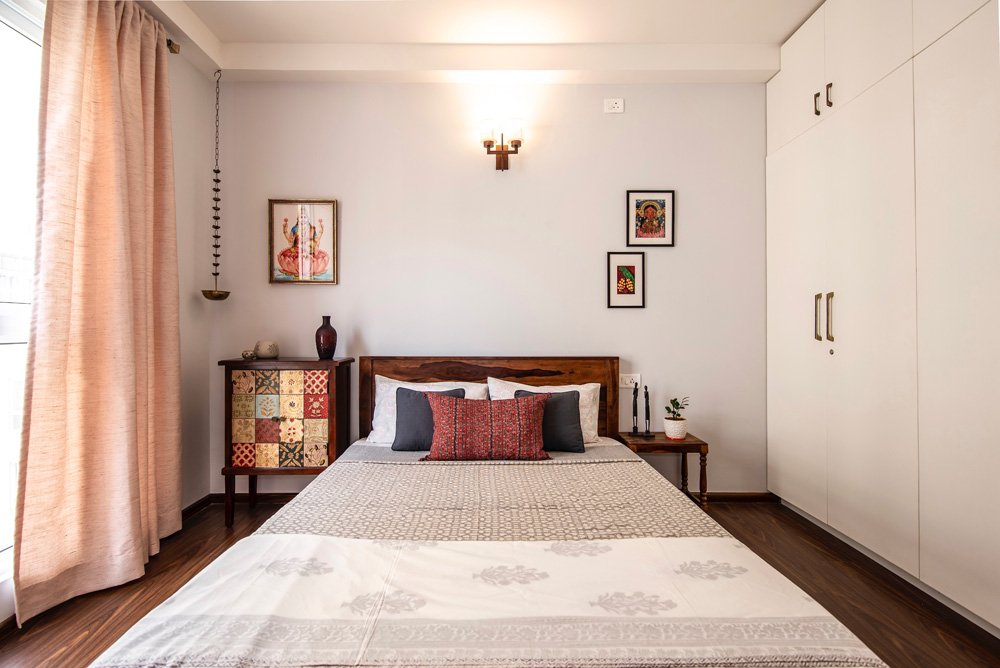
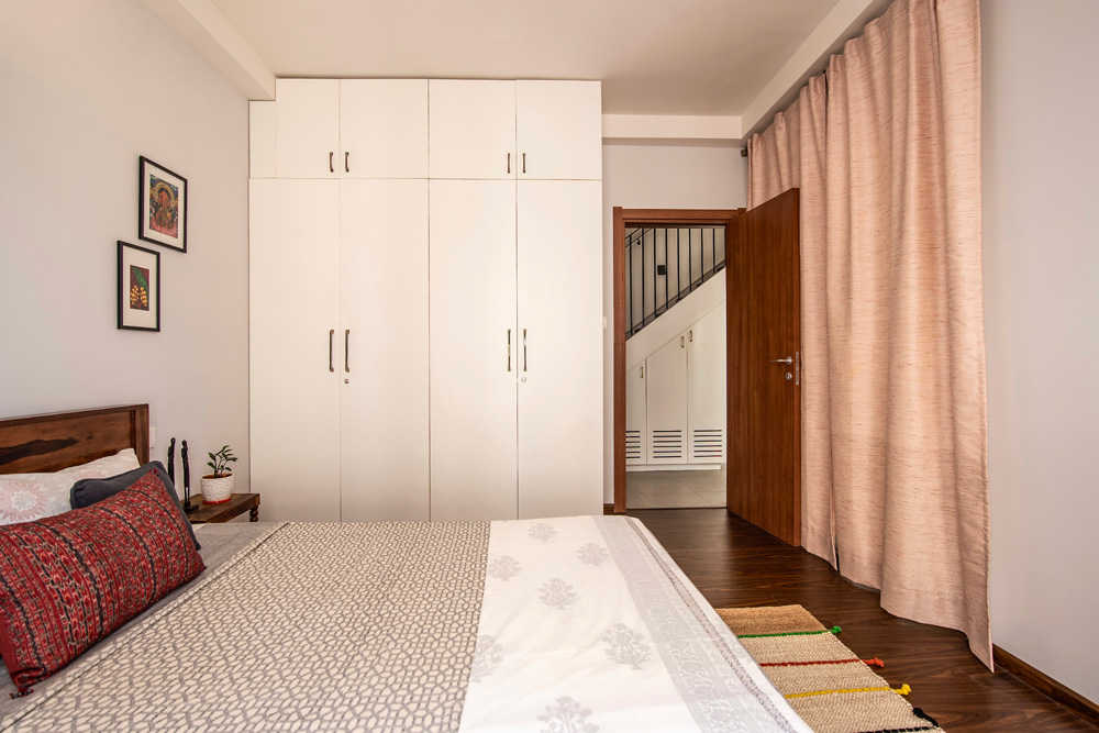
As you enter the apartment in the lower level right after the entryway is the guest bedroom, which has a subtle feel of India to it keeping in mind that the most frequent guests would be immediate family and senior citizens.
We chose a solid wood bed in medium teak finish with a simple clean headboard and added a beautiful decoupage cabinet on one side that brings both color and pattern to the space. The rest of the space is open and houses a modern white wardrobe that stands out against the warm wood.
Pastel pink curtains and simple light bedding keep the vibe relaxed. The art is bright and vibrant with a decidedly Indian look to it. The wall lights are a modern take on the Indian jaali / Moroccan lattice patterns letting light to come through when lit.


Staircase
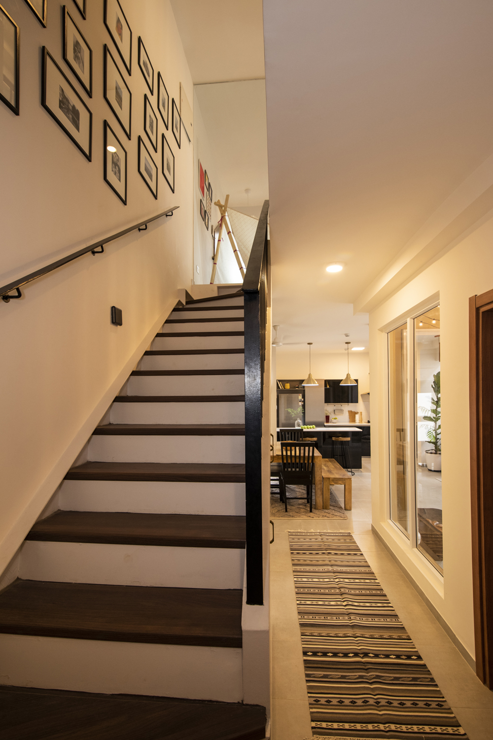
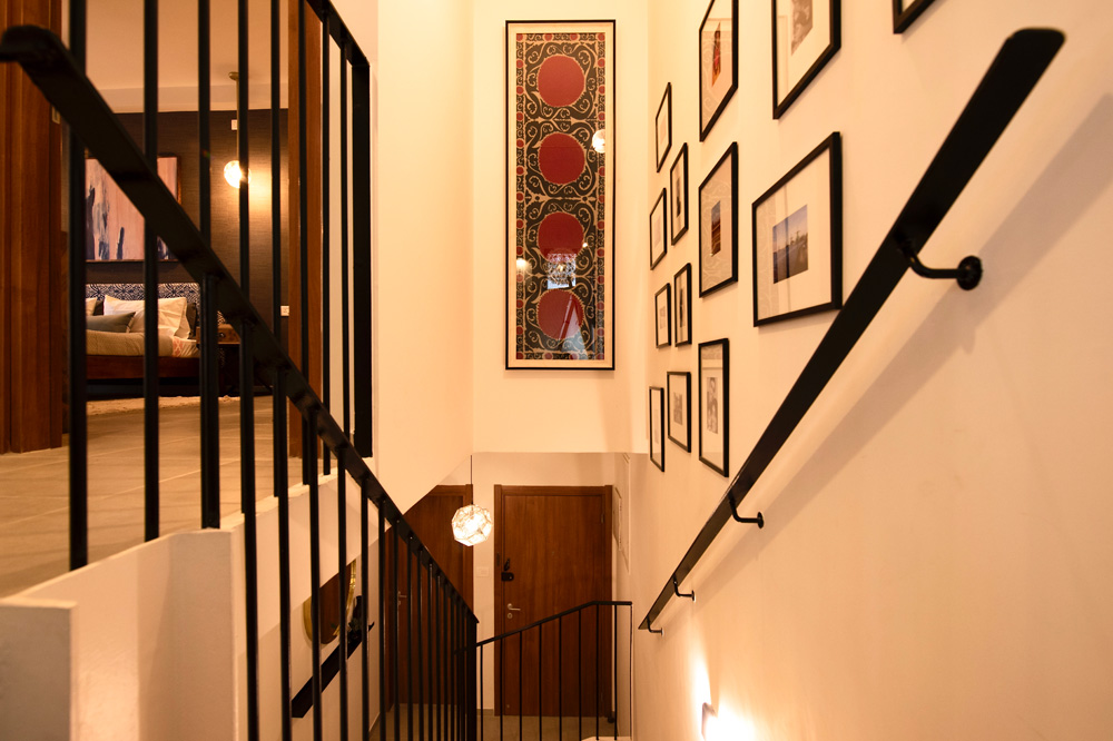
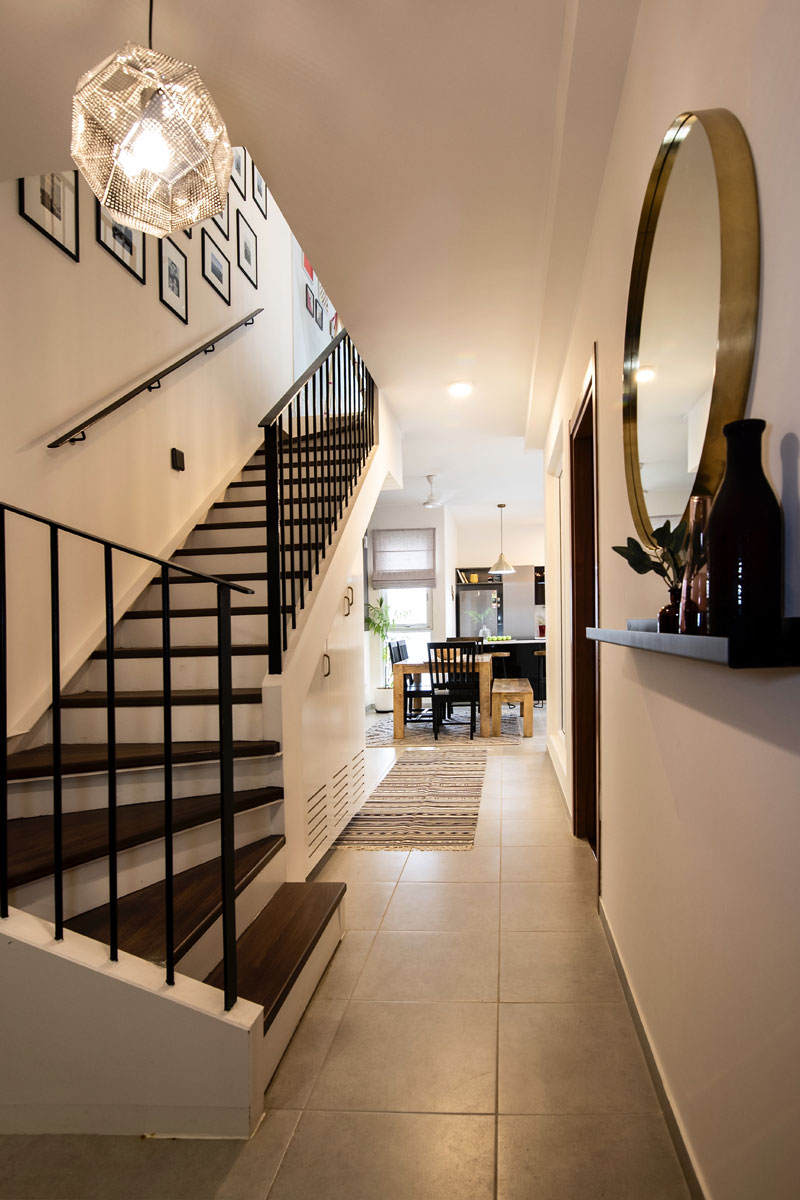
This is one of those spaces that I wanted to highlight as soon as I saw the home. The staircase was all white and we painted the railings black for contrast.
The large double wall houses a gallery wall of family photos where we took small pics and used oversized frames to make them pop! The gallery wall mixes black and white photographs with colored ones effortlessly and is one of my favorite features of this home!
Behind the staircase there was a large wall that we wanted to make into a feature wall. A beautiful suzani runner that I found got framed and hung on the wall and it makes for such a bold statement!


Family Room
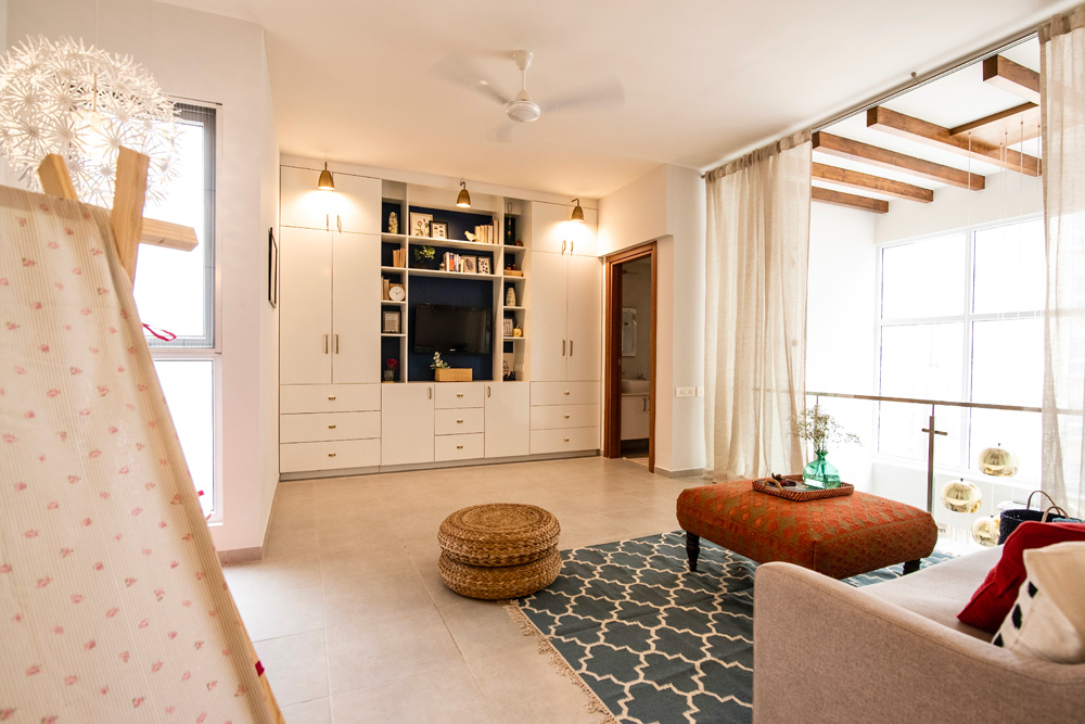
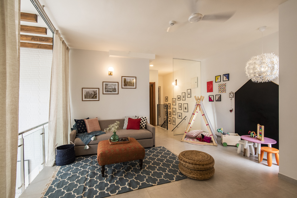
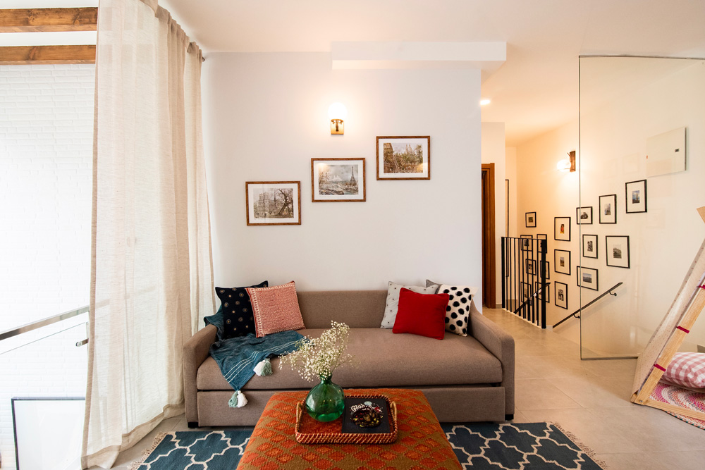
As we walk up there is a large open family room separated from the staircase with a glass partition and overlooking the double height ceiling. Since this room was to be used as a family room the primary objective while designing this space was comfort as well as functionality.
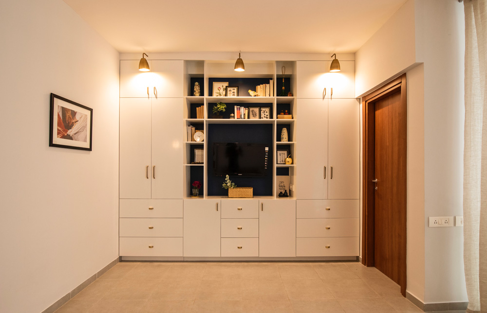
One of the major features in this space is the built in unit that provides much needed storage, holds a TV and has a gorgeous indigo accent color on the inside that makes for the perfect shelfie 😉 The brass sconces on the top add so much interest to this unit!
The rest of the family area has a sofa with a hidden pull out bed, with a deep teal and white dhurrie and a custom made kilim-covered ottoman. This space is all about comfort and warmth as against the sleek sharp feel of the lower level in this home!


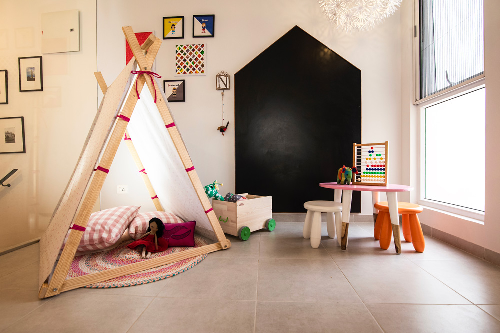
On the far corner of this family room is a cute little kiddie corner where we have a tent, a custom chalkboard frame on the wall and a small table with stools for all those art and craft afternoons. The hanging oversized white ikea lamp is the perfect addition here….What a fun little spot this is 🙂

Master Bedroom
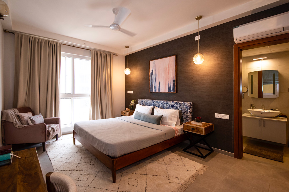
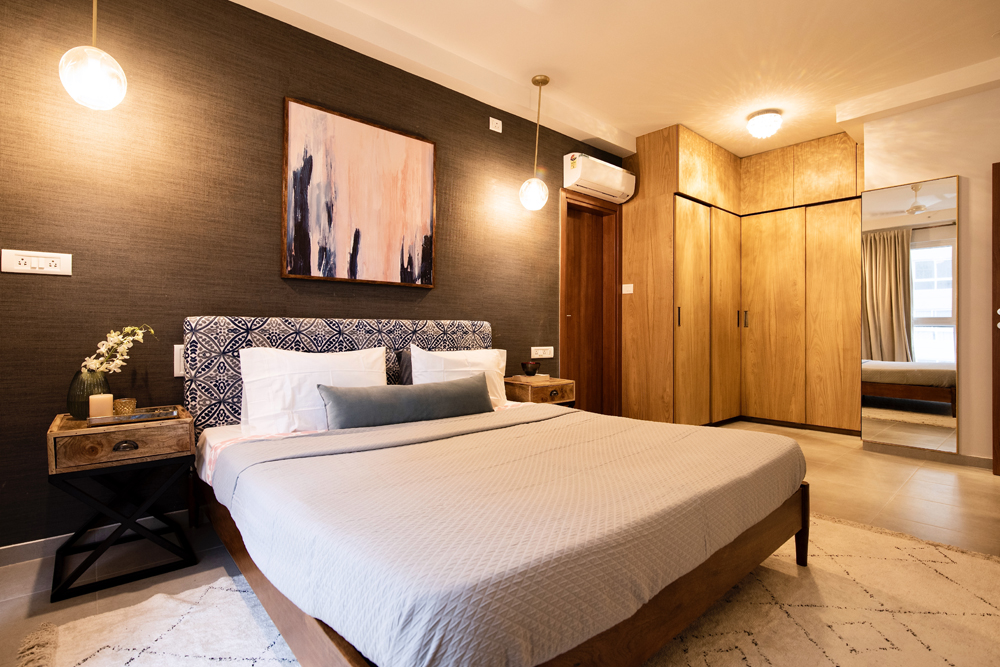
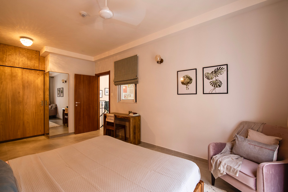
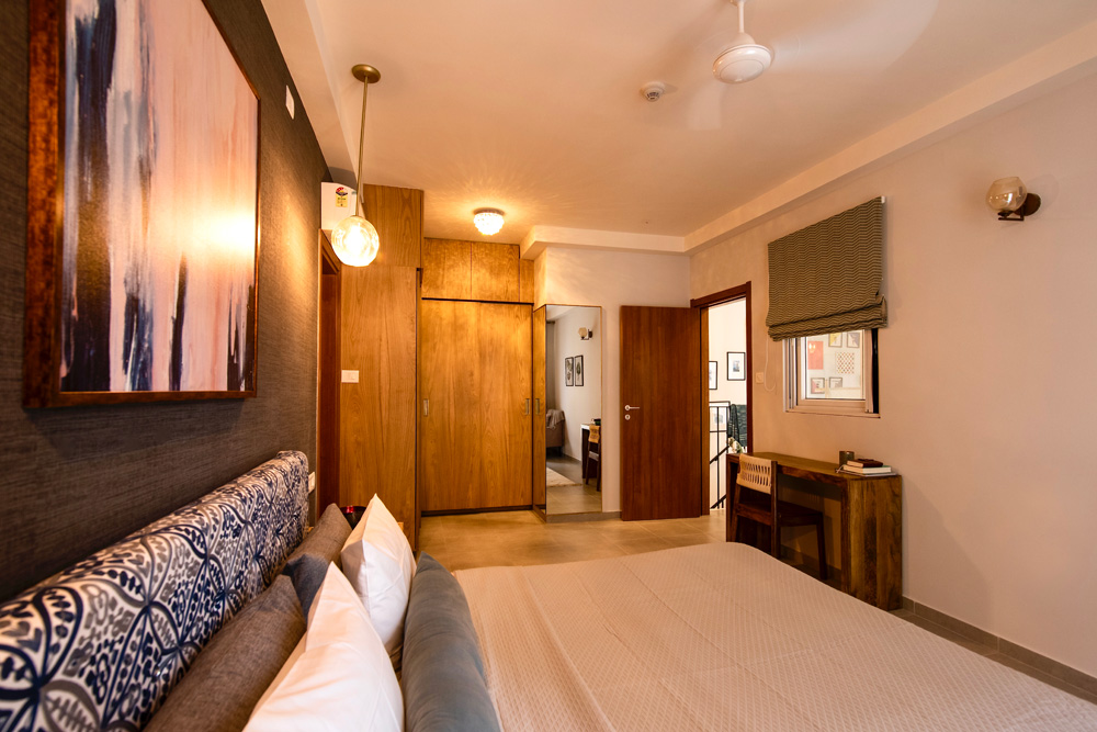
On the right side of the staircase is the beautiful master ensuite. The look and feel of this room is rich, layered and moody with a hint of luxury!
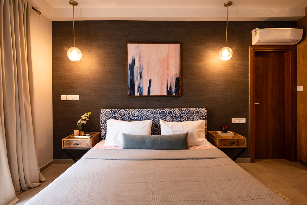
The color palette was predominantly gray and blue with some blush. The upholstered bed is custom made with a lovely hand embroidered fabric in shades of blue and is anchored by a charcoal seagrass wallpaper. The dark wall adds to the moody lux feel and makes the headboard stand out beautifully!
We added raw natural wood nightstands to complement the upholstered bed and hanging lights above.
A soft ivory and charcoal beni inspired rug is the perfect piece underfoot atop the cold tiled floor. The curtains are a neutral light gray adding a soft yet luxurious look!
The bedding is light in shades of white and gray with a pop of blush from the quilt and a beautiful custom made velvet lumber pillow!


Opposite the bed is a custom-made blush chair that makes for a cozy reading nook and a small console that we repurposed as a desk.

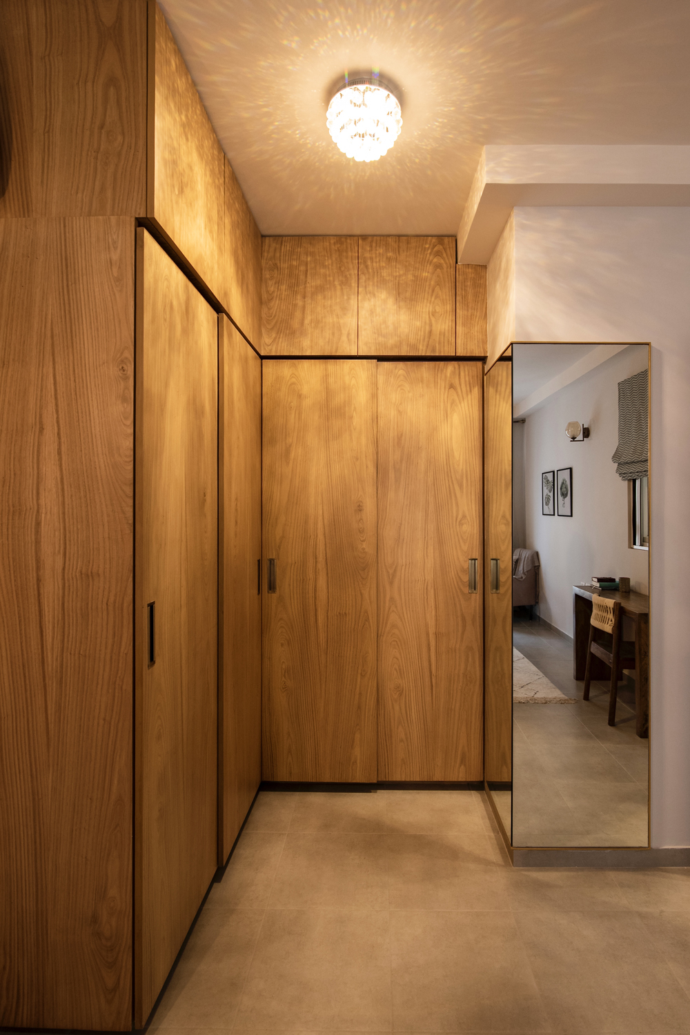
On the far end is the beautiful corner wardrobe covered in a chestnut veneer. This was such a challenging and tight spot to design…I’m so glad we could create a functional double wardrobe that works for the clients. The leftover space was too narrow and I thought a wraparound corner mirror would be a great way to maximize the space. The mirror is framed in a slim brass profile and is another of my favorite features in this house! A beautiful little chandelier on the ceiling rounds up this little wardrobe area!


Bathrooms
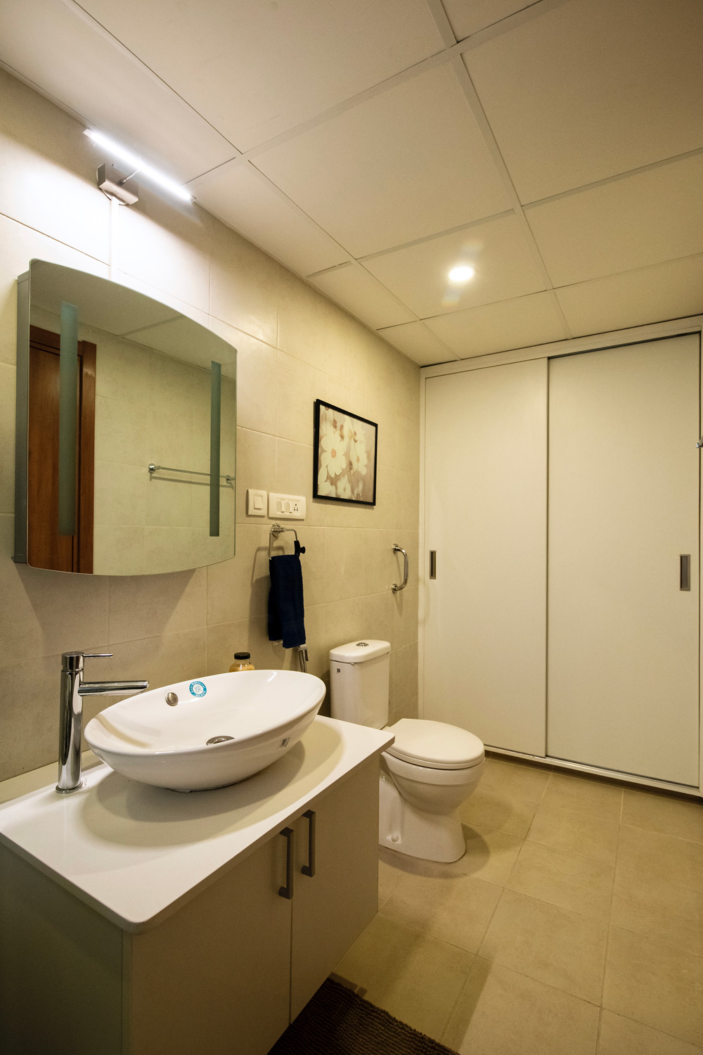
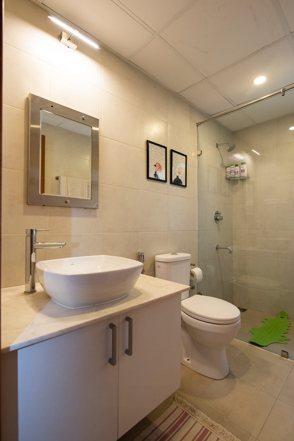
The master bathroom had a bathtub that the client did not want. So we removed the bathtub and added much needed extra storage by way of a linen closet inside. Simple storage mirrors, glass enclosures for the showers and some art make the bathrooms functional and pleasing!


And that sums up the walk through of this lovely home! Its fun, fresh but at the same time has a great design aesthetic where all the details come together beautifully! I hope you enjoyed looking through this home and a behind the scenes account of it all as much as I enjoyed every moment of working on this space and seeing it come alive 🙂
Until next time, till am back with our next project or a blog update, keep it personal and chic!
All pics by Parth Swaminath.

Project Reveal – Modern Boho Loft – Living Area
Created by Vinithra Amarnathan on January 9, 2019
A little modern, a little boho, a little organic and very chic ☺
After a bunch of remodels in the past two years, I was ready for a blank slate to work on and this modern boho loft was just the perfect project!
It was bright, with ample natural light, a great open floor plan and a modern clean structure to work with! Add to that a very discerning client who was willing to take design risks! Ok I got lucky ☺…but it was a lot of hard work, I kid you not! But so so worth it!
I am so happy with every design detail in this house and how well fleshed out the design is!
It’s restrained but full of depth, a muted palette on the whole but a fantastic play of textures, organic with bohemian hints and some great art!
We’re bringing this project to you in parts and here’s the first part of the reveal – the open plan living, dining, kitchen and entryway with a double height outdoor patio space!
Entryway
As you walk in to the apartment the entryway is narrow and tight with one part leading up the stairs into the top floor of this split-level loft while straight down you are led into the main living area!
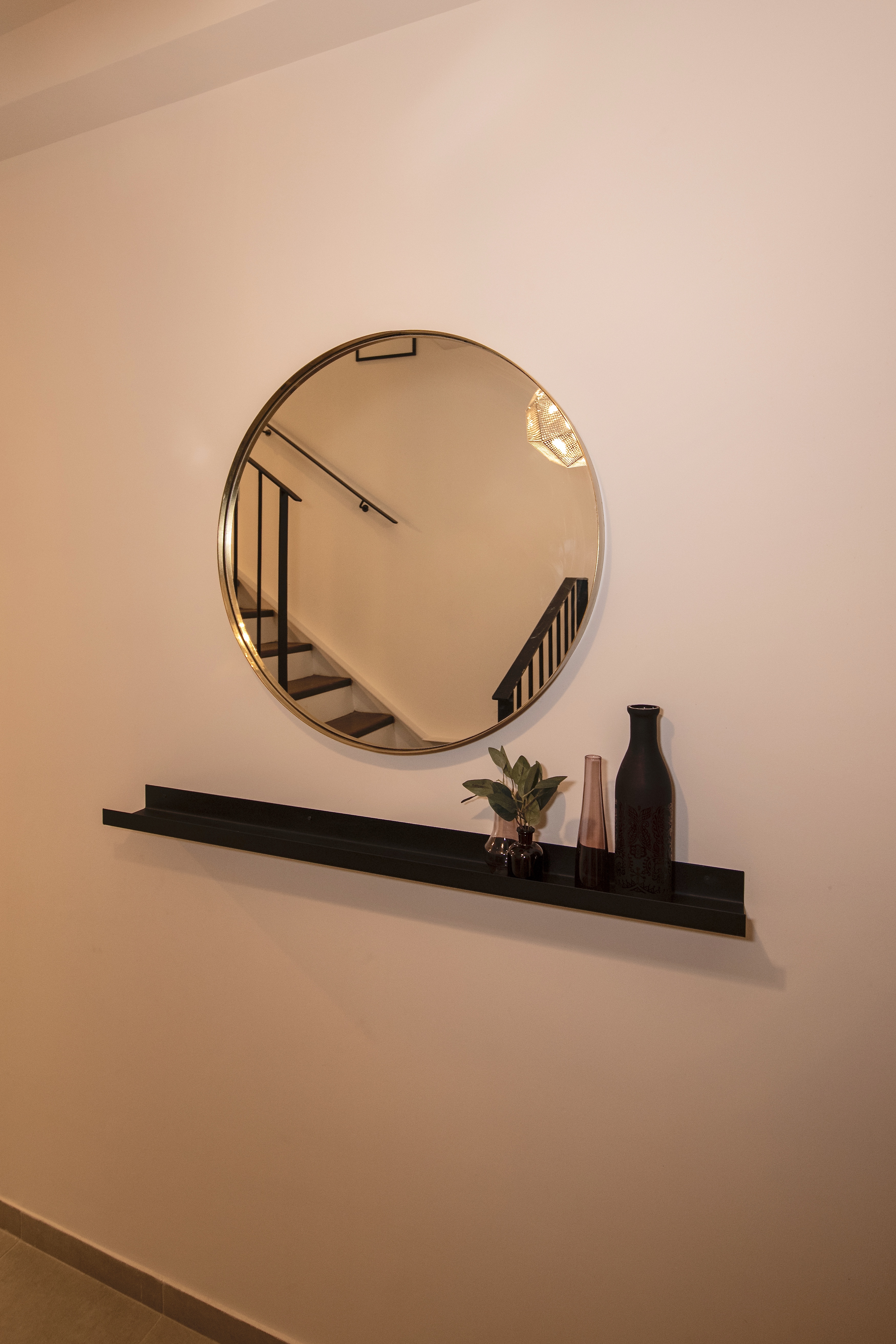
Being small, we wanted to make the most of the space! We used a large simple brass framed mirror with a sharp and slim matte black ledge below to hold small items.
The ceiling has a beautiful perforated metal pendant light in silver and the play of mixed metals adds a lot of interest to this little spot.


Bar
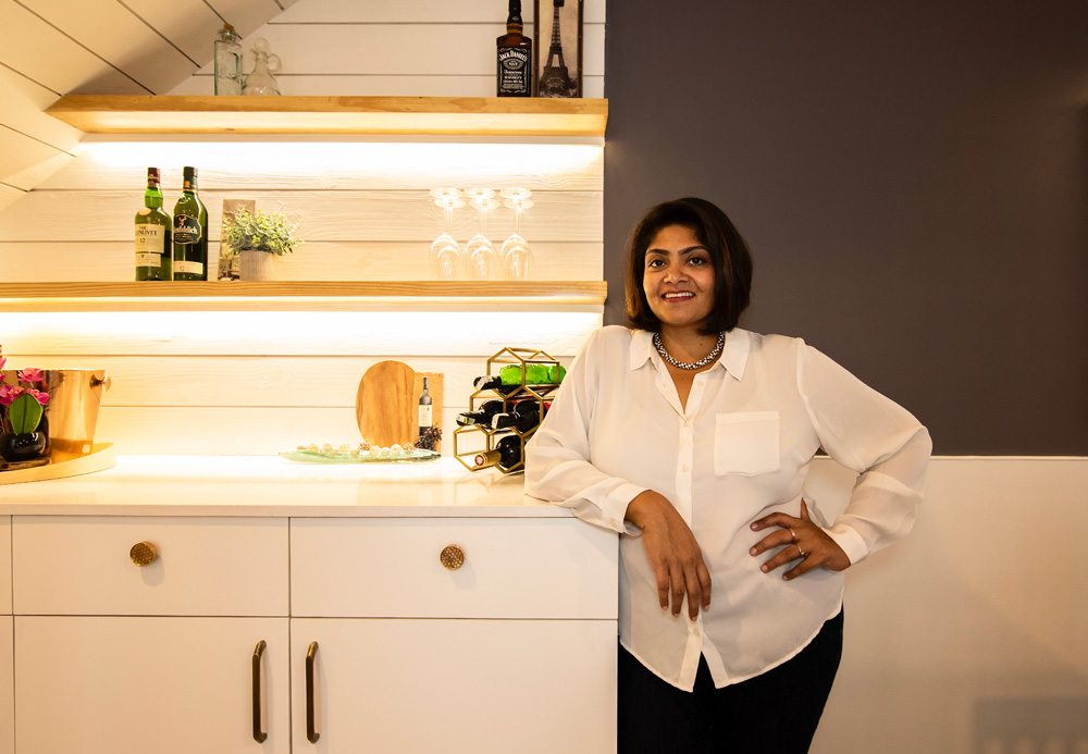
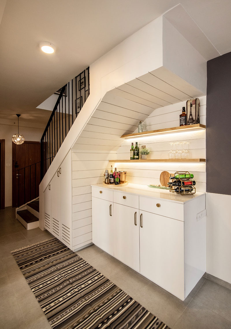
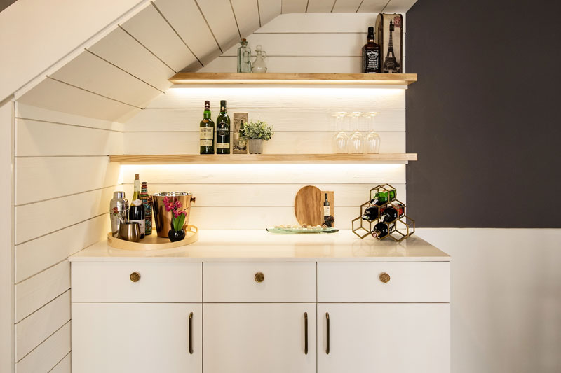
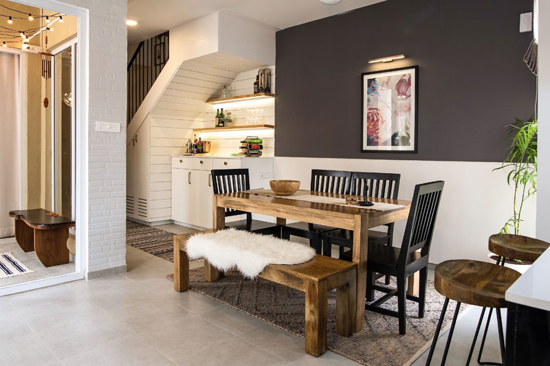
There was a whole lot of open but pretty much dead space that we had under the staircase and I think the idea of converting it into a bar was fabulous! It utilizes the space beautifully and adds a great spot that can be used for entertaining.
We used a large part of the area to create a bar and the rest of it to provide closed storage for shoes and other entryway essentials, which was perfect given that the house had a small entryway.
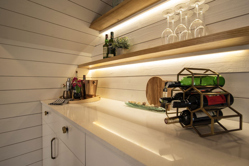
We wanted to go with an all white look to keep the space feeling open and bright and modern! One of my favorite elements here is the shiplap walls to set apart the bar area. It’s lined with pinewood and painted white, which adds a whole lot of warmth and texture to the space. We used gold hardware and I love how it offsets beautifully against all the white!


Dining
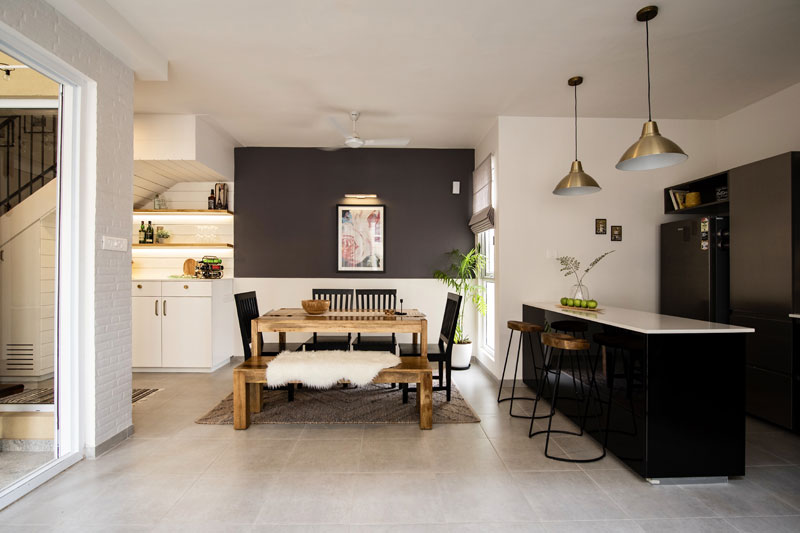
The dining area is right next to the bar and since it was adjoining, I thought a dark wall would help define the space. We went with a deep charcoal but kept it a half wall and kept the lower half paneled white for contrast. I love this modern take on wainscoting and it adds so much interest to this little space.
The natural wood of the dining table and bench bring in that organic feel, while the sharp black chairs add a modern contrast. We kept all the colors in this space neutral and you can see the textural play of all the elements from the metal candle stands, to the jute runner to the wood bowl!
The space is complemented beautifully by a peony print that adds a punch of color and a hint of feminine to this otherwise neutral space.


Kitchen & Laundry
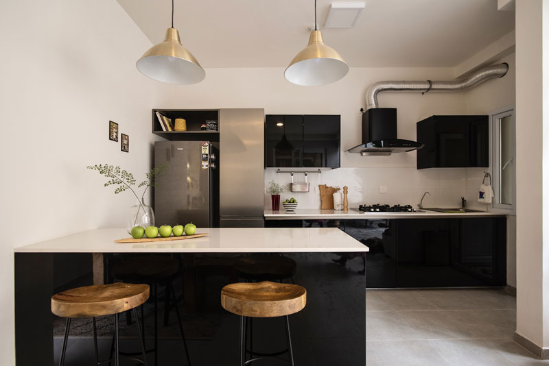
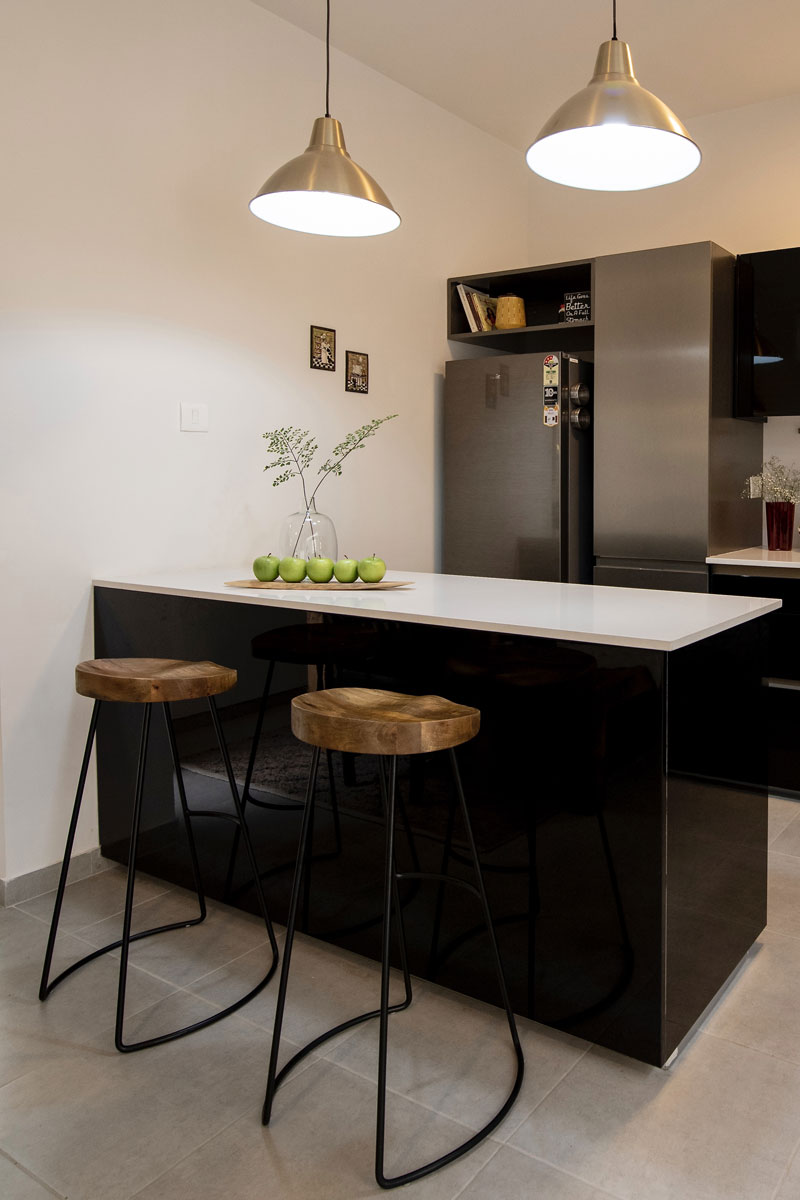
The kitchen in this house is small and has a clean sharp look. However we felt that it lacked in storage, so we added a sleek pantry unit in steel gray, switched out the countertops to white quartz and added lovely gold pendants over the island. A set of natural wood bar stools stand out perfectly adding warmth to the black and white space! I love how its come together!


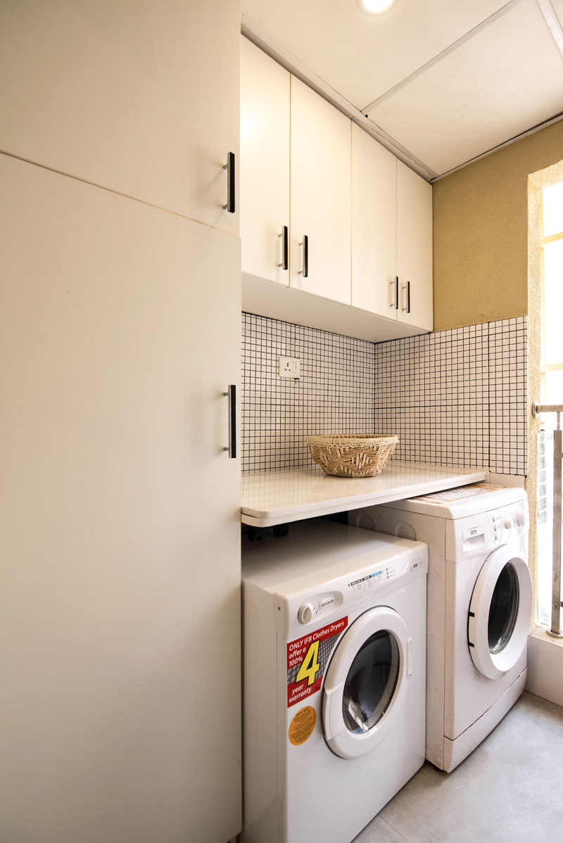
We also created a complete laundry room in the utility space complete with cabinets in white and a sharp black and white tile.

Living
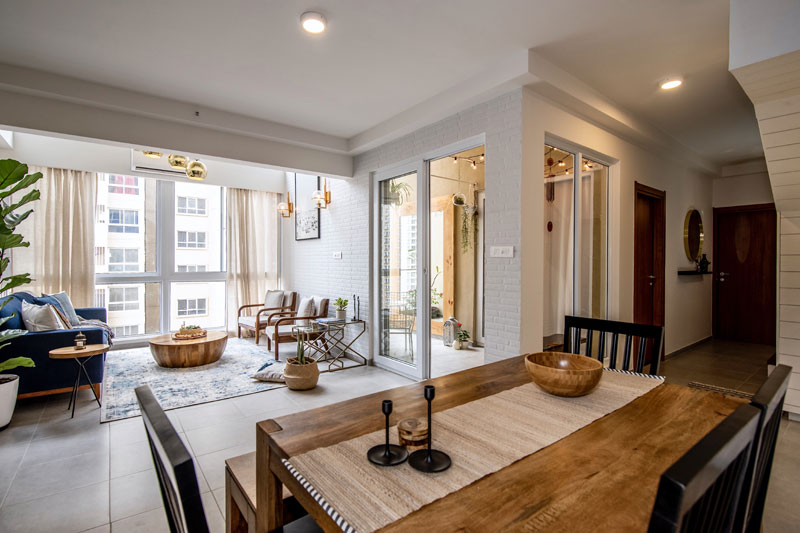
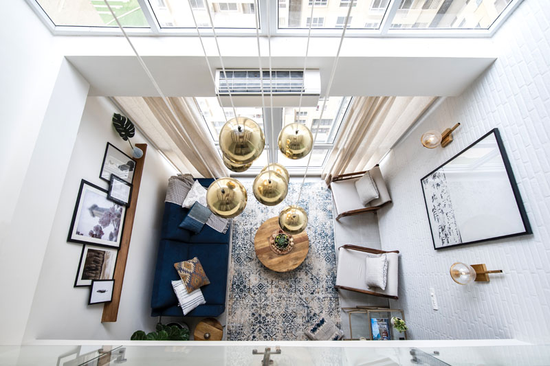
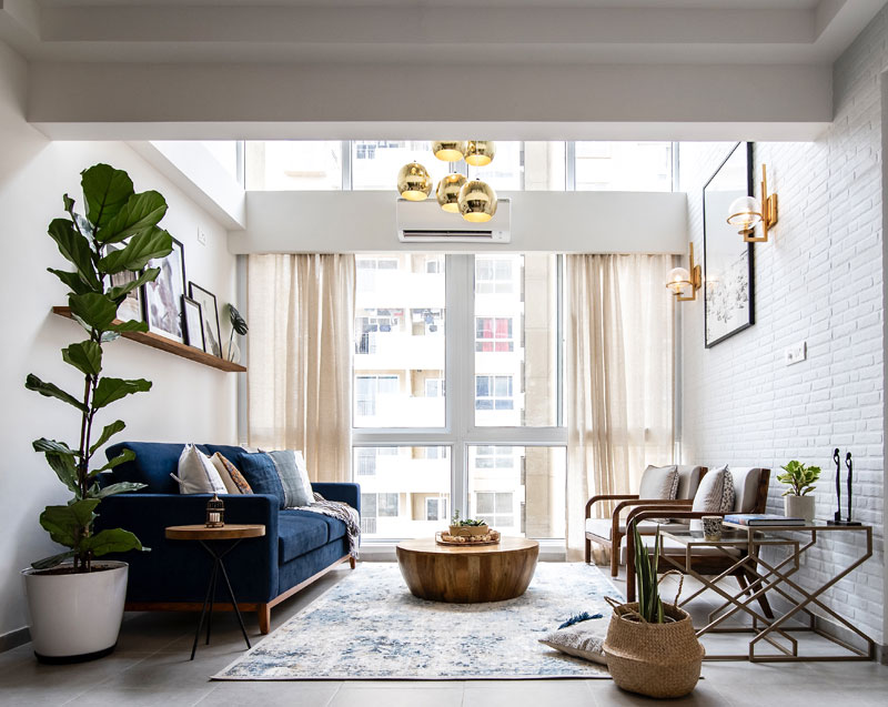
And now comes the showstopper double height ceiling living space! Clearly the height and natural light totally make this space, but it was a challenging space to design because even though it had height, it didn’t have much square footage or floor space. So our goal was to amplify the height and use it to bring in that wow effect….and we did ☺

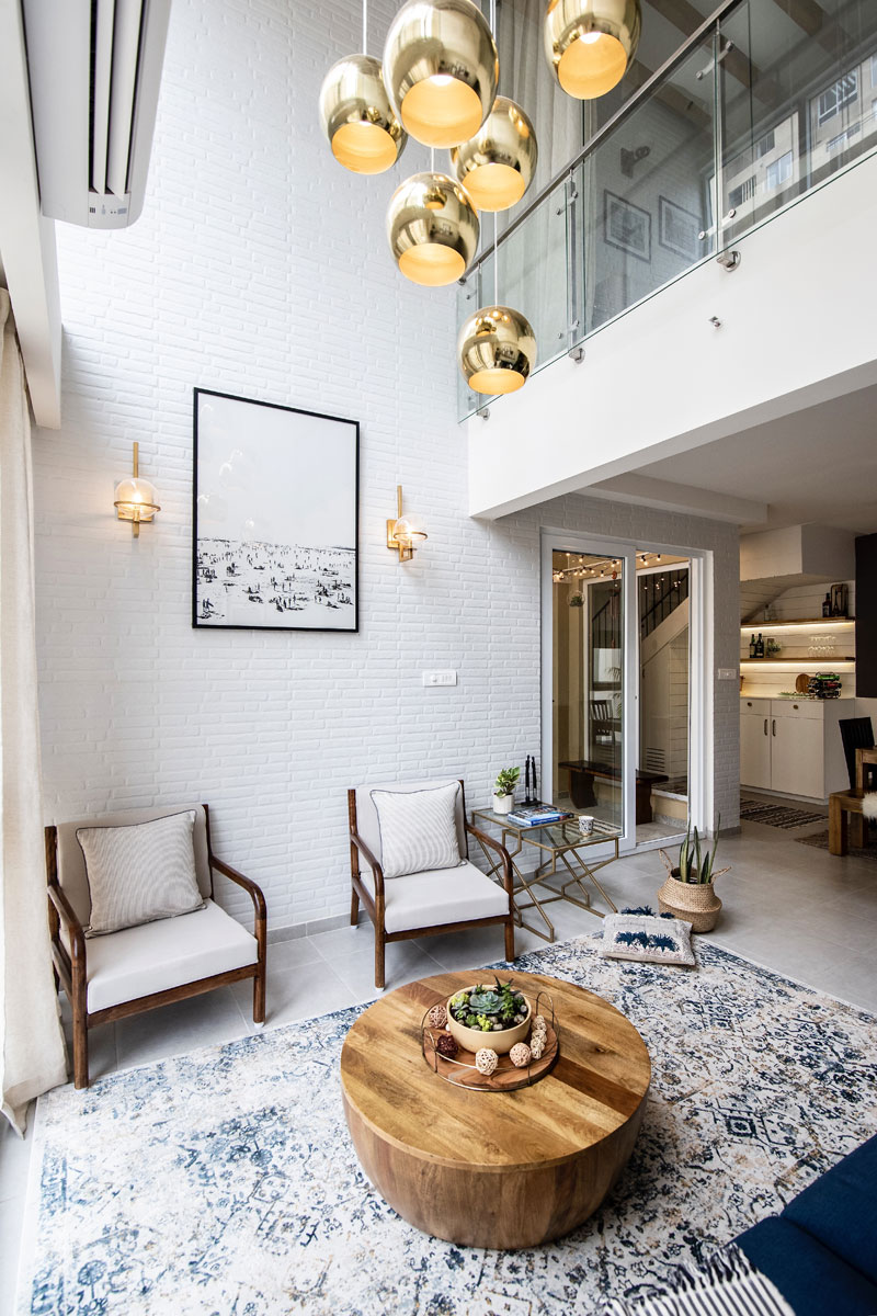
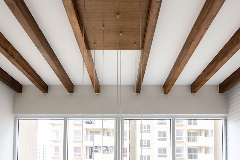
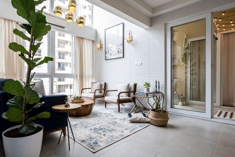
With gorgeous white brick tiling all over one of the double height walls and natural wood rafters on the ceiling, complemented beautifully by a custom made light fixture of hanging gold pendants, this space is truly stunning!


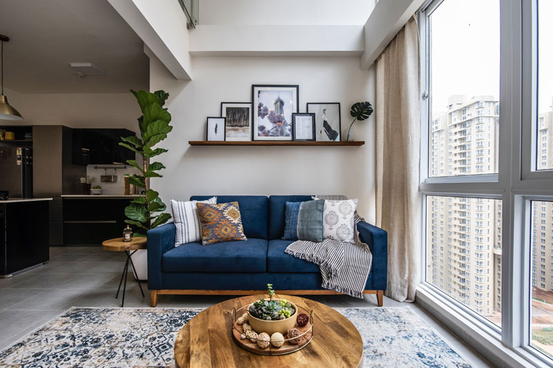
The furniture is modern and clean lined. The navy sofa packs a punch inspite of being a compact sized one and the custom armchairs are sleek with beautiful bent wood arms upholstered in neutral light gray linen. A solid wood round coffee table adds weight and grounds the space offering a nice contrast to the whites and the gold. A set of glass and gold nesting tables sit next to the armchairs.

We added simple neutral ivory curtains that bring in that breezy feel and let light in. The rug is one of my favorite pieces in this space and has subtle hints of color with shades of blue, light beige and gray and a bohemian touch that relaxes the entire spaces and brings in that easy casual chic vibe.

And the Art, how can I miss the custom-made picture ledge above the sofa that has some beautiful art that was handpicked and the stark yet stunning beach print on the brick wall!
Greenery with the succulent centerpiece, a gorgeous fiddle leaf in the corner and natural baskets add to the organic boho feel of the space. This living room is my absolute favorite…I want to move in ☺

Patio
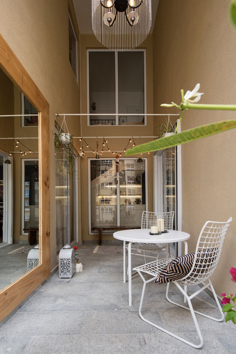
The double height ceiling of the living room extends into the patio/ outdoor space and is amazing how big this little space looks thanks to the high ceilings.
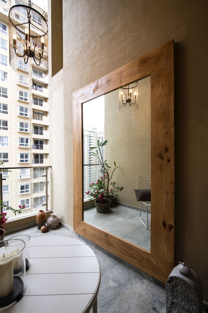
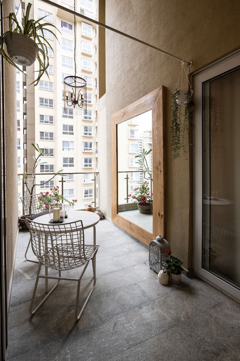
Given it’s a tight spot, we decided to add an oversized mirror on one side. This mirror is framed in recycled wood giving it a rustic chic feel that was perfect for the outdoors! A gorgeous chandelier with hanging chains again amplifies the double height ceiling here.

The seating is simple with a patio table and chairs in white metal. A pretty potted bougainvillea and plumeria plant which were the client’s ask when we first met ☺ make this lovely terrace pop with color.

We added some metal bars in the far end to hang string lights and some plants and a small bench makes for a spot to sit under!

I hope you enjoyed this walk through of the living area in this home.
Stay tuned to see more of this home – the master bedroom, guest bedroom, an amazing family room and the beautiful staircase! I can’t wait to share them with you 🙂
All pictures shot by Parth Swaminathan.
