Project Reveal – Modern Colorful Apartment – Part II
Created by Vinithra Amarnathan on July 29, 2019
I hope you all enjoyed the reveal of the living spaces in this apartment. We’re sharing with you today the reveal of the bedrooms in this home.
The bedrooms are designed to reflect the individual personalities of the inhabitants and marry color and aesthetics to create bold yet chic spaces.
Master Bedroom
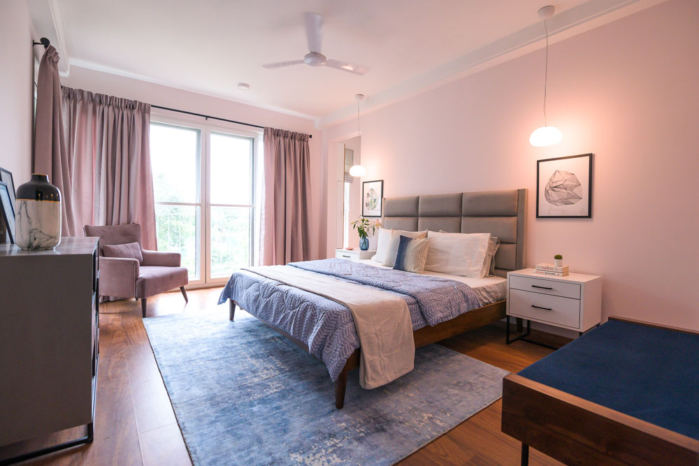
The master bedroom was imagined as a dreamy luxurious space for the couple to come back to after a day at work. They wanted a relaxed yet luxurious feel. Pink was the wife’s favorite color and we decided to paint the room a very soft pink with undertones of lavender.
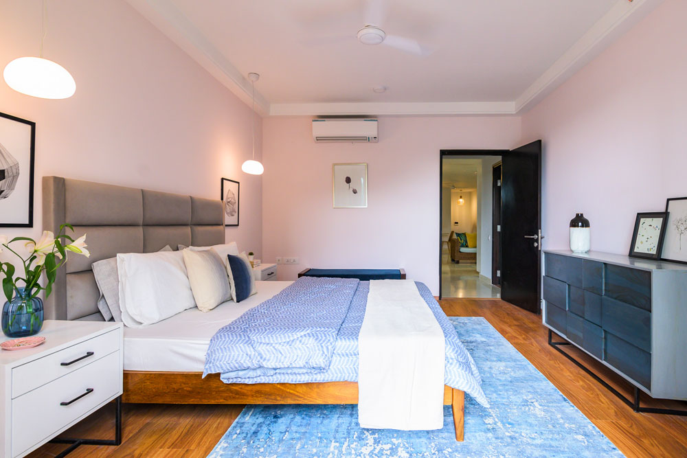
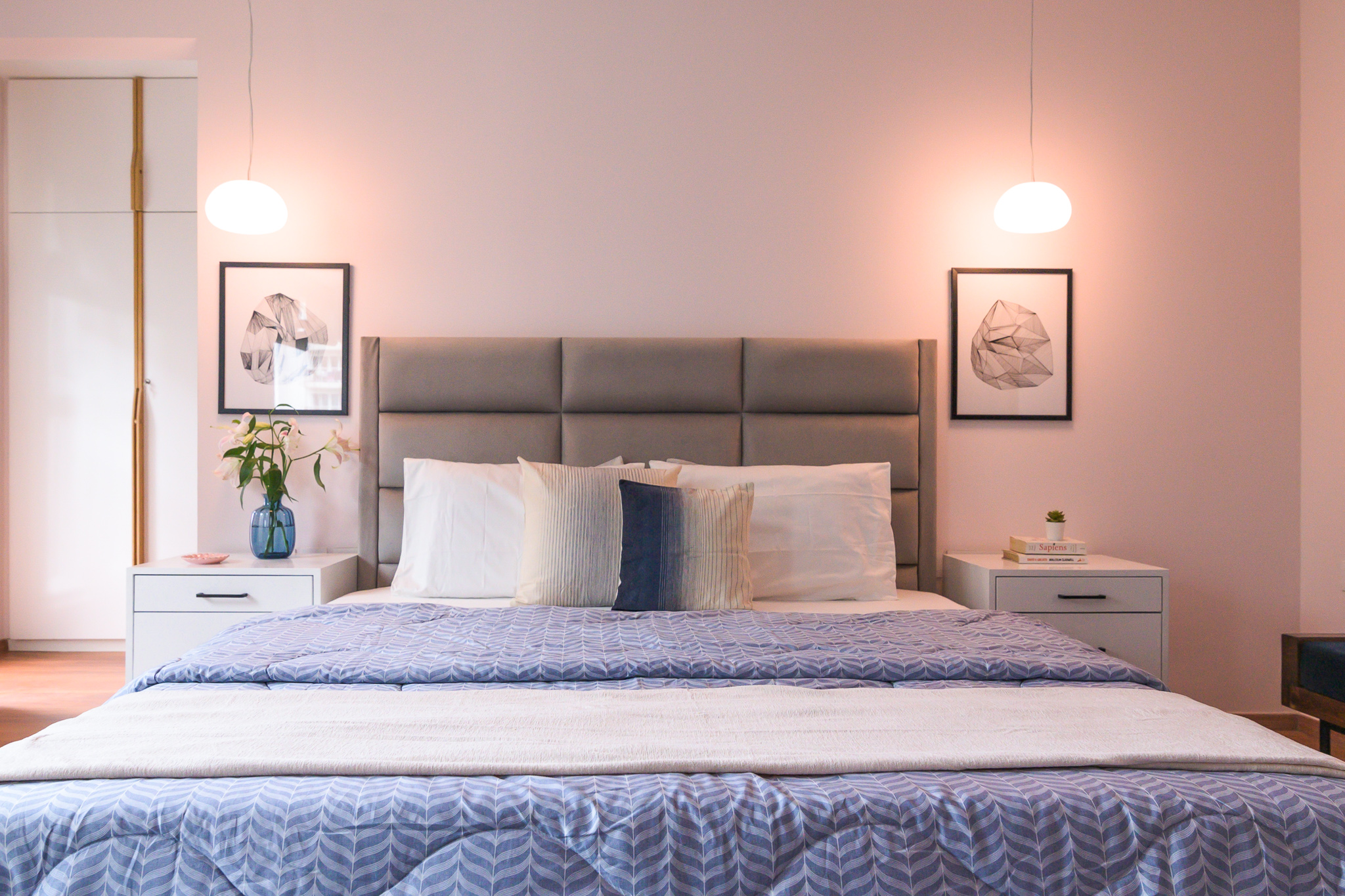
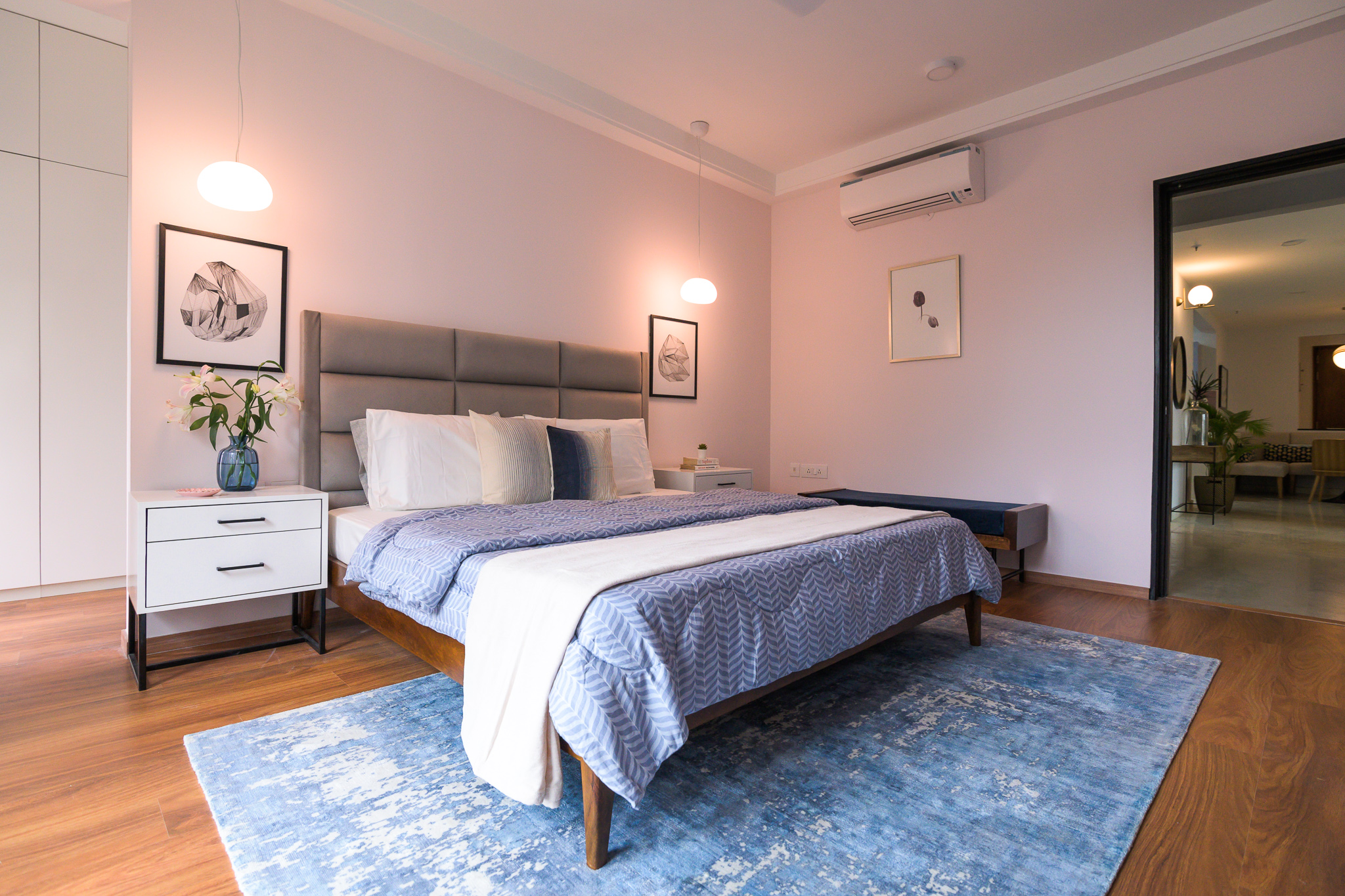
We used blue and grey through the rest of the room. The bed is an upholstered bed in soft gray velvet like fabric with beautiful horizontal tufting to amplify length. We added sharp white bedside tables with black hardware for contrast.
The Muuto Fluid pendant hangs on both sides and I love how it brings in that dreamy feel with its soft white light and the bubble shape!
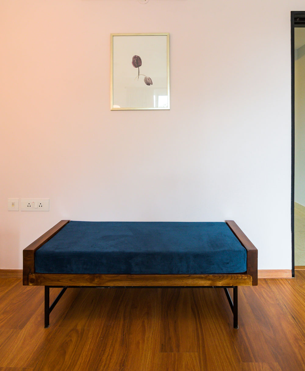
One of my favorite elements in the room is the beautiful blue gray abstract rug we picked. It reflects the abstract fluidity that we were going for in the space and provides enough contrast to the soft pink walls and the gray bed. We added a custom navy bench with a teak wood trim for seating and a custom blush velvet chair by the large window.
We played with tone on tones in this space, by keeping the window treatments a shade of pink and the chair in similar blush pink tones. I love how this brings in the dreamy soft vibe against the pink walls. There’s nothing like too much pink 😉
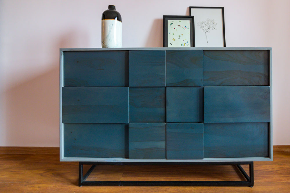
A blue gray dresser with an asymmetric front from Freedom Tree carries through the blue gray color story as well as the abstract feel that we wanted to contrast with the soft dreamy elements.
The art again echoes the same sentiment. The tulip print adds a beautiful calm vibe and was the wife’s favorite flower. We added geometric black and white prints from Ikea on the bedsides to bring in the sharp contrast.
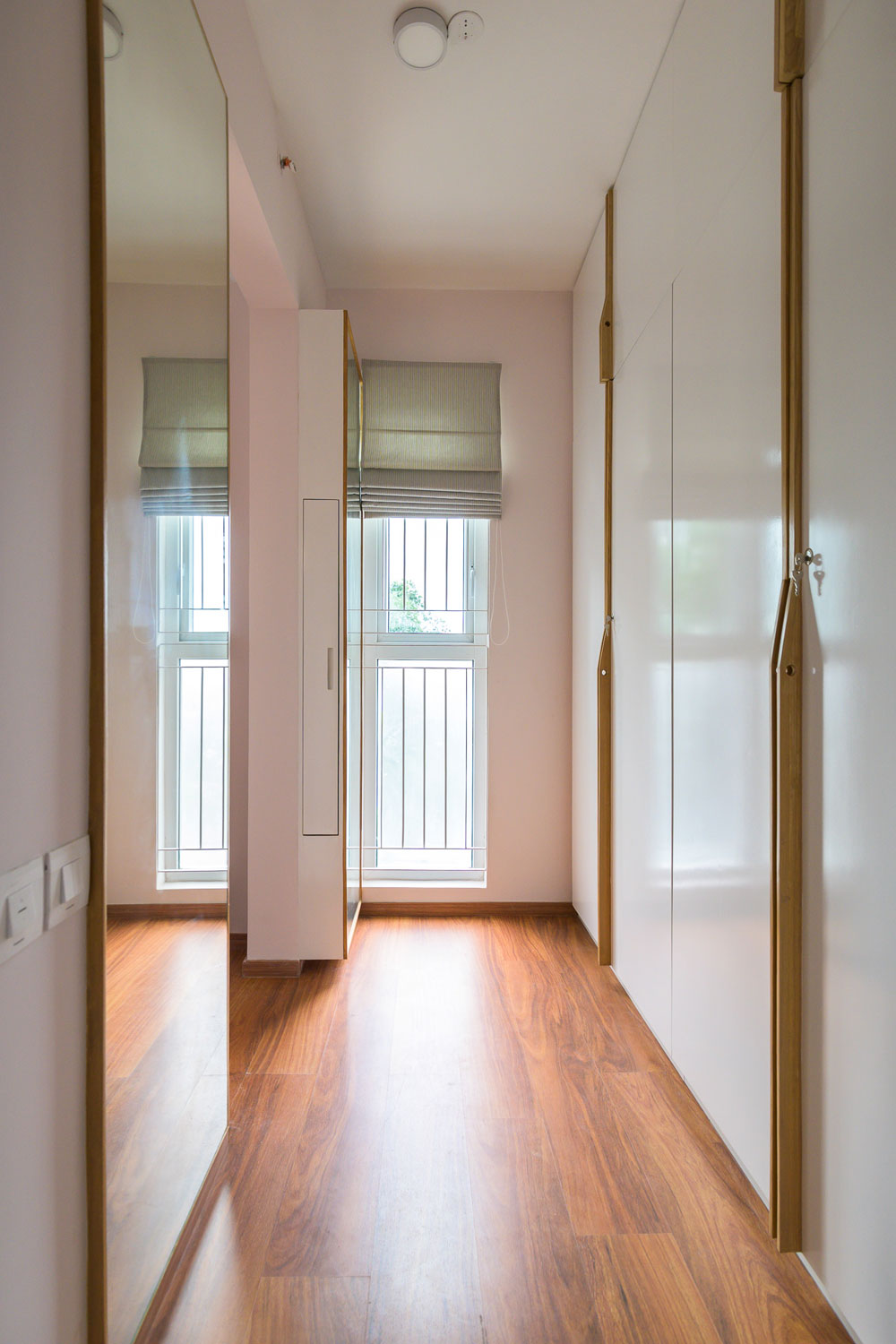
One of the most functional and chic parts of this room is the walk-in closet area where we created a his and hers closet. The wardrobes are white with handmade wood handles that are so chic and simple.
We added double full-length mirrors on either side opposite the wardrobes with a concealed pullout storage on ‘her’ side for storing bottles and accessories.
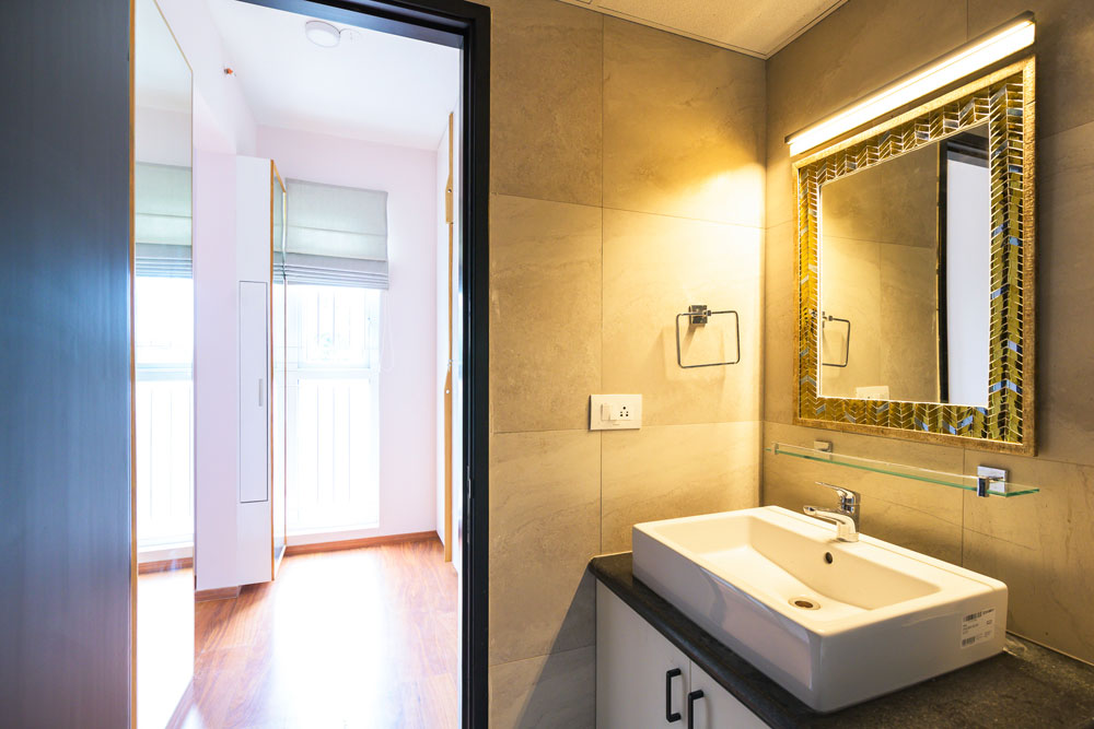
The master bathroom has a beautiful gold and silver mirror from Neter Living and a custom gold bar light on top.
Teen bedroom
The second bedroom in the home belongs to the teen son who is a Manchester United and Soccer fan. When I heard that his favorite color was black, my first reaction was ‘Lets do a black wall!’ 🙂
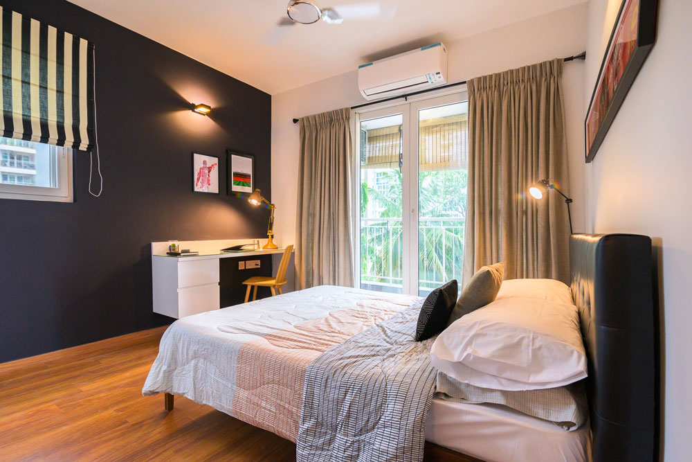
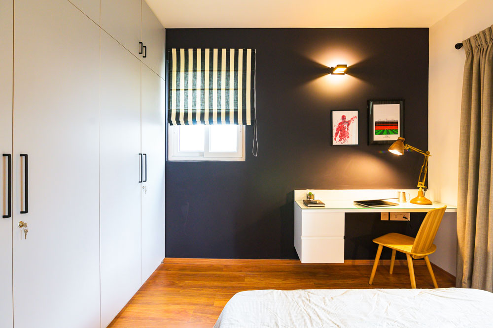
And that is my favorite part in this room! A bold sharp black wall that houses a custom wall mounted white desk. We added some striking Manchester united inspired art to the wall and a beautiful wood desk lamp…..the black, white and wood come together beautifully!
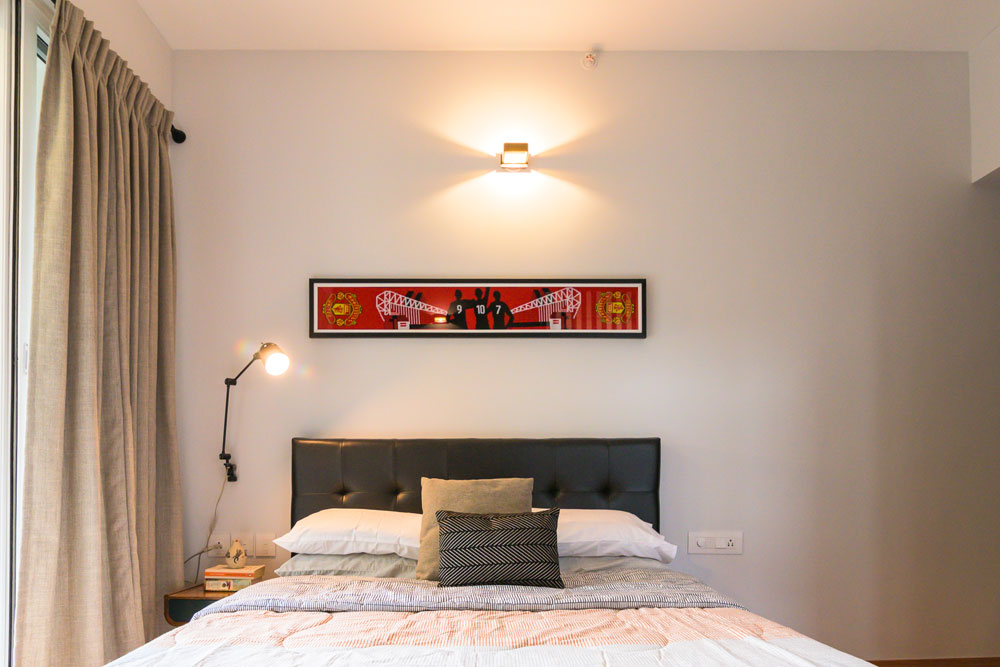
On the other end we have a black leather bed and a small bedside table in teak and black. We framed a Manchester United scarf to hang above the bed and added a black arm sconce on the bedside for extra lighting.
The window treatments are gray curtains that have a small-scale grid pattern and bold striped blinds on the window.
We kept the wardrobes a light gray and added simple black hardware.
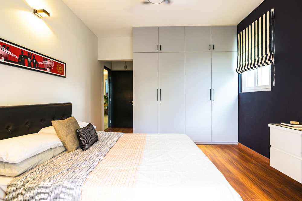
I like how this is a neutral room except for pops of red in the art but still has so much personality!
Kids room
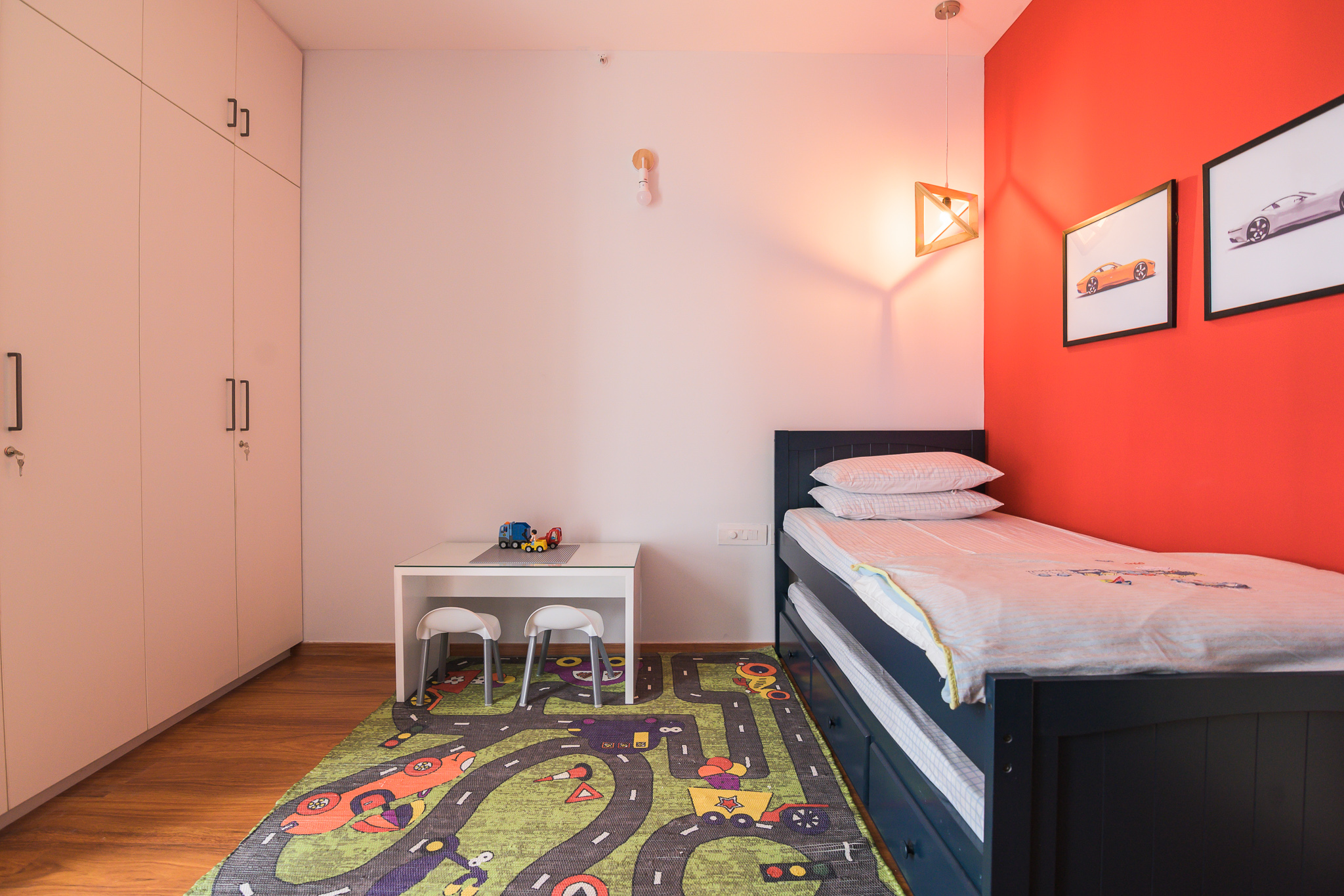
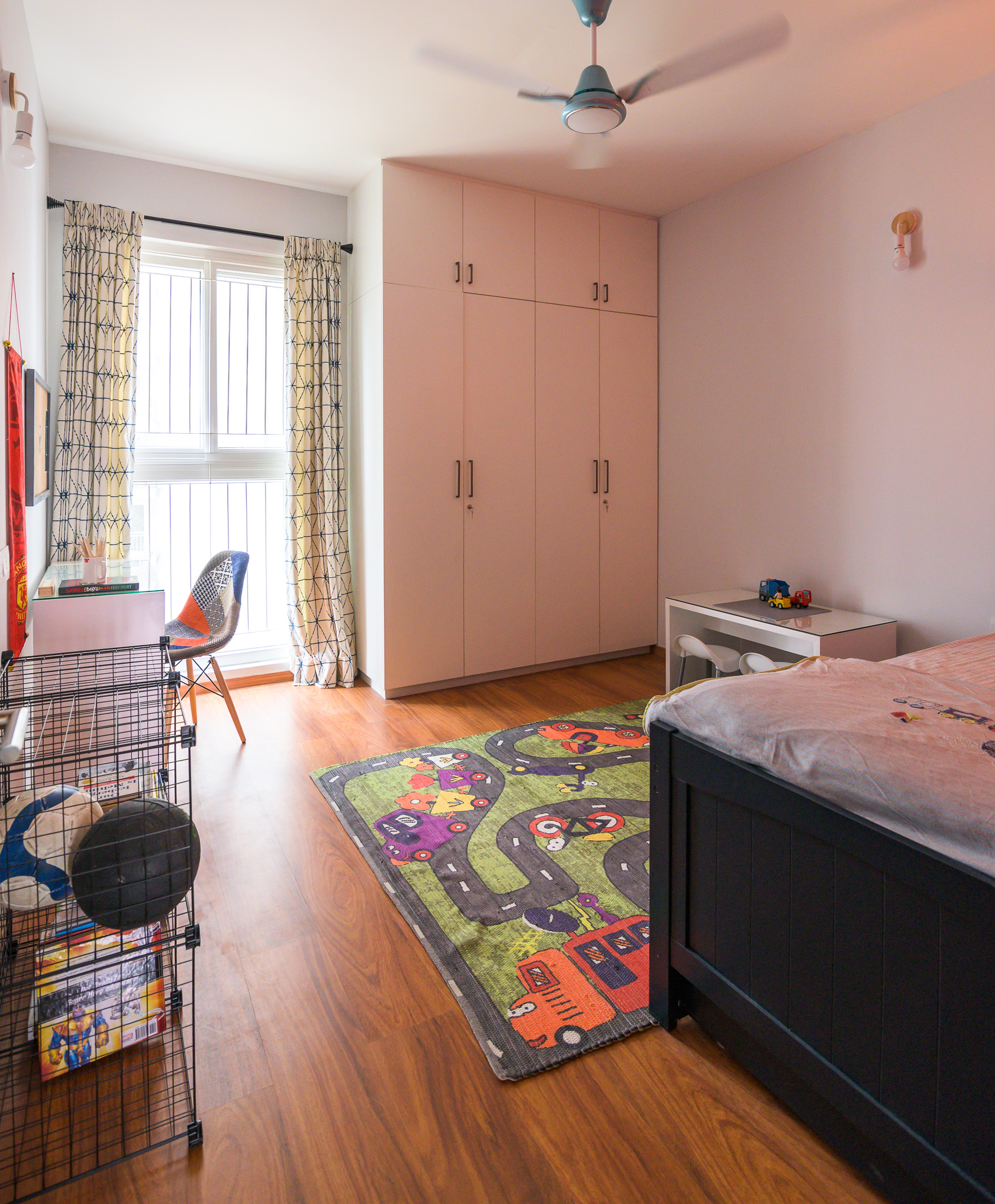
The last bedroom in the house is a little boy’s room. His love for cars and soccer is pretty evident in the room. We did a bold red wall and a race track rug to bring in some fun.
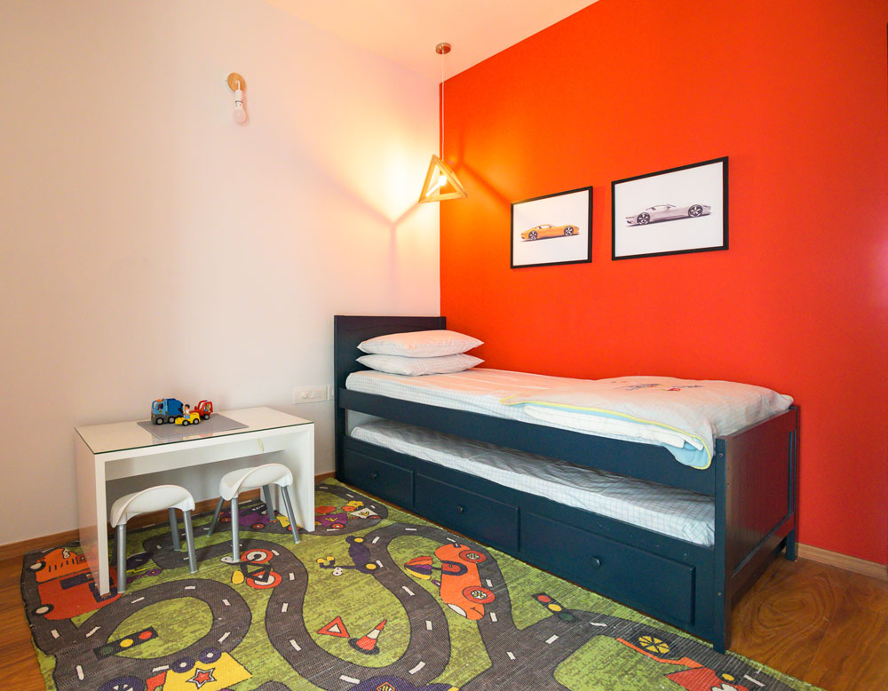
The red wall is balanced by a light blue all through. The room has a navy trundle bed to accommodate guests on occasion and is the perfect color for a boy’s room!
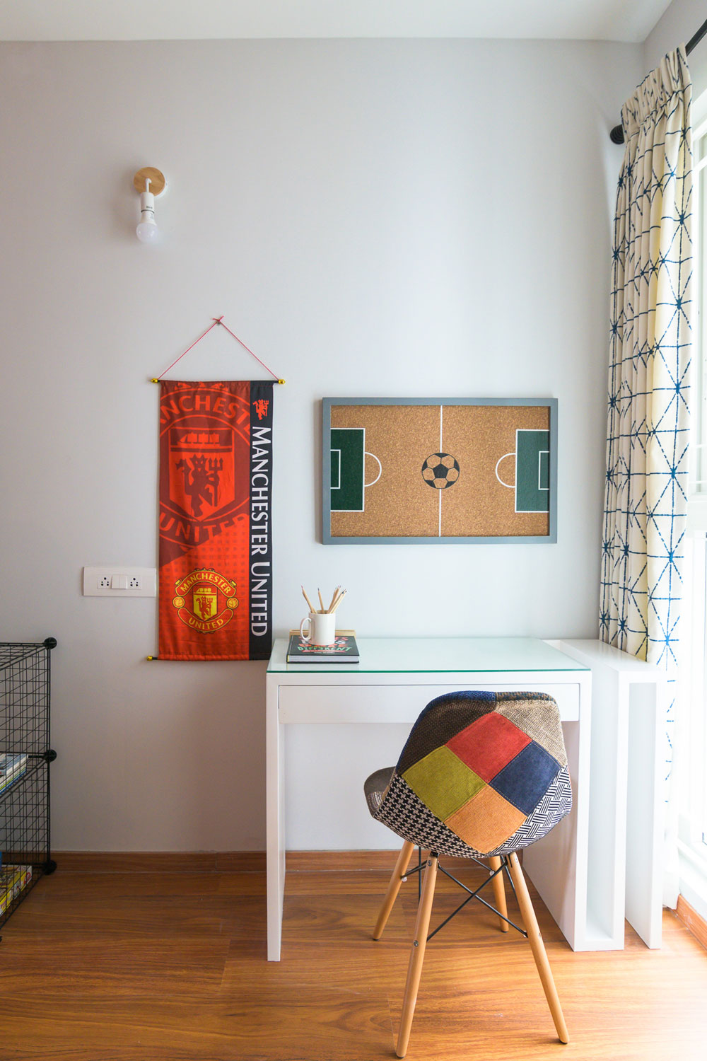
We added a white custom-made desk with an open side storage for large sheets and art that the client wanted to store. A fun patchwork chair and some simple wire storage round up the space.
We added a small white play table and some kids chairs for assembling legos and crafts.
The wardrobes are a simple white and balance out all the color in the space so well.
I loved working on this project and bringing personality to each of these spaces. I love how they are so different from each other but stay true to the overall aesthetic of the home!
All pics by Parth Swaminath.
Expressing Style. One Paint Swatch at a Time!
Created by Vinithra Amarnathan on July 11, 2019
Need to give your space a makeover and new personality without having to splurge on it? Paint is your best option hands down! For the longest time, while décor trends have swayed across different styles and periods, paint has continued to be the most durable, economic and simplest option that can change the entire look of a space in a matter of days.
From protecting your surfaces to becoming a medium of self-expression, paint can anchor a surface effortlessly and create just the perfect mood you want to set in your space whether it’s the interiors or exteriors! We explore a few ways in which you can use various paint product ranges by Berger Paints and techniques to create spaces that are an extension of your style!
Interior Paint Finishes
Interior paint finishes can literally make or break a space. The colors, textures and finishes can influence greatly the identity a space has. By using paints in a complementary or even a contrasting color scheme one can create a binding visual language. We take you through some of our favorite paint interior finishes that we find trendy and we hope you’ll be inspired to explore some of them!
Concrete Limewash Paint
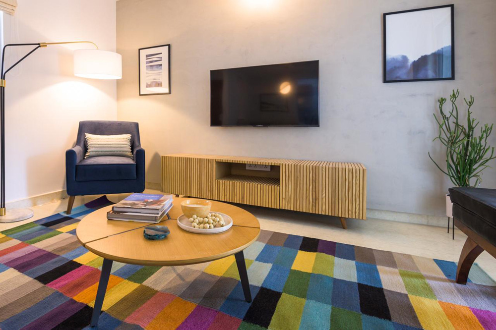
Created originally using a mineral base, limewash paint has a lovely chalky & nuanced texture. The material dries to create a suave matte surface which gives any wall surface visual depth and a standout look. Limewash paint works great on porous surfaces like brick, plaster or even stone and gives spaces a natural and neutral-toned look. We used this in our most recent project in the modern colorful apartment and its one of our favorite looks with its cool concrete finish. This grey tone gives the space a super modern, clean & stark look that is oh so swoon-worthy! Limewash finishes can also be achieved in color ranges of browns, taupe & shades of grey.
Metallic Finishes
Metallic finishes on walls are such a chic way to glam up your room’s vibe! Playing with metallic finishes can give the room an edgy & elegant look which is out of the box and unique. These walls can be created as accent walls in spaces so they have visual attention drawn up to them and can be the perfect backdrops for art / wall décor on the wall. Unleash your creativity and choose from a range of golden, champagne, silver or jewel tones to create that statement backdrop!
Berger paints offer some great products like Silk Illusions Design Metallica or the Silk Illusions Metallica that can help you achieve the metallic magic you’re going for! Find the products here:
https://www.bergerpaints.com/products/interior-wall-coatings/4/designer-finishes/54/silk-illusions-design-metallica
https://www.bergerpaints.com/products/interior-wall-coatings/4/designer-finishes/24/silk-illusions-metallica
Textured Paint
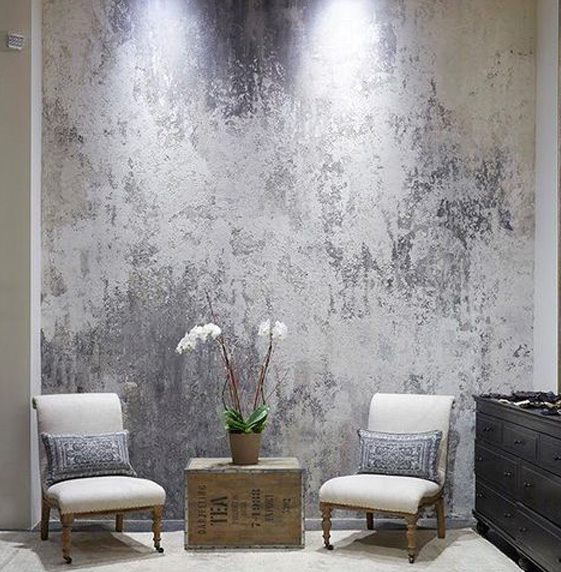
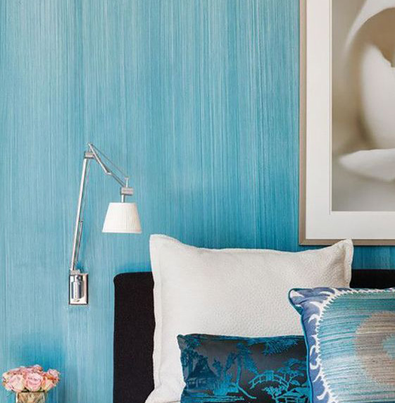
If you like to have fun with your walls and would like to take a little leap into a versatile palette of interior paint finishes, textured paint is just for you! With this type of paint finish, you can achieve unique patterns with absolute ease. Textured paint is perfect for a room facelift, is durable, versatile and can be customized to create the look you want. What better than the freedom to create and implement just the right texture for your walls?
Berger Paints has some products that can help you create some intriguing textural play for your walls. The Silk Illusions Marble Finish & Silk Illusions Vintage Finish are some of our top picks! What’s more? These are Green Pro certified and are eco-friendly too! Check these products out:
https://www.bergerpaints.com/products/interior-wall-coatings/4/designer-finishes/25/silk-illusions-marble-finish
https://www.bergerpaints.com/products/interior-wall-coatings/4/designer-finishes/71/silk-illusions-vintage-finish
Exterior Finishes
An exterior paint finish is a functional and aesthetic layer that protects a building from all external factors from sun exposure to rainfall and any sort of wear and tear. Exterior finishes can set the tone of a built space literally at first sight!
One must ensure that the finishes picked for the shell of the building matches the weather conditions of the site and the potential weather-related factors the building may need to endure. Properties like durability, water repellency and fungal prevention should be of prime focus while picking your finishes for exterior surfaces.
We’ve shared with you two of our personal picks that we feel can add to the façade of your home.
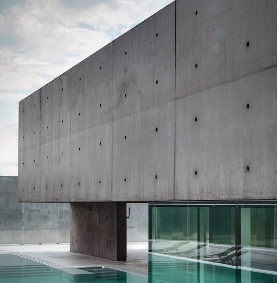
Exposed Concrete Finish
High on the style scale, the concrete exterior finish can give anybuilding a sharp stylish feel. You can channel some great Brutalist expression with exposed concrete facades and elevations to make your built space stand out and make its presence felt! There’s something so alluring about the rawness of this look and we feel it fits well with modern architecture and design especially with an industrial chic vibe.
Painted Brick Finish
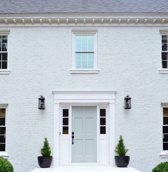
This style of exterior wall treatment is a throwback to classic style! Painted brick walls add an earthy look and feel that has an unconventional beauty of its own. The choice of colors can range from the classic earth tones to brick to bright hues! We are seeing a big trend towards dark exteriors and painting your brick exterior a sharp black or deep green or charcoal lends it a bold sharp look.
The WeatherCoat Long Life or the WeatherCoat All Guard paint finishes by Berger Paints is a great pick for you to keep your external walls looking fresh for years to come! Do check the paint varieties out:
https://www.bergerpaints.com/products/exterior-wall-coatings/15/exterior-emulsions/34/weathercoat-long-life
https://www.bergerpaints.com/products/exterior-wall-coatings/15/exterior-emulsions/69/weathercoat-all-guard
All in all, paint as a material is timeless. It’s the perfect medium for creative & visual expression that can be altered and customized to suit each homeowner’s personal style. So, the next time you are contemplating the perfect makeover for your spaces, whether at an interior or exterior level, be rest assured that paint and the plethora of finishes available in the market will breathe new life into your abode!
It’s all about finding the perfect shade, combination, texture and finish that will complement your style and give your space a whole new look. Don’t be afraid to play around with paint and colors…. it’s your cheapest and easiest tool for major impact
Check out Berger Paint’s detailed and expansive range of products that can give your home a dose of love, be it on the inside or the outside.
Stay tuned for more from us about our thoughts on paint and other accessories that can help you create a home truly reflective of you.
Project Reveal – Modern Colorful Apartment – Part I
Created by Vinithra Amarnathan on July 7, 2019
A home that’s not afraid of color!
Let me rewind back to September of 2018 which is when I first met the clients for this home….It was a long detailed meeting and I knew I was with people who had a keen sense of aesthetic and were invested in their home and the design process.
Weeks went by and almost a couple months later we signed up to get started. We had our first design chat and when my client said ‘I want a pink kitchen’…..I part laughed and part squirmed! And then I thought to myself….how often do you get that brief?
Lets just say that sets the tone for the fearless, yet thought through use of color through this home. From the pink and gray kitchen, to the color packed living to each of the bedrooms having their own distinct color story, this home is an eyeful.
We achieved balance in the clean lines, sharp accents, natural wood and a simple chic aesthetic.
We’re bringing this project reveal to you in two parts. The first part is the large connected living space that comprises the entryway, living, dining, kitchen and family room.
Entryway
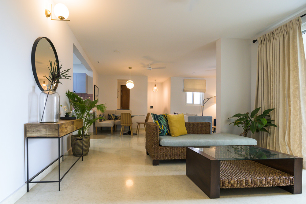
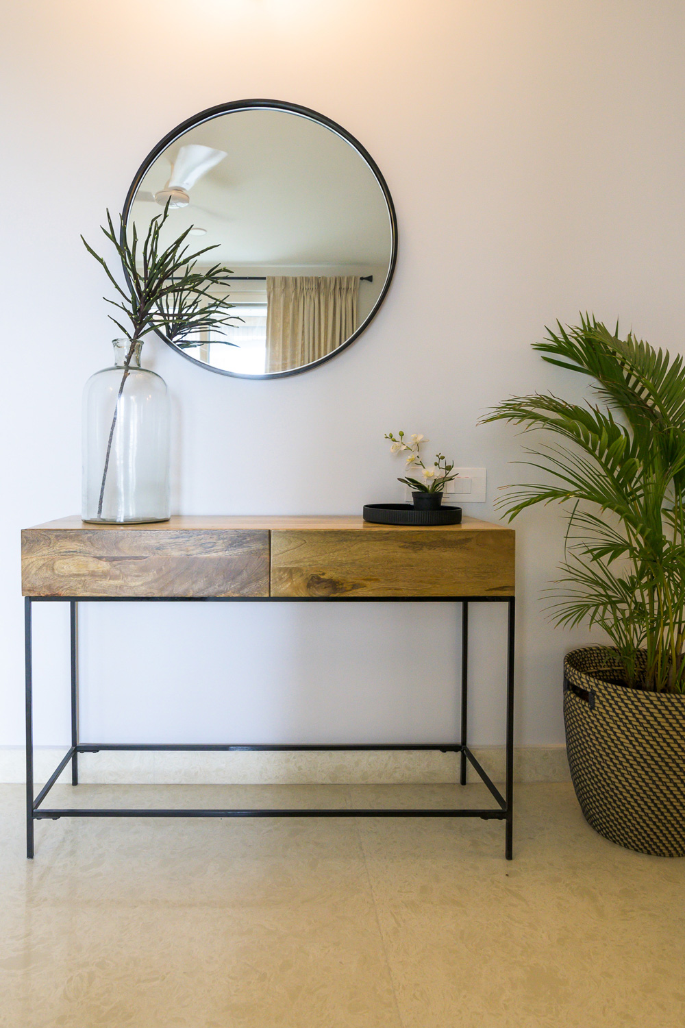
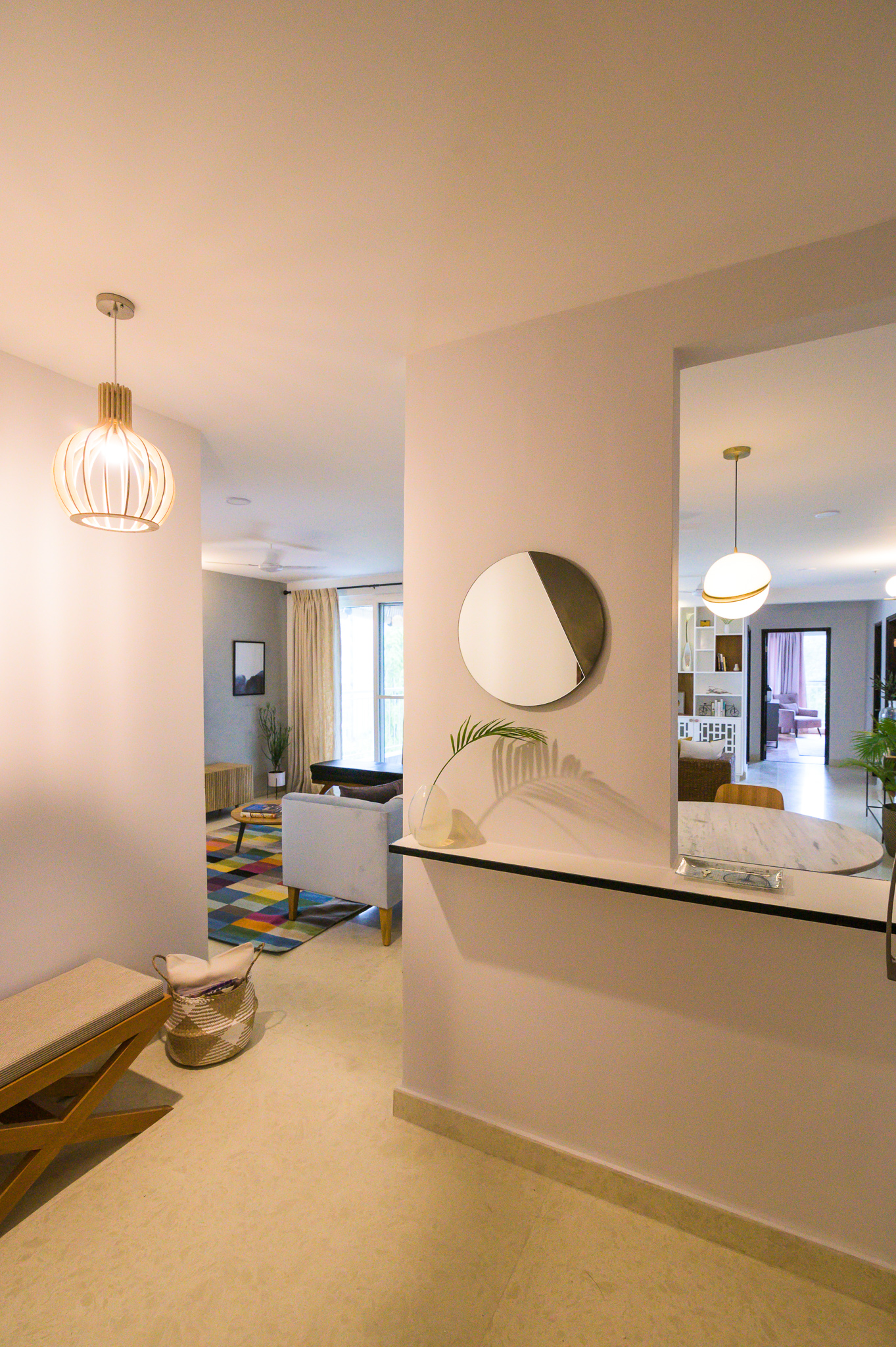
The entryway was small and narrow leading directly into the living dining space. We kept it very clean and simple by adding a quartz ledge framed in black metal to go over the niche and the wall separating the entryway from the living dining. The ledge has a simple round mirror on top. A small cross leg custom seat and a modern bent wood pendant ground the entryway.
Living
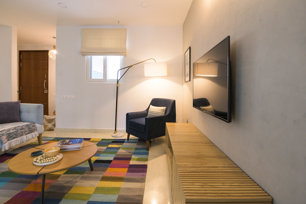
Walking into the home, the living room is the first space you see. The whole space comes alive with the bold colorful rug! A powder blue custom velvet couch is in the center of the living and dining space. We added a modern upholstered navy corner chair and a black leather bench for additional seating. A beautiful arc lamp perks up the corner and adds extra lighting.
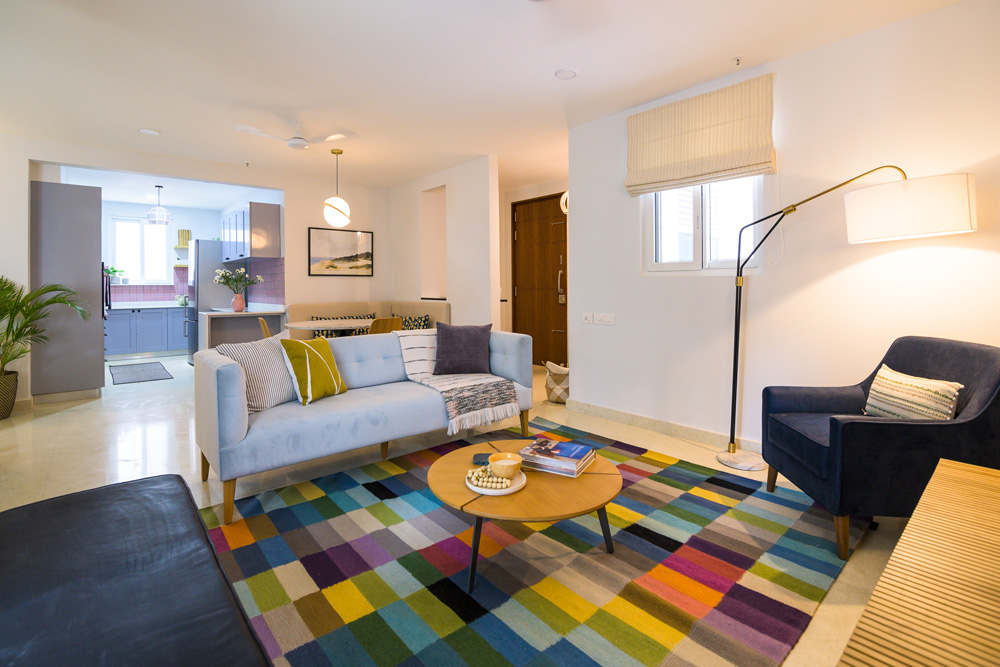
One of my favorite elements in the space is the natural wood slat media console and the limewash wall that gives a muted concrete look to the wall! They balance all the bold colors in the rug perfectly.
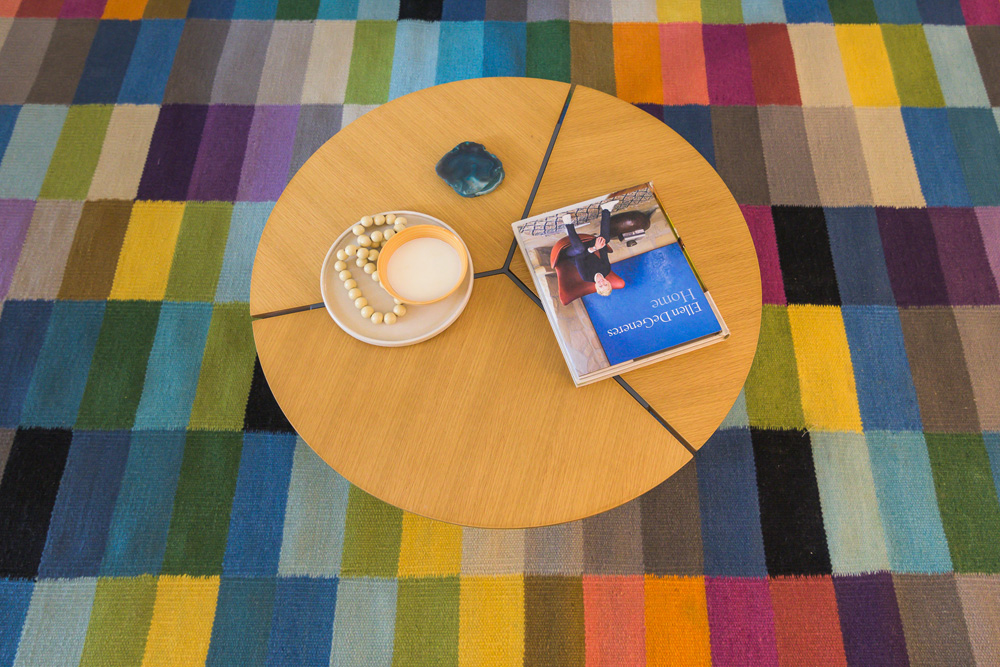
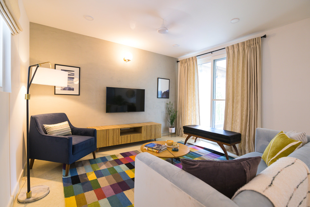 A round coffee table and simple abstract art round up the space. We kept the window treatments neutral and added a striped roman shade to the window.


Dining
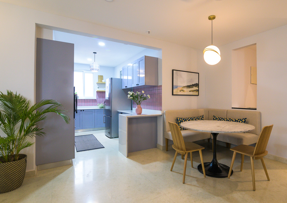
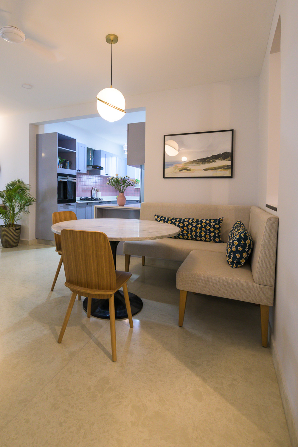
When we started out we knew we wanted a round table to seat a family of four. We all loved the classic clean lines of the iconic Tulip table and decided to recreate the classic in a high contrast sharp black leg and marble top!
The dining space by itself wasn’t very big and had a big corner that was to go unused if we had a dining table in the center of the space. And that’s when the idea of having a banquette seat seemed like such a charming and space saving option…..not to mention the comfort of sitting on a couch and having your dinner 🙂

We created a custom banquette seat to fit the area and the beautiful tulip table with sleek wood chairs bring this dining space together.
The Montauk print from Juniper Art makes for a beautiful addition to this already chic space.

Kitchen
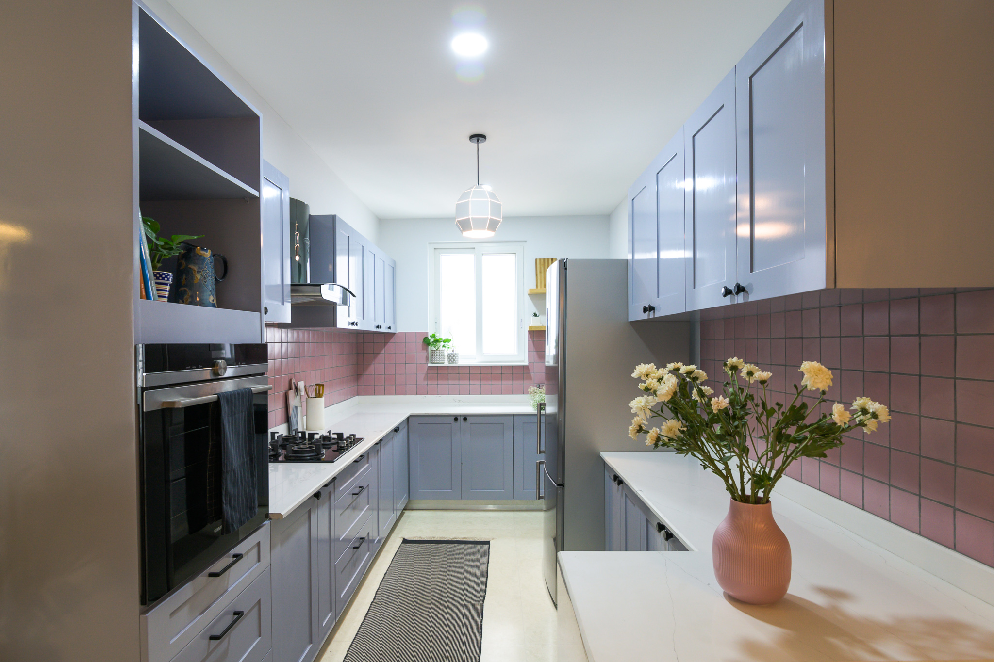
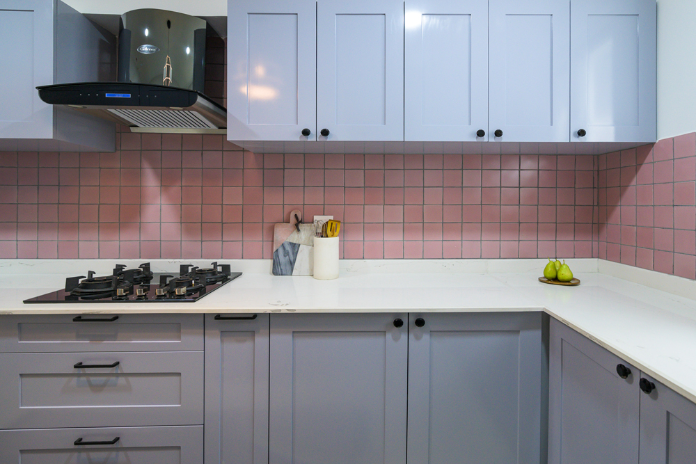
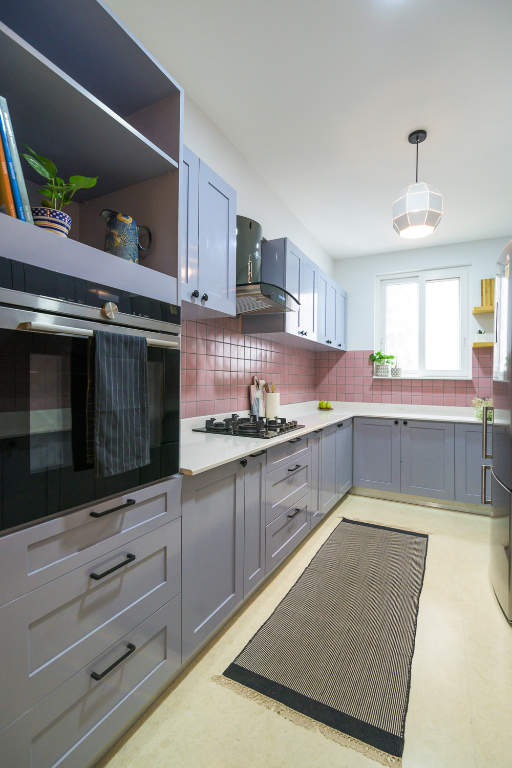
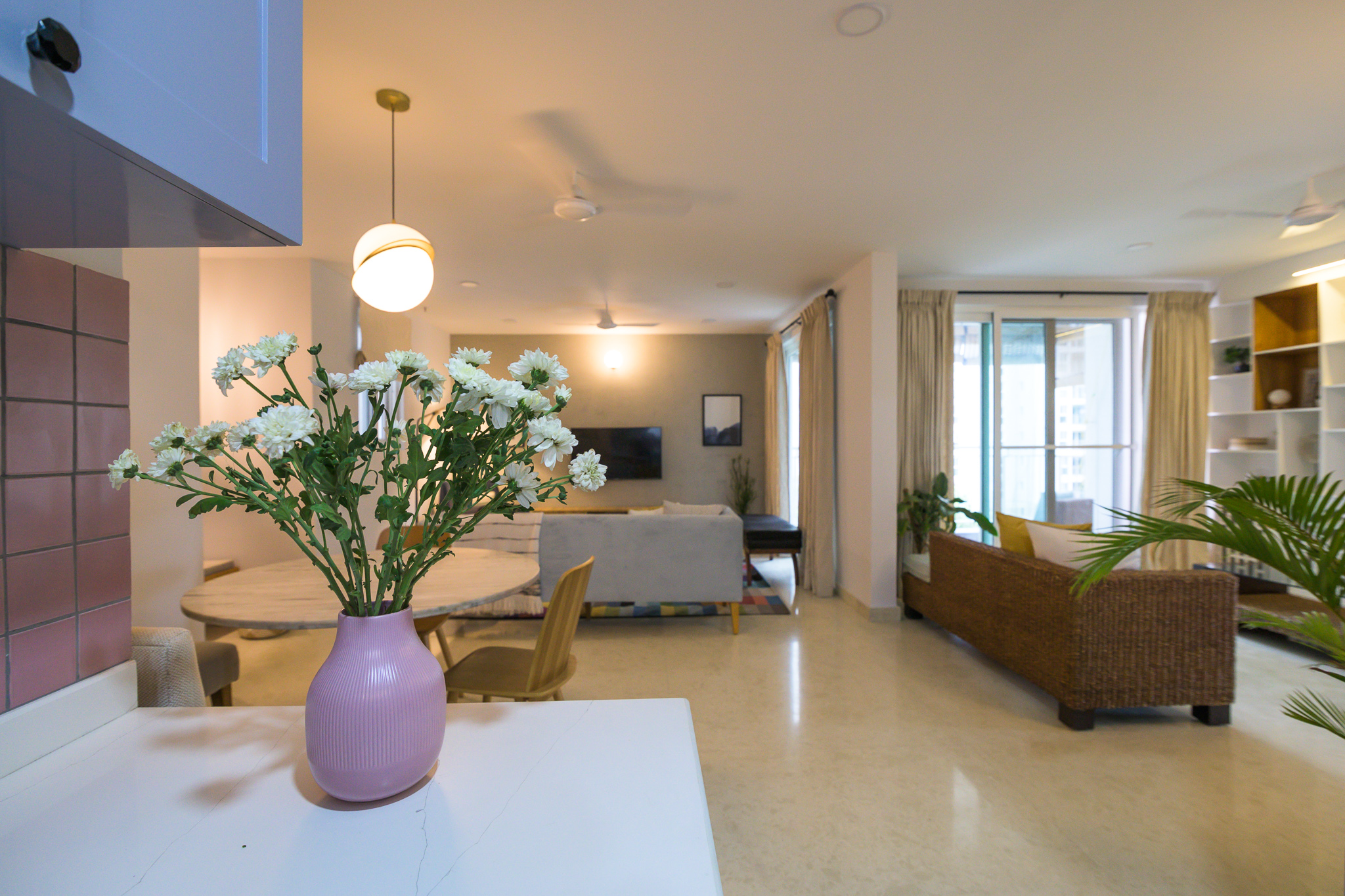
Aah here we are with our beautiful pink kitchen 🙂 The lady of the house was keen on a pink kitchen and I wanted to bring that in without it looking overly feminine or like a barbie’s kitchen.
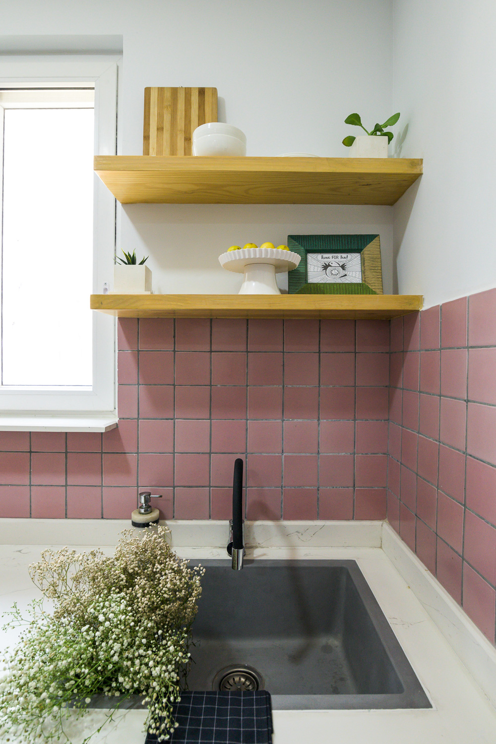
We found the perfect pink tile that was handmade ceramic and had subtle color variation that adds depth. Gray cabinets balance the pink beautifully and sharp black hardware provide that hint of masculinity. The countertop is a satvario quartz that has beautiful gray veining which is perfectly picked up by the gray cabinets.


The kitchen in itself wasn’t too big at a modest 8X13. We incorporated a tall unit for the appliances on one end to balance the refrigerator on the other and gave the clients a long running L counter on one side that incorporates the cooktop, the sink and the refrigerator in a perfect work triangle. The other end has a shorter L that adds extra counter a small breakfast counter like extension. I love the waterfall stone edge on this little counter!


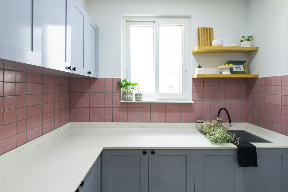
One of the features I loved was the window soon as you walk into the kitchen and we wanted to make it a feature. We added a custom quartz ledge at the window and open shelves by the window in natural wood to add to the open feel in the kitchen. A granite sink and matte black faucet fit perfectly.

Family Room
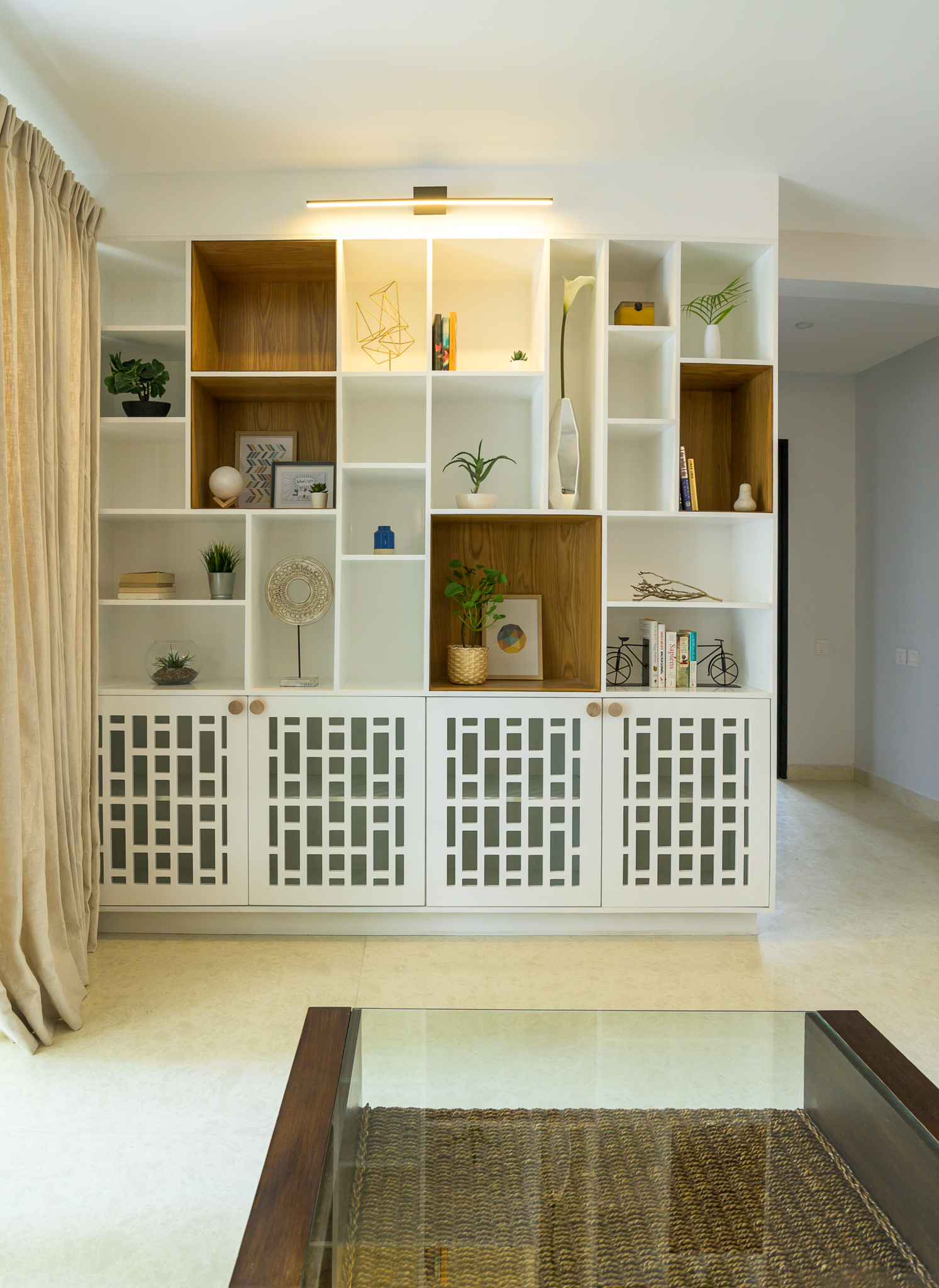
The family room is an extension of the dining and the kitchen space and we wanted to make sure that all these areas integrate well with each other. We created a built-in cabinet here that houses the client’s puja at the bottom behind lattice doors and an asymmetrical open top unit that’s just great for books and memorabilia!

This is one of my favorite elements in the home with the veneer clad pockets popping so beautifully against the white.
A rattan chaise makes this the perfect spot to lounge with a book 🙂


This home has so much detail in every little corner and that’s what makes it a unique personal space…..much like the ones we try to create!

I hope you enjoyed walking through this home with me….stay tuned to see the bedrooms and how the bold color choices make their way into those spaces next 🙂
All pics shot by Parth Swaminath.


 A round coffee table and simple abstract art round up the space. We kept the window treatments neutral and added a striped roman shade to the window.