Project Reveal – A Timeless Transitional Master Bedroom
Created by Vinithra Amarnathan on August 30, 2019
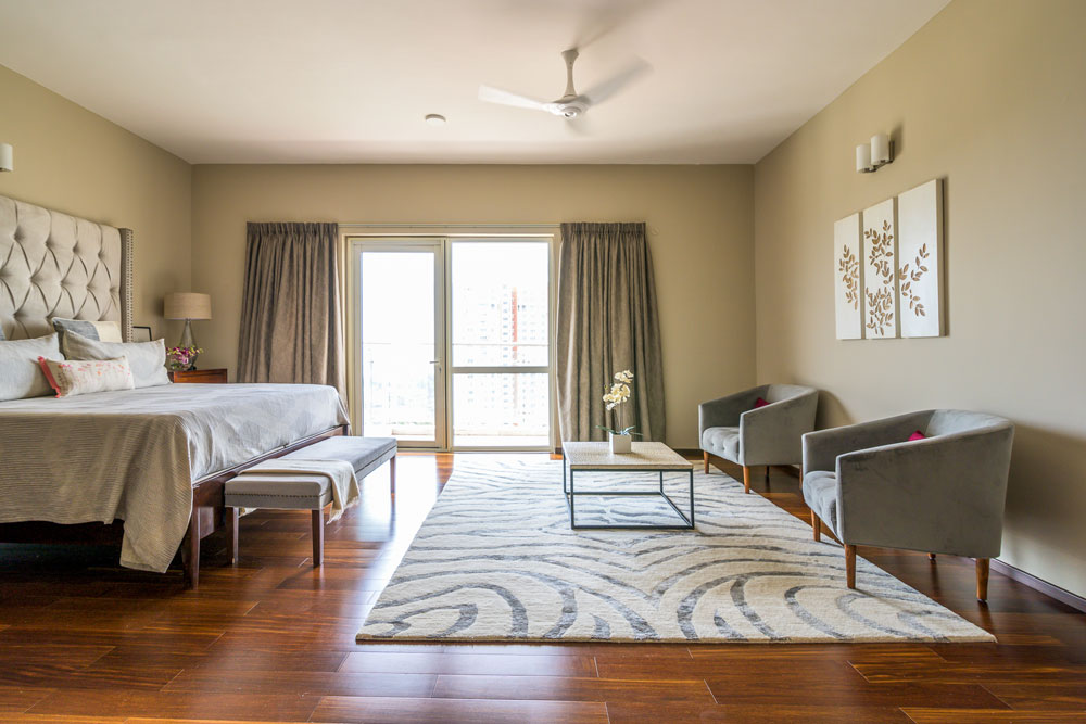
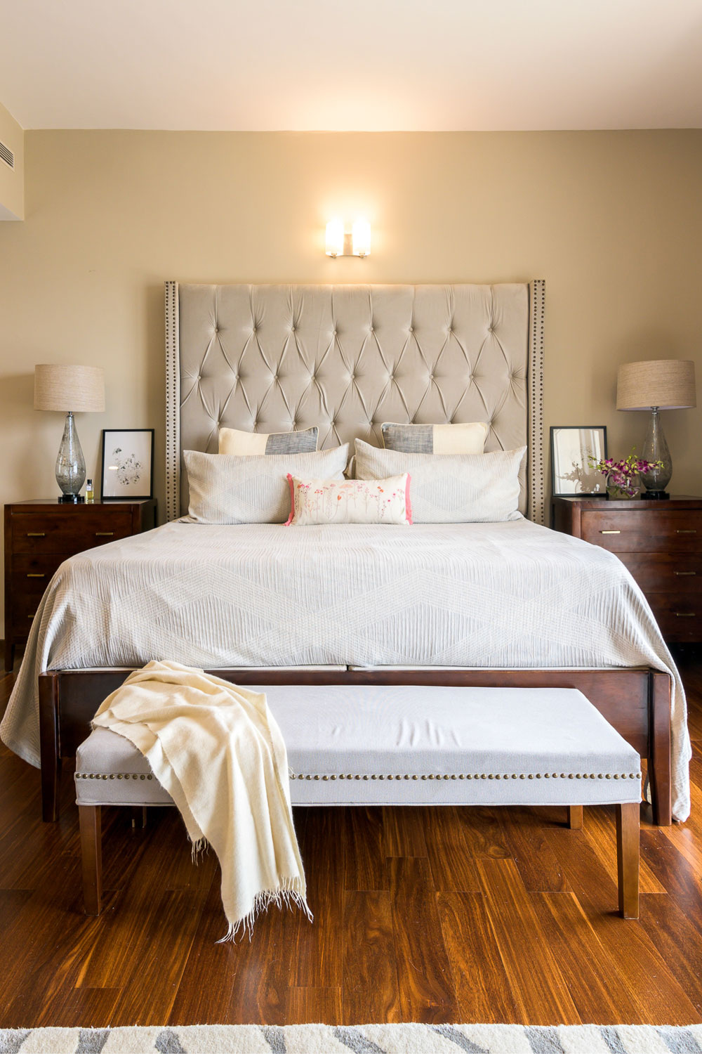
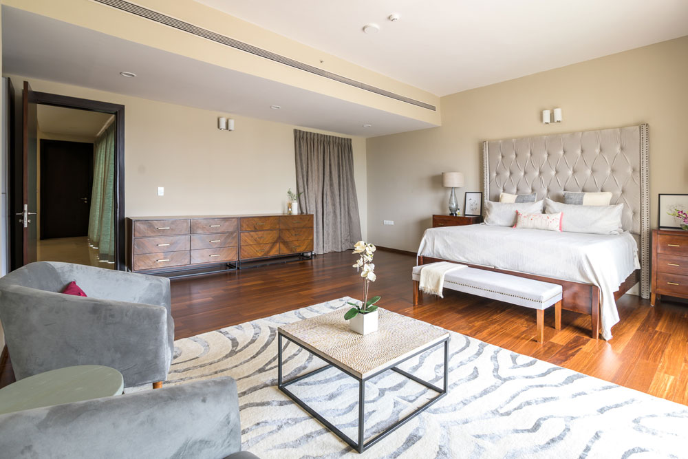
We’re bringing to you today the master bedroom that we designed for this home. It’s a departure from the rest of the home in having a serene, tone on tone look. I love how this space has come together!
We had a lot more freedom designing here because Shalawn wanted to create a beautiful master that she would love coming back to and one that could transition easily to their own home when they moved back.
She we wanted it to be a calming neutral oasis but at the same time luxurious and welcoming. And I hope we delivered 

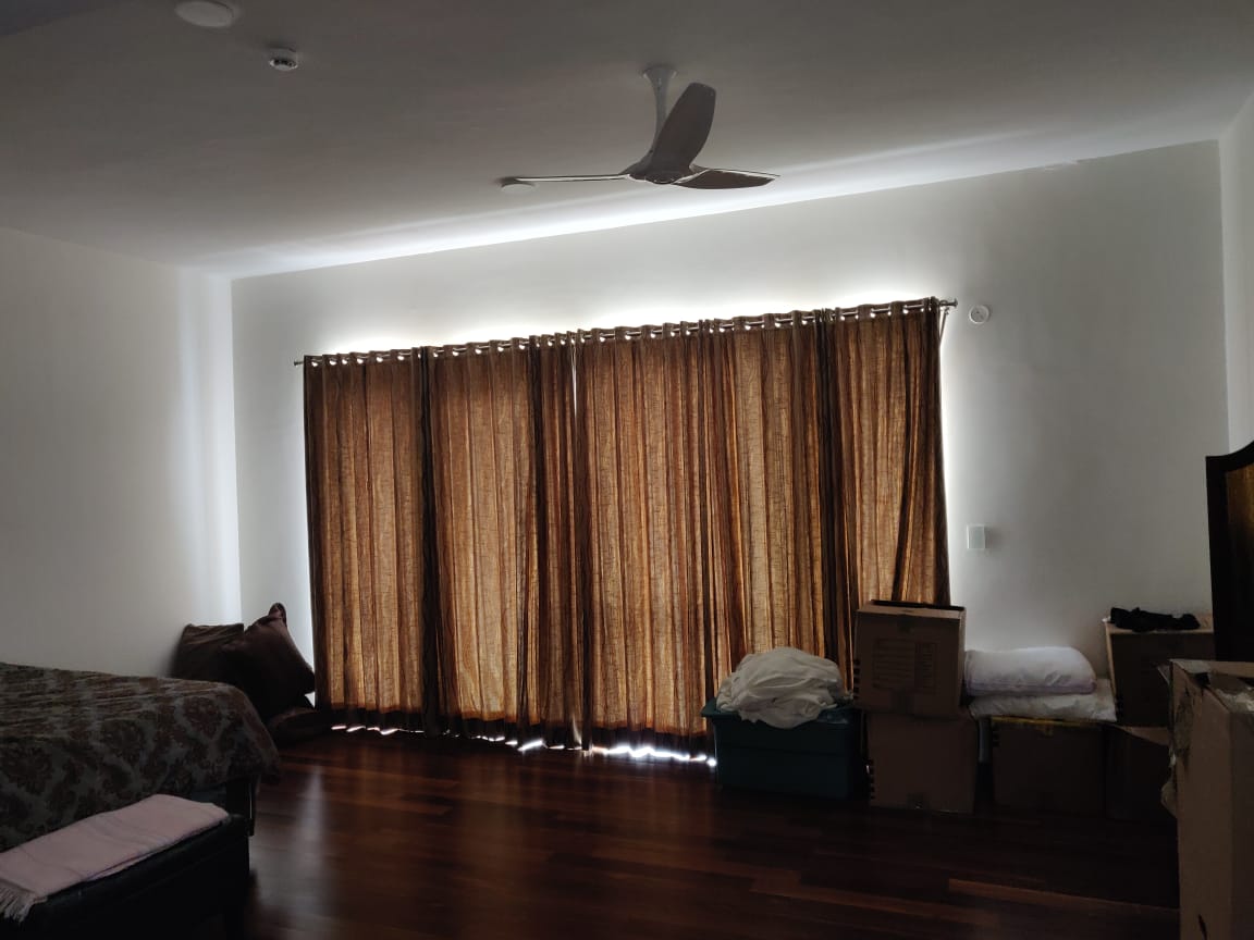
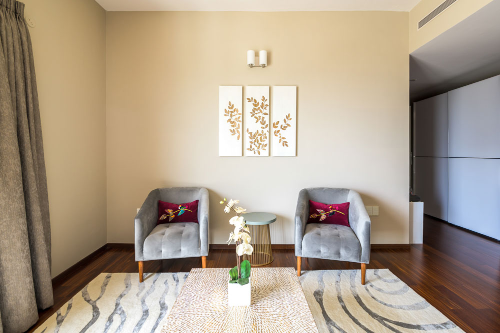
Given the large space we were dealing with, I thought splitting it into an ensuite seating area and having the bed on the other end would help create two zones in the same space.
Before

After

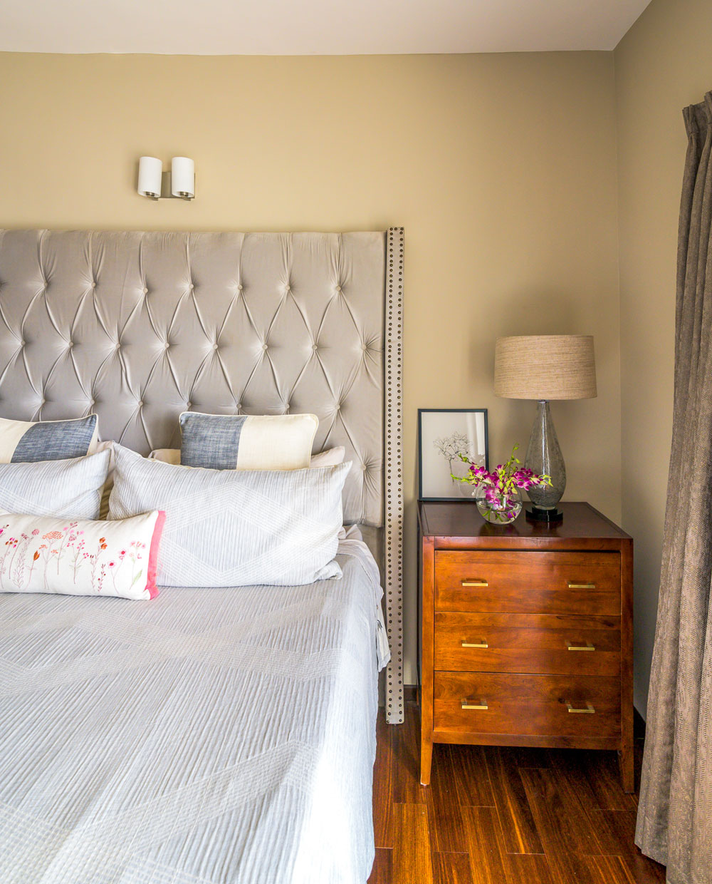
We had to custom make every piece from the rug to the chairs to the beautiful American king size velvet upholstered master bed. Here’s an interesting story for you!
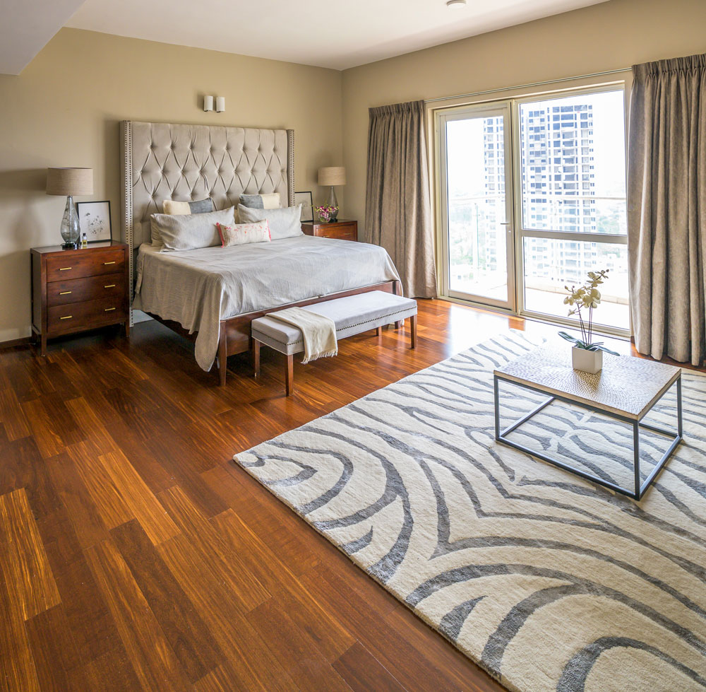
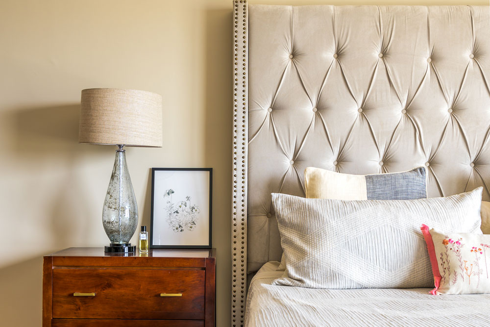
We worked with the clients to custom make the bed to the specific box spring and matress size they had. The first time around the headboard came out too short, so we had to remake the whole headboard. And the second time around it was too big to get through the doors of the stairway or the elevator in their apartment building. And we had to get the bed up to the highest floor of the apartment!!
I told you’ll this was a challenging project for us 
After exploring everything from forklifts to cranes, we finally had to resize the headboard to fit through the doorways and then reupholster it back.
But when you see this beauty, you’ll understand it was well worth it!
Before

After

We added two dressers on either side for nightstands and glass table lamps.

Keeping the overall look neutral allowed us to play with patterns like adding an animal print rug, a hand carved wood top coffee table (that originally, we got for the living but it turned out to be too small and we ended up using it here;)) and some beautiful wood inlay art.

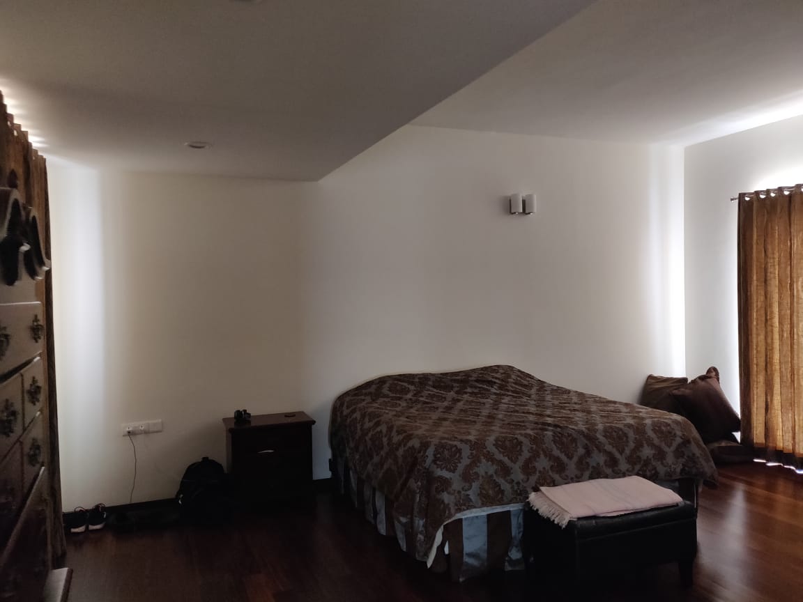
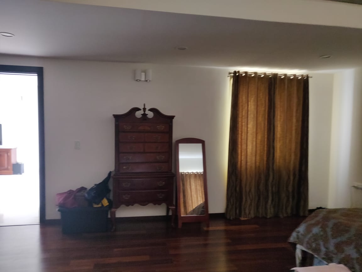
We custom built two his and hers dressers in a chevron wood finish to fit the length of the wall and I would have loved double mirrors to go above the dressers to round off the look.
Before

After

I was very excited to see how this space came together and it looks beautiful and calming just like we had expected.

I hope you enjoyed this little master bedroom tour! We had so much fun and such a learning experience putting this space together.
Project Reveal – A Timeless Transitional Makeover! – Part I
Created by Vinithra Amarnathan on August 23, 2019
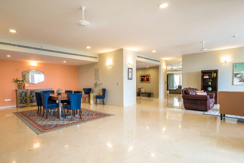
In most cases having a large space to work with is any designer’s dream. When I walked in to meet our clients who had just moved from Texas, US to Bangalore, I was struck by how large and massive the apartment was.
Larger even than a standard American home! That became our biggest challenge combined with the fact that it was a rental and the client had a relatively short term stay in Bangalore.
The idea of making this expansive apartment feel cozy and warm within the constraints of not being able to make any permanent changes, staying within a reasonable budget and focusing on adding pieces that the client is able to take back home was quite the challenge.
Added to that the fact that almost every piece had to be tailor made as most retail options would simply not cut the size requirements we had.
Shalawn and James wanted a home that was classic but with clean modern lines. Something that was vibrant yet understated. We used paint, soft furnishings, furniture and accessories here to make an impact. The home is punctuated with some beautiful art and color that bring in that vibrancy.
I was excited to work with the clear vision and thoughts they had and the effort they put into their home, no matter how temporary it may seem. I am so grateful I got the opportunity to work on this project.
Entryway
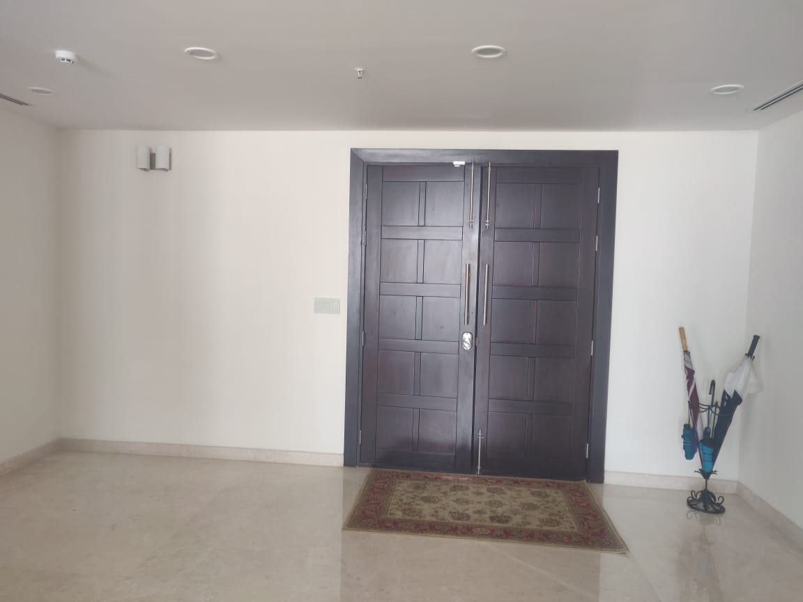
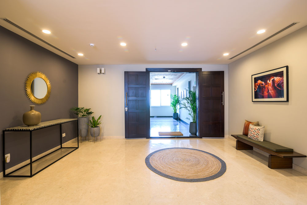
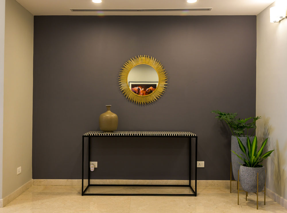
The entryway is a large space that opens into the formal living room. We wanted to make a bold impact here and at the same time be conscious of not bringing in oversized pieces that cannot fit elsewhere.
We painted one side of the entryway a dark charcoal to add some interest and visually recede and ground the space. A gold sunburst mirror and a custom made black and white bone inlay console bring sharp contrast.
On the other end we have a wood bench flanked by a David Mead print of the sun shining through the Grand Canyon. I love this piece with its bold colors and modern abstract feel!
We added a round jute rug to further define the space.
Before

After


Living Room
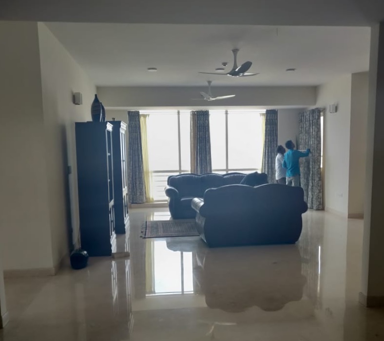
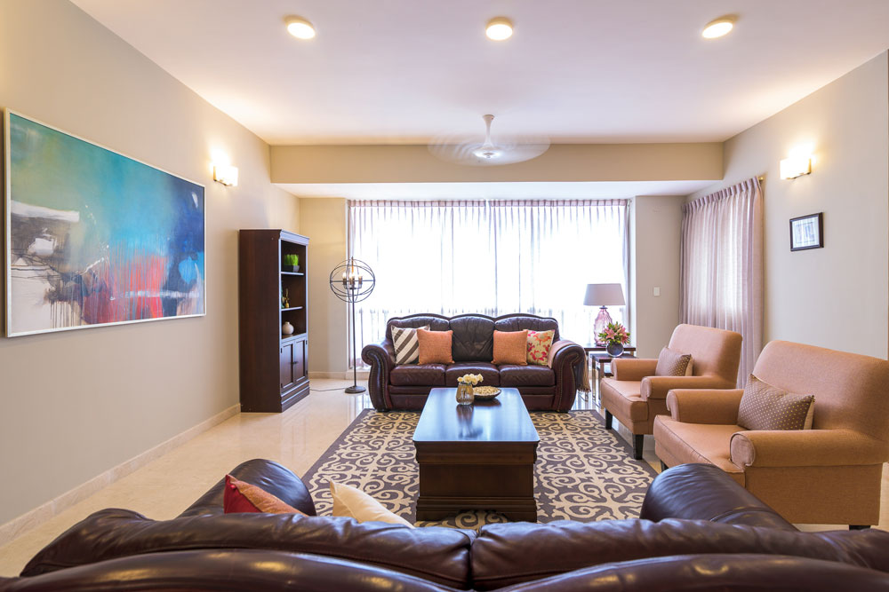
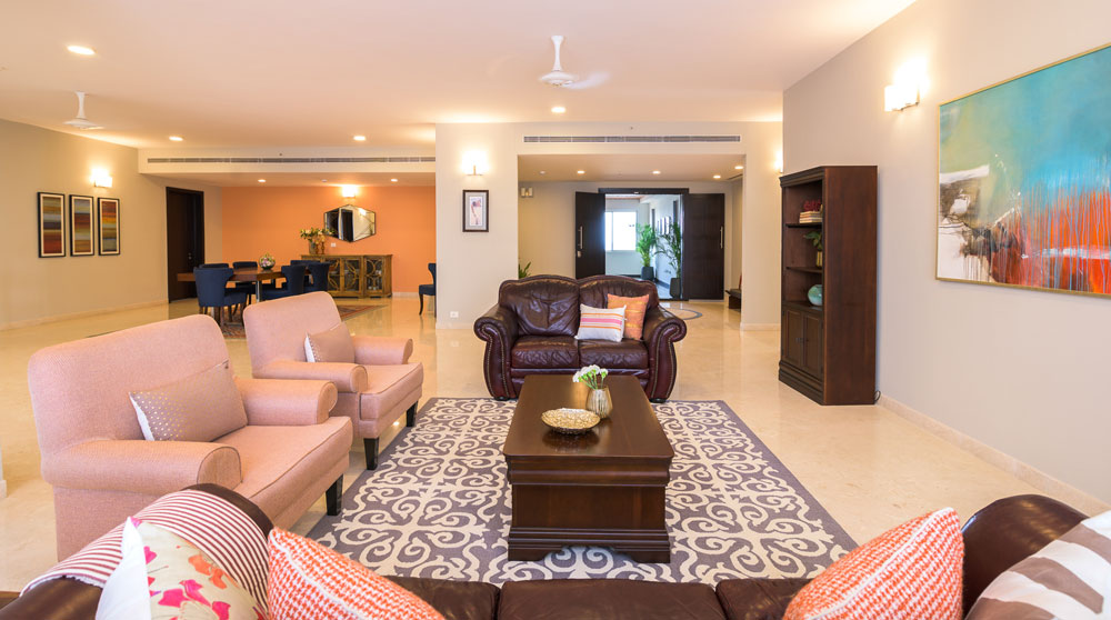
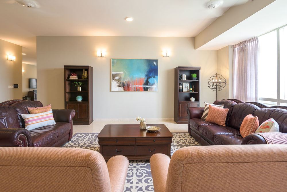
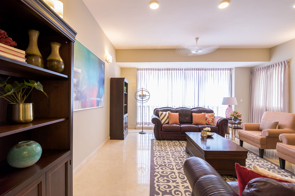
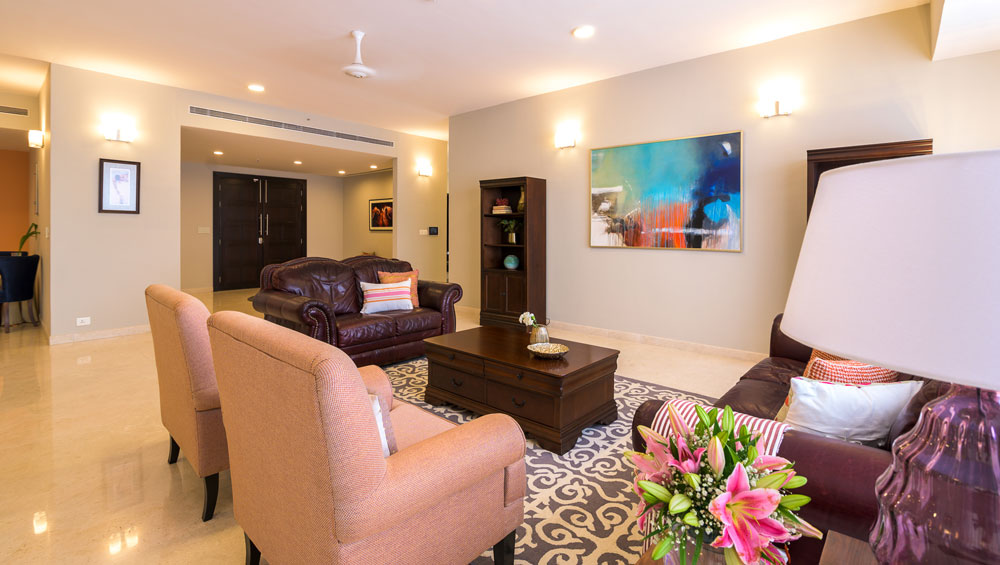
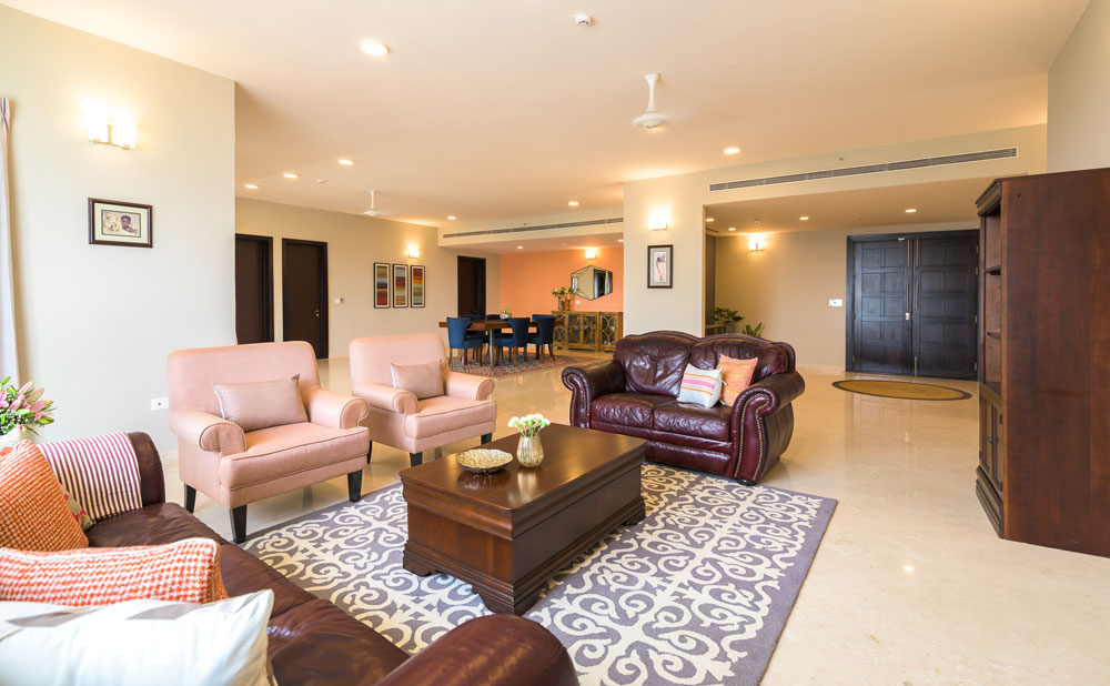
We already had a traditional leather sofa that the clients owned and added to it custom made oxford roll arm chairs in a soft peach. Now that might seem like an odd choice for a living room, but I loved the idea of a soft pastel to complement the bulk of the leather sofas.
We added a beautiful gray and white hand tufted wool rug to ground the space. The rug is heavy and bold on pattern but the colors are neutral which allows it to sit comfortably and balance the space out without letting the leather couches take over.
Before

After


What pulls this space together beautifully is a commissioned art piece by Gulrez Ali. We all loved the style of his art which embodies modern bold brushstrokes of color and the drip.
The colors in the piece with warm blues and whites and grays perfectly ties the room together and makes it feel cohesive.
While there was a lot of ceiling lighting, we wanted to add some accent lighting to bring in that coziness and warmth. Because it was a rental we couldn’t really add chandeliers or pendants. I opted for a standing chandelier lamp that adds a touch of traditional and perks up the corner.

On the other end of the large couch, we added a set of nesting tables and a beautiful pink glass lamp that’s one of my favorite pieces.


Dining Room
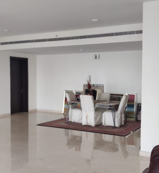
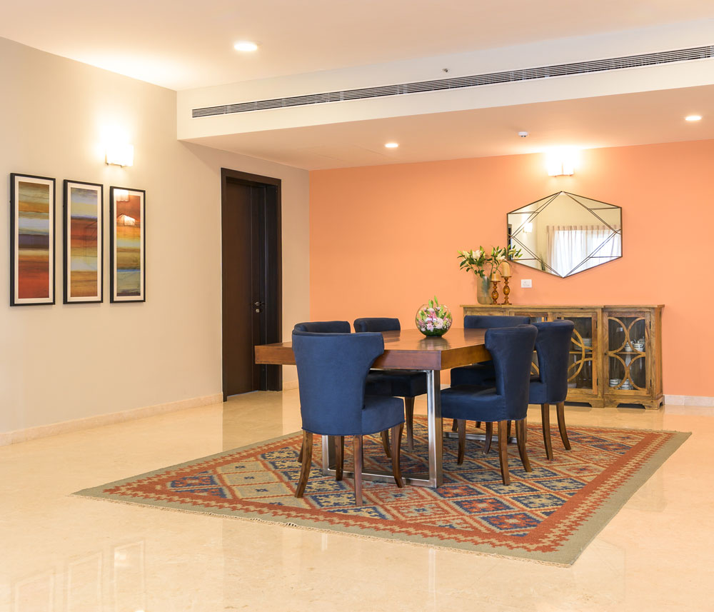
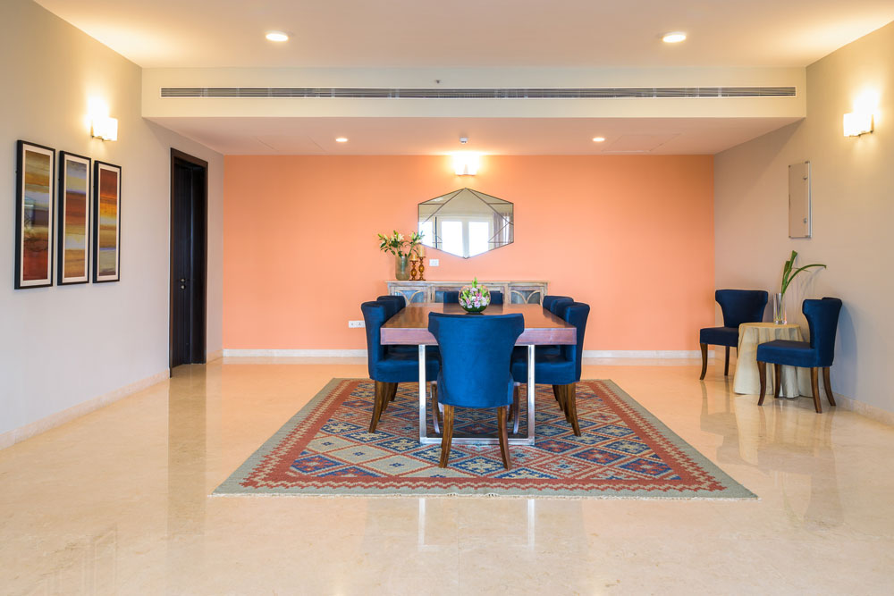
The dining room was massive and even after we planned to have an extra-large custom eight – seater dining table in solid wood and metal legs we felt the need to connect the dining and the living.
I love the metal leg detail we used here that brings in a touch of modern to the classic wood top dining table and sort of updates it.
Color has been the biggest tool we used to unify the space. The coral wall does a great job of connecting the living and the dining by picking on the art and the pastel peach tones of the chair.
We reframed some of the existing art that the clients already had that complement the colors of the space beautifully.
Before

After


We added custom made indigo chairs and a patterned rug that picks on all the colors but has an earthy neutral base that grounds the dining area.I think the rug brings together this space so well with its different kinds of wood, upholstery and the accent wall.
A cabinet for crockery and storage and a metal framed cut work mirror add interest to the coral wall.


Family Room
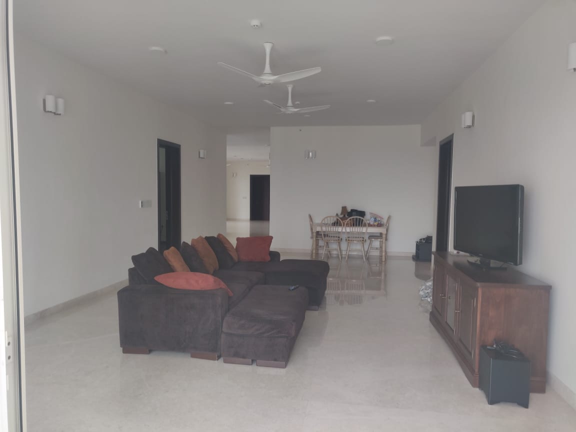
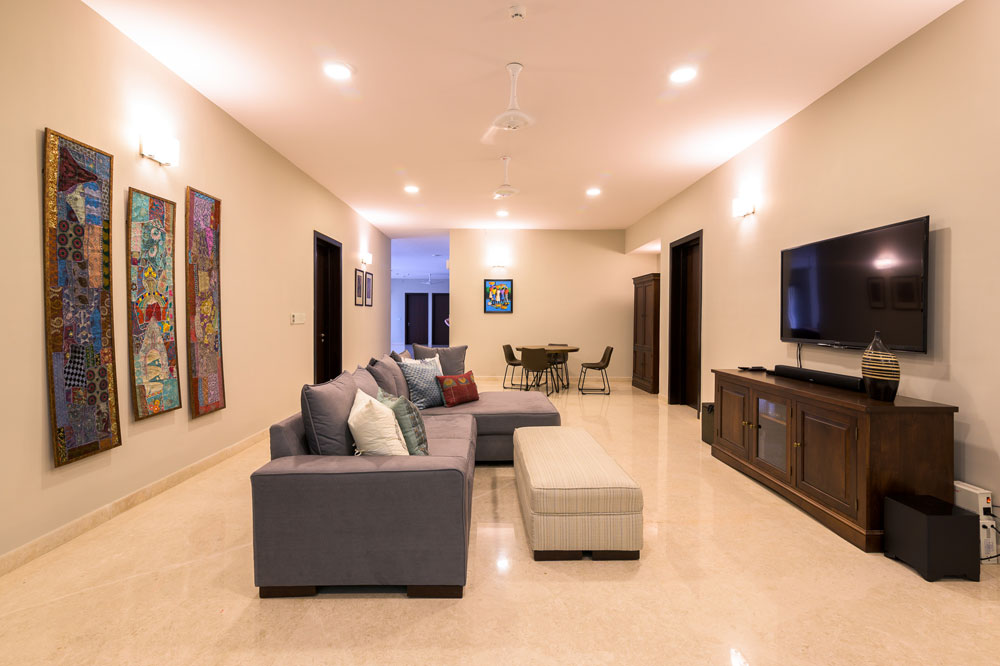
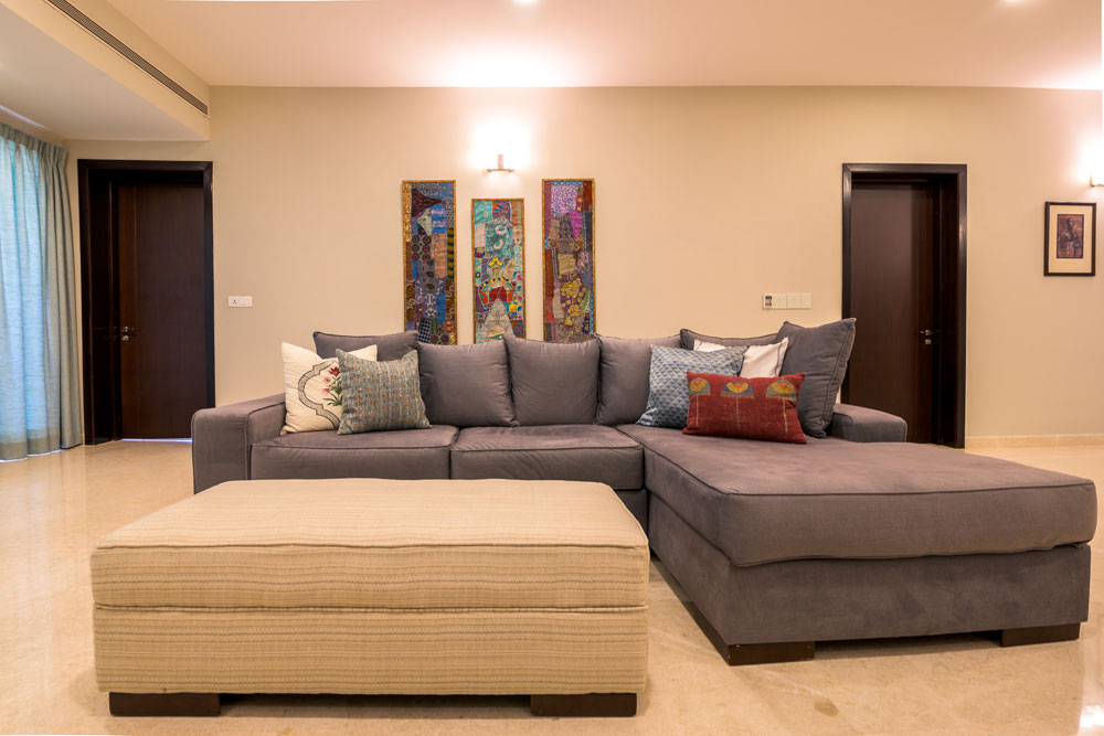
We didn’t do much here except small changes like new window treatments, reupholstering the sectional to a lighter gray and a lovely striped fabric for the ottoman.
We replaced the country style dining table with a more modern game table for the family to hang out and play games on.
Some throw pillows and art on the walls tie it all in.
Before

After


If you thought color was the predominant story in this home, wait till you see the neutral and serene tone on tone master bedroom that we designed from scratch!
Stay tuned for that coming up next on the blog 
It’s All in The Accent!
Created by Vinithra Amarnathan on August 6, 2019
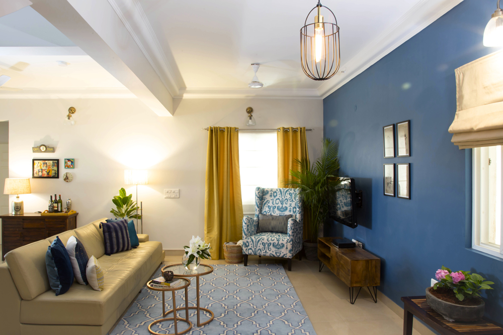
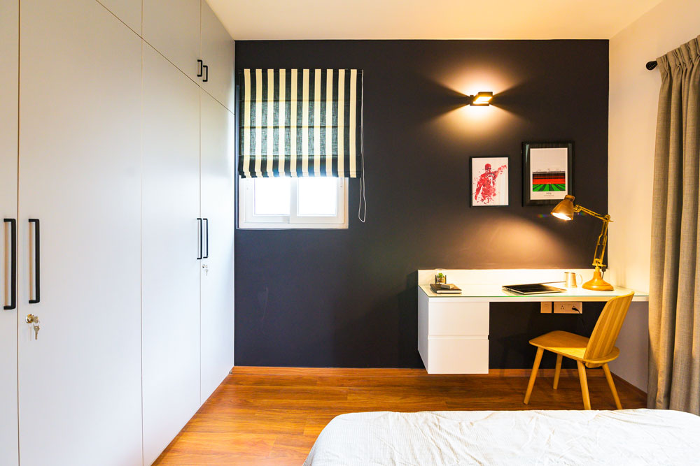
How many times have you stared at that blank wall and wondered what you could do to give the space more character? Or how many times have you caught yourself feeling like your room lacks a focal point and needs a revamp? With this blog post, we’ve worked with Berger Paints to bring to you the simplest Accent Wall hacks that can transform your spaces in a quick, cost-effective and impactful way! 
The idea of creating an accent wall is a simple way to bring personality to a space. An accent wall in a room will have attention drawn to itself effortlessly (and for the right reasons  ) and will act as that perfect conversation-starter. We hope that with this detailed post, we’ll be able to help you find your perfect accent wall design match!
Before we get into details about the various ways in which you can create an accent wall in your room be it the living area, dining space, bedroom or just any space you want to freshen up the look in, let’s answer the more pressing question.
Which type of wall can be turned into an Accent Wall?
This step is probably the most important one and also confusing for most! Start with picking out a clean wall that has preferably no breaks or structural elements like doors, windows etc. The wall picked could be the one behind the bed or the one behind the couch or even a wall where you want to highlight a focal point like a large piece of art or a gallery wall! Keep your focus on picking a wall that does not have to compete for attention with something already present on the wall surface in the form of a structural or a feature element.

You can pick a wall that has a dominant presence in the space and then introduce elements that will complement the accent wall. Against the accent wall feature, you can get creative and decide on what type of décor items, furniture or focal pieces may go with the statement wall. A bright couch, a gallery wall or just an iconic piece of art can all be options that anchor the wall visually!
A key element to keep in mind is natural light. A wall that receives a good amount of light is a good candidate for an accent wall. Accent walls are also a great tool to visually create dimension in a space. For example, painting a wall on the far end of a long or large room a dark/bold color, visually brings the wall closer and reduces the length.

Once the accent wall is in place, it is sure to create impact in terms of visual drama and highlight the features you were seeking to.
Moving onto the most fun part now!
How to create an Accent Wall?
The answer to this is in many different ways!  Accent walls much like paint in any form are an expression of your unique personality, the effect you want to create or the characteristic vibe that you are going for. Let’s explore a few different techniques that we can use to bring to life your custom accent wall feature with the help of some Berger Paints products:
Paint – The Most Versatile Medium:
Paint has been the cheapest and easiest way to give a space a whole new look (read more on this: https://www.wee-spaces.com/expressing-style-one-paint-swatch-at-a-time/). With paint options, there are a variety of directions of design you can head into.
Start by deciding on the overall palette of the space. You can choose to work with warm colours (reds, oranges, yellows, browns) or cool colours (greens, blues, purples) to create a visual ambience of your choice. Dark, bold and striking colours work well to create an engaging backdrop in a space. Softer toned colours work well to tie the space together.

Within the color wheel you choose to work with you can choose hues that create a complementary or contrasting palette! Some trending combinations could be: teal and white, mustard, grey and white, shades of blues with orange for something vibrant or mint for something fresh and cool!

You can spruce up your accent wall colour wise with design options like ombre shades of a base colour, a solid hue on the wall, metallic finish walls, textured walls, wallpapers in sections, panelling and even decals to complement the colour story of the space. The options are endless!
You can create a statement accent wall using Berger Paints Silk Illusions range.
Stencils:
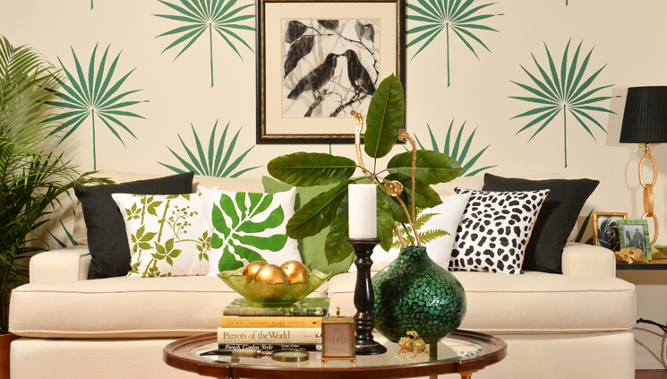
Stencils are a great option if you want to infuse pattern and make your wall a feature wall even without any further accessories! They’re customizable and can make for a fun DIY project in your home. The use of stencils allows you to give your space a quick makeover that can follow a certain theme and set the mood of the space. Choose from a range of abstract, geometric, form-inspired or a collection of shapes to create that personalized accent wall.
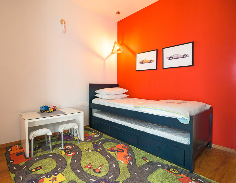
Stencils work great in kid’s rooms, study spaces, offices or anywhere you need to feel creatively inspired!
Go ahead and let your imagination free when it comes to choosing a base coat color and the pattern color to layer on top of that. Here too, you can choose to pair colors that complement each other or create an interesting visual with their contrasting pairing! Stencils are that perfect blend of pattern and personality that come together to create magic on your walls.

Pic credit – Pinterest
Berger’s range of Interior Emulsions can be paired well together in various shades to create that desired stencil accent wall feature.
Color Blocking:
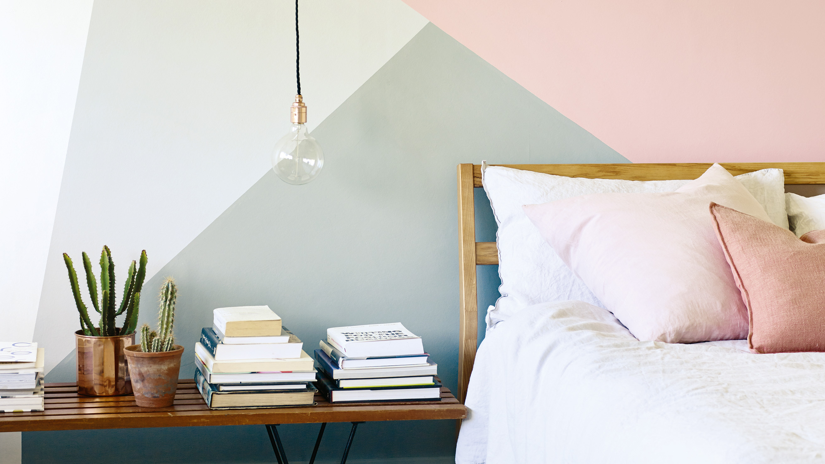
Now coming to one of our personal favourite techniques! Color blocking is a technique in which two or more solid colours are paired together in a symmetrical or asymmetrical fashion to create an interesting composition. The goal is to visually break up the space by splitting it into geometric portions that each have a distinct colour, thus creating that picture-perfect accent wall!
You can start by dividing the wall into a few sections. Use any pre-existing elements as guides to divide the wall as per your requirement. Use complementary colours for a striking effect or even subtle hues if that’s your palette. The technique is perfect for demarcating zones & adding character to your space!

Pic credit – Pinterest
Have a look at some of Berger Paint’s Silk Luxury Emulsion range to get cracking on your colour blocked wall.
Here is the golden rule: there aren’t any rules!
Remember to have fun while you freshen your walls up and know that your take on accent walls is your own. It is an interior design feature that can go a long way in adding that bold touch of persona to your space and make it seem anew!
Until next time, keep it chic and colourful! 
Content by Lavanya Chopra for Weespaces
