Project Reveal Part III – The Modern Mediterranean Bedrooms
Created by Vinithra Amarnathan on December 30, 2019
We couldn’t wait to share the last part of the modern mediterranean with you and so here goes…..the last but some of the best parts of this beautiful homes are in the private spaces we created.
They all have a very distinct identity yet flow with the aesthetic of the home. There’s deep rich finishes, earthy colors, a hint of lux and some moody vibes all tucked in here!
Master Bedroom
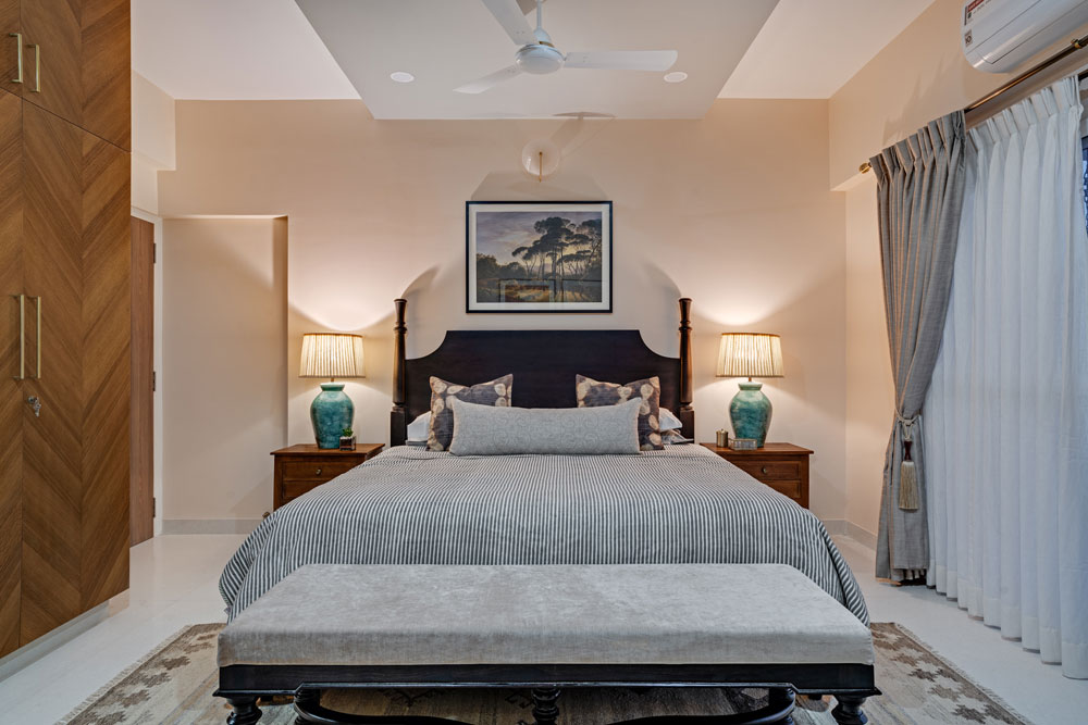
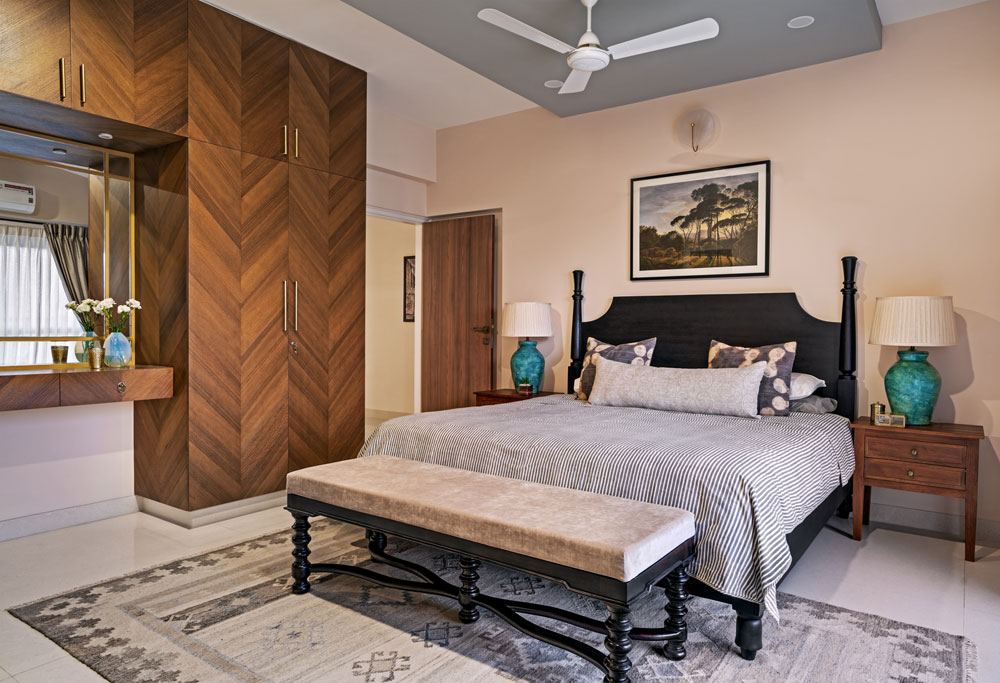
The master bedroom channels a blend of traditional pieces with modern ones and makes for a contemporary look with character. The bed is a classic dark-stained low poster bed with a solid headboard and an ornate end of bed bench builds on the intricate details with sculpted legs in the matching shade of the bed. The nightstands have a minimal yet classic demeanor. Oversized terracotta lamps in an unexpected shade of turquoise create visual impact.

A chevron teak finished veneer clads the wardrobes and vanity niche. The rich wood tone is balanced by light blush paint that bathes the walls bringing a hint of warmth into the space. I love how we highlighted the ceiling in a tone of gray and it gives so much dimension as well as balances the presence of the bed which is the focal point of this room.

A kilim pattern-inspired rug in neutral tones introduces interest into the space while grounding it. We used double layer curtains which add a sense of plushness to the whole space.
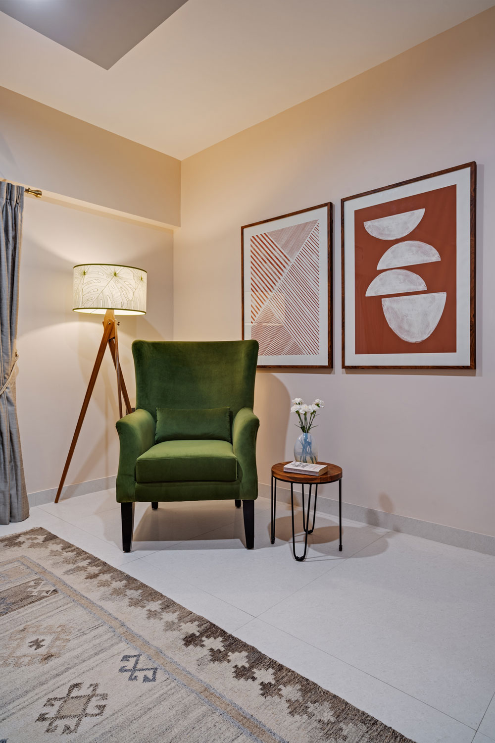
A reading nook in the corner is composed of a modern wingback chair upholstered in a forest green velvet fabric, a tropical print floor lamp and oversized geometric art in shades of terracotta.

The art above the bed takes cues from the client’s love for landscapes and is a vintage art print to go with the vibe of the space. This is possibly my favorite addition to this master and does a great job of bringing the space together!
Guest Bedroom
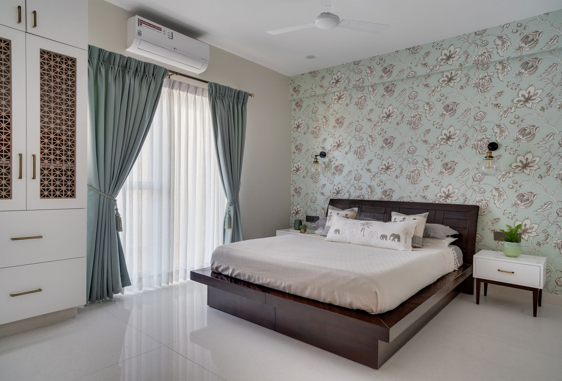
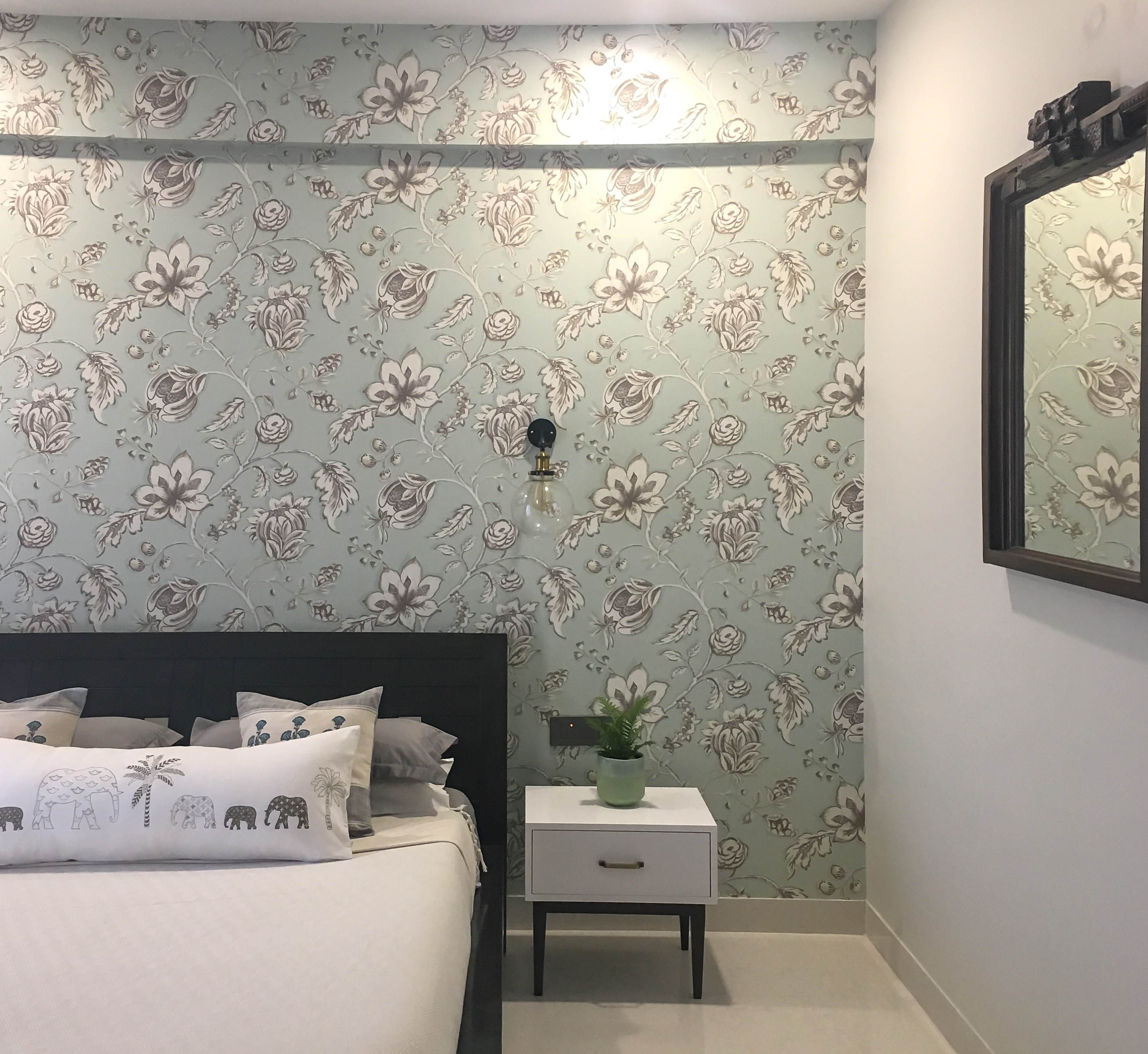
The guest room is a simple and minimal space that has been punctuated with the presence of a floral-patterned wallpaper. The scale of the pattern adds to the room’s volume without overwhelming it.
The color scheme is dominated by whites, dark wood and the light teal of the wallpaper. The space has a similar modern-traditional vibe.
The wardrobe section also houses a dedicated pooja niche that has lattice doors and champagne gold hardware to complement the look.

The bed was a piece of furniture retained by the client and the room was designed with that in mind. We added custom bedside tables in white and wood to match the bed.
The lighting is simple and the glass and brass wall sconces act as bedside lighting without taking away from the wallpaper which is the focal point of this room!
I love the antique wood mirror we added on the long wall for balance and it brings so much character to the space.

Home Office & Study
The study was designed as a little oasis for the husband who works extensively from home and reads voraciously.
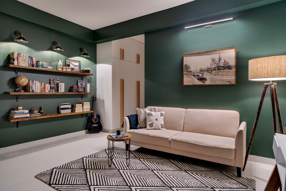
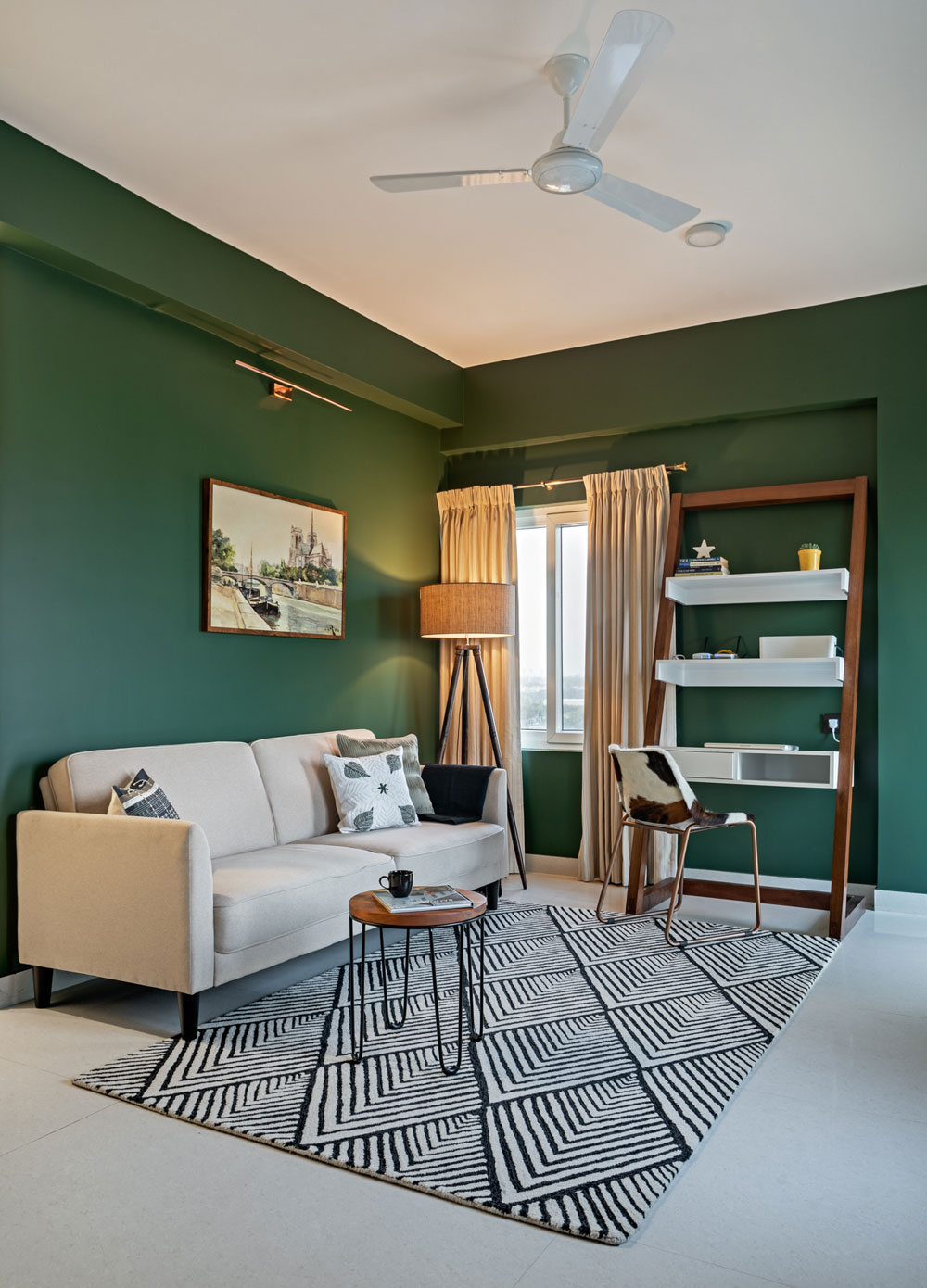
Deep Forest Green envelopes the walls and creates a moody space which sets the tone of the room. The vibe of the room is a blend of modern and moody. A cozy den cum casual home library setup.
Three long wooden open shelves flank one side of the room and make for the perfect space to display the large collection of books and curios from the couple’s travels. Three wall sconces on top of the shelves complete the look and introduce mood light into the space.

A simple sofa cum bed in beige complements the design scheme of the room when paired with the monochrome geometric rug.
A Parisian landscape art print echoes the travel-inspired sentiment of the space and a natural fiber look floor lamp brings in a warm cozy glow!
The other side of the room anchors a sleek wood and white custom ladder desk that is modern and functional. We added a faux hide chair that has a beautiful pattern.

This space blends form and function so seamlessly and creates such a lovely vibe!
And this concludes the reveal of our modern mediterranean home. We hope you enjoyed every part of this home as much as we did 
Stay tuned for more of our future posts and project reveals!
Content by Lavanya Chopra for Weespaces
Photography by Shamanth Patil
Project Reveal Part II – The Modern Mediterranean Kitchen
Created by Vinithra Amarnathan on December 19, 2019
Kitchen
Aah I love this kitchen! When we first met, Kaustubha said her heart was set on a blue and white kitchen and this set the tone for the home. I remember walking through this home and standing at the entrance of the kitchen imagining the wall gone and a big picture window with a hanging pendant over it!
When I stand now and look, to see that vision come to life is such an amazing feeling 

Structural changes
We broke down the wall on the right and took the puja niche provided into the study to create wardrobes. That gave us an open view of the kitchen and a clean long wall facing the lounge and dining area.
Next we broke down the small kitchen window and created the biggest window we could and swapped out the door with a glass top door to continue the uninterrupted view!
Layout
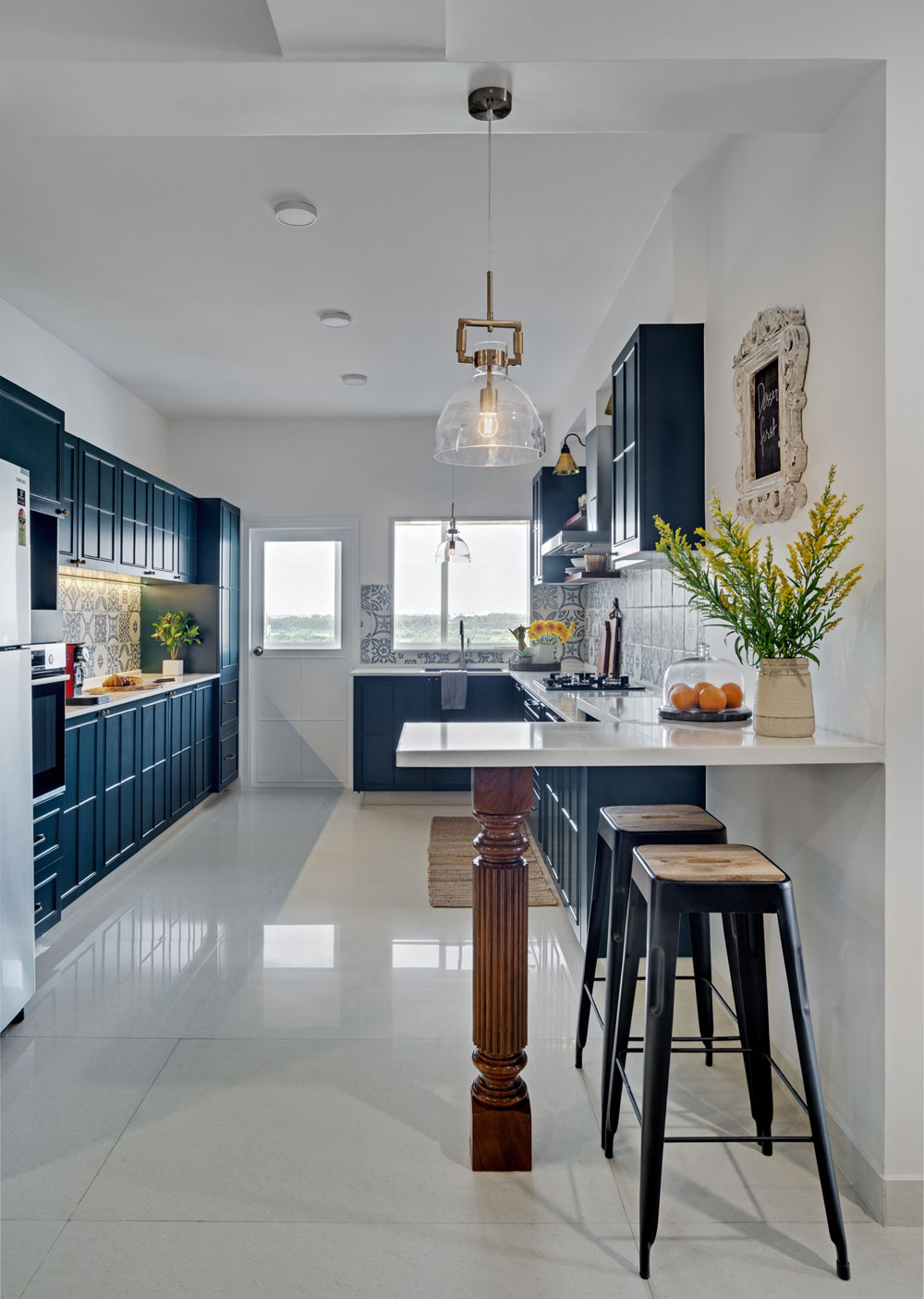
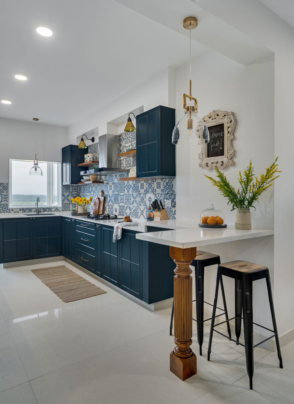
Now that we had a large open kitchen to work with we worked on the layout. We have the sink under the window, the cooktop in the middle of the kitchen and the refrigerator and oven right behind creating the perfect work triangle.
Since the kitchen itself was large we could afford to have enough storage on the other end and a custom pantry unit that took care of most of the storage needs.
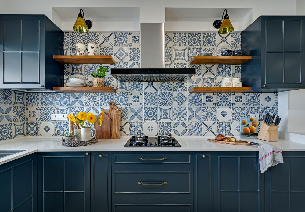
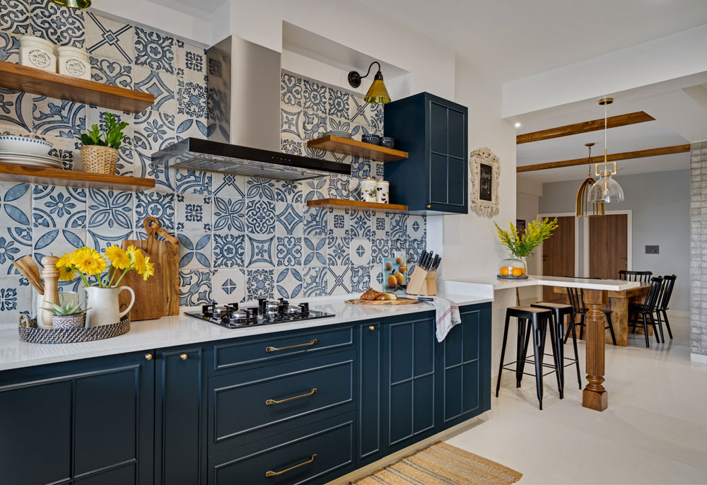
This allowed us to add open shelves on either side of the cooktop / chimney to bring in that feeling of openness and make for easy stacking of every day serveware!

I can’t miss the lovely breakfast counter we created by extending the same quartz stone countertop along the length of the kitchen supported by a custom made wood pillar leg that brings in that unexpected traditional element in an otherwise modern space!
We kept the counter open at the bottom to slide in a couple bar stools.

Color palette
Blue and white was what our client wanted….but what’s unexpected here is the midnight blue of the cabinets! The tile was a beautiful white and blue…..but we didn’t really want to pick the blue off the tile and instead went notches deep in the color range to create cabinets in a rich warm tone of blue. I love this because it was a large enough kitchen to handle that bold color and we balanced it by keeping all other elements white or wood!

The open shelves and the custom pillar leg bring in the warmth of wood.
Simple brass knobs & a grey natural quartz sink round off this beautiful kitchen 
Lighting
A pair of pendants hanging over the kitchen sink and the breakfast counter was part of that vision I had and I love how that has come together! Brass and glass pendants add a clean chic look.
The gooseneck sconces above the wood shelves are different and I love how the mixing of metals and shapes in the lighting keeps it interesting!
This kitchen combines form and function beautifully and makes for a lovely statement in the modern mediterranean home.
All photographs shot by Shamanth Patil.
Project Reveal Part I – The Modern Mediterranean Living Areas
Created by Vinithra Amarnathan on December 14, 2019
Back in June of this year I met our clients for the first time in a blank apartment. It was spacious but had a large column in the middle of the house, a big kitchen space but hardly any light and a large area adjoining the kitchen with great natural light!
And that was our starting point to the modern mediterranean home! Its layered, its beautiful and the perfect mix of the modern and the traditional!
Our clients, a young couple had very different aesthetics…..she loved traditional curves, the warmth of wood that reminded her of her childhood home, deep rich colors and lux finishes! He loved modern clean lines, metal, rustic wood and cool colors!
This home effortlessly blends the two aesthetics and develops a layered look that balances both.

We have a modern formal living room right next to a warm casual lounge! The palette is defined by the mediterranean….blues and whites, earthy terracotta and browns and the warmth of wood.
One of the interesting things in this home is the use of color….the palette is restrained but the colors themselves are rich and bold!
Mustard, navy, forest green, midnight blue all make an appearance, but without distracting or taking away from the individual spaces!
In the first part of the reveal we’re walking you through the large living dining and lounge space that defines the mod med vibe!
Entryway and Living
Even though we had good square footage to work with, this home had many challenges and one of them was the lack of a distinct entryway! The home opened right into the very large space with a column in the middle.
My thought is when you can’t do away with something – in this case the column, make it a feature!

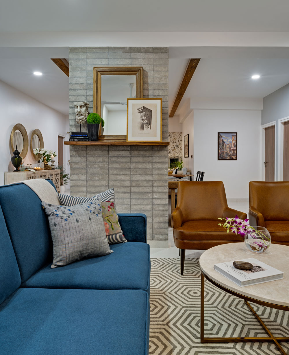
So we decided to wrap the column in a stone tile. The tile itself is a beautiful warm tone of gray with imperfections that give it a textural look. We did a clean horizontal stack to give it a nice modern feel and this stone wall now is one of the best features of this home! The living room side of the stone column has a beautiful mantle ledge we added. A large mirror and some art stacked against it bring in that modern european / mediterranean vibe we wanted. A simple geometric rug and marble coffee table ground the space.
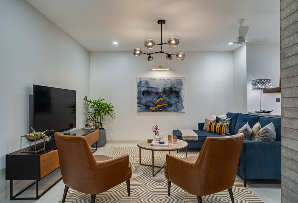
We had the main door opening into a long area that had little natural light and we decided to use this space as the formal living area. A large comfortable sectional flanked by gorgeous custom leather chairs that have my heart and a custom raw edge wood TV console!

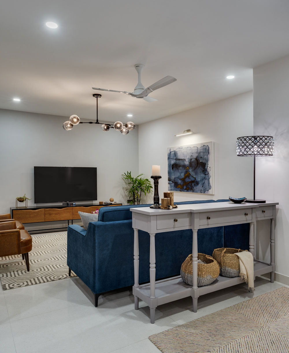
We added a sofa table/ console behind the sectional to bring in a visual break and create that entryway that this house did not have!
A simple runner rug and a custom made long gray console sit perfectly in harmony.
We added a large table lamp on the console for lighting and convenient drawers for keys and papers. Baskets below the console add more storage and there’s a shoe rack tucked away in the niche behind the door!

We knew we wanted to have a large piece of art sitting above the chaise of the sectional and we got lucky with this beautiful blue and white modern marble art piece with hints of gold. A striking chandelier and recessed ceiling lights complete the look and add much needed light to this space.
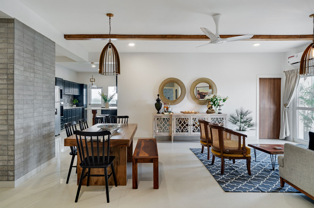
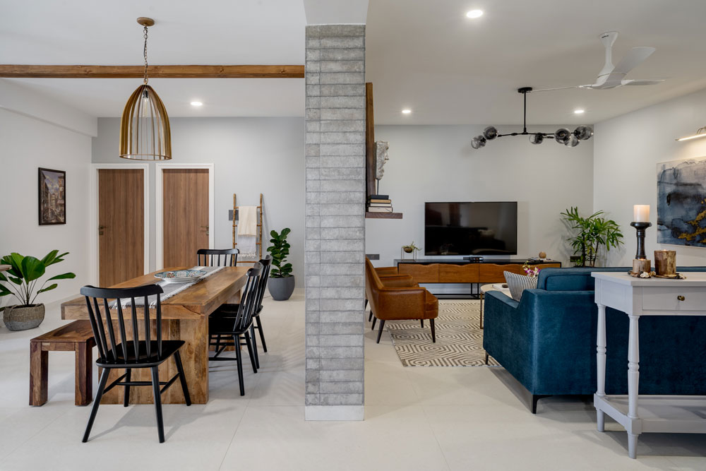
To have the dining sit right off the kitchen in such a way that it opens up to the lounge area as well as the kitchen for easy entertaining was a strategic choice and the stone wall acts as the perfect anchor for that!

The dining table is a clean modern wood table with black chairs for contrast. The chairs are a modern take on the windsor chairs and I love how the vertical slats sit against the stone wall!
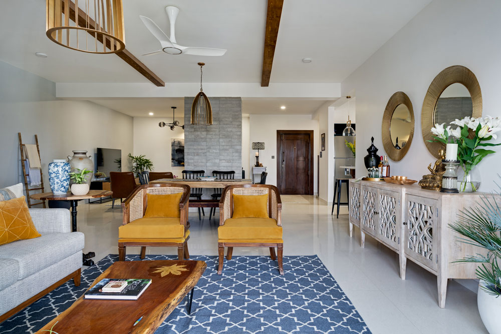
We added two large ceiling beams in the large lounge area to bring definition and to visually bring the dining and lounge together. This feature also takes inspiration from traditional plantation homes that Kaustubha’s childhood home resonated with. Two large two striking bronze caged pendants on either side amplify the length and visually tie these spaces together.
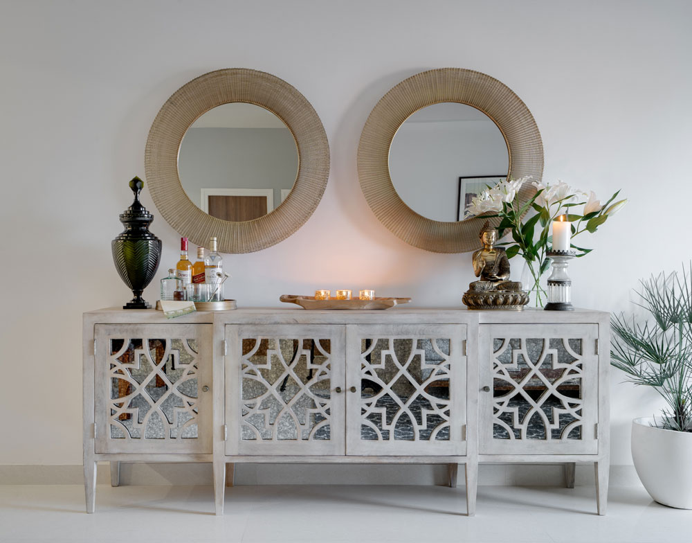
A custom bar and crockery unit with wood fretwork and antiqued mirror glass sits on the wall facing the dining and the lounge. We topped it with two large custom mirrors with a gold wired frame and I love how it instantly brings in the wow factor in this space!
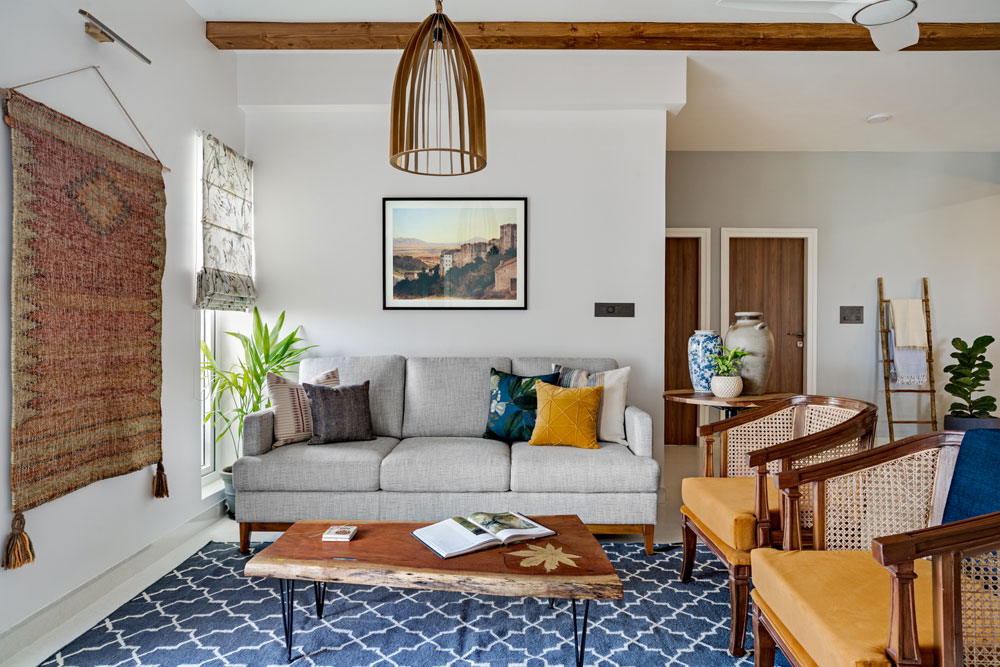
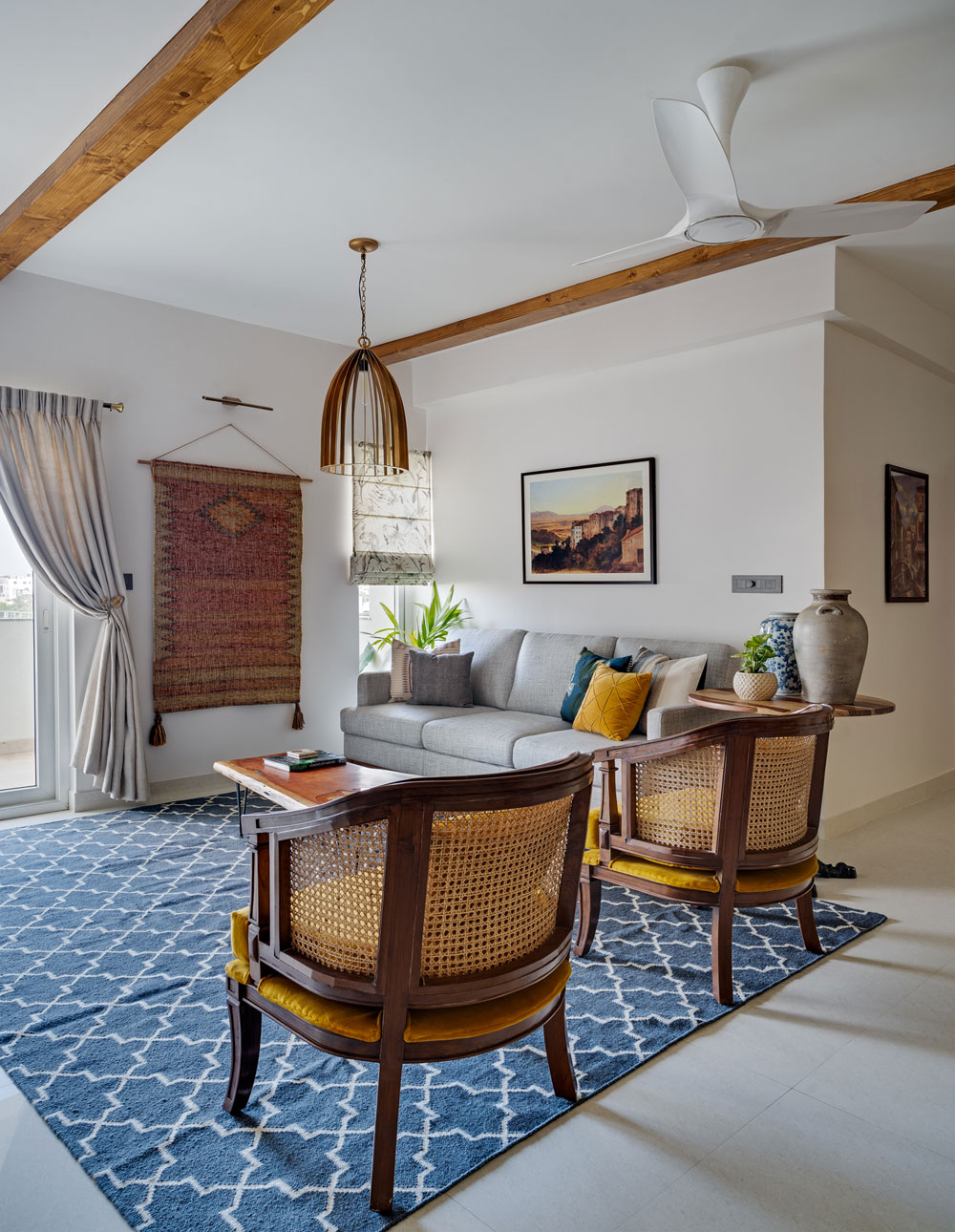
The lounge itself is a cozy comfortable area that’s awash with natural light. We brought in a lot of earth tones here with grays, browns and mustard. The charcoal dhurrie acts as the perfect contrast to the custom chevron fabric couch and the mustard cane back chairs.

My favorite element in this space is the vintage inspired art print in shades of terracotta and the dhurrie that we hung on the wall. The play of these earth tones and the wood beam along with the bronze lamp does make for a lovely space 

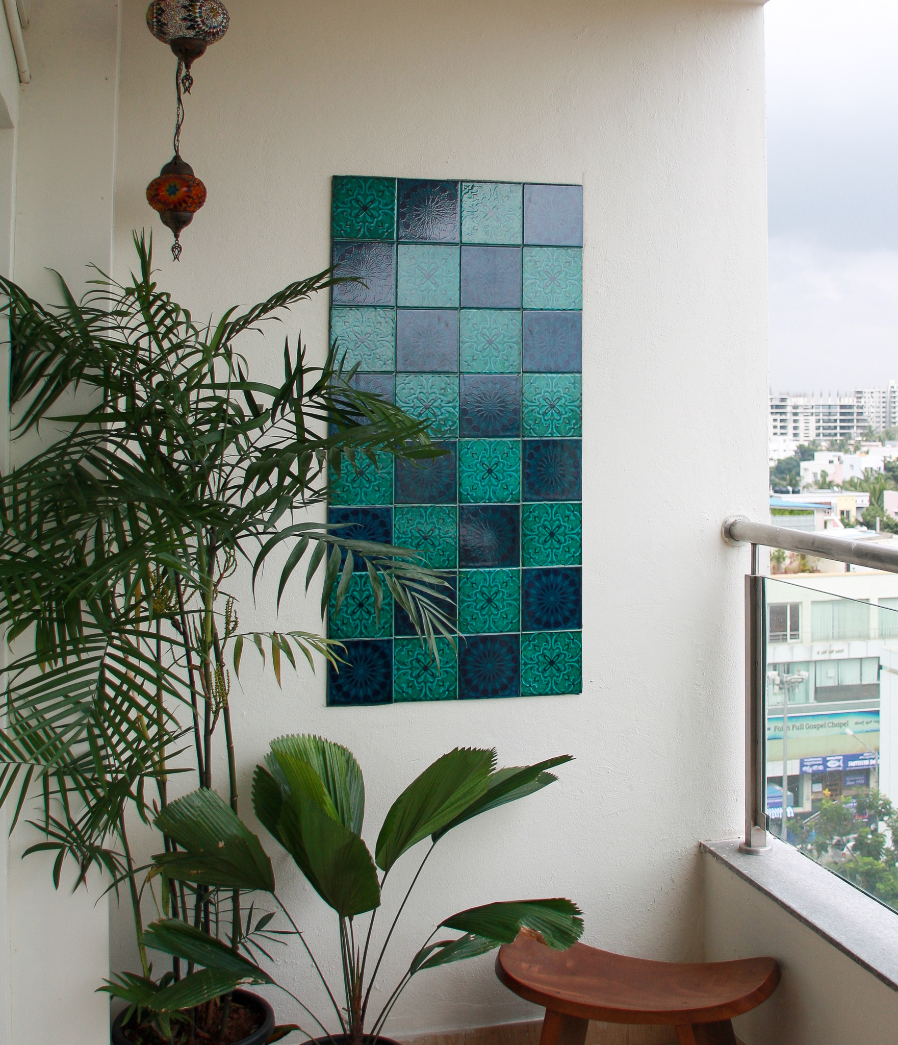
Adjoining the lounge is a little balcony. We wanted to carry through the Mediterranean feel and brought in vibrant green and blue patterned Portuguese tiles to create a custom tile wall! Such a gorgeous punch of color against the greens 

A wood balcony table and chairs make this a simple but striking spot to spend your sunday!
We are so excited to bring to you the next two parts of the reveal as well. The bold kitchen and the bedrooms in the Modern Mediterranean are full of character and an interesting take on color. We’ll be back real soon!
All photographs shot by Shamanth Patil.
