Project Reveal Part III – The Modern French Country Inspired Home – Private Spaces
Created by Vinithra Amarnathan on January 22, 2021
We hope you enjoyed the pastel perfect living spaces and kitchen from this home. The private spaces are equally beautiful and carry through that subtle and calm elegance.
Master Bedroom
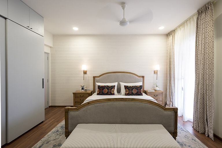
The master bedroom is one of my favorite spaces in this home. It’s neutral in its tones but has beautiful textural elements that make it all come together.
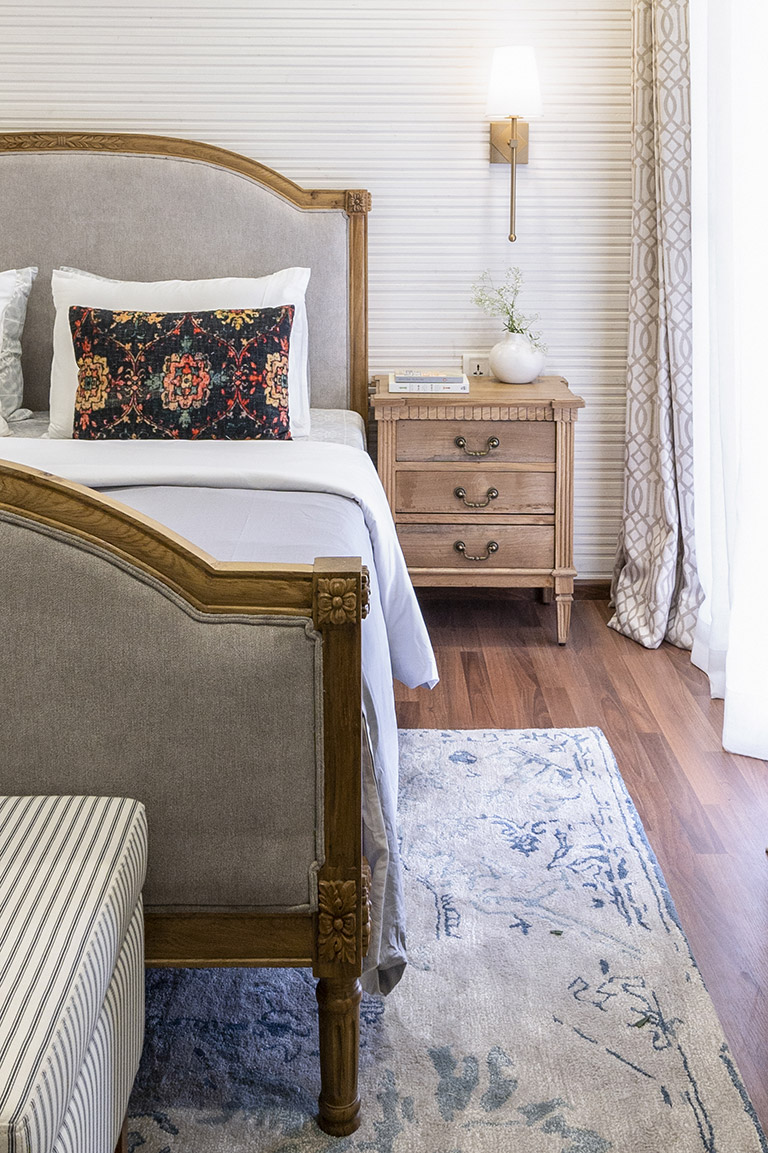
The fluted wood paneled wall behind the bed is a favorite element. Its a refreshing updated take on shiplap and brings in so much texture and character to the space. We painted it a few coats of white but left the wood grains peeking through which bring in warmth and dimension.

The wall is anchored by a linen upholstered classic carved French country bed and bedside tables. We used larger bedside tables here and also added a beautiful striped bench to the foot of the bed. The deceptively sleek bench packs in storage for all the bed linen and is such a functional piece!

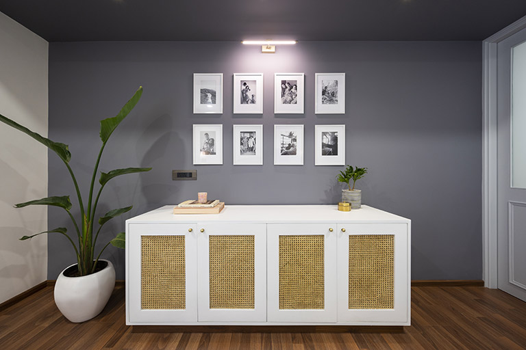
Opposite the bed we added a beautiful cane and white sideboard for additional storage. We painted the wall a dark charcoal and added beautiful black and white framed photographs that are minimal yet impactful!

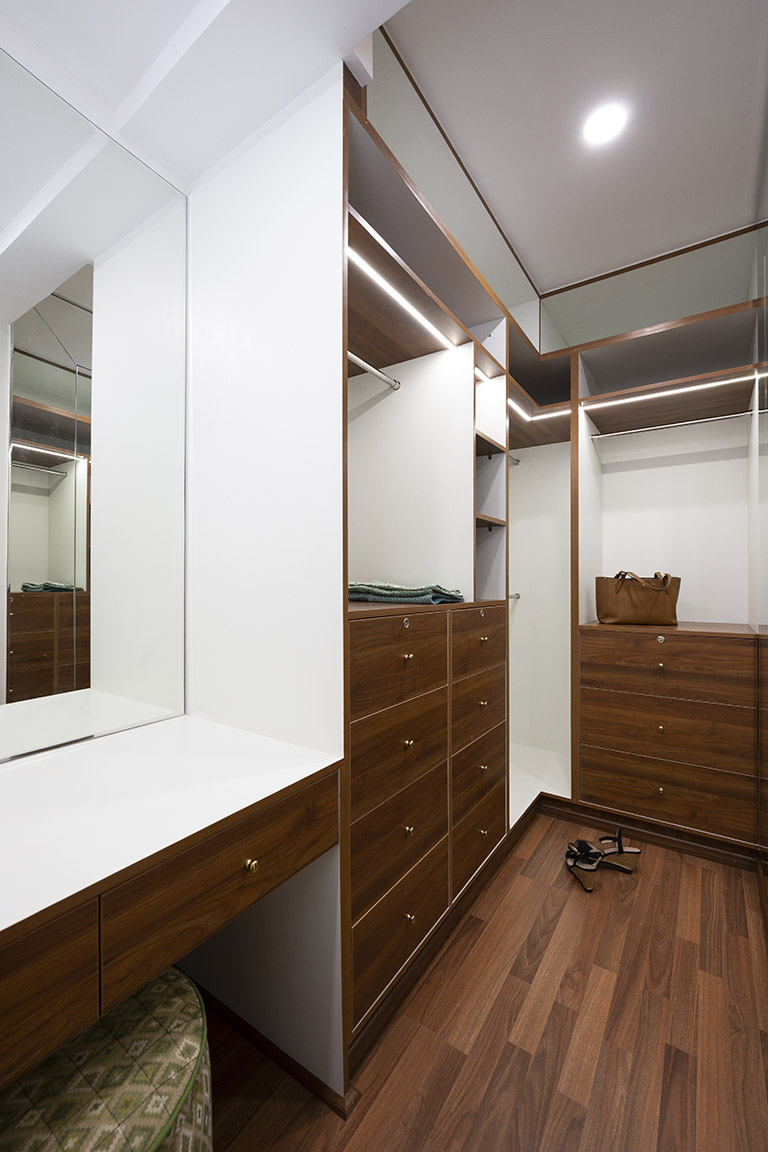
To the right of the master we converted a bathroom into a walk in closet for Pallavi and added a simple grey painted closet in the master for Tarun. The walk in closet in tones of walnut and white has ample storage and a vanity.

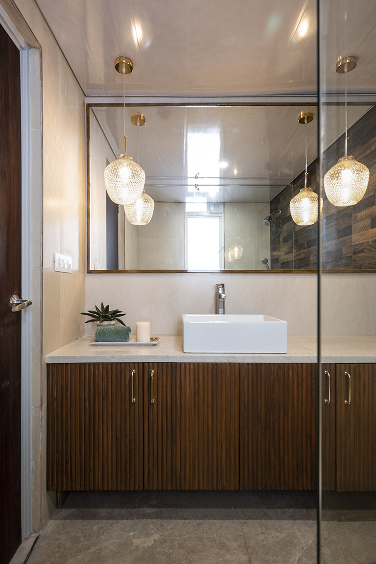
We carried the beautiful wood fluting into the master bathroom and added a wall to wall mirror with pendants to update the builder grade bathroom

Guest Bedroom
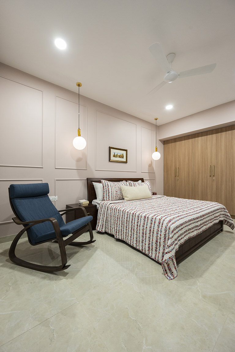
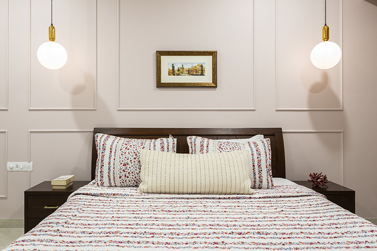
This guest bedroom was a simple room where we kept the clients existing bed and added wardrobes and a chair. But we can’t miss that beautiful moulding and the perfect blush tone we used for the walls!

We added simple cotton floral bed linen and brass globe pendants to complete the space.

Library
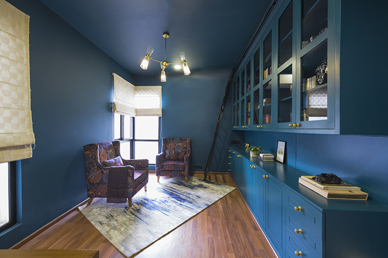
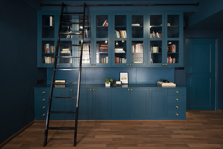
This room is such a bold departure from the rest of the home and is enveloped in tones of deep teal. We knew this was a smaller room and both Pallavi and Tarun wanted the space to be a refuge and something that was set apart. They both loved reading and we imagined the space bathed in deep color and wall to wall cabinetry to bring in that dark moody library feel.

We painted the entire space ceiling included in a deep teal, added beautiful millwork across the length of the entire wall and used glass doors for the upper cabinetry to lighten the feel.

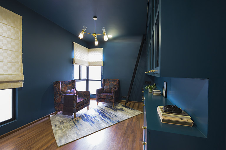
A simple brass and glass chandelier and ladder tie in the space. We painted the window frames a sharp black and added linen blinds.

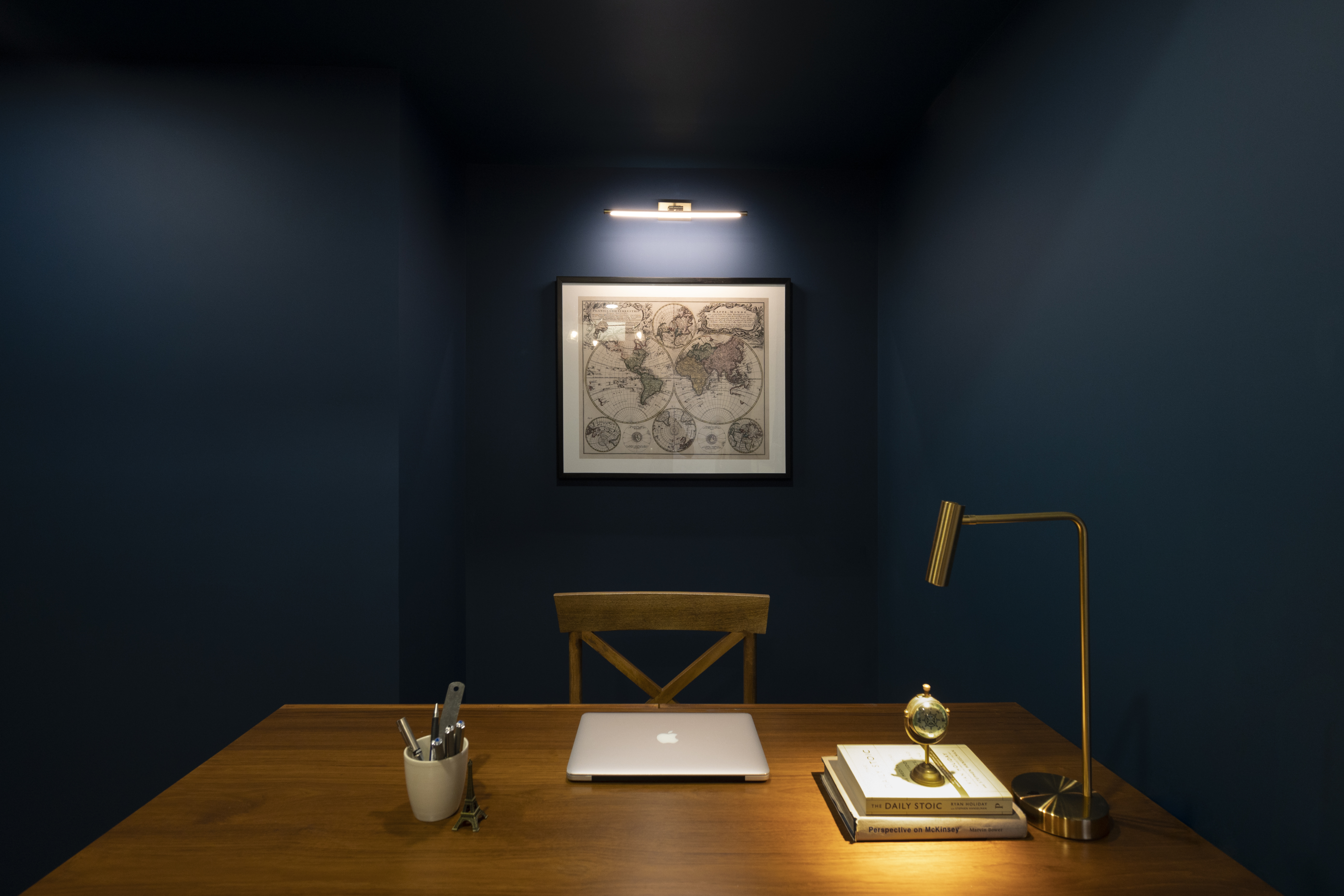
In the corner a set of large wingback club chairs upholstered in deep navy and rust tones are anchored by an abstract modern rug. On the opposite end we added a large wood desk and a vintage world map print behind the desk nook.

I absolutely love this space and how it came together!
And that’s a wrap people on this beautiful home! I hope you enjoyed reading all about it!
All Pics by Parth Swaminath
Project Reveal Part II – The Modern French Country Inspired Home – Kitchen
Created by Vinithra Amarnathan on January 18, 2021
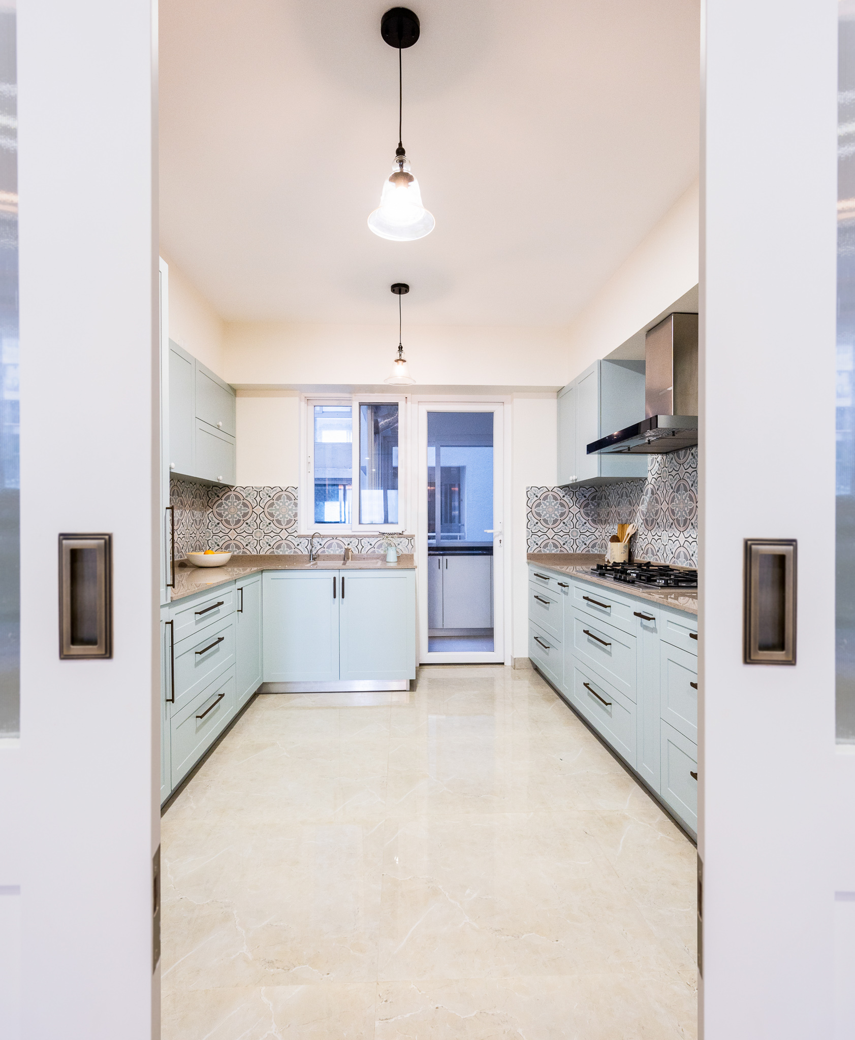
Welcome to all about the French country inspired kitchen! The pocket doors with fluted glass on top and brass sliding handles open into this pretty pastel kitchen.

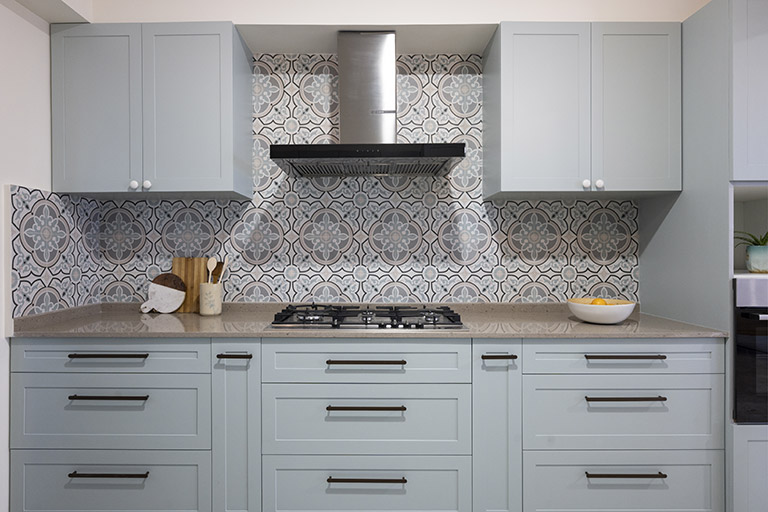
The kitchen in this home was centered around the light pastel aesthetic our clients were loving. We carried through the color palette from the living areas and worked with a tile that was a classic pattern reminiscent of European floral tiles but in a pastel palette of soft blush pinks, mint green and greys.

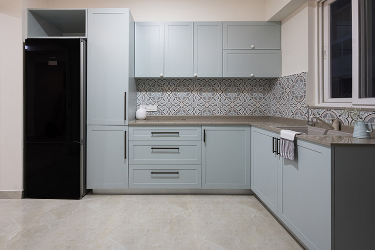
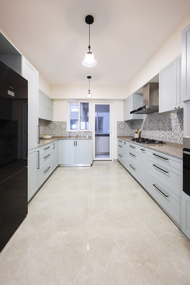
We painted the cabinets a beautiful shade of soft mint and the countertops are beige quartz. This kitchen is again a galley kitchen and to maximize function on one side we added drawers throughout along with slim under counter pullouts for spice racks and bottles.
On the opposite side we have the tall pantry unit and more storage via corner units and bottom shelves.

The sink is a small quartz sink while the utility houses a larger sink. Simple white ceramic knobs on top and long lean brass handles below add visual length and contrast. We added classic glass bell pendants in black which also elongate the kitchen.
Do I miss a long runner in this kitchen?? Heck yeah! But our clients weren’t too keen on rugs in the home because of a pet and a toddler!

I love how we worked a pastel palette into this kitchen without making it feel too cutesy! It has a relaxed yet grown up feel which I absolutely love 🙂
All pics by Parth Swaminath
Project Reveal Part I – The Modern French Country Inspired Home – Living Spaces
Created by Vinithra Amarnathan on January 16, 2021
A year back when I was in Goa for a holiday break, I got a call from our clients to design their home in Bangalore. They had a tight schedule and we were unable to take on new projects at the time…..so we signed off saying “lets hope we get to work together in future”!
A few days later one of our new projects didn’t go forward as planned and I reached out back to them saying if you’re still keen we may be able to explore this 🙂
A year later and what a crazy year it’s been, here we are sharing all about this project with you! This space is home to a beautiful warm family and I hope we have been able to bring forth their love for colors especially tones of blue, Pallavi’s love for the classic French country aesthetic and Tarun’s love for the warmth and ruggedness of natural wood!
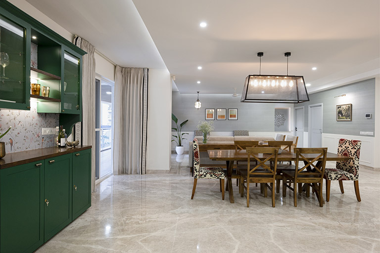
The home itself as in all of our designs centers around functionality and making the most of every space have its own character and identity in a large open plan home. We broke down a large living area into a living, dining, bar area, a kids nook and entryway. We made a whole lot of structural changes in this home especially in the utility area creating a functional space for the clients help, changed a bathroom into a walk in closet for Pallavi and opened up the kitchen wall to create flow between the kitchen and the dining.

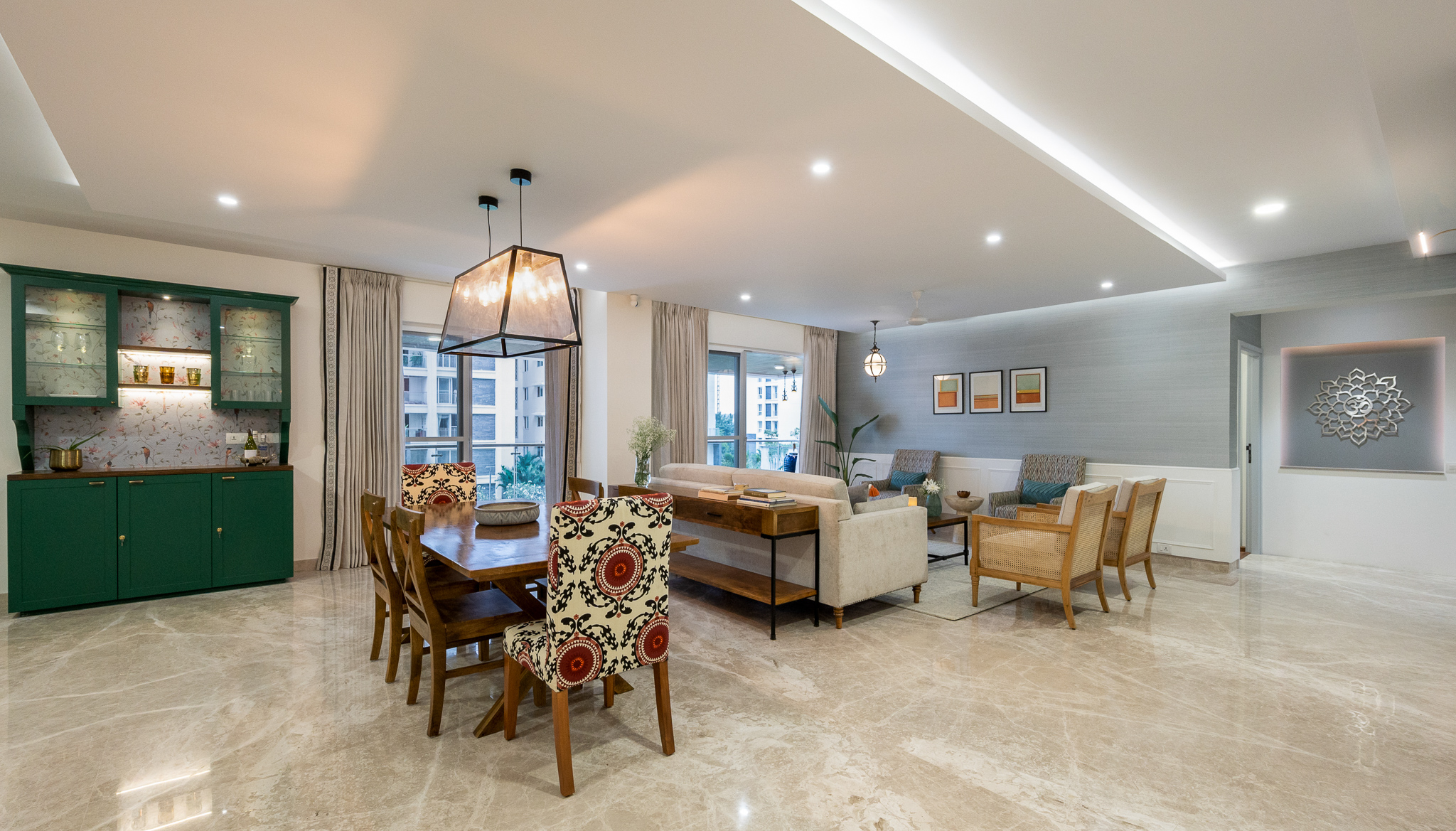
As you walk in the entryway visually extends all the way through the living which was made possible by the float ceiling we added to further define the living and dining and eventually rests at the end of the hallway where we have a beautiful custom made wall hanging.
The wall hanging is designed around a marriage of the symbols Om and the Sikh symbol which Pallavi put together. It sits on a wall painted a beautiful tone of gray.
Living
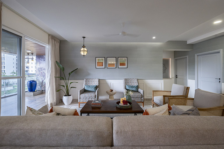
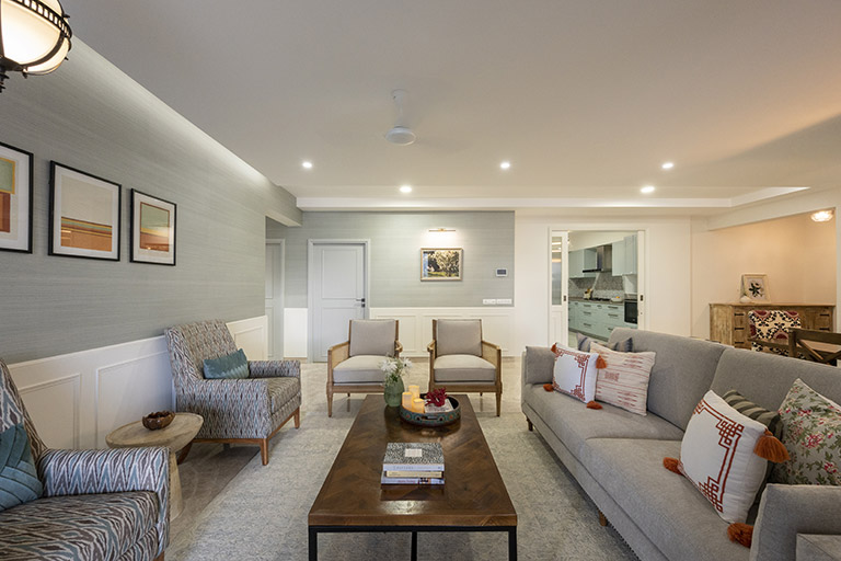
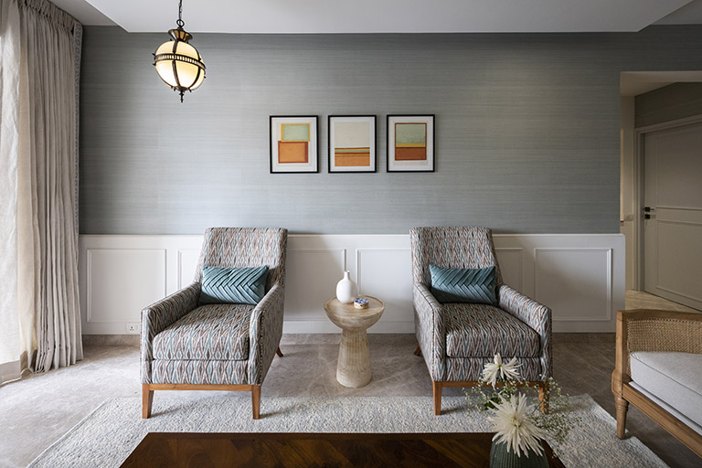
The living room is developed around a classic French country feel with a light airy palette of blues and soft grays. We wanted to define and demarcate the living area clearly and adding a beautiful wainscoting panel all through the large L shape wall allowed us to do that beautifully! A grasscloth wallpaper in tones of pastel warm blue brings in a hint of color and texture.

The seating is designed to relax, entertain, have conversations, play board games and more! A large nailhead trim couch facing the large wall and with a view of the balcony forms the main seating for the living. We added a pair of beautiful oak and cane classic French country chairs to the right and two upholstered chairs in an Ikat fabric opposite the couch. We grounded the space with a soft blue and white rug and a large wood and metal coffee table perfect for game night!

The details in this space like the curtains with an embroidered border, the milk glass pendant with filigree carving, the art and the sculptural corner table are all the little things that make this space come together!

Dining
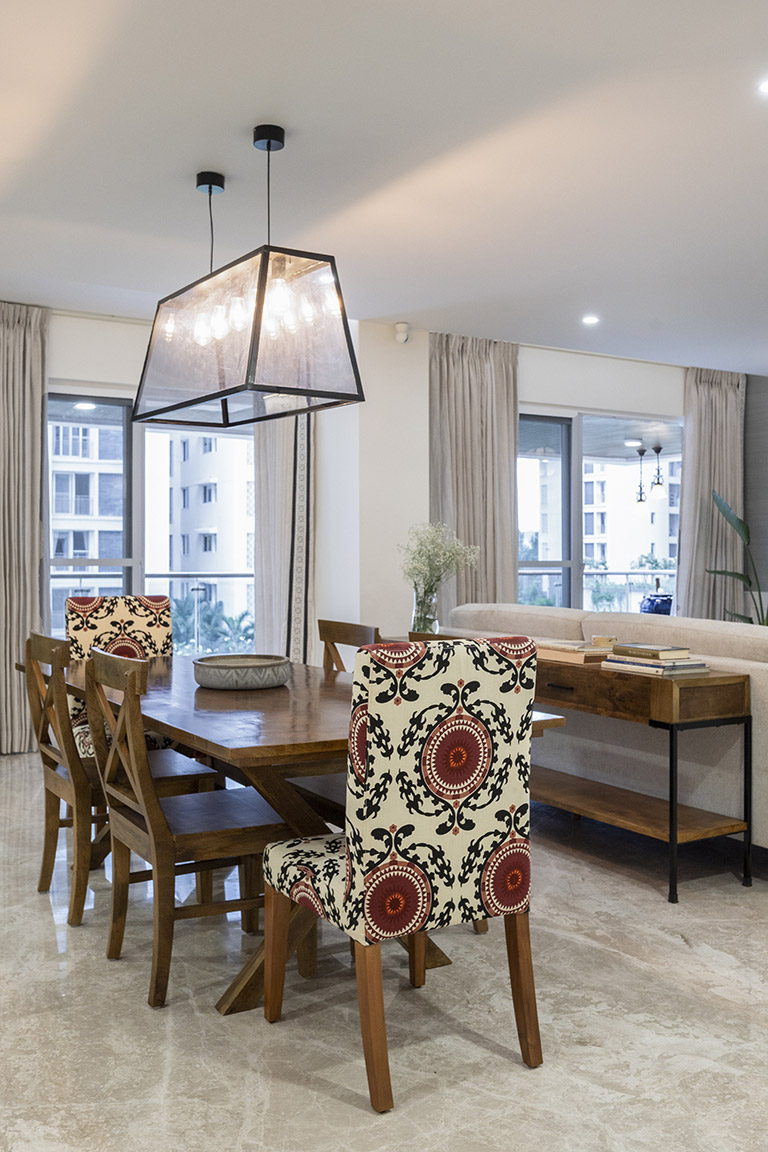
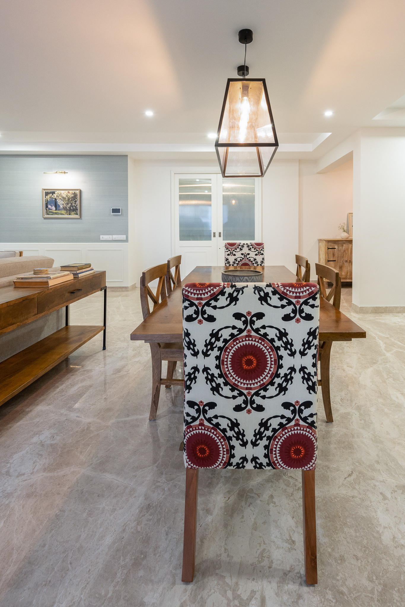
The dining is divided from the living with a large custom console that offers not just visual demarcation but brings in enhanced function serving as a buffet while entertaining and much needed storage below with baskets.

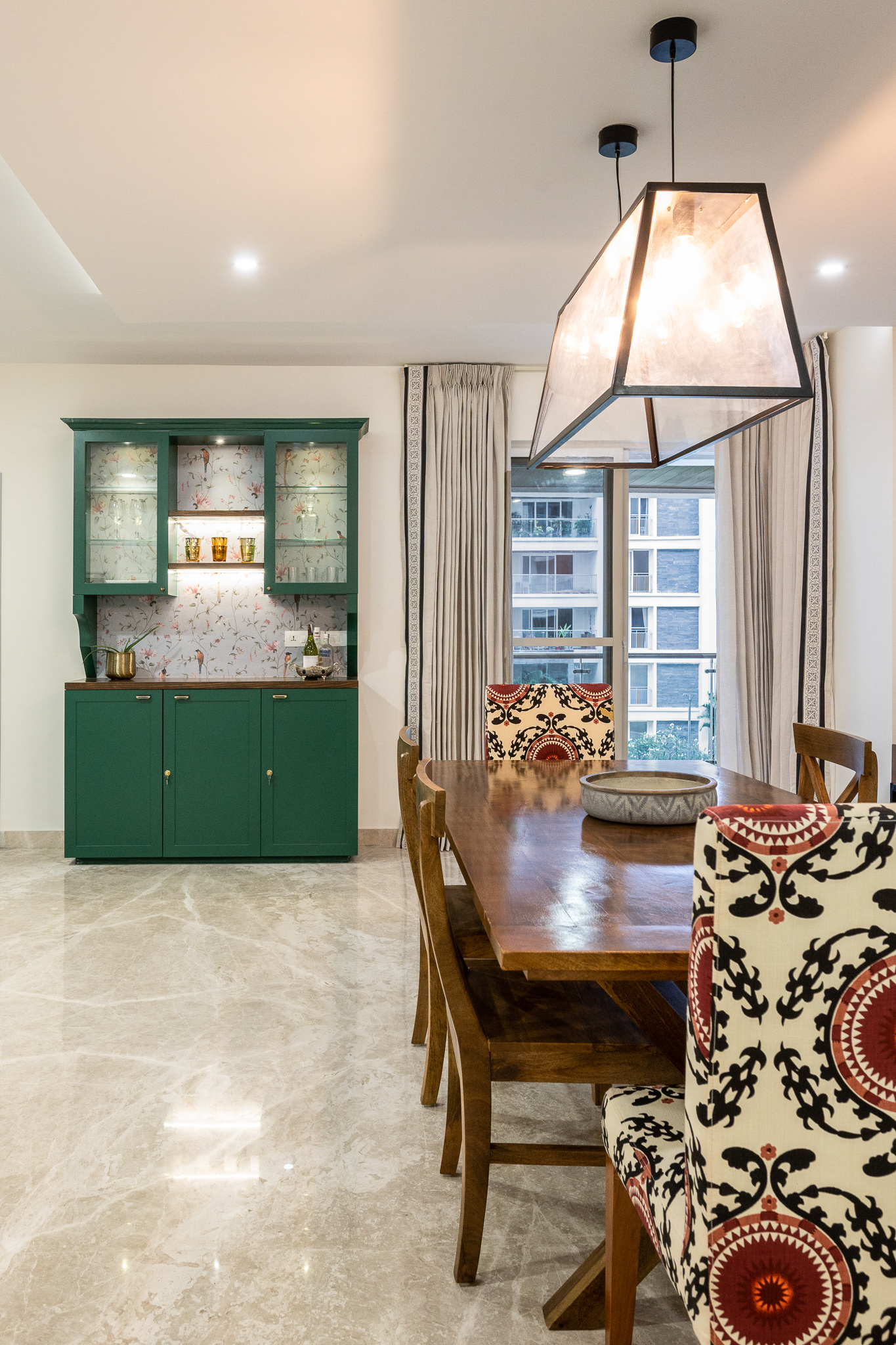
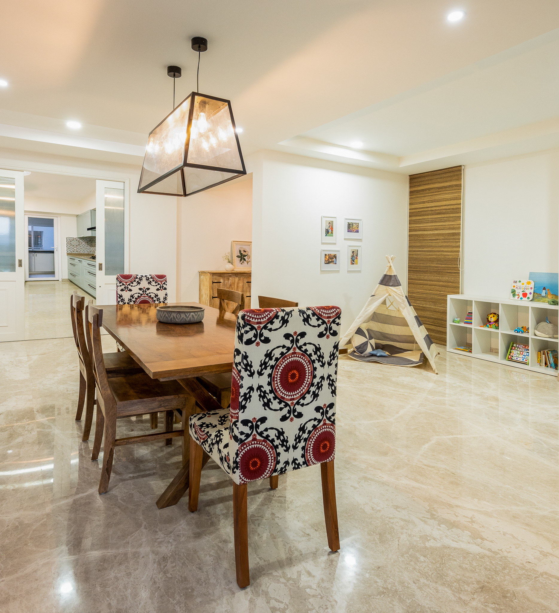
We added a large natural wood x leg dining table for a modern French farmhouse look. The dining table is grounded by a classic modern glass linear pendant. We added a splash of color with Suzani upholstered head chairs and kept rest of the chairs in a natural wood tone.

The dining area is flanked by a beautiful bold green custom made hutch with a wallpapered back for some depth and contrast. The green hutch makes a nice segue for the bold blue library to the left and also adds function and color. To the corner of the dining area is a cute kids corner with a teepee tent and simple storage for the toddler of the home 🙂


One of my favorite features is the way the dining overlooks the kitchen. The kitchen is concealed with beautiful pocket doors in white that echo the same wainscoting detail in the living and carry that through.

On that note signing out and see you all back here with all the details of the gorgeous kitchen and the other private spaces.
Happy Weekend 🙂
All Pics by Parth Swaminath
