Project Reveal – The Retro Midcentury Inspired Remodel – Private Spaces
Created by Vinithra Amarnathan on August 25, 2021
In this segment we walk you through the beautiful private spaces in this home. The home had a nice layout where the public and private spaces are segregated and as you walk past the kitchen you come to a long hallway that connects the bedrooms.
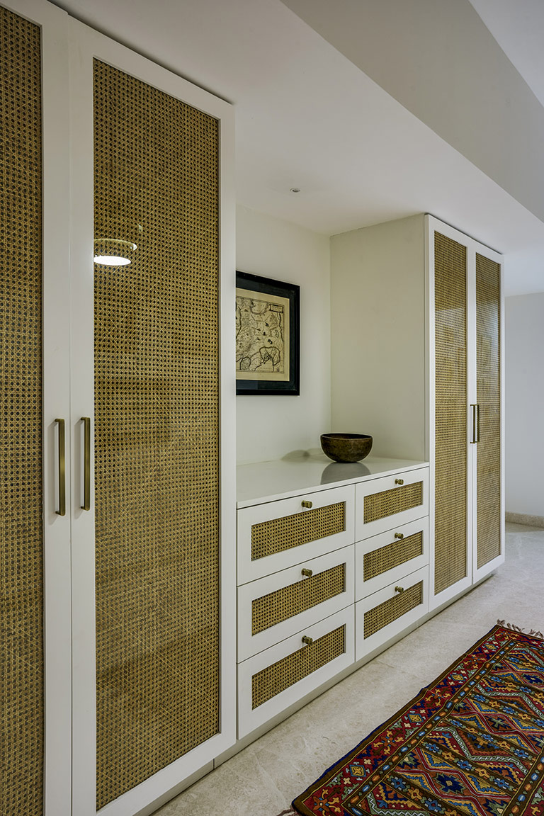
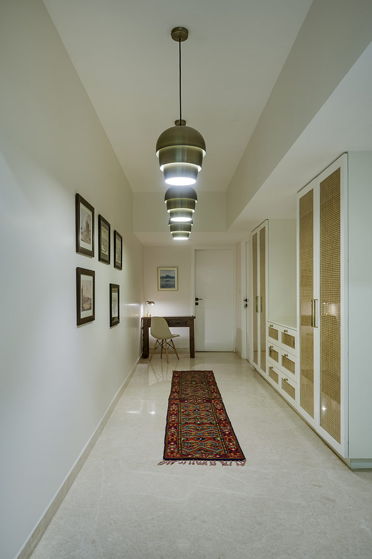
The long hallway is adorned with vintage Iranian rugs and maps from the clients travels. We created a custom cane insert hallway closet with a niche that houses one of the clients favorite piece of art. The cane is sandwiched between glass to keep it dust free.
Brass pinecone pendants from BoConcept span the length of the hallway and bring in a moment of drama while visually elongating the space!
The walls carry vintage maps collected by our clients and make for a simple and personal gallery wall.
Guest Bedrooms
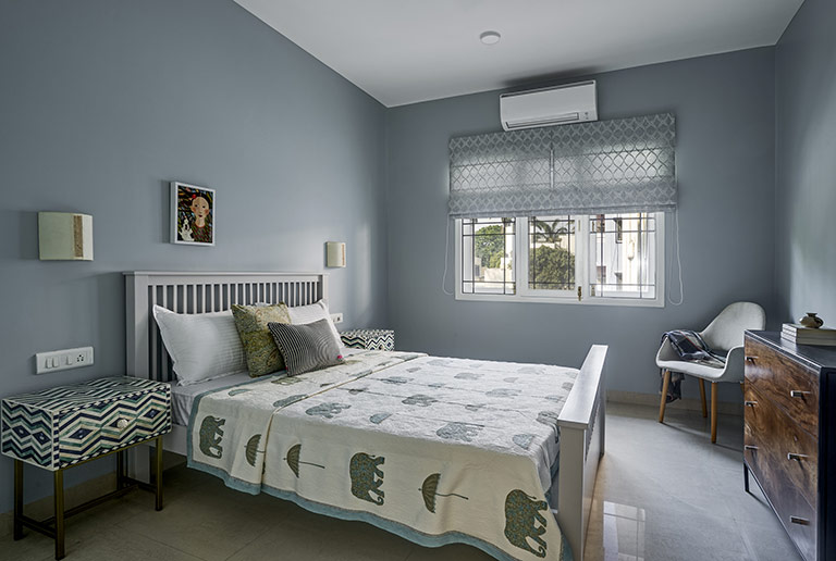
The guest bedrooms are situated to the right of the hallway. While one is painted all over in a beautiful smoky blue tone and has a mid-century artsy feel, the other guest bedroom is a pastel paradise with a beautiful hand embroidered fabric headboard as the focal point complemented by blush wardrobes and vintage botanical prints.
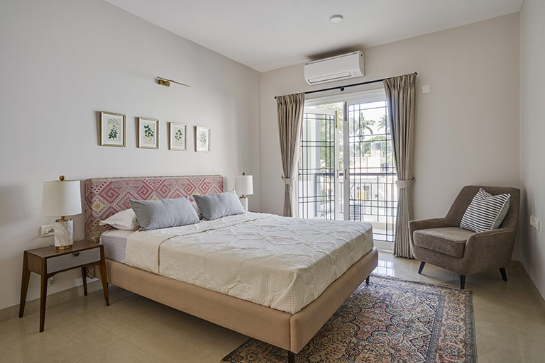
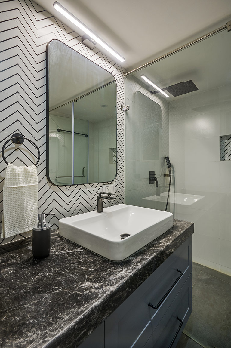
Adjoining this pastel bedroom is a striking monochromatic bathroom that brings in beautiful contrast to the space as you walk in! We completely remodeled all bathrooms in the home and the palette here is simple black and white tiles accented by a geometric chevron tile and a beautiful black marble countertop.
Primary Bedroom
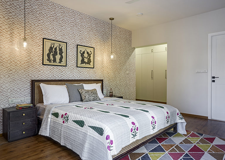
At the end of the hallway sits the beautiful walk in wardrobe and the primary ensuite! The primary room is one of my favorite spaces in this home. A large king size cane bed sits against a geometric ikat inspired wallpaper in tones of beige and brown. Simple glass pendant lights bring in a modern fresh flair to the Balinese art that our clients owned. I love the eclectic collected feel of this room!
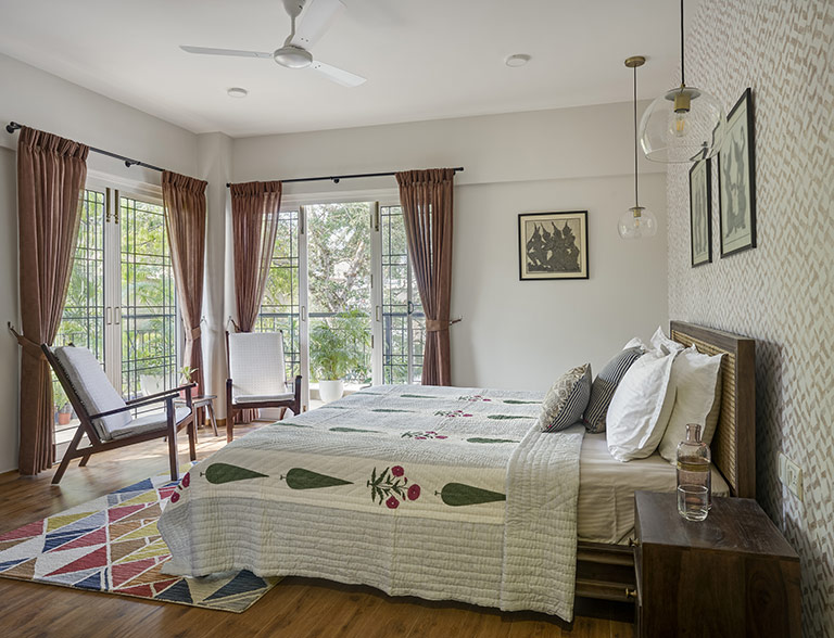
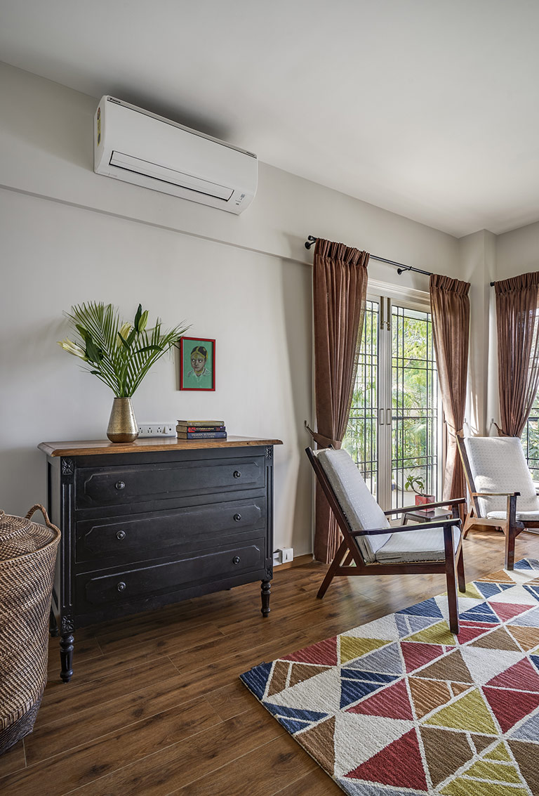
The seating nook on the opposite side has the clients vintage Danish chairs and a vibrant rug against the french doors that open into a wraparound balcony. We added a custom chest of drawers with beautiful detailing and it adds storage and function to the space.
The master bathroom is dressed in dark charcoal anti slip floor tiles and a white and gray faux marble wall tile. The vanity is wrapped in teak veneer to bring warmth to the space and a wall to wall brass framed mirror completes the space.
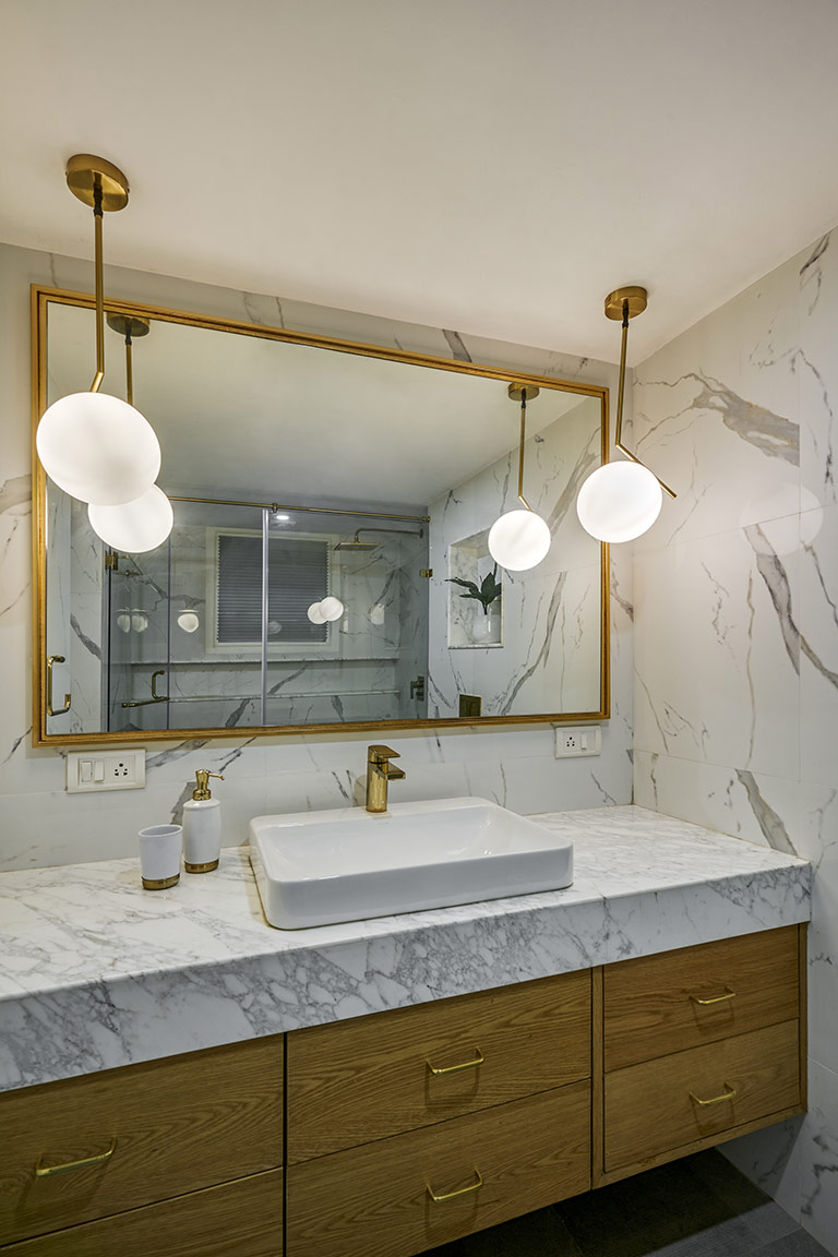
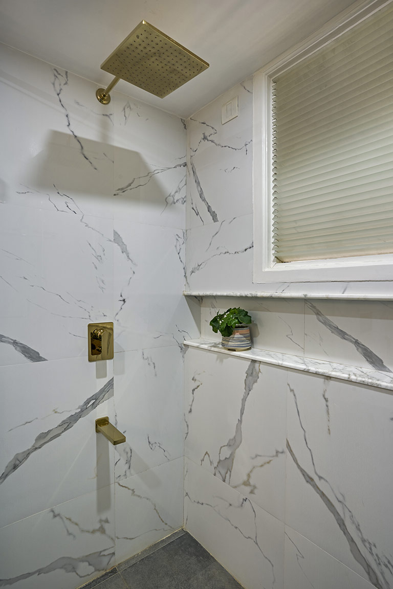
We added a beautiful white calacatta marble for the countertop and a long shower niche to bring in textural contrast. French gold fixtures from Kohler round off the space.
The design of this home was a beautiful journey in the spontaneous nature of the design process and how each of the spaces in the home evolved. Nothing’s over thought or over designed but feels just right and inviting but at the same time has an elevated presence!
Cant wait to be back here with our next 😉
Until then, Ciao and thanks for dropping by!
All pics shot by Shamanth Patil.
Project Reveal – The Retro Midcentury Inspired Remodel – Living Spaces
Created by Vinithra Amarnathan on August 16, 2021
I’m back here after so long……I thought I’d struggle with where to start and how to cover the depth and width of this amazing project. All our projects are so dear to me, but the extent of change we see through in some of our projects and those spontaneous design decisions we made that paid off, makes some of them that much more special and this is truly one such project.
Early last year when we kicked off this project, the extent of change we were going for, the beautiful location of the apartment with a breathtaking view of Ulsoor Lake all made it so interesting and challenging compared to what we had done before. Our clients had been traveling in India and overseas and after several years of moving were keen on setting up their dream home in Bangalore. As empty nesters this home had to be not just functional and comfortable but also representative of their many years of travels and collected memories.
They wanted their home to accommodate for their art collection, their books, rugs, artefacts and furniture and at the same time bring in a freshness that a first own home would bring with it! We imagined a simple clean but nuanced canvas that could allow their collected pieces to take centerstage while still having a personality!
The home has a very unique look and feel. It has a beautiful retro mid-century aesthetic that’s defined by clean lines, geometry and punches of fun color! We juxtaposed this with the eclectic art, artefact and rug collection the clients already owned to create a striking mid-century eclectic vibe!
In reimagining this home, we made quite a few structural changes. Let me walk you through this home!
Entryway
The original plan of the home was such that the main door opened into a wall that enclosed the dining area and we broke that entire L shaped wall down to expose the dining to the long and large living area. We then closed off the entrance to the powder bathroom from the kitchen as in the original plan by building a wall and created access from the dining room instead. This helps it serve as a powder for guests.
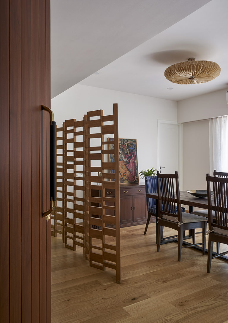
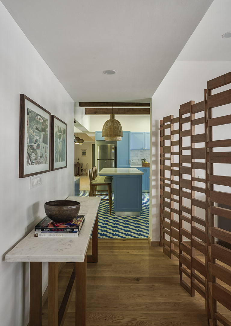
The home now opens into a narrow entryway set right next to the dining and partitioned off by a teak wood partition from Phantom Hands. To the left of entryway is a small mudroom that accommodates storage, gardening tools, shoes and other items.
The entryway is grounded by a custom marble top console table and a simple table lamp from Boconcept. A set of Melvyn Evan prints sit atop the console.
Dining Room
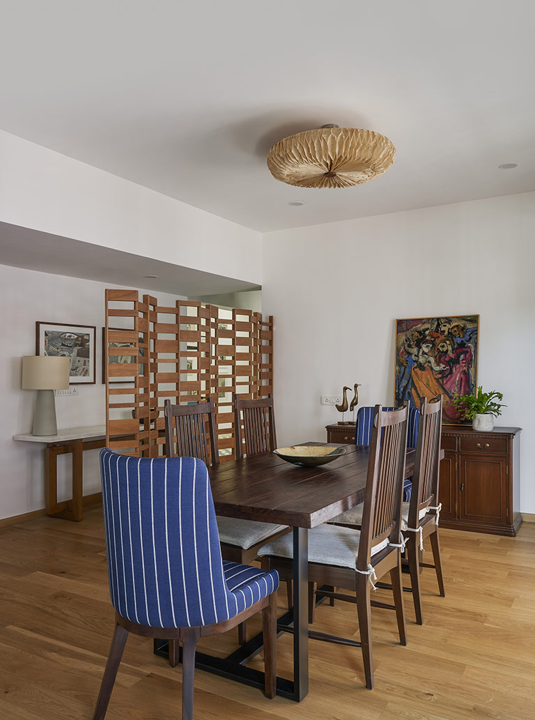
To the right of the entryway is the open dining area accented by beautiful oak wood floors. We replaced the original marble floors here with hardwood floors to warm up the space and help it standout in a long open area. The dining has beautiful french doors that open into a small balcony. These doors were original to the house that we retained and painted white.
The dining area comprises of a 6 seater dining table from Gulmohar Lane combined with vintage balinese slat back chairs and navy stripe upholstered head chairs also from Gulmohar Lane. The lighting is a beautiful ceiling flush mount in banana fiber from Oorja Lighting.
Lounge
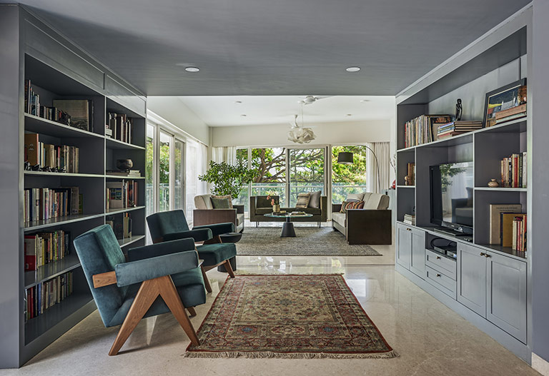
The dining leads into the lounge area that had very low ceilings due to a structural issue and we decided to paint the entire lounge area a beautiful shade of gray for the walls as well as the ceiling. This allowed the space to stand out beautifully!
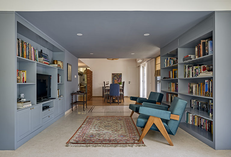
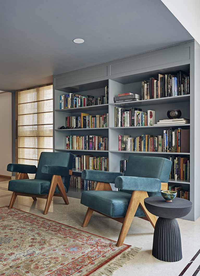
The lounge is enveloped in tone on tone grey wall to wall cabinetry that houses the clients large collection of books on one side and a TV on the other! Beautiful mid-century style teal velvet upholstered Pierre Jeanneret reproductions grace the lounge and make for a comfortable seat for the couple!
Living Room
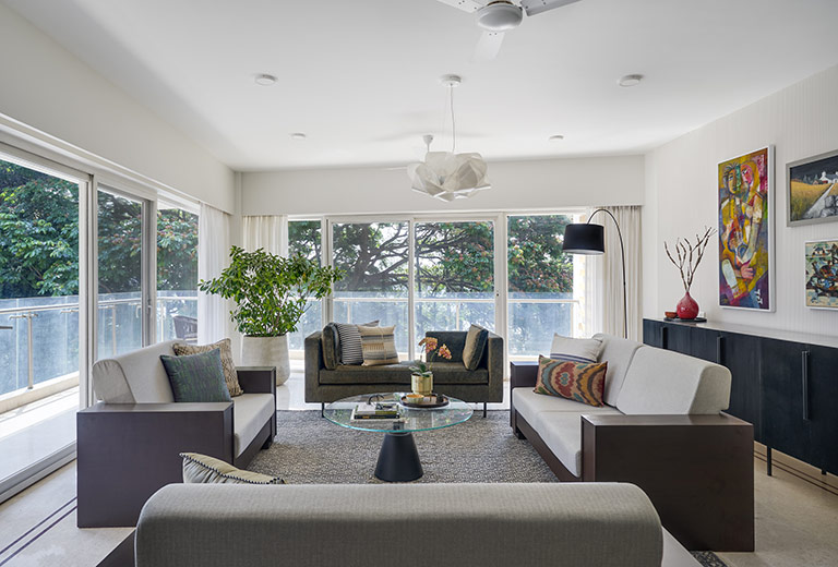
As you walk further into the lounge, the massive angled living room with a beautiful view of Ulsoor lake makes its appearance.
The living room is large, filled with natural light and we wanted that and the view to remain the focus! The entire room is painted white and a single wall is accented in a fluted plaster texture. This wall anchors some of the clients beautiful art and is anchored by a custom made black stained 10ft long credenza.
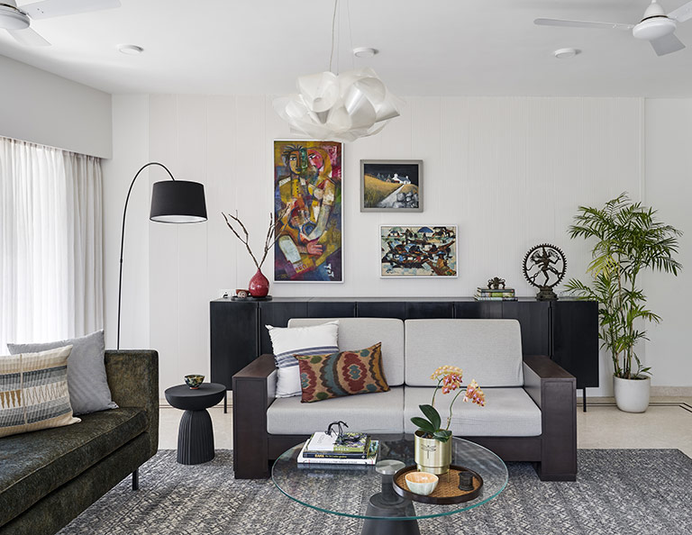
The lighting comprises a Fabula suspension chandelier in a beautiful fluid shape and sharp black arc lamp from Boconcept.
The seating is a wood sofa set that was originally owned by the client now reupholstered and is beautifully complemented by a custom daybed upholstered in a deep forest green fabric that brings in a hint of color in an otherwise monochrome space.
Kitchen
On the other side of the home, the entryway leads into the fun retro cottage inspired kitchen.
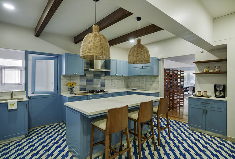
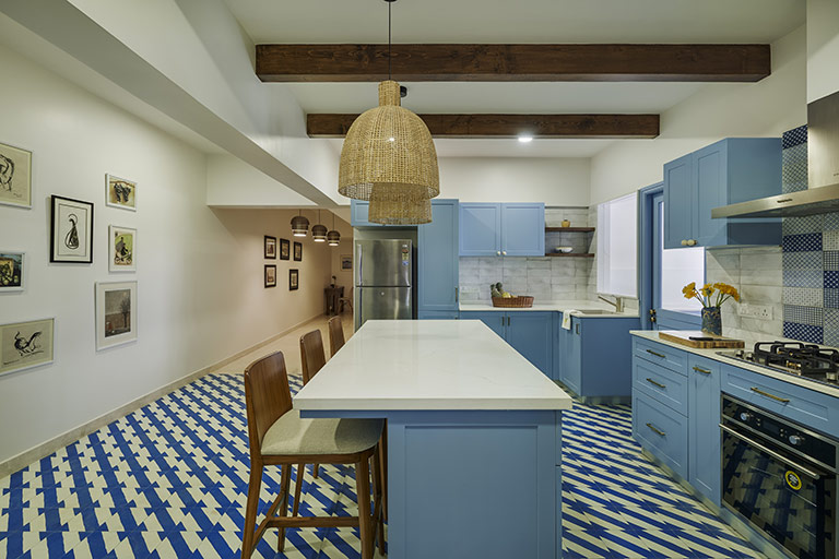 The kitchen floors are dressed in geometric blue and white tiles from Bharat Floorings and the cabinetry is a crisp shade of blue! All white kalinga stone countertops, oversized custom rattan pendants and custom bar chairs round off the look!
The ceiling beams accentuate the height in this area where we retained the original ceiling. A small coffee bar set next to the island is a great addition.
We even added a beautiful dutch door to access the utility area and add some ventilation to this kitchen!

And that was a crisp walkthrough of the living spaces in this home…I’ll be back here soon with more about the private spaces 🙂
Ciao
All pics shot by Shamanth Patil Photography.


 The kitchen floors are dressed in geometric blue and white tiles from Bharat Floorings and the cabinetry is a crisp shade of blue! All white kalinga stone countertops, oversized custom rattan pendants and custom bar chairs round off the look!