Project Reveal – The European Farmhouse Villa – Private Spaces
Created by Vinithra Amarnathan on October 26, 2021
If you have had the chance to walk through the living spaces of this villa, you know how nuanced and beautiful the spaces are and how true to character we have tried to keep the home.
The private spaces are no different and bring in the same old world charm and character in a fresh modern and restrained way! They set a mood, tell a story and most of all feel like home 🙂
Vinithra
Before we take you up the stairs into the larger private spaces, the ground floor houses a bedroom that we treated as the couple’s parents bedroom.
Parent’s Bedroom
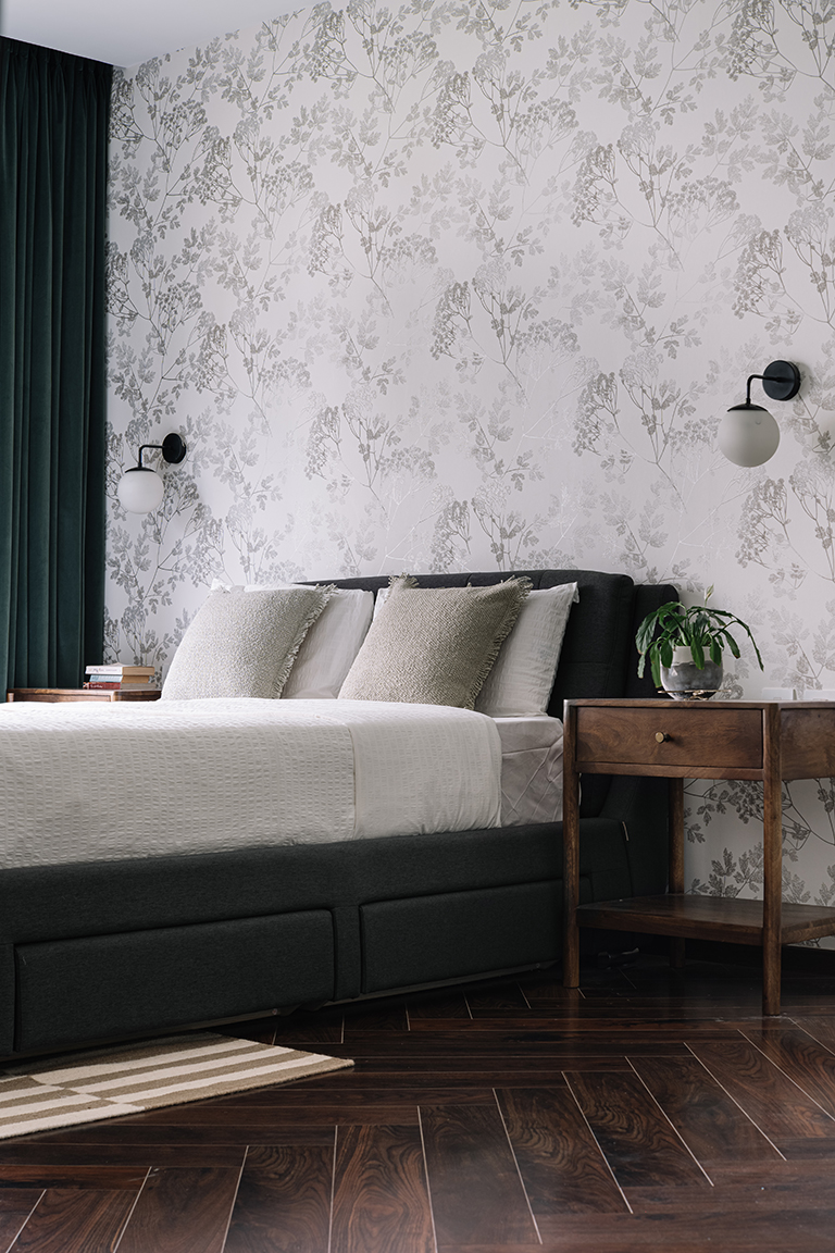
The inspiration for this bedroom stemmed from wanting the colour green to become the visual protagonist. The statement monochrome botanical wallpaper imbues a minimalistic feel into the room against which the preowned charcoal upholstered bed has been placed in tandem with open-legged wooden nightstands above which the white-globed sconces levitate.

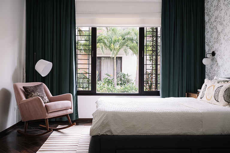
The colour green permeates the space in the form of plush velvet curtains, expressing the depth of the hue while taking in the green views of the surrounding landscape. A blush pink rocking chair occupies a quiet reading corner in the bedroom by the windows. The solid hues in the room have been interjected by the neutral striped rug which grounds the space. A soft sage washes the wardrobe’s exterior, linking it with the omnipresence of green in the palette.

Walking up the stairs we knew we had to create a moment and the staircase landing in this home stops you to take a moment and gaze up 🙂
Staircase
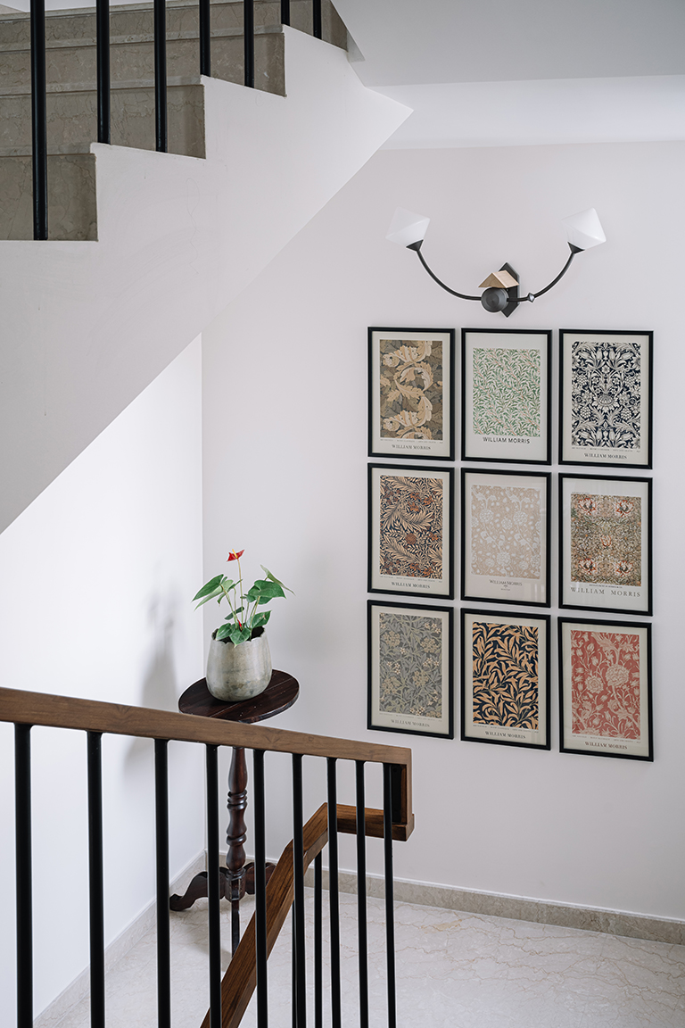
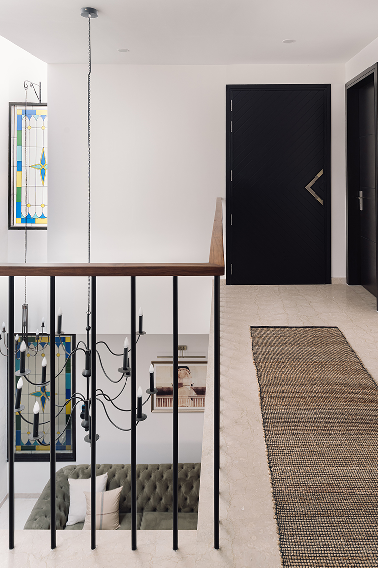
Inspired by a Spanish influence, the primary staircase of the home was transformed to ensure that the presiding design language carries through. The balustrade now comprises suave matte black metal members which connect in the form of a continuous teak-toned handrail that sculpts itself along the stairwell. A set of 9 art prints from the house of British Artist William Morris have been curated to layer the landing space, introducing an interplay of colour and pattern in the space.

FIRST FLOOR
Home Theatre
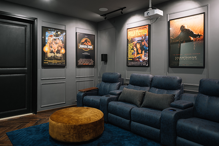
Immersive in its milieu, the home theatre is the couple’s cinematic retreat within the comfort of their home. The sliding barn door is enveloped in a black chevron pattern on the outside and boasts of a leather padding on the interior with rivet detailing. Functionally designed to create an engaging environment, the home theatre exudes a dark and moody identity with the slate grey hue tinting the walls and ceiling uniformly.

The wall mouldings create intentional nooks for the display of movie posters, showcasing some of the couple’s go-to favourites while staying connected to the classical persona of the residence. The ergonomic lounge furniture stays true to the doses of ochre and deep blues that can be spotted across the abode’s shared spaces.

Master Bedroom
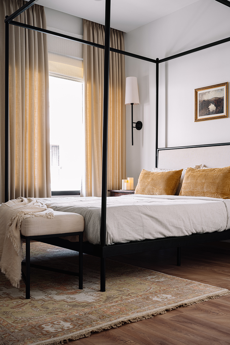
Designed with a deep-dyed penchant for the traditional European aesthetic, the strength of the room’s character lies in its love affair with lyrical nuances. Autumnal colours like ivory, off-whites and mustard paired with accents of black brew visual sorcery in this sanctuary for the couple.

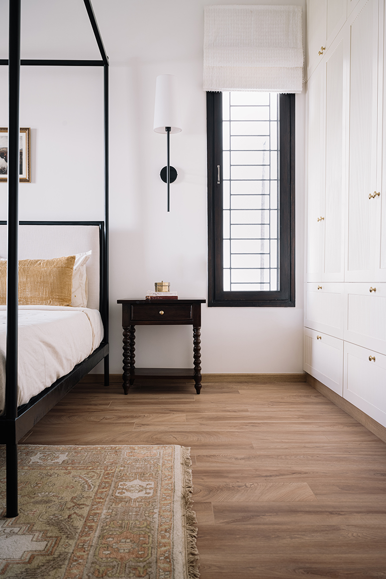
The poster bed with its linen headboard becomes the objet d’art in the room and culminates as a bed-end bench. Archetypal wooden nightstands have been coupled with massive wall sconces that delicately illuminate the bedsides. The pastoral landscape vintage art print above the headboard borrows its hues from the area rug that is garbed in the colours of fall.

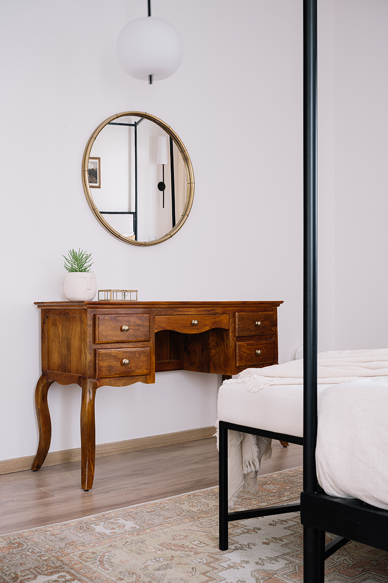
A wood dresser with a brass-framed mirror layers the wall opposite the resting space, further celebrating the deliberately dated charm of the room. The fluted-front wardrobe finished in an off-white shade becomes an extension of the room’s volume.

Master Bathroom
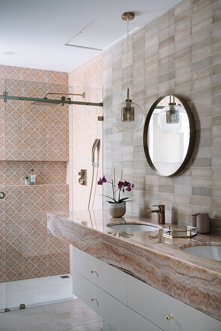
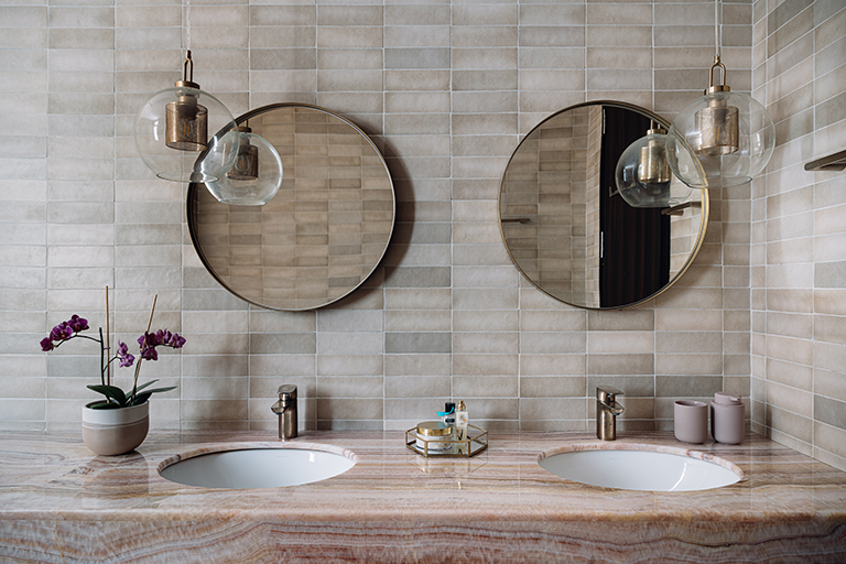
The warmth of the colour palette seeps into the ensuite bathroom of the master. The veined pink onyx double vanity is backed by textured beige subway tiles which extend into the shower in the form of peachy patterned tiles, creating a sense of visual interest. Hints of brass and glass make a cameo in the form of sanitary ware, round wall mirrors and dainty lighting pendants.


Guest Bedroom
Strung together with a driving inclination to introduce an impactful punch of colour while creating a soulful oasis for its inhabitants, the guest bedroom splits the expanse of its walls to summon forth a duality in colour and surface finishes.
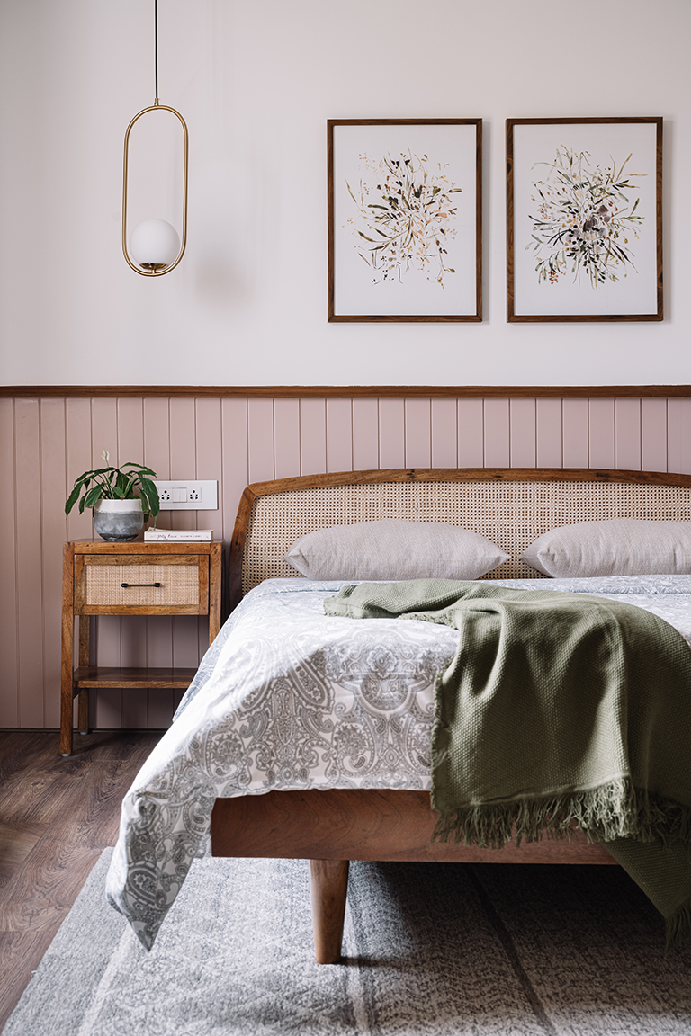
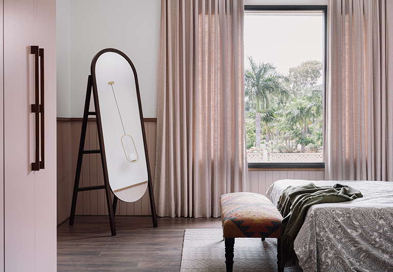
The walls encasing the room have been demarcated by a running wooden profile which renders the bottom half of the panelled surfaces in a salmon-blush tone while the top half in a neutral and pared-down hue. The walls travel the perimeter of the wall, bookending as the wardrobe which also sports the blush tone seamlessly.

The woven cane and wood arched-back bed and complementary bedside tables allow a modern-bohemian essence to trickle into the bedroom. This aesthetic is further elevated in the form of the duo of botanical watercolour prints, the patterned greige rug and the bold eclectic upholstered bed-end bench. An elliptical standing mirror occupies a corner of the room, amplifying the sense of space and light within.

The Den & Home Office
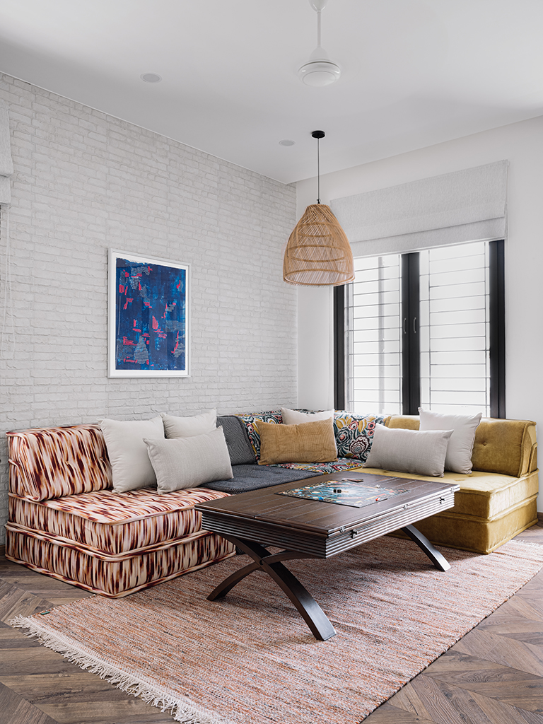
Conceptualised straight off the bat as a space for Arun and Ancy to unwind and possibly host loved ones in, the den is an informal and versatile zone in the home. Meant for evenings dedicated to playing board games and lounging, we introduced a replica of the Mah Jong Modular Sofa that injects colour and diverse function into the space. A beautiful indigo hand made art piece by Hansika Sharma sits against the white brick wall!
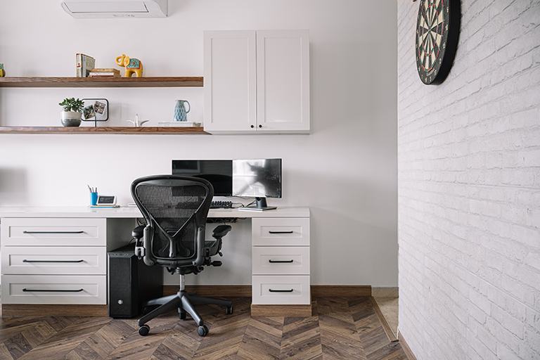
The colour and pattern-hewn upholstery pop brightly against the textured white brick walls. A sumptuous cane pendant, lively woven rug and central wood coffee table embellish the space. The adjoining wall hosts recreational elements like a dartboard ensemble for the couple and their friends to enjoy!

A dedicated minimalist yet effective workstation has been amalgamated into the layout in the form of a running desk with drawers below, overhead cabinetry and open shelving cloaked in a warm white.

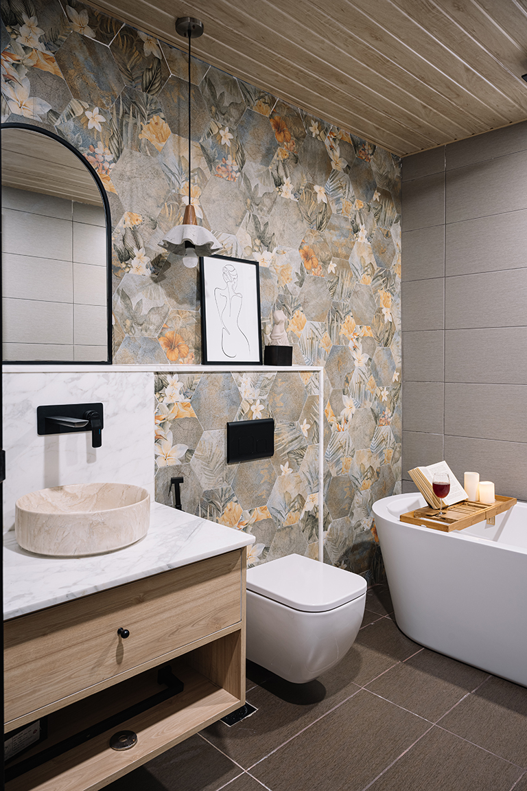
The attached bathroom embodies a zesty tropical character wherein a neoteric bathtub completes the space. Wooden-finished panels line the ceiling, and a grid of hexagonal botanical-printed tiles visually dominate the wall’s canvas. The arched mirror leans against the ledge atop a vanity dotted with light wood and white tones.

At the European Farmhouse Villa, the creative freedom for us as a design firm assumed a newfound definition. With clients who were absolute troopers in spirit, we were able to create a seamless blend of spaces that enabled the resonant design vocabulary and the facets of functionality to come together in harmony, thus creating an atmosphere that echoes quintessential European-style expression.
Content – Lavanya Chopra for Weespaces
All photos shot by Ishita Sitwala
Project Reveal – The European Farmhouse Villa – Living Spaces
Created by Vinithra Amarnathan on October 10, 2021
Almost one year to the date since we started working on this gorgeous home, in the midst of the pandemic, our clients moved in! I truly believe beautiful people make beautiful homes….and this one is another outstanding example of that. Arun and Ancy made this one of our most immersive, nuanced and fun projects to work on….from the minute you are at the front door you know you are in a home that embodies its vibrant and warm home owners.
Bringing this home to life was a passion project of sorts, every little detail thought through and a clear vision that helped us navigate this journey without losing focus and at the same time with the signature spontaneity that we yearn to retain in all our designs 🙂
So excited to be sharing with you’ll all about this gorgeous home ….
Vinithra
Light-filled inviting homes, playful doses of colour and expansive floor plans that allow the outdoors and indoors to converse. The imagery that comes to mind is that of a classic European-influenced farmhouse sequestered far from the reaches of urban chaos.

We crossed paths with the sprightly young couple in early 2020. Ancy Lina and Arun Kumar’s personas are a physical representation of the analogy of ‘Yin and yang’ but in the best way possible! While Ancy’s idea of the aesthetic of the home was connected to a vivid vision, Arun’s practical approach towards design allowed us to string together a design narrative that represented the union of a strong design grammar and functionality.
Located in the residential suburbs of eastern Bangalore, The European Farmhouse Villa is a two-floor residence spanning across 4,000 square feet and was conceptualised and executed amidst a flurry of lockdowns. While the home had to pay homage to the overruling design palette, we were particular to pack in function-driven interventions. The design ethos lay in the creation of a rustic European-inspired farmhouse essence that could come alive within the bare shell of the residence.
Transportive in its aura, the design interventions engage the senses to allow the inhabitants to dwell in a hacienda-style abode, laced with focal details like that of cascading chandeliers, stained glass windows, stucco-sheathed walls, and a spectrum of eclectic patterned tiles. With unpredictable timelines hanging in the balance, the challenge was to ensure the home was not over-designed and that we retained that sense of ingrained spontaneity that we celebrate as Designers! The goal at hand was also to create a cohesive identity that flowed uninterruptedly across the home, tying in each room to the overall design matrix.
GROUND FLOOR
The Porch
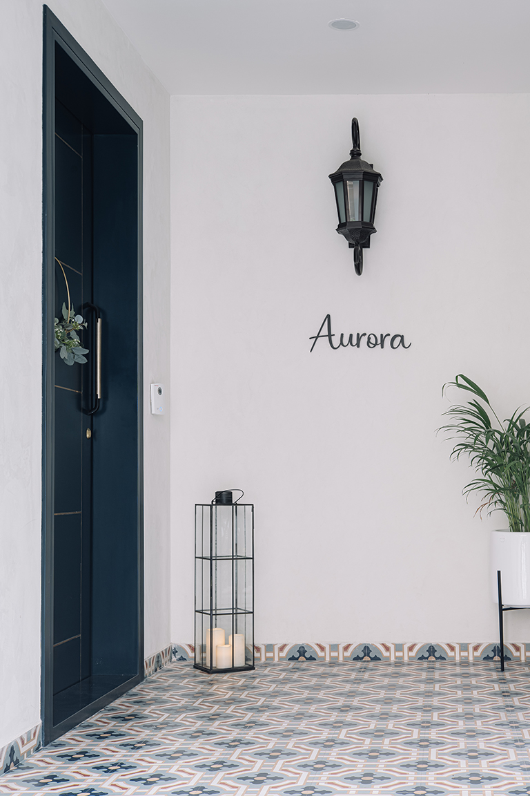
A fleeting yet impactful rendezvous at first glance, the outdoor porch section acquaints one with the design inspiration of the home in a glance! The stucco-clad walls at the façade level hint at the materiality that one can anticipate indoors. The patterned tiles swathe the flooring, introducing shades of blue, taupe and an oxide red. The statement deep blue main door is reminiscent of classic English country home entrances and has been detailed with brass inlay. The tall glass floor lantern and Victorian wall sconce whimsically grace the nook while framing the calligraphic signage.

Foyer
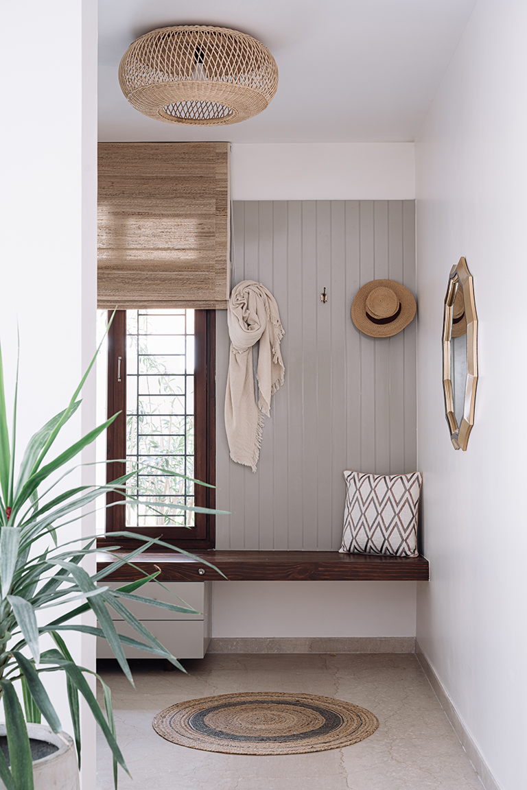
The petit foyer dons a rooted feel and has been reimagined as a minimalistic interpretation of a mudroom that is characteristic of farmhouse dwellings. Washed in umber and taupe tones, a cantilevered wood bench floats against a panelled segment of the wall. A series of wall hooks double up on the function of a classic coat rack, while earthy rattan makes a debut in the form of the woven round area rug and the flush-mount ceiling light which casts beautiful shadows.

Living Room
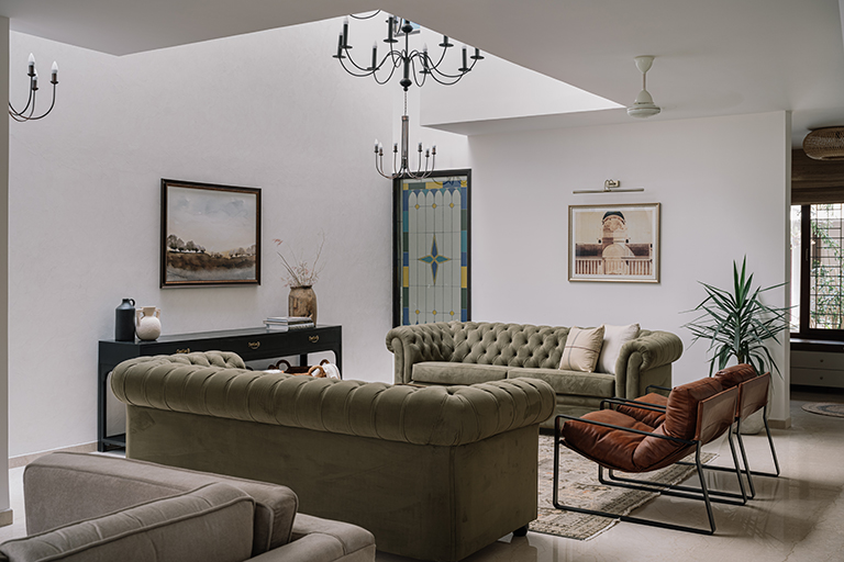
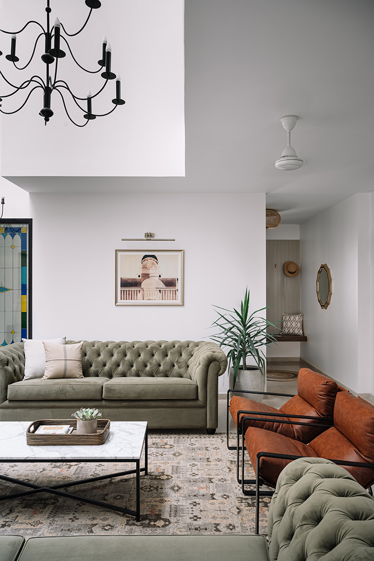
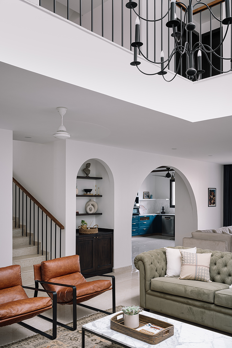
Flushed with light and colossal in its scale, the double-height living area occupies the heart of the blueprint and is bathed in traditional farmhouse undertones. The stucco-finished wall introduces a sense of texture and warmth into the space, creating a neutral canvas against which restrained hues assume centre stage.

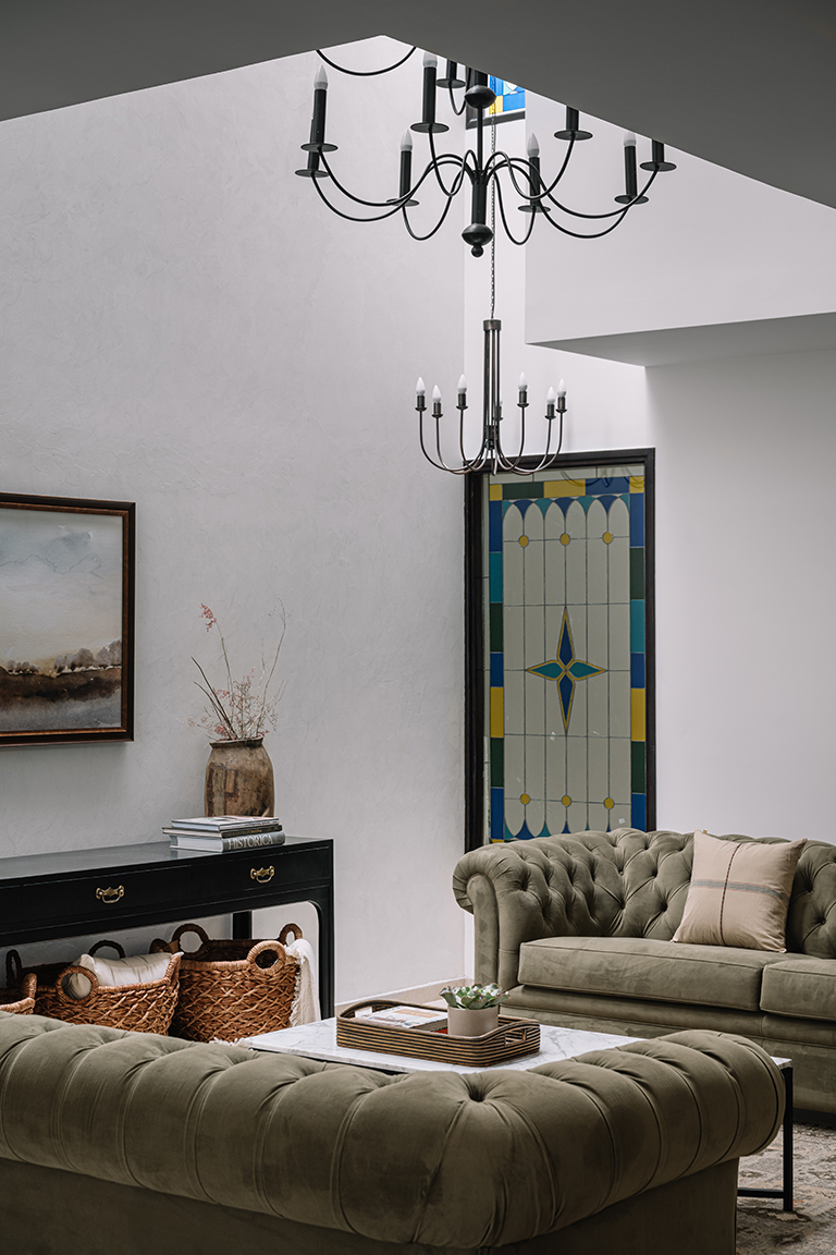
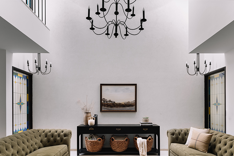
The lofty volume of the space is punctuated by a quartet of stained-glass windows that filter light into the space in strobes of tinted illumination. A trio of black metal chandeliers by The Purple Turtles waft into the double-height space, crowning the conversation area below.

A set of two chesterfield sofas by Chesters in soft olive green are paired with tan loungers framed in sleek black metal silhouettes. A pared-down white marble top coffee table sits atop the artisanal traditional-motif neutral rug by Jaipur Rugs. A dark-stained console with vintage brass handles poses fittingly against the stucco walls and has been peppered with a landscape art print that fills the space with an old-world charm.

Family Lounge
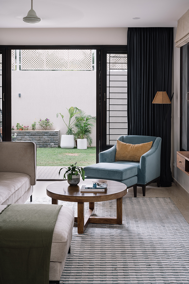
A serene spot perched by the threshold that unfolds into the lush backyard, the family lounge has been conceived as a delightful space meant for the clients to unwind or to entertain loved ones in, capitalising upon its adjacency to the outdoors.

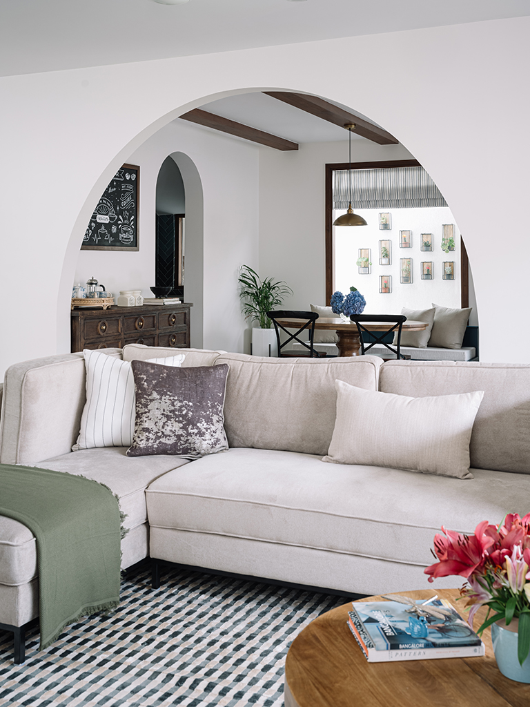
A deep-seated taupe sectional sofa and a Belgian sloping armchair in French blue cum ottoman grace this space while mustard and wood tones layer the area. Deep navy curtains introduce a welcome accent of colour into the lounge.

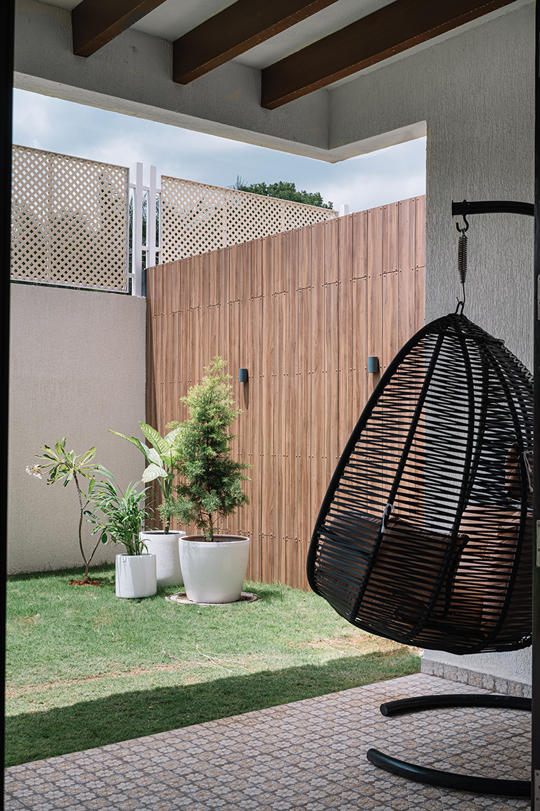
The alfresco deck boasts textured patterned flooring, wooden ceiling beams and a cocoon swing to enjoy downtime outdoors.

An array of arches lines the backdrop of the family lounge wherein the former narrower arch has been fashioned to frame a built-in collage of open wood shelves and dark-stained cabinetry below, creating a charming vignette in the space formerly meant to be a puja in the builder plan. The second massive sweeping arch leads into the kitchen and dining areas, with views of the sizeable picture window in the background.

Kitchen & Dining
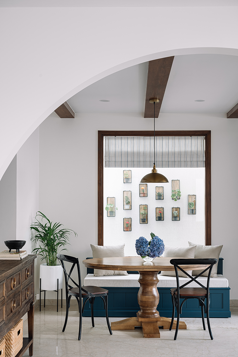
A true-blue ode to the classic farmhouse-style dwellings, the open-plan kitchen and dining are the nucleus of familial buzz — a space that hosts morning cuppas brewing by the coffee station and dinner conversations by the banquet dining nook! The former wall housed an access door to the ancillary sections of the home which was sealed to create a sizeable wood-framed picture window that peeks into the collage of greens outdoors.

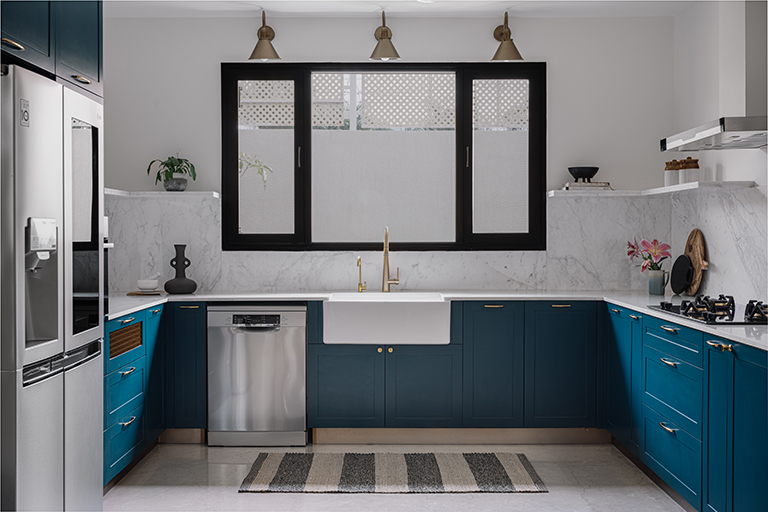
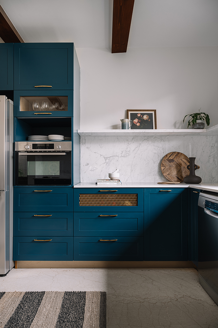
The U-shaped kitchen engulfs the dining area as an organic part of its layout. True to the vision harboured for the space from the get-go, the kitchen is a concoction of classic countryside elements meshed with all the bells and whistles of a modern and functionally adept one!

A classic palette of deep teal-hued cabinetry, brass hardware, and ubiquitous usage of white marble dot the canvas of the kitchen. The golden rule of the ‘kitchen triangle’ was kept alive in the layout, creating distinct zones to optimise function. The pièce de résistance becomes the white apron sink that rests below the crisp black-frame windows lined by bronze gooseneck wall sconces. The handsome marble douses the countertop surfaces and traverses the backsplashes to finally culminate as sleek open shelves.

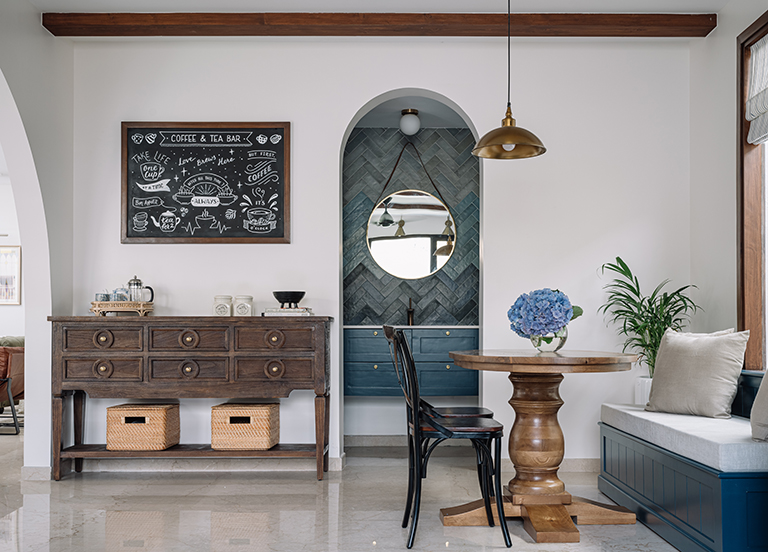
An eat-in kitchen was always on the cards for the clients as they visualised cooking while indulging in simultaneous conversations across the day. The dining space has been earmarked by a banquet seat under the picture window, a robust oval wood pedestal dining table and a few café chairs that rest under the wooden ceiling beams.

Butler’s Pantry & Beverage Bar
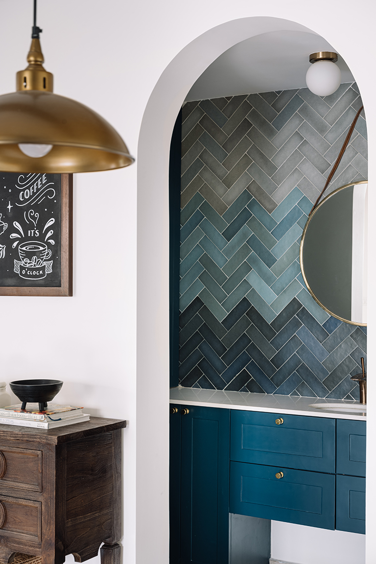
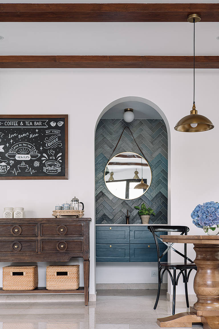
The butler’s pantry flanking the dining area houses a wall-mounted washbasin with under-counter storage. The left side of the pantry hosts a larder, and the right side makes room for additional storage. The hero in this compact space is the ombre-washed tiles that dabble in a spectrum of blues and greens.

A custom coffee and tea bar made for an idyllic addition, creating a dedicated corner for the beverage connoisseurs the clients are at heart. A distressed wood console adds umpteen storage to the nook while the chalkboard introduces a sense of whimsy!

Text – Lavanya Chopra for Weespaces
Pics shot by Ishita Sitwala
Project Reveal – The California Chic Home
Created by Vinithra Amarnathan on October 1, 2021
When interior designers say every project is special it’s true….but some just tug at your heart! This is one such!
Its not always that we come by a project where decisions are effortless, stay true to the original vision and encompass a narrative that’s so close to your personal style! The California Chic is such a nuanced and beautiful home that stays strongly rooted to a vision and a vision that was shared by us and the client from the get go!
And you can see that in every little nook of this home. I’d love to move in….just sayin 😉

Our clients Sowmya and Vinay wanted a home that reflected their style of a clean modern space with a laid-back luxe aesthetic that is definitive of the California design sensibility! We connected on that and more….the result is a home that feels effortlessly cali chic 🙂
The apartment is approximately 3200 square feet and located in a premium community in South Bangalore. Let me walk you through this lovely home!
Entryway
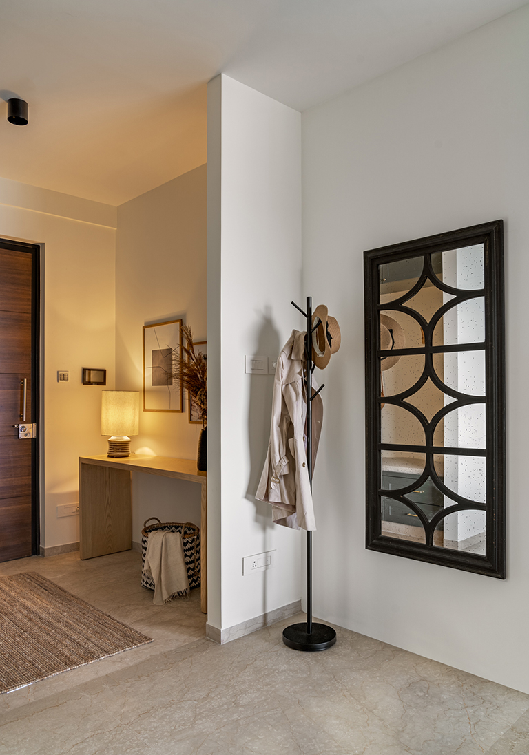
The apartment opens into a small but well-defined foyer area that’s highlighted by a simple waterfall console table clad in oak veneer. Styled with simple earthy elements and a table lamp for lighting it makes for an inviting and cozy entrance.

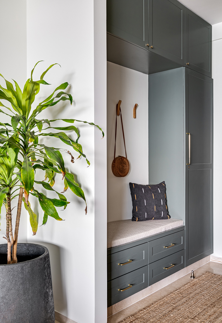
On the opposite side keeping function in mind, we created a small mudroom painted in a tone of deep sage to complement the raw wood console that offers storage for all entryway essentials for a young family. The mudroom has a small bench seat accented with sharp leather strap hooks.

As you walk in through the entryway you catch a first look at the expansive living and dining area with a long balcony sitting afront.
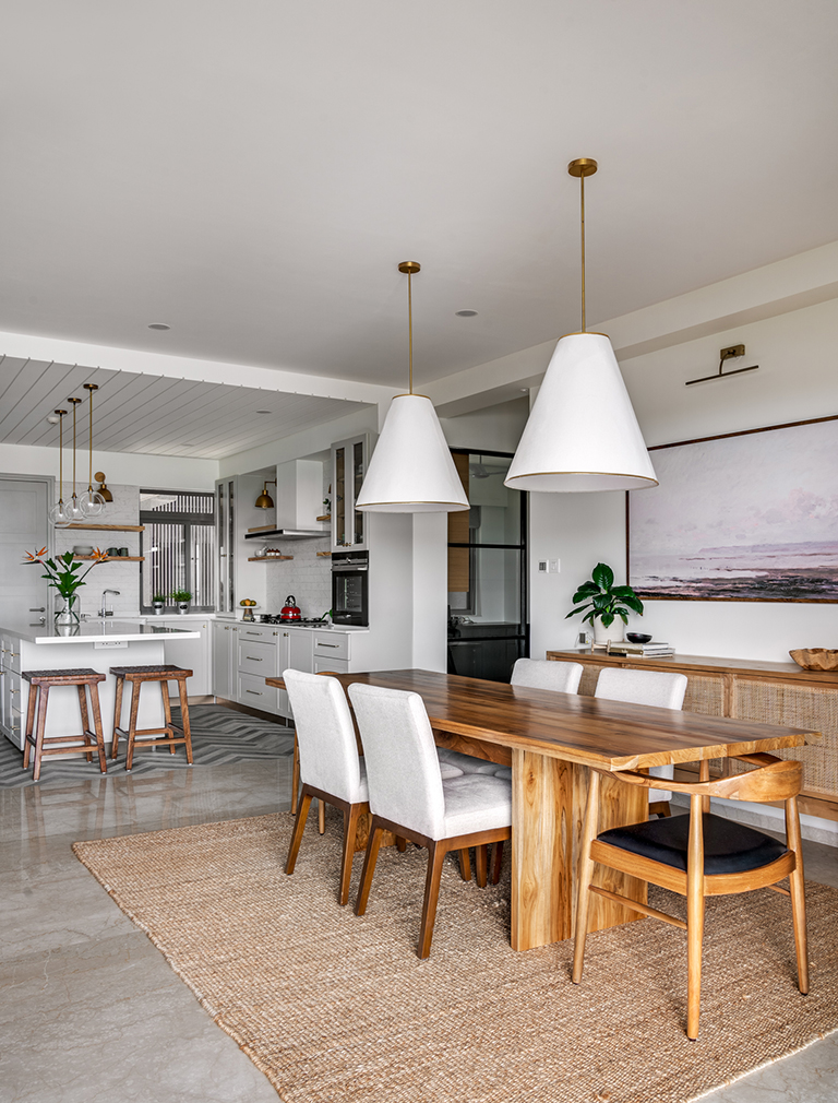
The open plan living, dining and kitchen form the mainstay of this apartment and beautifully reflect the laidback california chic vibe we wanted to bring to the space.
Living
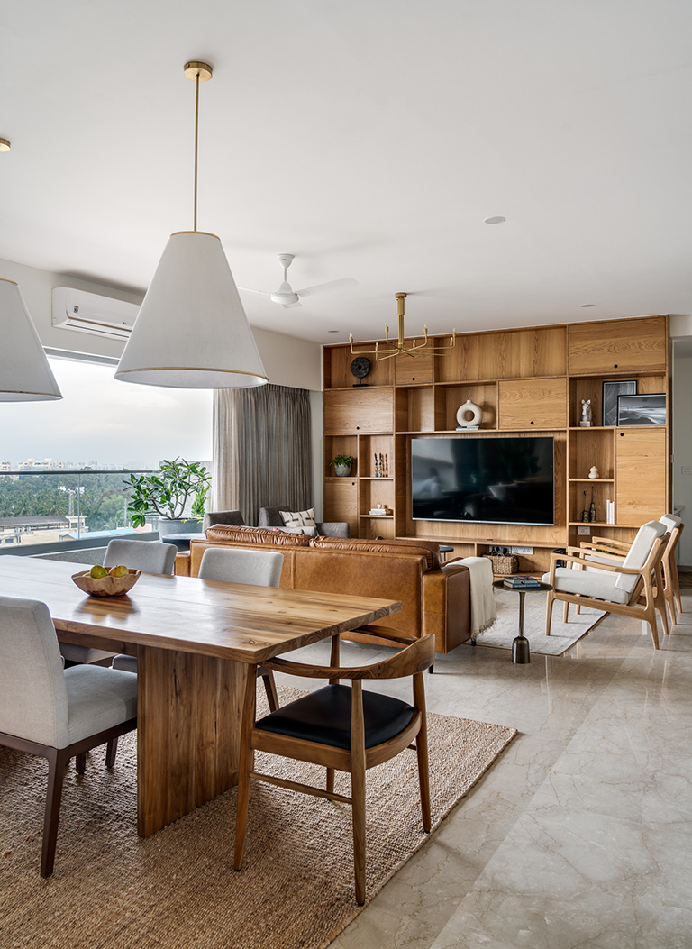
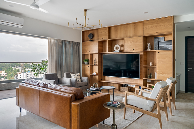
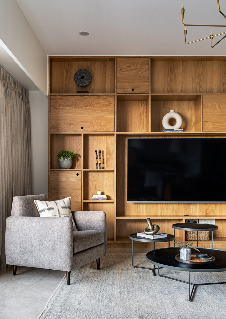
The living room features a built-in wall of cabinetry draped in a beautiful oak veneer all over and houses the TV as well as offers additional niches for display and books. Layered with the natural warm tones of the oak, we brought in distinct pieces of furniture in tones of ivory, gray and classic tan leather.

The forms remain classic midcentury inspired clean lines and balance beautifully against the pastel toned rug from Jaipur Rugs. A sharp cluster coffee table in black from Blue Loft complements all the soft tones and offers contrast while a simple brass chandelier rounds off the space.

Dining
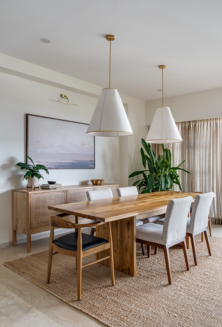
The dining set right next to the living is punctuated by an oversized art print that brings in a California desert feel with muted earthy tones. Two voluminous ivory pendant lamps sit atop a simple oak finished dining table with upholstered chairs and classic bent wood head chairs. A natural wood and cane credenza adds much needed storage to the dining area.


Kitchen
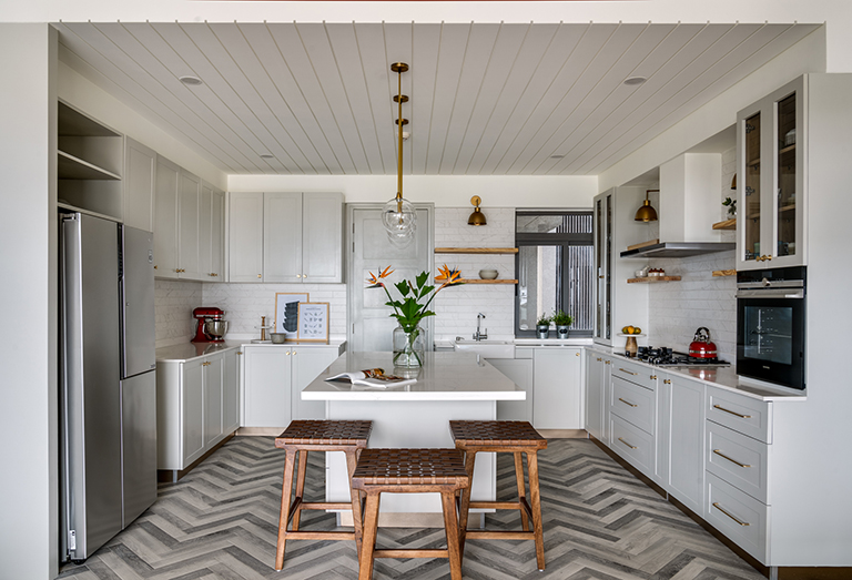
What completes this open plan living area is the beautiful open kitchen! We brought down the wall dividing the kitchen from the living dining areas and created a large expansive open kitchen that now speaks to the living and dining areas which was perfect for the lady of the house who loved to cook and bake!

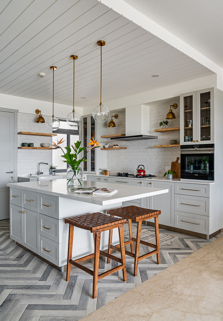
We changed out the flooring in the kitchen to herringbone style gray toned wood tiles. The cabinetry is a soft dove gray and the layout is super functional with an island grounding the center.

Custom brass sconces sit against veined marble subway tiles creating a beautiful contrast. The island is accentuated by leather strap bar stools and simple brass and glass globe pendants.
We added a simple groove detailing to the ceiling to mimic the look of shiplap and I love how it draws your eye up!
Balcony
The open balcony adjoining the living space has a beautiful live edge wall mounted bar table on the dining side where one can sit with a drink and take in the views and small lounge seating area on the living room side that feels like an extension of the living room!
Private Spaces
As you walk into the foyer to the right is a small and well-appointed puja space clad in a custom Kolam inspired wallpaper that leads into the guest bedroom.
Guest Bedroom
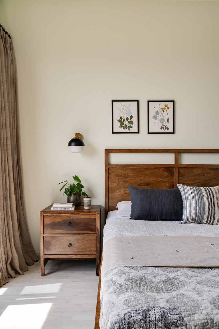
The guest bedroom is designed to be a simple comfortable space for the clients father. The walls are a pastel tone of sage green accented by a warm walnut tone bed and bedside tables. Botanical prints and wall sconces bring in interest to the space.

On the opposite wall we have a simple wall mounted built in desk and chair that offers a functional spot to sit and work or write.
Walking along the kitchen into the hallway, the apartment opens into the private spaces. We converted the open family room, into a home office for our client.
Home Office
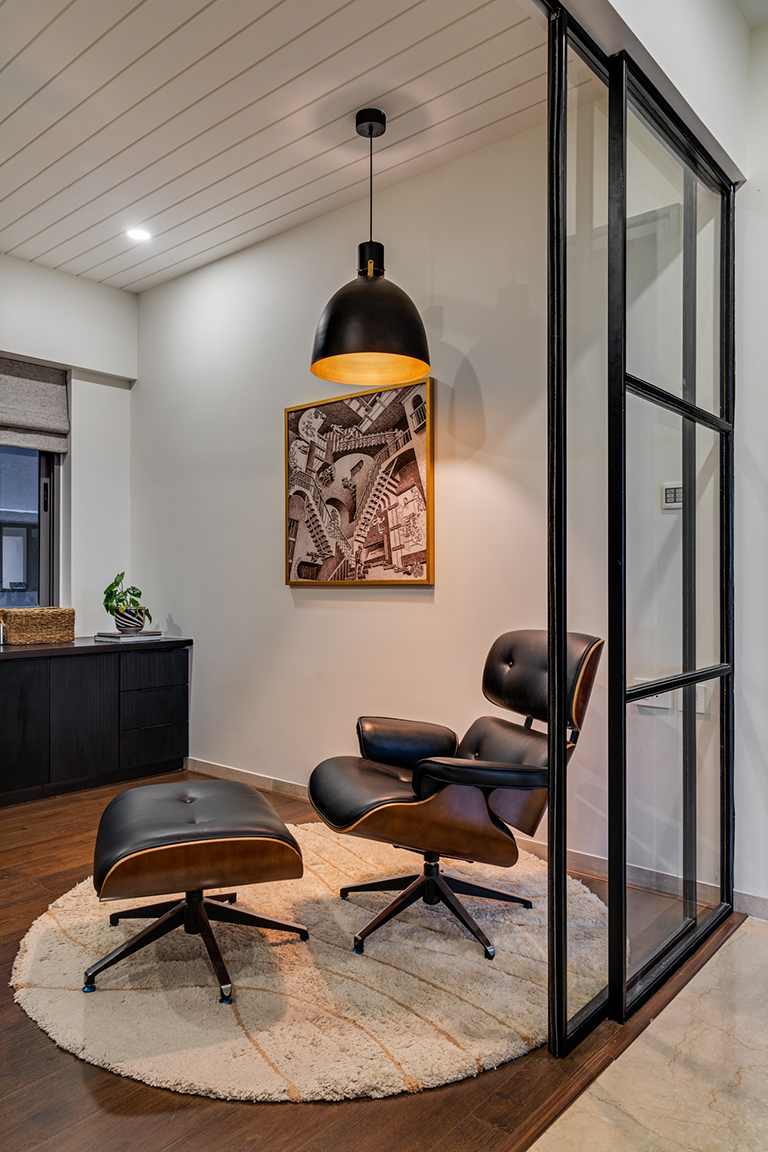
The home office is partitioned off with a custom metal and glass partition and continues the shiplap look ceiling detail from the kitchen. A large L shaped custom desk spans from one end of the room to the other. The desk top is made of black stained pine wood while the bottom shutters show a beautiful fluted front.
The home office has a nook created with an Eames chair replica and an oversized pendant that makes for a perfect spot to sit down with a book and relax!

Kids room
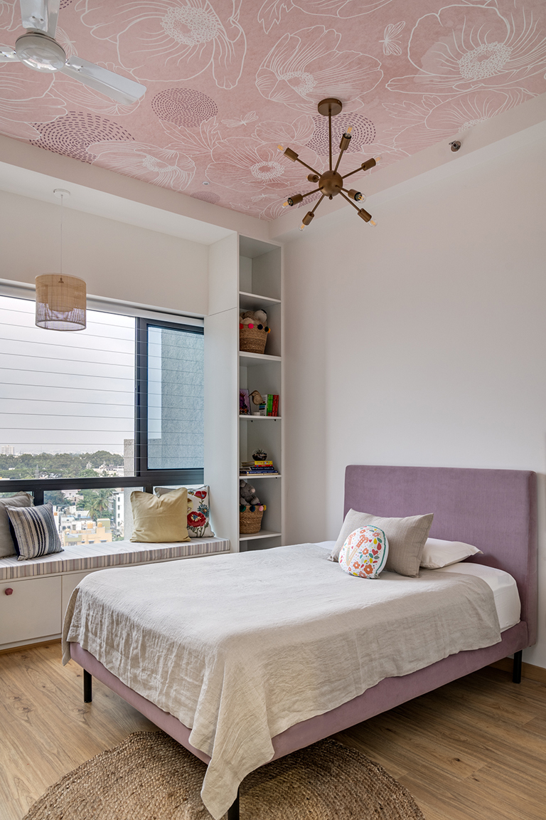
One of my favorite details in the home is the wallpapered ceiling in the kids room. We wanted to bring in a little bit of whimsy without having a pattern overwhelming the space. Adding an oversized floral pattern to the ceiling brought in a sense of scale to the otherwise small room.

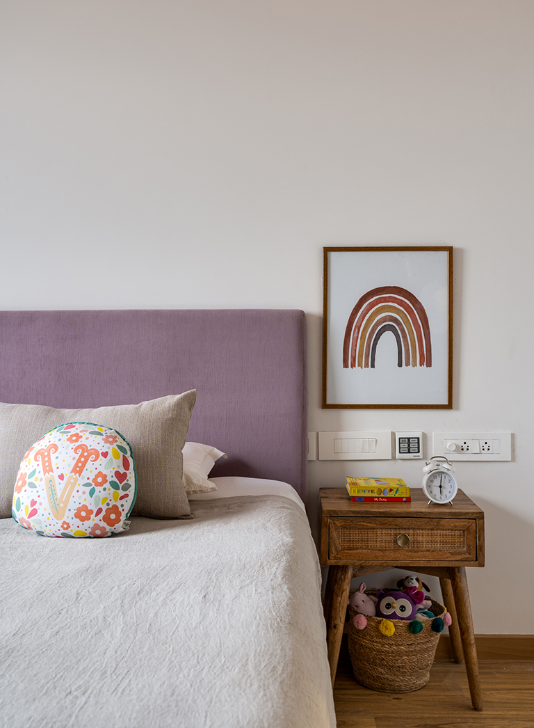
The furniture is simple and has a lavender upholstered bed with white cabinetry all over. We created a beautiful long window bench seat with storage on both sides for the little girls toys and books. A small desk sits opposite the bed.

We added a simple yet striking mid century inspired chandelier to the wallpapered ceiling and a rattan pendant to accentuate the window seat.
Primary Bedroom
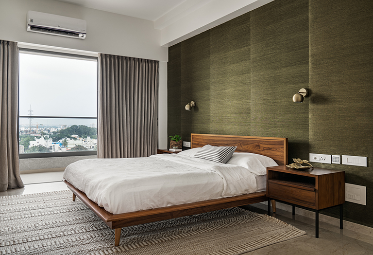
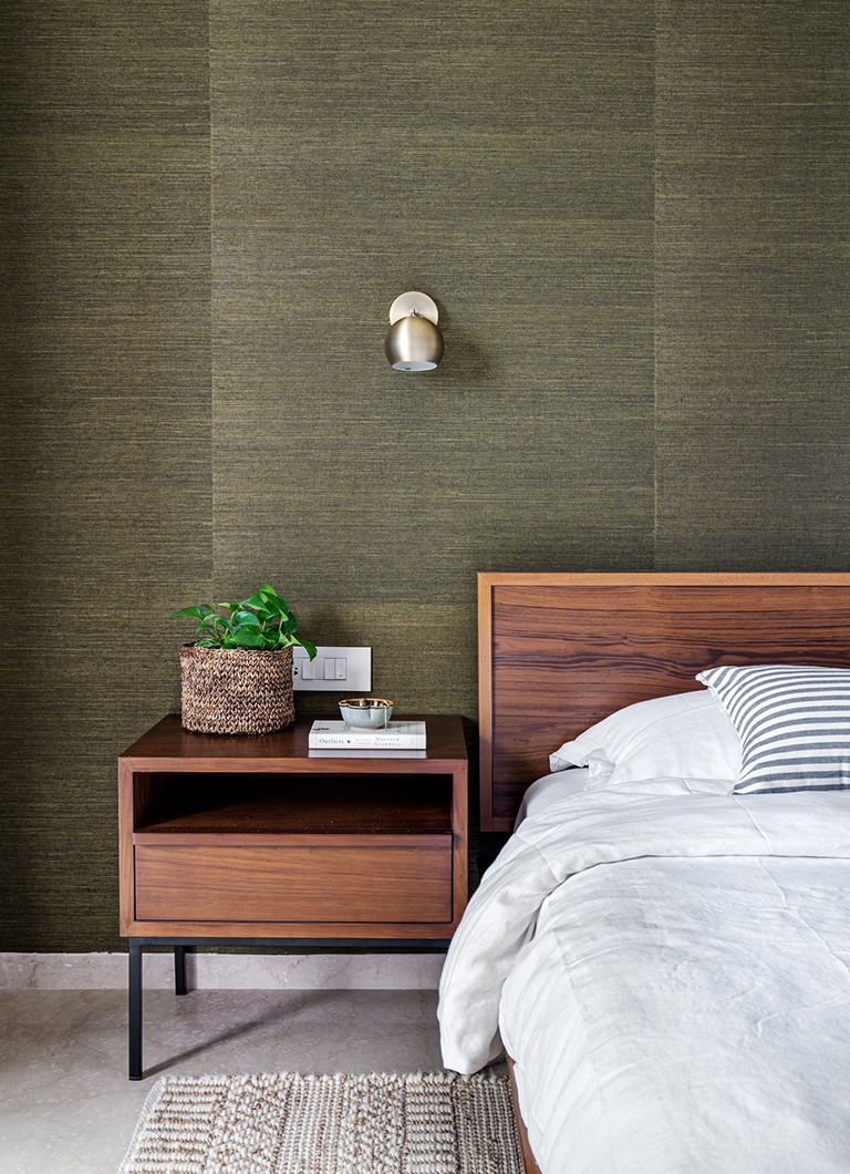
This easily might be one of my favorite bedrooms we have designed in its simplicity and beauty. The wall behind the bed is wrapped all around in a gorgeous Thibaut grasscloth wallpaper and a classic platform midcentury bed grounds the space. Brass sconces from Boconcept bring in a minimal touch to the space.


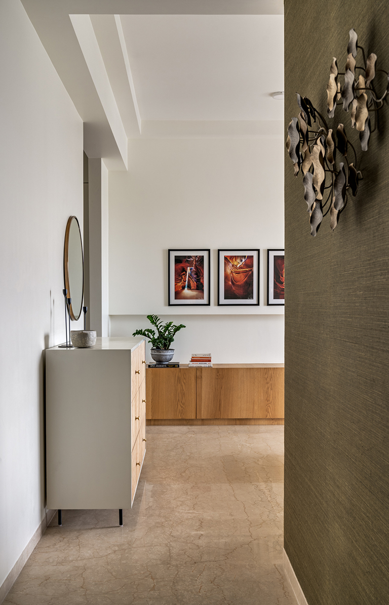
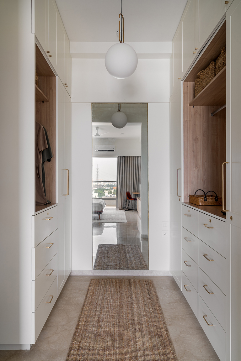
A beautiful fluted wood and white dresser flanks the bedroom wall and leads into an all-white walk in closet. The wall opposite the bed houses the TV and a set of beautiful David Drost prints of the Grand Canyon. The bottom section offers a length of concealed storage for the couple.

The walk in closet is a simple but functional space that has a his and hers closet and a large mirror to ground the space. The look is clean with white, wood and gold creating a beautiful yet simple space.

Master Bathroom
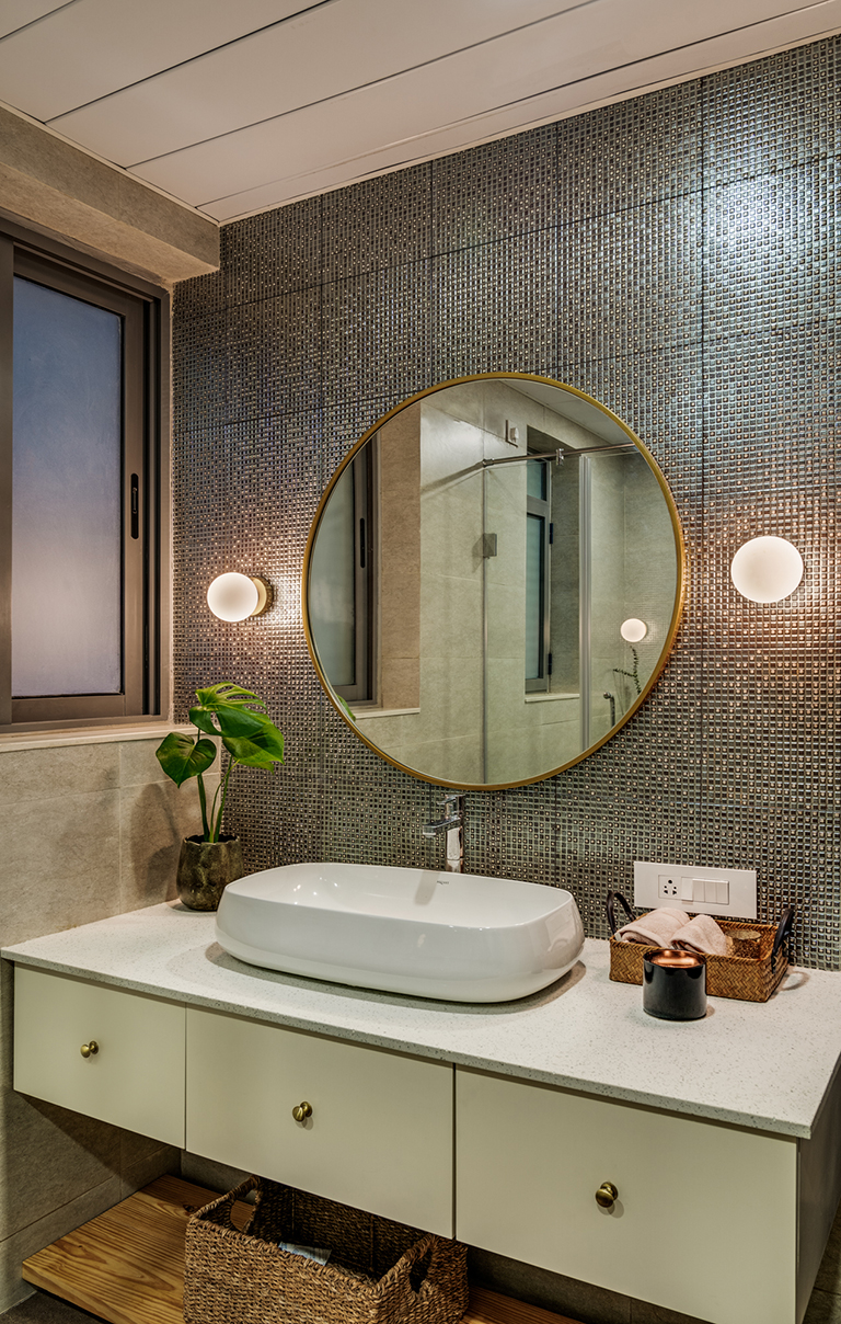
We kept the bathroom simple by adding mosaic tiles in a bronze tone, a round brass mirror and simple brass sconces.

Material and Color Palette
One of the key design elements in the home is the use of warm wood tones complemented by blacks and whites. Warm wood peeks through in the walls and the furniture extensively while rest of the elements play a textural role.
The color palette is composed of warm earthy neutrals juxtaposed with sharp contrasts being offered by the use of blacks and whites. The palette is defined by ivory, grays, sage to olive tones and warmth from the wood and leather.
I hope you enjoyed walking through this home….like they say ‘Home is a feeling’ and this one definitely feels like a sunny california day!
Hope to see you’ll back here soon 🙂
Vinithra
All pics shot by Shamanth Patil.
