Project Reveal – The New Victorian Remodel
Created by Vinithra Amarnathan on January 30, 2023
Located in an old quiet neighbourhood tucked behind busy streets is this 30 year old ancestral home where our client grew up as a child. Years later when the larger family moved out and Nandish made this his own family home, we had our job cut out to remodel and nurture this home to function for the present day and his young family.

One of our challenges as well as design inspiration came from the need to retain the old world charm and character of the home while marrying it with functionality, freshness and personality for the new generation of inhabitants.
We wanted to be able to build without erasing, create with sensitivity and retain the feel of a generational home that has been brought up to the times.
What was also inspiring was Nandish and Nandita’s past experiences like studying in London, living in downtown Bangalore etc that had shaped their views on design and aesthetic and to cohesively marry that with the character of an old home!
We tried to develop a charming Victorian like town home with character and married old with new to bring in a fresh feel to the home.
Here’s a detailed walkthrough of the various spaces in this split level home.
Entryway/ Foyer
The entrance to the home involved changing the entire stairway and structural changes. We opened up the wall at the entrance and created a large picture window to bring in much needed light and created a small foyer.

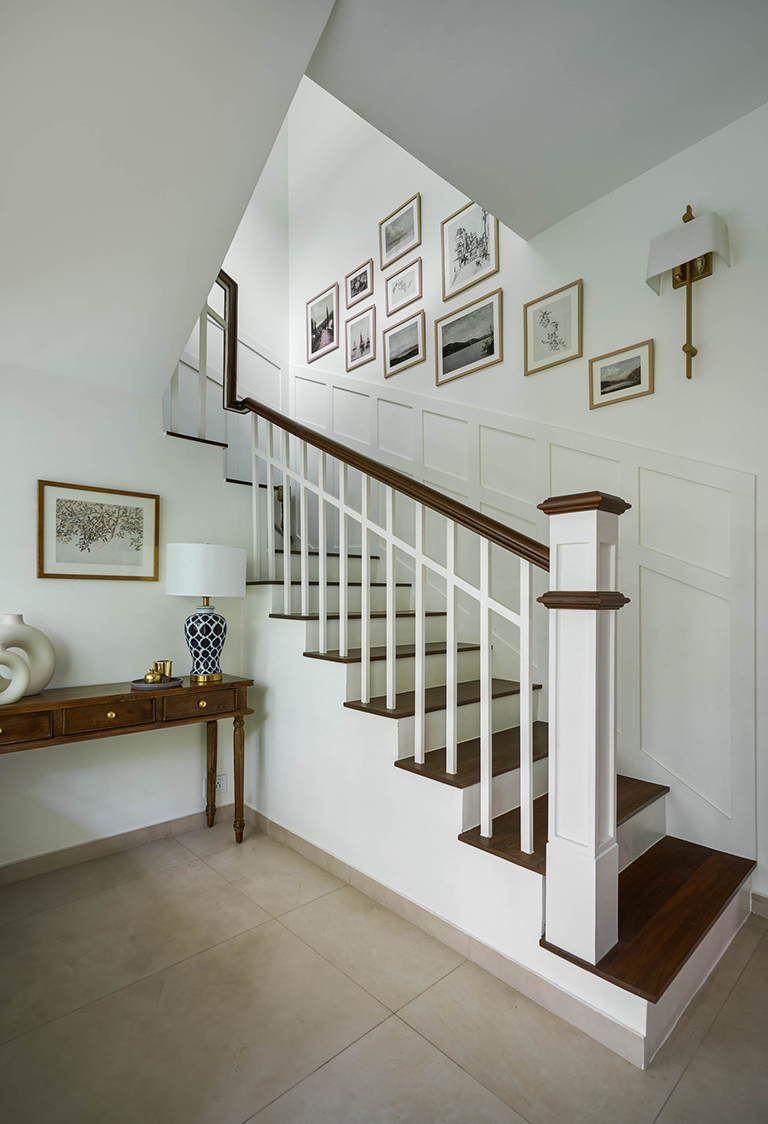
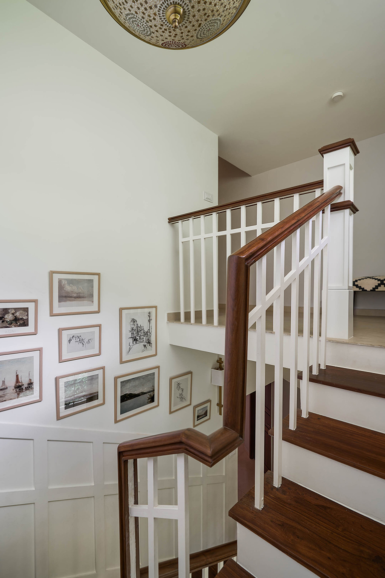
The staircase was entirely remodelled to a wood and white staircase with wall panelling along the sides that enhances the character of the space and brings in a beautiful detail.
Along the panelling we have a gallery wall of vintage landscapes that sets the tone for the aesthetic of the rest of the home.

Living & Dining
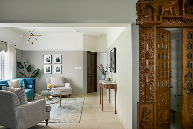
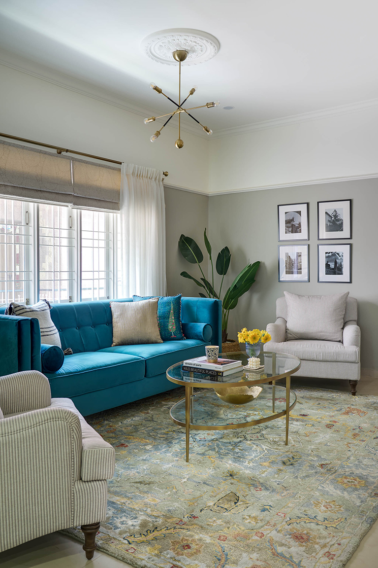
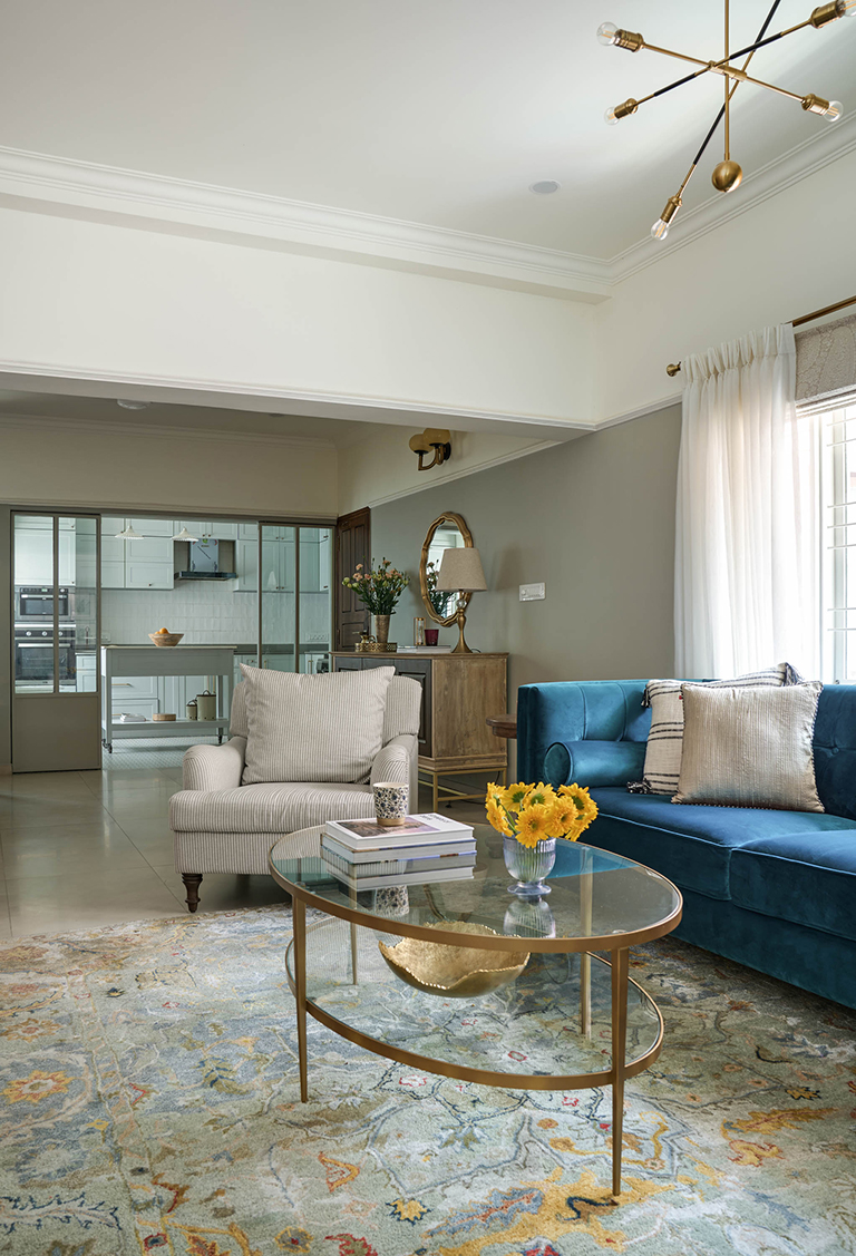
The living room floors are clad in a cool greige tone faux marble tile for easy maintenance. The walls are painted a beautiful tone of soft gray upto 3/4th height and has a beautiful bright white ceiling with a moulded cornice detail inspired by Victorian homes. This also cleverly tricks the eye away from the beams we encountered while taking down the wall between the living and the once powder bathroom and utility.

We removed the wall and integrated the powder with the dining to create a larger space and converted the utility area to a powder.
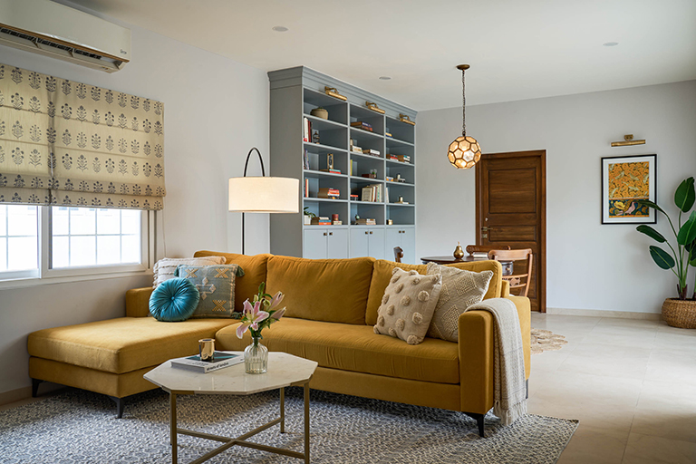
The living room features a teal velvet couch set against the window that brings in ample natural light and is flanked by large English roll arm striped chairs on either side. An oval brass coffee table sits in the center below a modern branch chandelier suspended from a medallion to create the perfect balance of old and new.

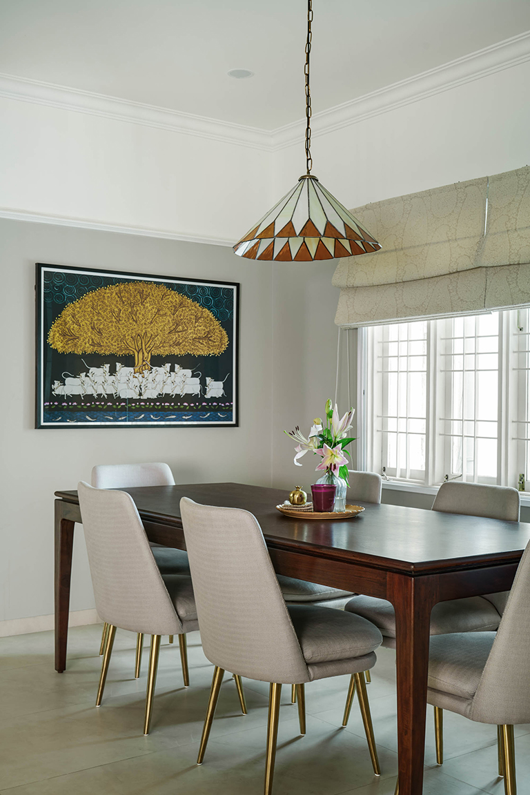
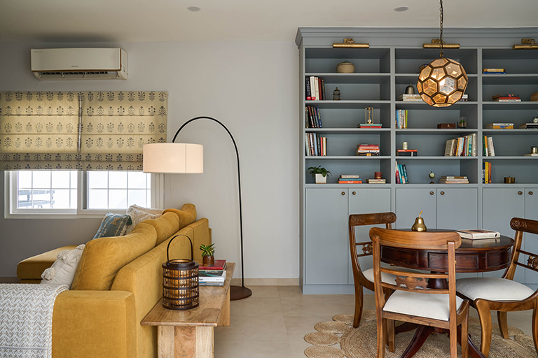
The adjoining dining space sits in front of the puja that has hand carved teak doors and features a beautiful walnut dining table and upholstered chairs.

The pendant is custom made and inspired by the classic tiffany pendant.
A large Pichwai print sits on the far end and hones in on the old meets new vibe we wanted to create.
Kitchen
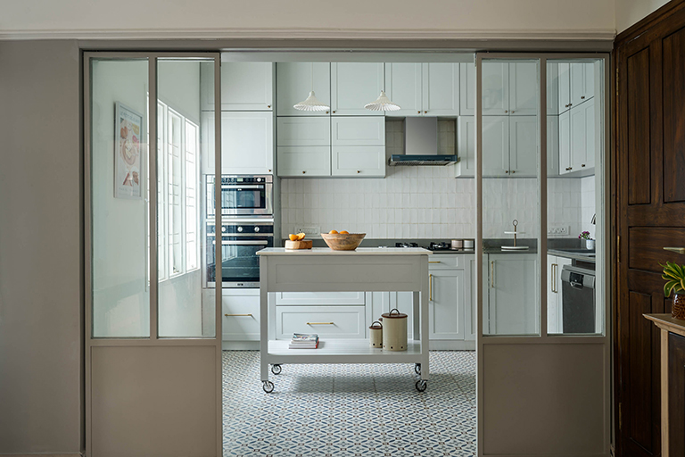
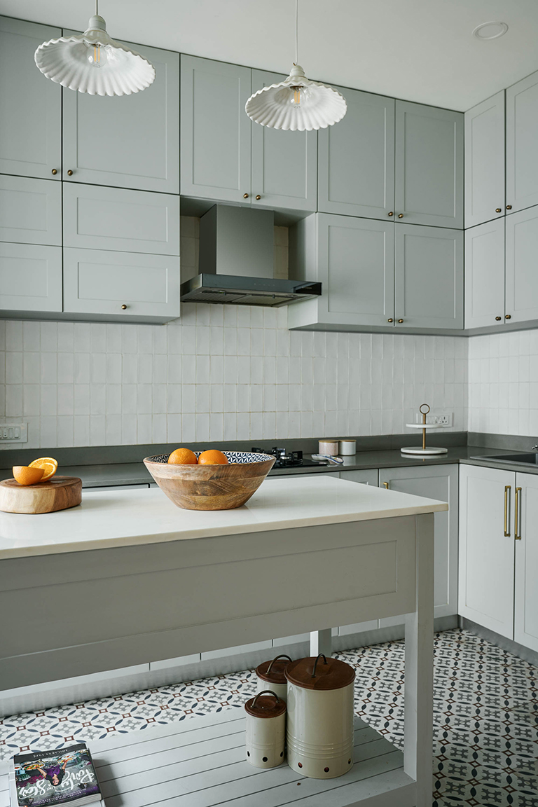
We entirely gutted the kitchen and used a patterned floor tile to create interest while keeping the cabinetry a soft gray to tie with the palette in the living. One of my favorite additions here is the small brick tile stacked vertically to create a simple yet stunning backsplash.


Since the kitchen was small in space we added a prep cart with wheels for convenient use as an additional work surface.
We also added metal and glass sliding shutters to close the kitchen when needed for extra privacy.
Guest bedroom
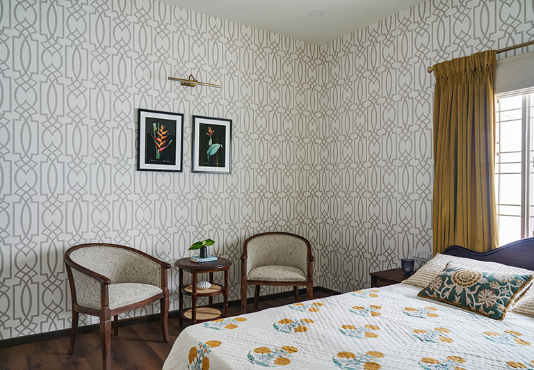
The guest bedroom uses the clients antique rosewood bed and we added a simple geometric wallpaper all over the room to unify the space. An antique armoire and a set of curve back chairs add functionality.

Kids room
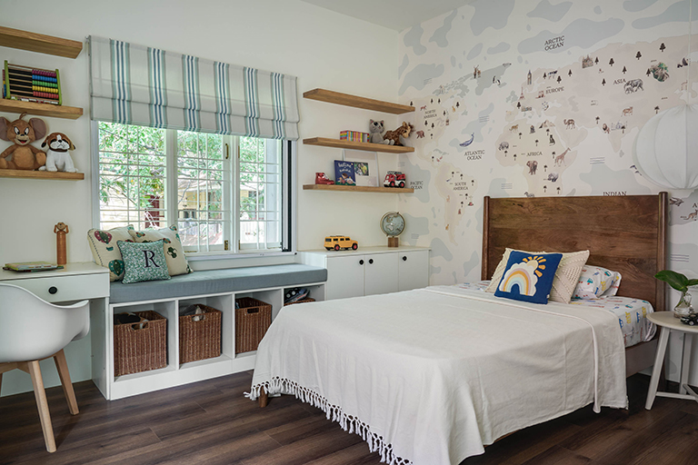
The kids room is a small cozy space for a 5 year old boy. We clad the wall behind a simple teak wood bed in a world map wallpaper and carried through the rest of the space in blues, greys and whites.

A built in desk adds function and a window seat makes for a reading nook!
The second floor in the independent home is imagined as a private space for our clients and has a family room cum library area, the master bedroom and an adjoining terrace.
Family room & Library with Terrace
The second floor was designed as more of a private space for Nandeesh, Nandita and their son. We remodelled the space to house a cozy family room with a TV and and adjoining library area for the collection of books.


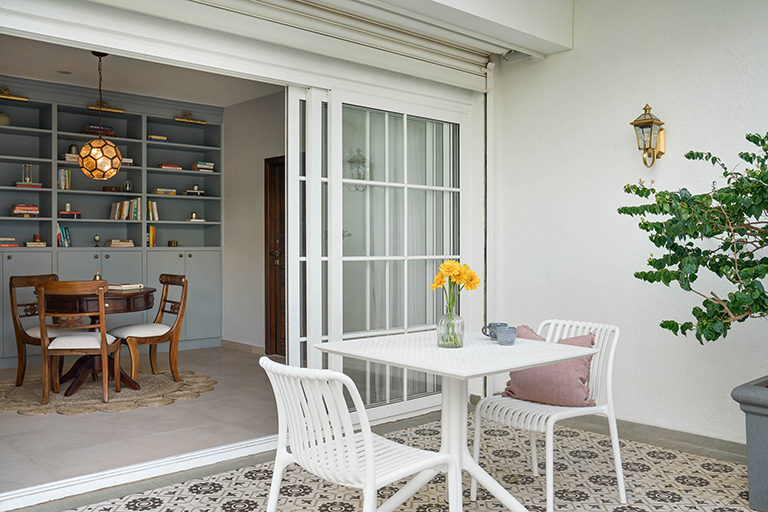
The library opens into a large adjoining terrace. We create a small pergola area for seating and highlighted it with patterned tiles with a Victorian vibe.

Master Bedroom & Bathroom
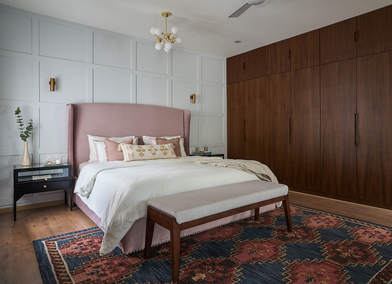
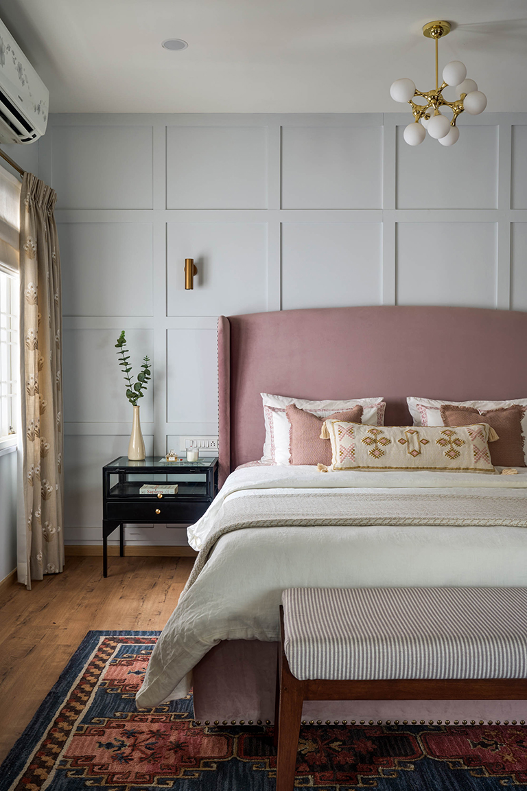
Adjoining the family room is the master bedroom and bath. The master bedroom is decked in tones of blush, gray and beautiful wall to wall walnut veneer clad wardrobes.

A panelled wall forms the perfect backdrop for a blush velvet upholstered wingback bed.

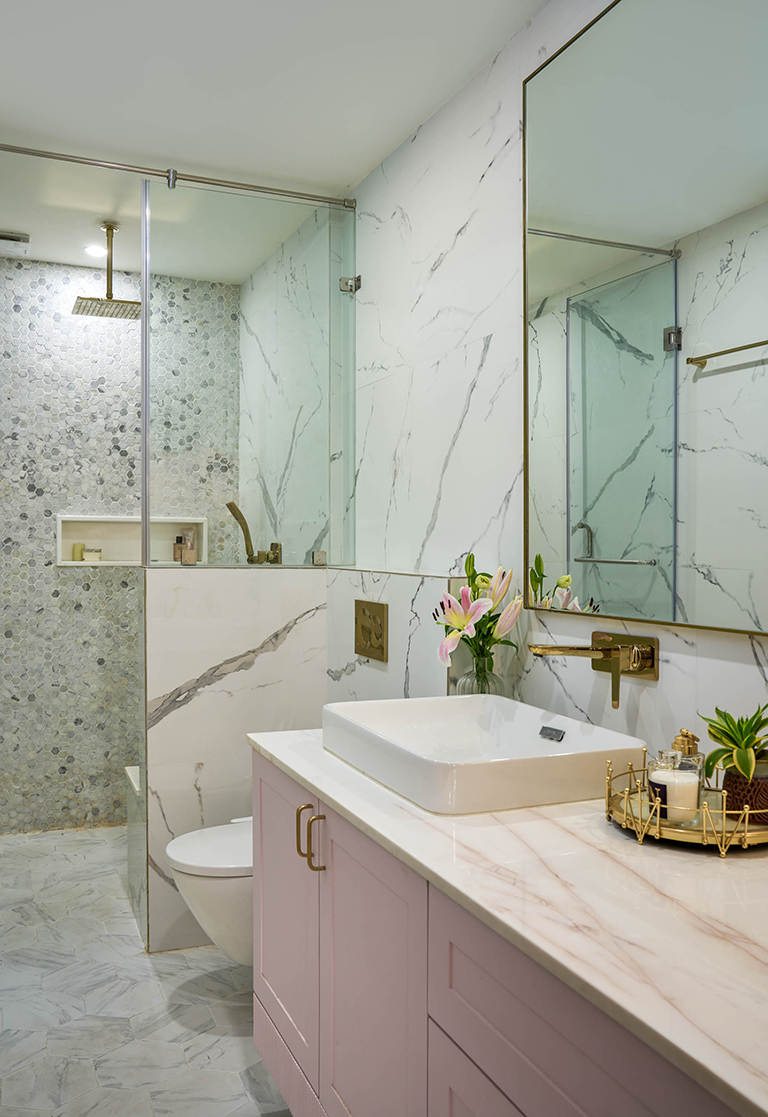
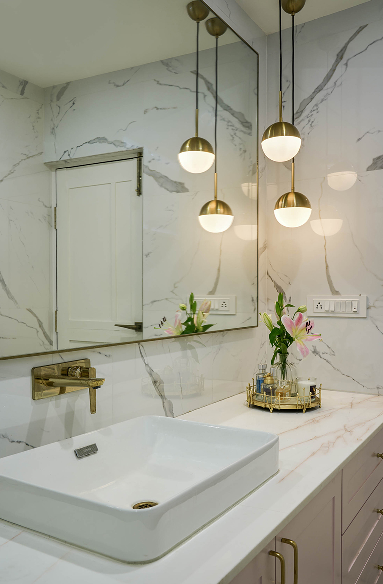
The bathroom vanity is clad in a beautiful rosato marble and hex marble tiles in the shower area that features a small bench seat and a half wall.


Working on this remodel was an extensive process of change and creating a space that’s fresh and modern in its sensibility without losing its character was quite the challenge! I hope you enjoyed walking through this transformation.
Vinithra
All pics by Shamanth Patil
Project Reveal – The California Casual Home
Created by Vinithra Amarnathan on January 16, 2023
Set in a verdant green expanse in small town Belgaum this home brings forth a warm, welcoming and relaxed California aesthetic! Our clients young professionals working in Bangalore after the initial days of the pandemic made the decision to move to a smaller city – Belgaum and embraced the slower pace of life, abundant green and the support of family!
We signed up to transform this almost 3500 Sq ft bare shell apartment into a home that’s young, fresh and modern with a distinct California casual vibe! Being our young home buyers first home this was a home designed with a fresh modern vibe and on a budget.
The home is light, bright and airy in a way that allows natural light to shine. It’s a large expansive open floor plan that brings with it seamless flow from one space to another and an aesthetic that is fresh and modern. The home is built around simple sustainable choices using natural materials like solid wood, jute, hemp and cotton fabrics to create a fuss free and organic space!

Entryway
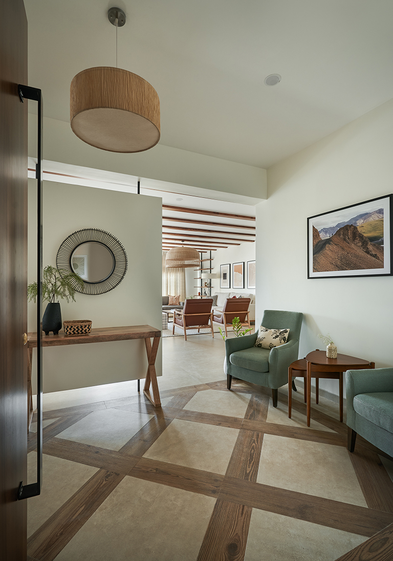
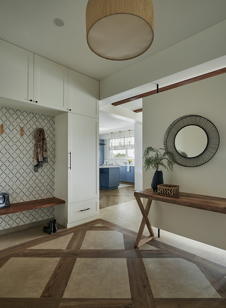
The apartment originally opened directly into the expansive living dining space. To create a visual separation and a foyer area we designed a floating wall that visually separates the foyer from the larger living spaces. This area is further defined by a patterned floor using the wood tile of the kitchen and the neutral marble tile of the rest of the living spaces to create an interesting detail that allows the foyer to stand out.

On one side of the foyer is a beautiful mudroom that provides ample storage for the family and on the other side is a seating area anchored by two upholstered chairs. A simple marble top console and a mirror sit against a floating wall.
The mudroom is accented with a simple wallpaper that carries through the same geometric detail of the flooring.

Living room
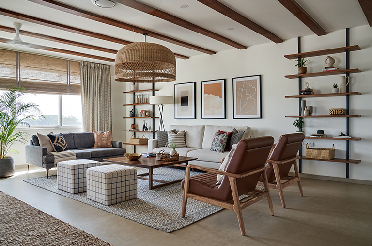
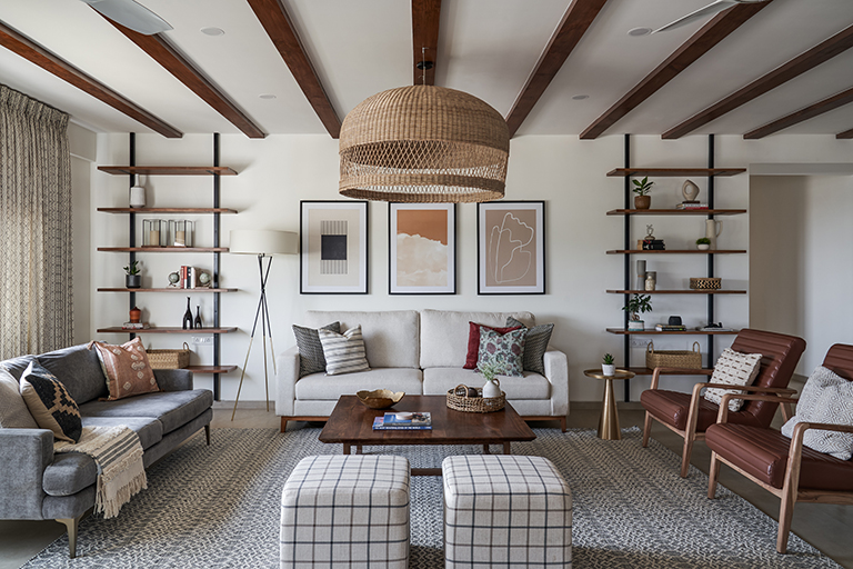
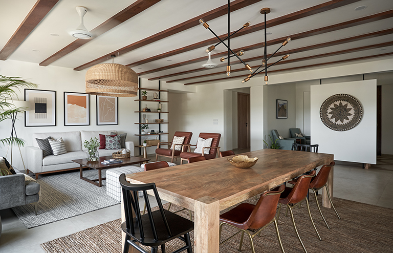
The living room is expansive, airy and beautifully sets the tone for rest of the home with its wood beams, white walls and an oversized rattan pendant. The flooring is a beautiful Italian tile in a seamless concrete inspired ceramic tile from Nexion’s Endless collection. Being a large space it’s ground by a 9X12 neutral flatwoven rug and ample seating with 2 sofas, 2 leather chairs and 2 ottomans. The symmetry in the seating is something we carefully complemented with varying colors, textures and layers!

Two floor to ceiling floating open shelves bring interest and are a clever way to allow for display away from the seating area and little kiddie hands 🙂

Dining room
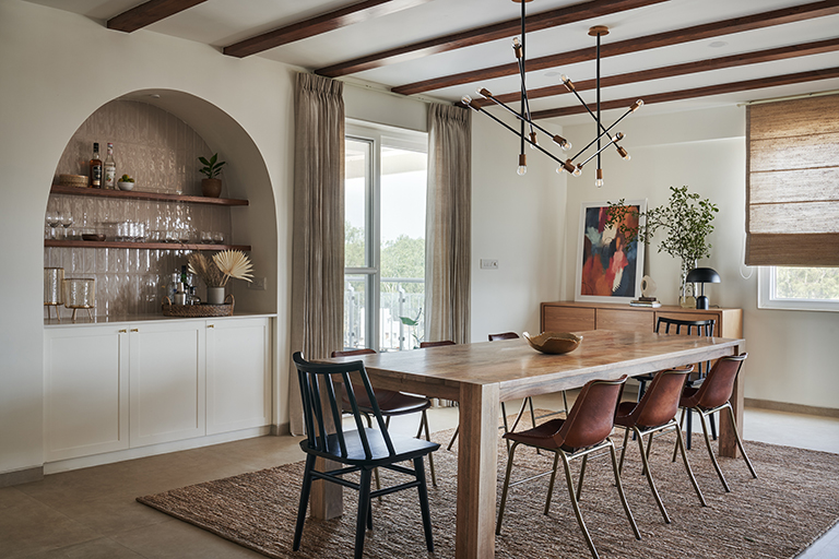
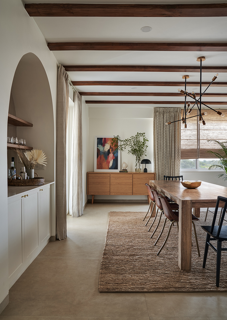
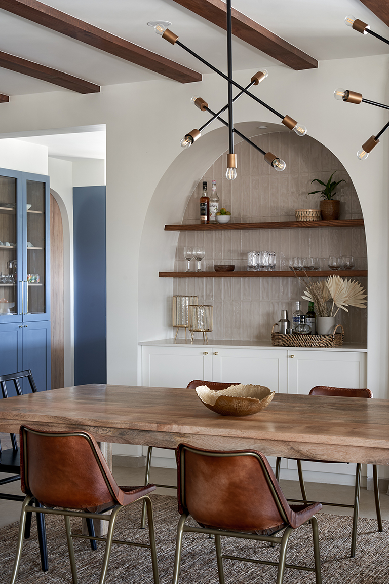
The dining room was designed to be a stylish yet functional space that could serve for the family everyday as well as accommodate extended family and friends. A long 9ft table in natural wood is complemented with sleek leather chairs and modern spindle back chairs in black for added contrast.

Two branch chandeliers in black and brass sit atop the table.

But everyone’s favorite has to be the beautiful niched in arch bar. Clad in neutral subway tile to create a textural backdrop and a clean organic look, the bar is one of my favorite elements in the living dining.

Kitchen
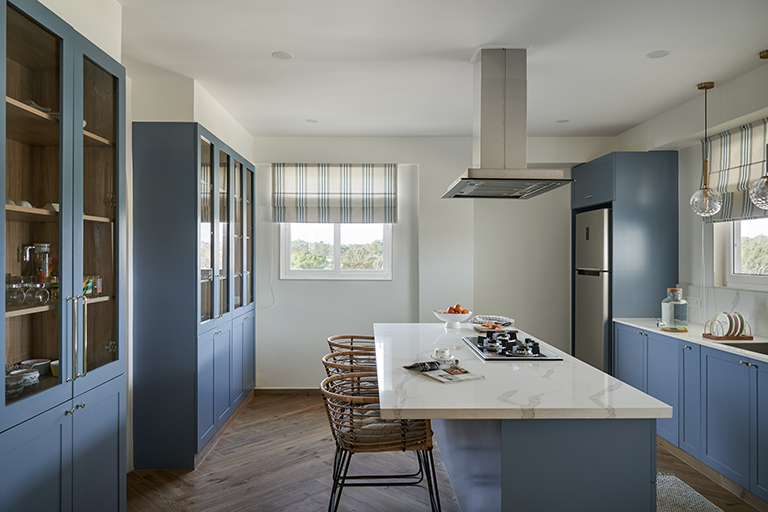
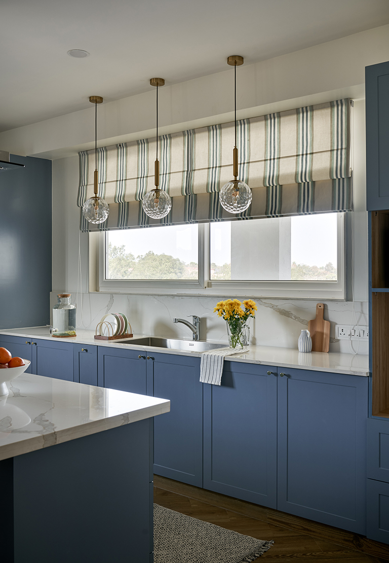
The kitchen was a labor of love! Swathed in a cool blue tone and expansive, its one of those instantly uplifting spaces in the home.

We started off opening up the wall facing the terrace to create a large 8 ft long window that brings in natural light and provides instant interface to the outdoors!

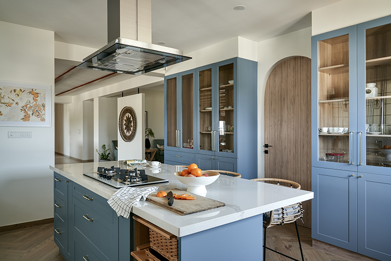
The counter under the window houses the sink and is flanked by the refrigerator and the appliance unit on either side. In the middle of the kitchen sits a large island that holds the hob and makes for an eat in kitchen with bar stools.

The wall to the left facing the island boasts of floor to ceiling storage in the form of a pantry on either side with a small puja tucked in. A beautiful oak tone arch door leads into the utility which has the laundry room and a small wet kitchen.
Master Bedroom
As you walk along the hallway, at the end of the corridor is the master bedroom on one end and the kids bedroom on the other.
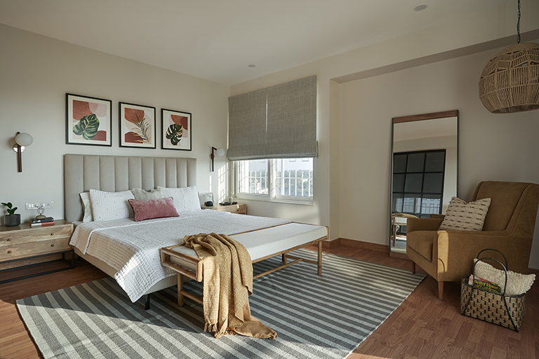
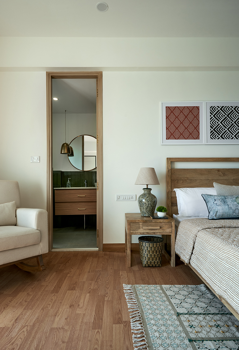
The master bedroom is a large space with a king size upholstered bed and large bedside tables. The overall space is clean, light and modern with touches of natural materials like jute and rattan that keep it looking airy like rest of the home!

A woven rattan bench sits at the foot of the bed and a custom made simple striped rug anchors the space.
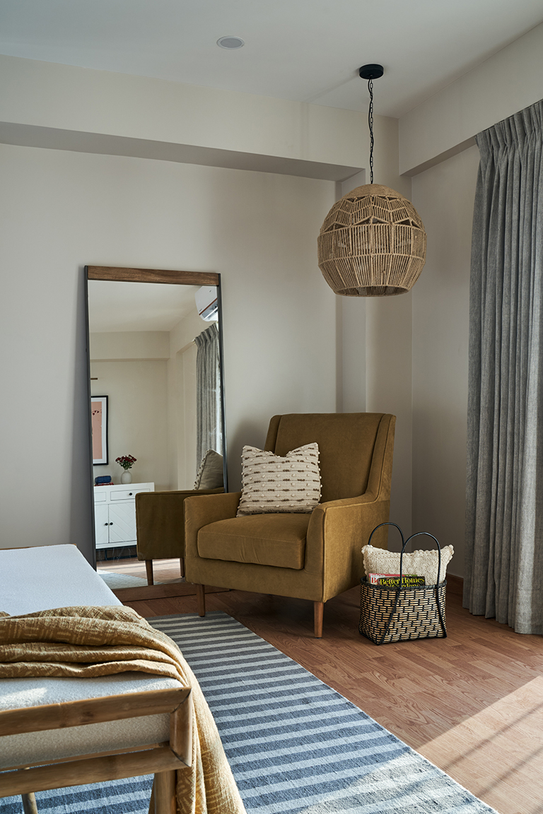
On the opposite side is a large mustard upholstered chair flanked by a full length leaning mirror that creates a beautiful reading nook.

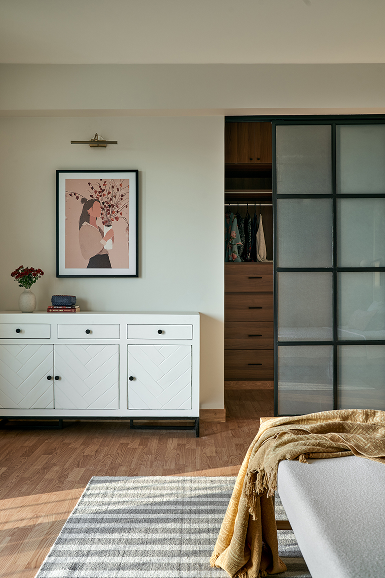
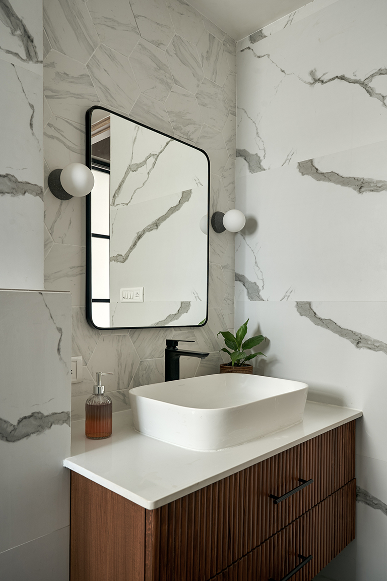
The walk in closet area and the master bathroom are sectioned off with beautiful metal and glass sliding doors. The adjoining bathroom is a monochrome space with simple details that elevate it.


Family room
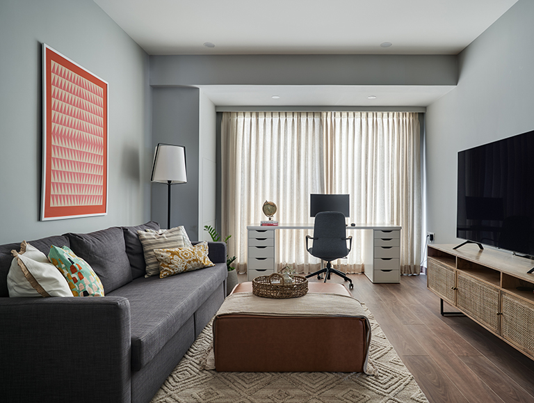
The family room is designed as a space where the family can spend time together. A long custom made work desk sits on one end of the room, which we extended to take in a balcony. This acts as the home office for the couple.

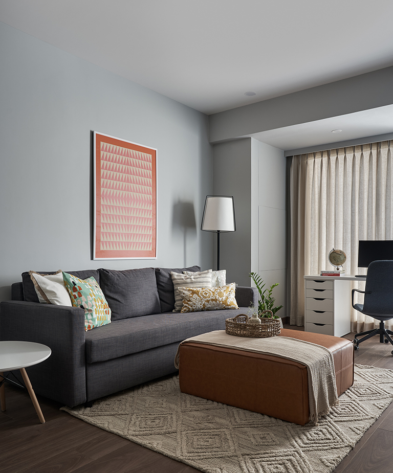
A sofa bed and a large ottoman make for a comfortable spot for watching TV. A vibrant geometric art print adds interest to the grey walls.

Powder bathroom
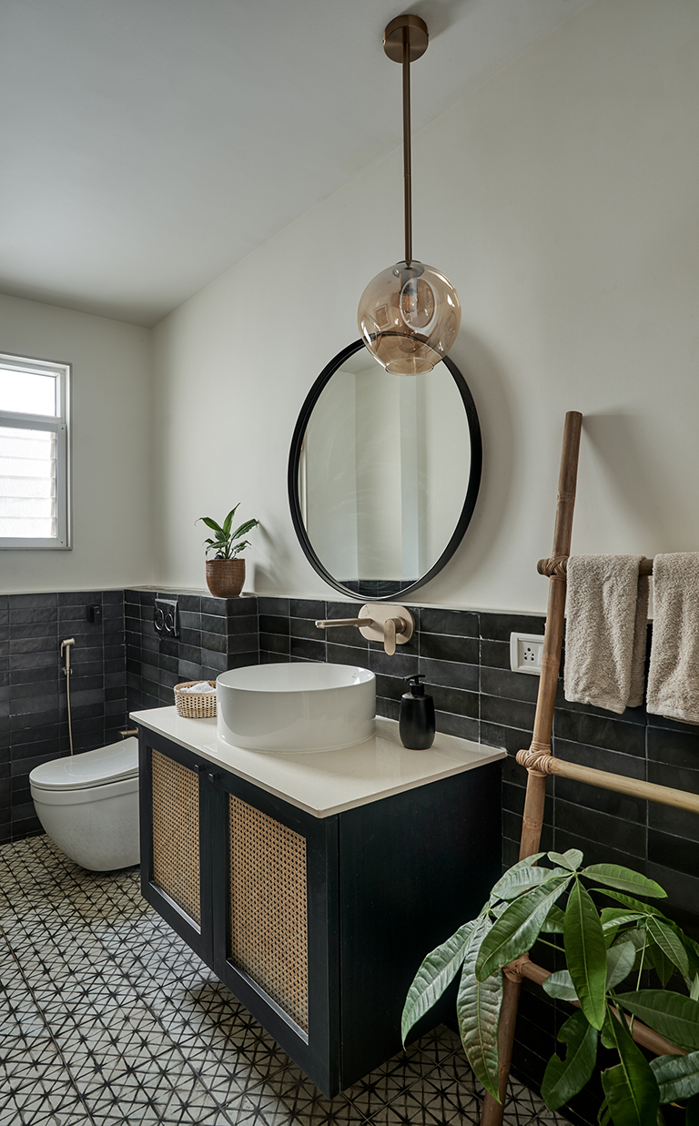
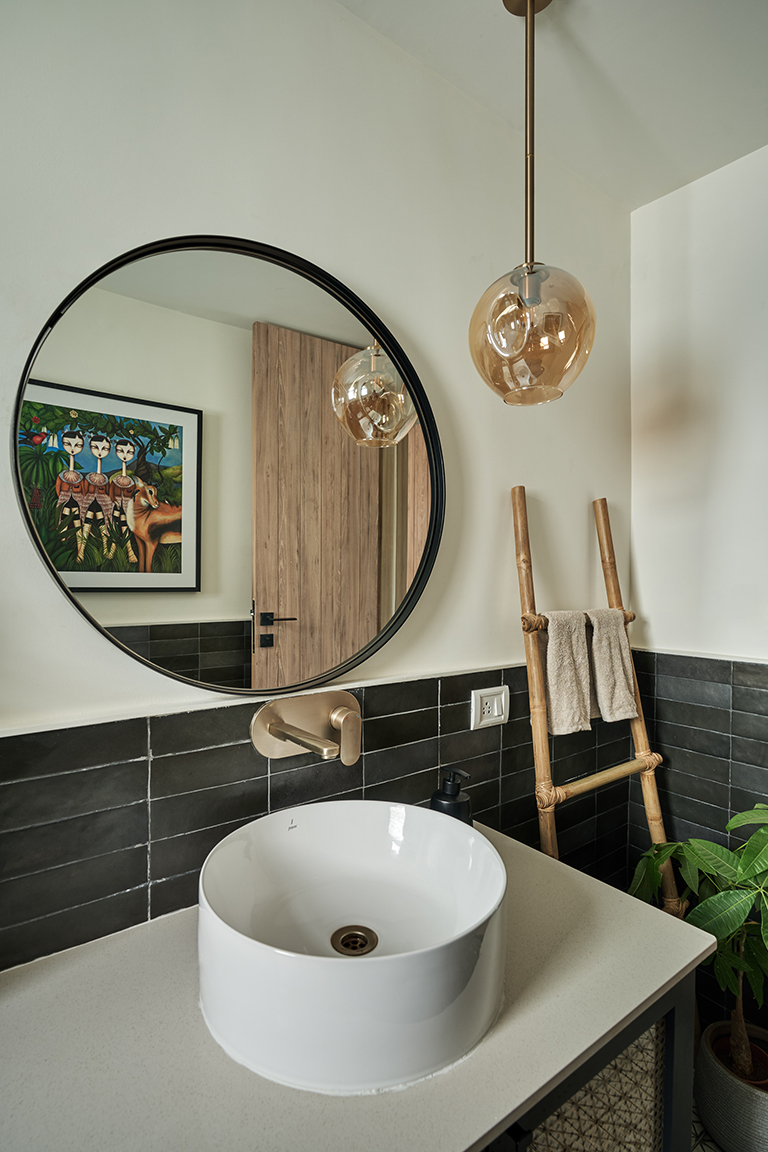
The powder room adjoining the family room is a simple yet striking space outfitted in a monochrome palette. A shibori inspired geometric black and white tile adorns the floor and simple matte black subway tiles are stacked up till half height of the walls.

A vibrant print adds a pop of color to the otherwise neutral space.

Guest Bedroom
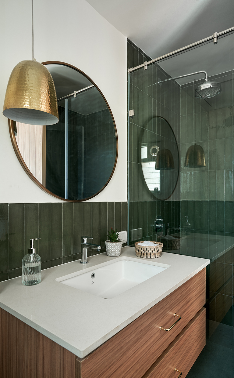
Simple earthy tones and patterns come together to create a warm space for guests. The adjoining bathroom is decked in olive subway tiles and a brass pendant.


We hope you enjoyed seeing more of this home.
Vinithra
All pics shot by Shamanth Patil Photography
