Project Reveal – Modern Colorful Apartment – Part I
Created by Vinithra Amarnathan on July 7, 2019
A home that’s not afraid of color!
Let me rewind back to September of 2018 which is when I first met the clients for this home….It was a long detailed meeting and I knew I was with people who had a keen sense of aesthetic and were invested in their home and the design process.
Weeks went by and almost a couple months later we signed up to get started. We had our first design chat and when my client said ‘I want a pink kitchen’…..I part laughed and part squirmed! And then I thought to myself….how often do you get that brief?
Lets just say that sets the tone for the fearless, yet thought through use of color through this home. From the pink and gray kitchen, to the color packed living to each of the bedrooms having their own distinct color story, this home is an eyeful.
We achieved balance in the clean lines, sharp accents, natural wood and a simple chic aesthetic.
We’re bringing this project reveal to you in two parts. The first part is the large connected living space that comprises the entryway, living, dining, kitchen and family room.
Entryway
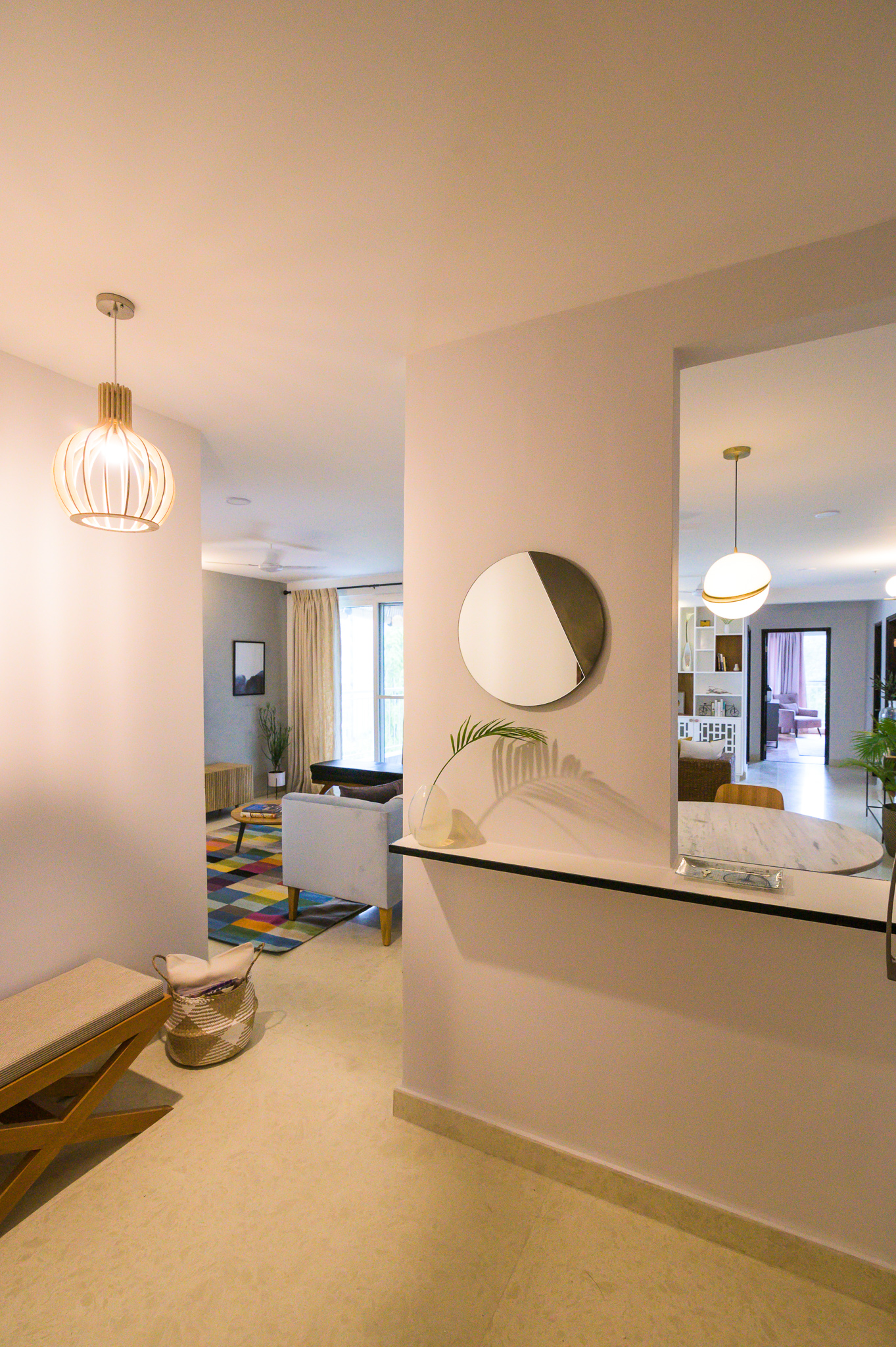
The entryway was small and narrow leading directly into the living dining space. We kept it very clean and simple by adding a quartz ledge framed in black metal to go over the niche and the wall separating the entryway from the living dining. The ledge has a simple round mirror on top. A small cross leg custom seat and a modern bent wood pendant ground the entryway.
Living
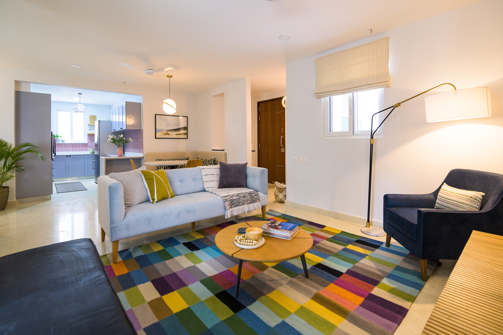
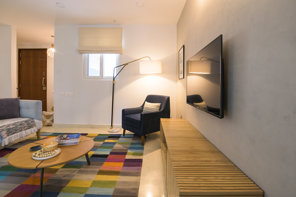
Walking into the home, the living room is the first space you see. The whole space comes alive with the bold colorful rug! A powder blue custom velvet couch is in the center of the living and dining space. We added a modern upholstered navy corner chair and a black leather bench for additional seating. A beautiful arc lamp perks up the corner and adds extra lighting.
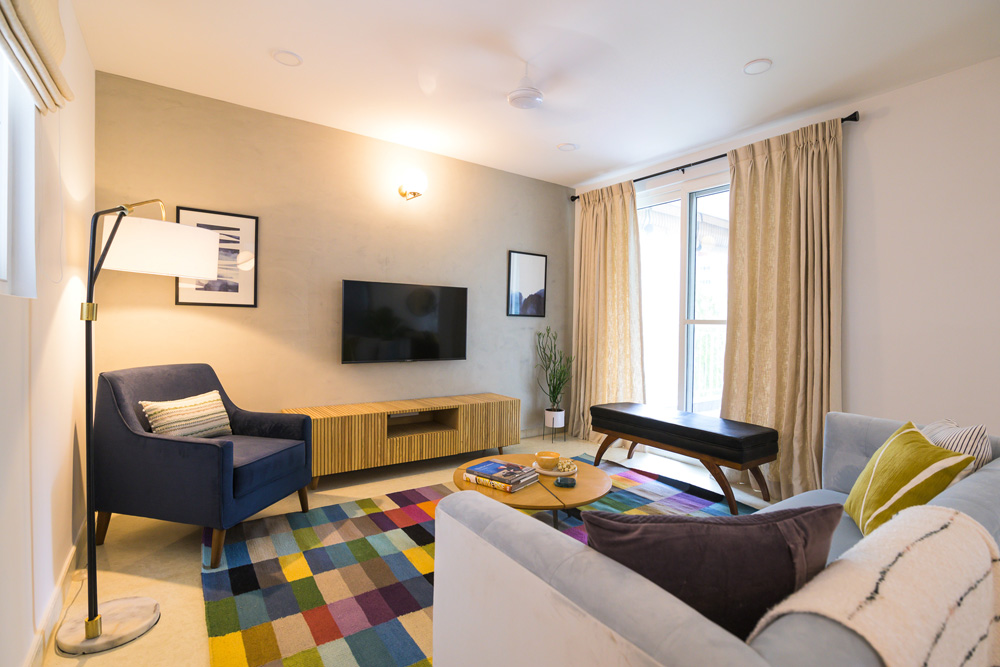
One of my favorite elements in the space is the natural wood slat media console and the limewash wall that gives a muted concrete look to the wall! They balance all the bold colors in the rug perfectly.
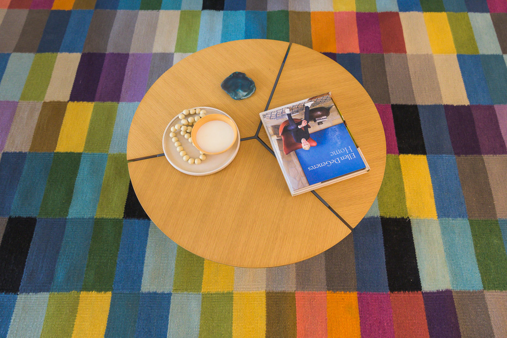
 A round coffee table and simple abstract art round up the space. We kept the window treatments neutral and added a striped roman shade to the window.
Dining
When we started out we knew we wanted a round table to seat a family of four. We all loved the classic clean lines of the iconic Tulip table and decided to recreate the classic in a high contrast sharp black leg and marble top!
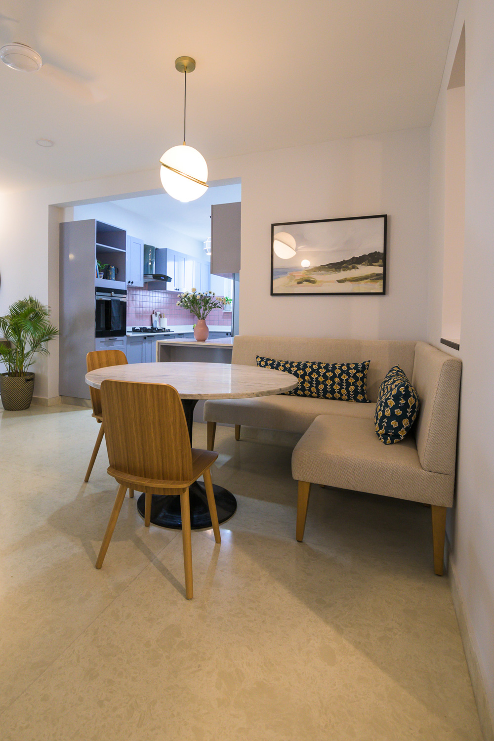
The dining space by itself wasn’t very big and had a big corner that was to go unused if we had a dining table in the center of the space. And that’s when the idea of having a banquette seat seemed like such a charming and space saving option…..not to mention the comfort of sitting on a couch and having your dinner 🙂
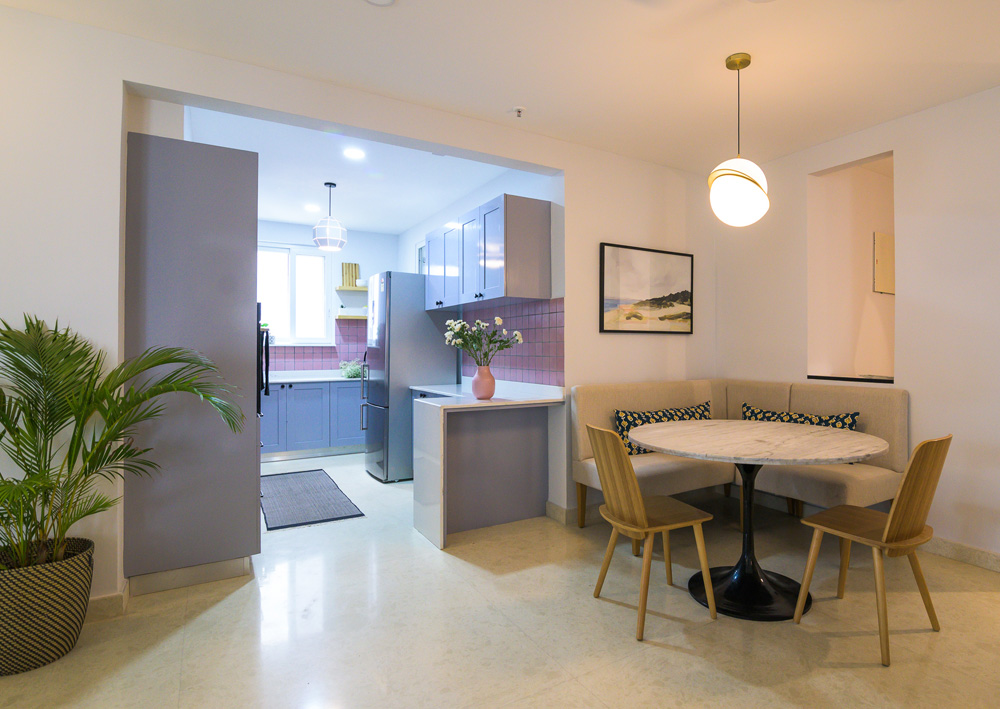
We created a custom banquette seat to fit the area and the beautiful tulip table with sleek wood chairs bring this dining space together.
The Montauk print from Juniper Art makes for a beautiful addition to this already chic space.
Kitchen
Aah here we are with our beautiful pink kitchen 🙂 The lady of the house was keen on a pink kitchen and I wanted to bring that in without it looking overly feminine or like a barbie’s kitchen.
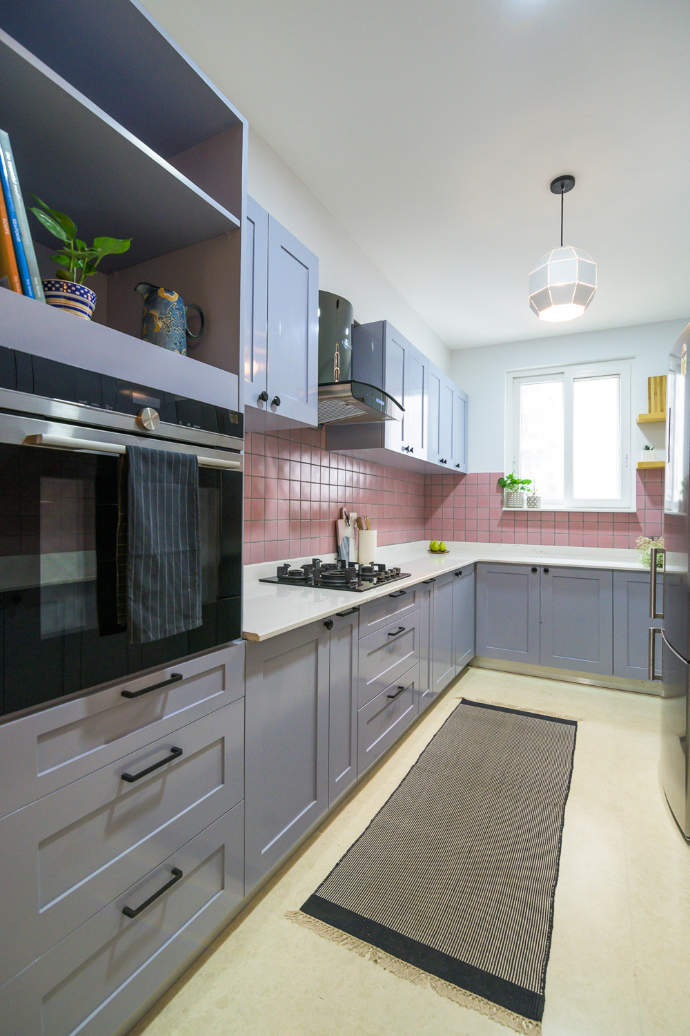
We found the perfect pink tile that was handmade ceramic and had subtle color variation that adds depth. Gray cabinets balance the pink beautifully and sharp black hardware provide that hint of masculinity. The countertop is a satvario quartz that has beautiful gray veining which is perfectly picked up by the gray cabinets.
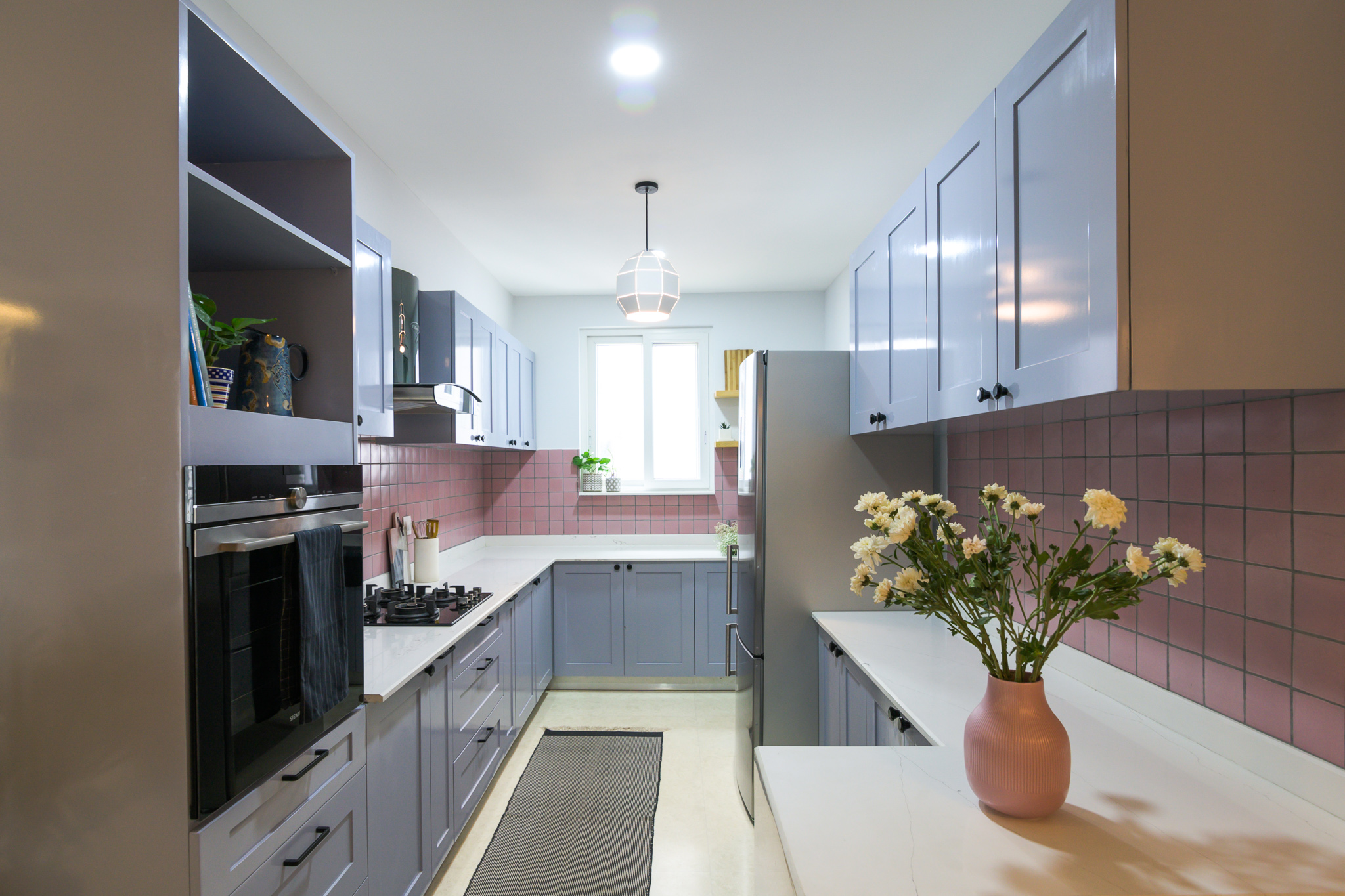
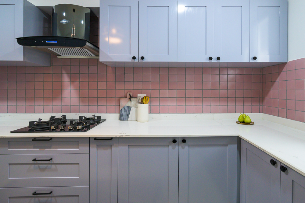
The kitchen in itself wasn’t too big at a modest 8X13. We incorporated a tall unit for the appliances on one end to balance the refrigerator on the other and gave the clients a long running L counter on one side that incorporates the cooktop, the sink and the refrigerator in a perfect work triangle. The other end has a shorter L that adds extra counter a small breakfast counter like extension. I love the waterfall stone edge on this little counter!
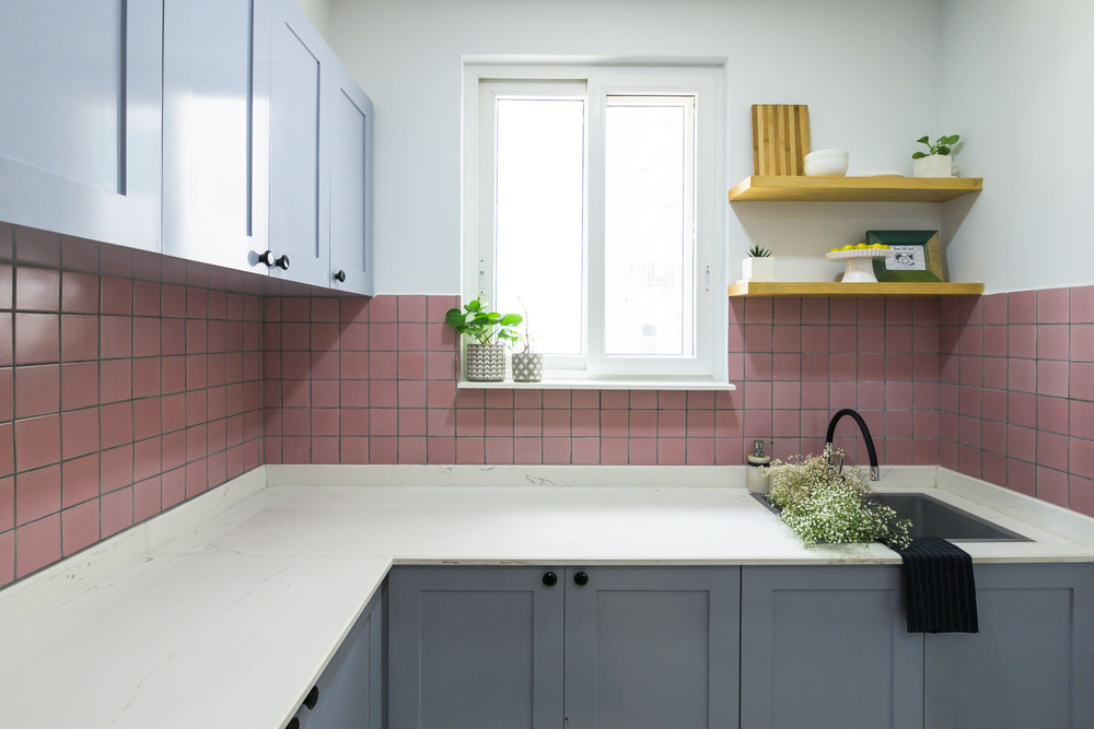
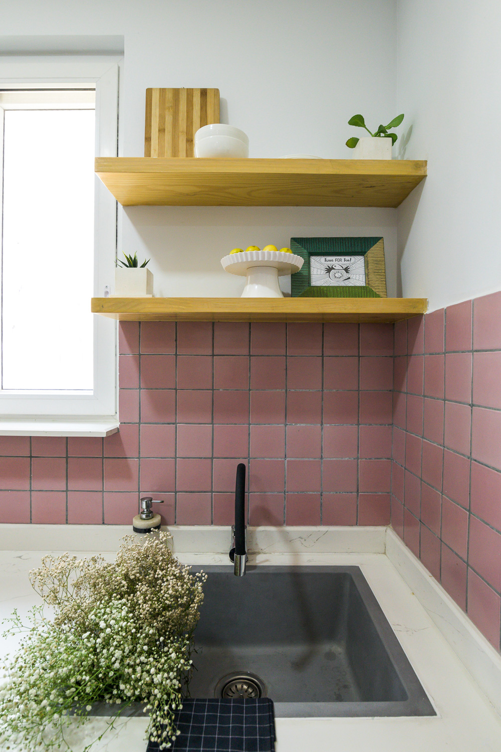
One of the features I loved was the window soon as you walk into the kitchen and we wanted to make it a feature. We added a custom quartz ledge at the window and open shelves by the window in natural wood to add to the open feel in the kitchen. A granite sink and matte black faucet fit perfectly.
Family Room
The family room is an extension of the dining and the kitchen space and we wanted to make sure that all these areas integrate well with each other. We created a built-in cabinet here that houses the client’s puja at the bottom behind lattice doors and an asymmetrical open top unit that’s just great for books and memorabilia!
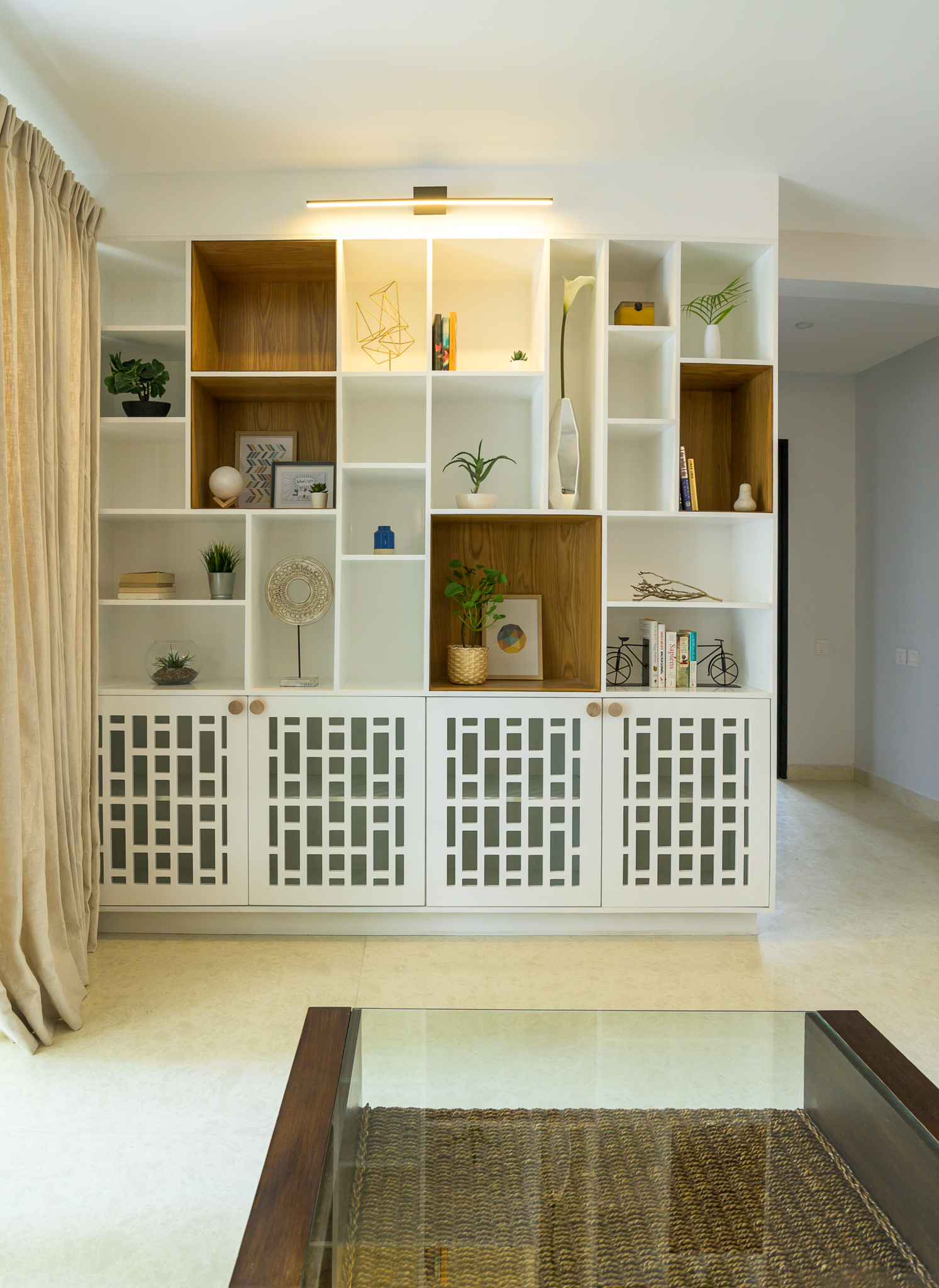
This is one of my favorite elements in the home with the veneer clad pockets popping so beautifully against the white.
A rattan chaise makes this the perfect spot to lounge with a book 🙂
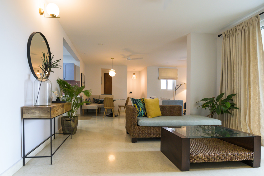
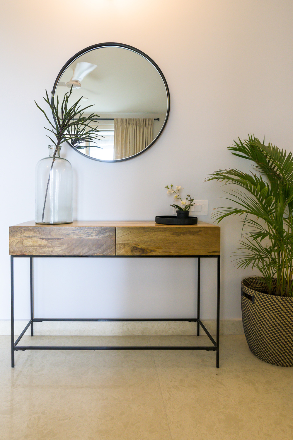
This home has so much detail in every little corner and that’s what makes it a unique personal space…..much like the ones we try to create!
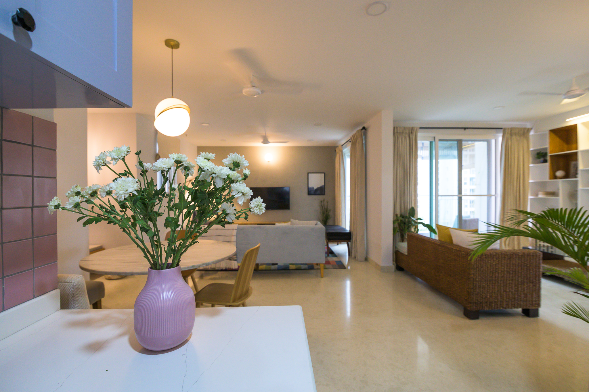
I hope you enjoyed walking through this home with me….stay tuned to see the bedrooms and how the bold color choices make their way into those spaces next 🙂
All pics shot by Parth Swaminath.
