Project Reveal – Modern Colorful Apartment – Part II
Created by Vinithra Amarnathan on July 29, 2019
I hope you all enjoyed the reveal of the living spaces in this apartment. We’re sharing with you today the reveal of the bedrooms in this home.
The bedrooms are designed to reflect the individual personalities of the inhabitants and marry color and aesthetics to create bold yet chic spaces.
Master Bedroom
The master bedroom was imagined as a dreamy luxurious space for the couple to come back to after a day at work. They wanted a relaxed yet luxurious feel. Pink was the wife’s favorite color and we decided to paint the room a very soft pink with undertones of lavender.
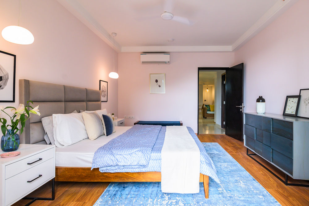
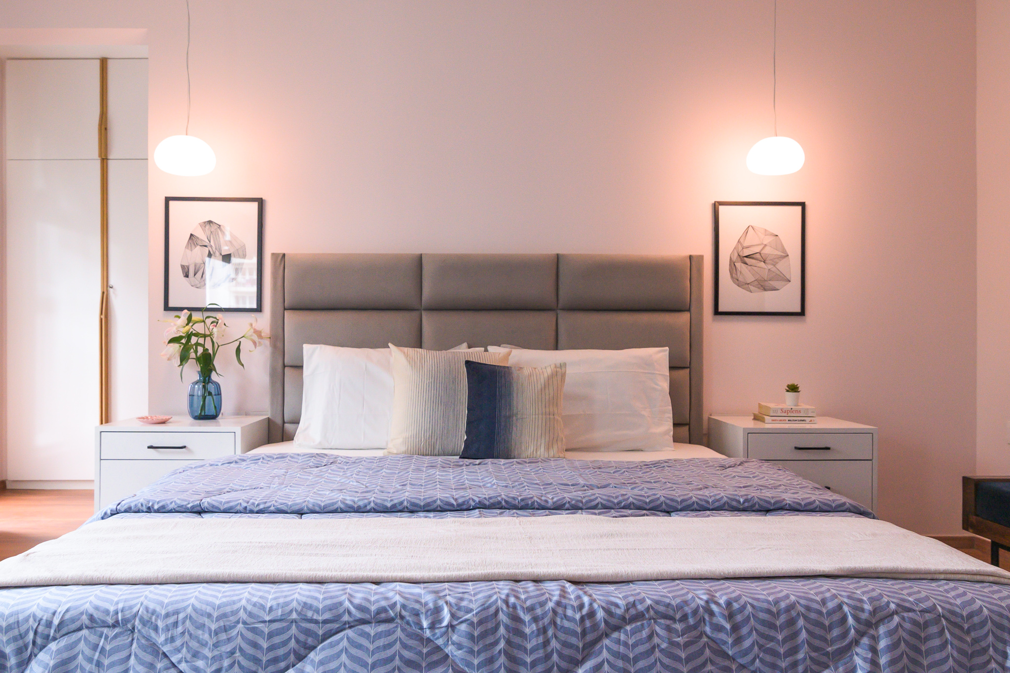
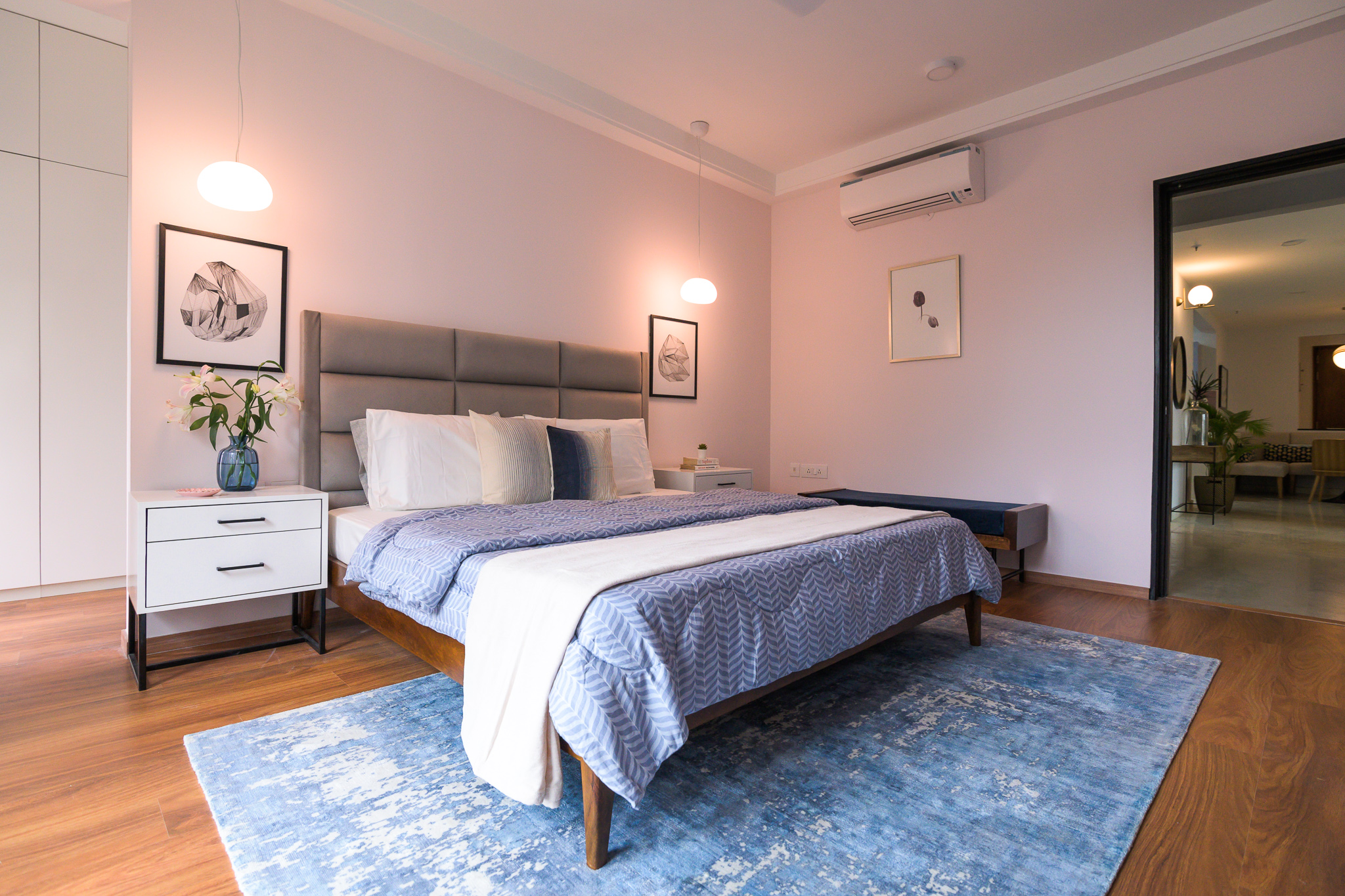
We used blue and grey through the rest of the room. The bed is an upholstered bed in soft gray velvet like fabric with beautiful horizontal tufting to amplify length. We added sharp white bedside tables with black hardware for contrast.
The Muuto Fluid pendant hangs on both sides and I love how it brings in that dreamy feel with its soft white light and the bubble shape!
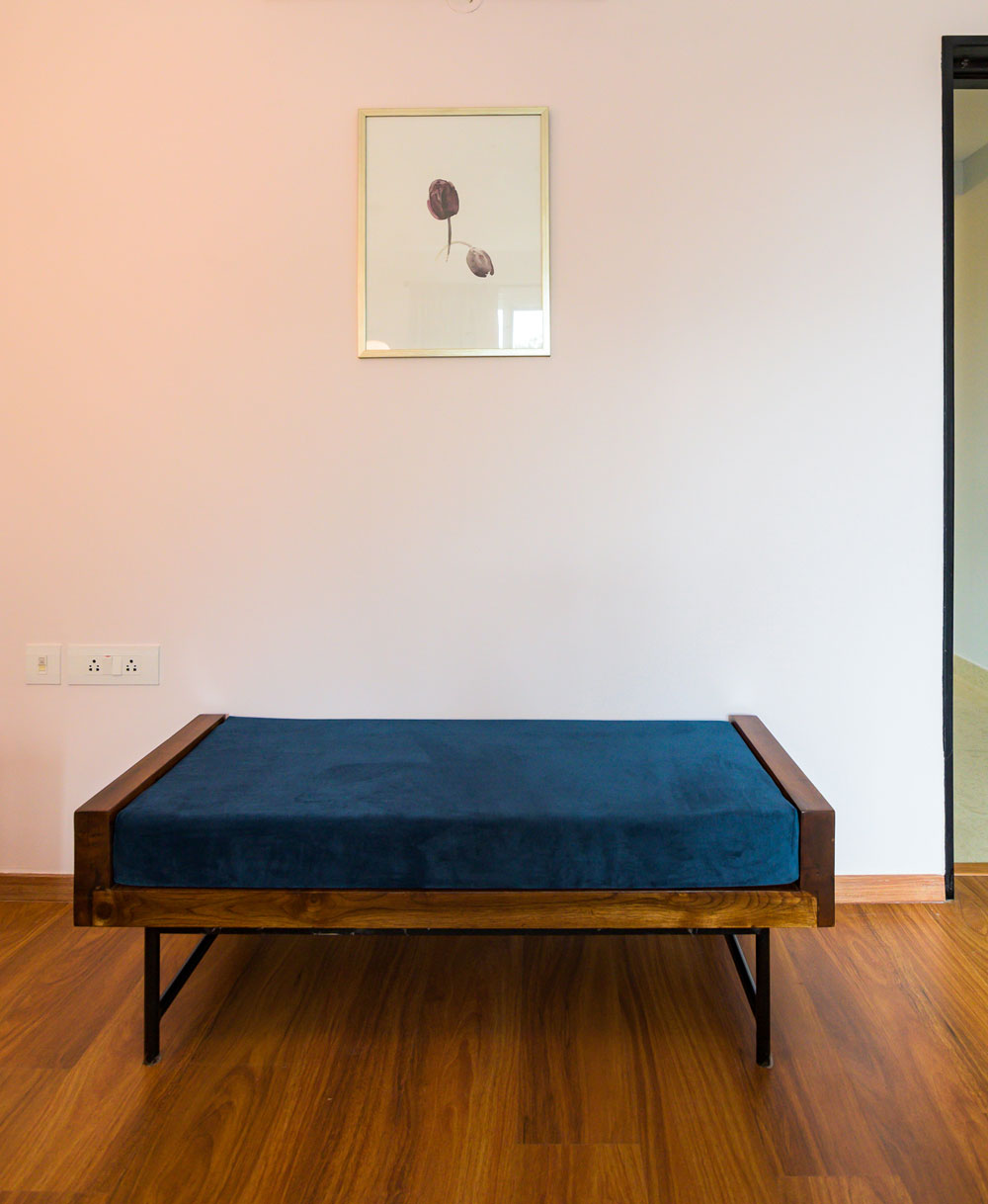
One of my favorite elements in the room is the beautiful blue gray abstract rug we picked. It reflects the abstract fluidity that we were going for in the space and provides enough contrast to the soft pink walls and the gray bed. We added a custom navy bench with a teak wood trim for seating and a custom blush velvet chair by the large window.
We played with tone on tones in this space, by keeping the window treatments a shade of pink and the chair in similar blush pink tones. I love how this brings in the dreamy soft vibe against the pink walls. There’s nothing like too much pink 😉
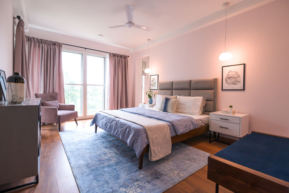
A blue gray dresser with an asymmetric front from Freedom Tree carries through the blue gray color story as well as the abstract feel that we wanted to contrast with the soft dreamy elements.
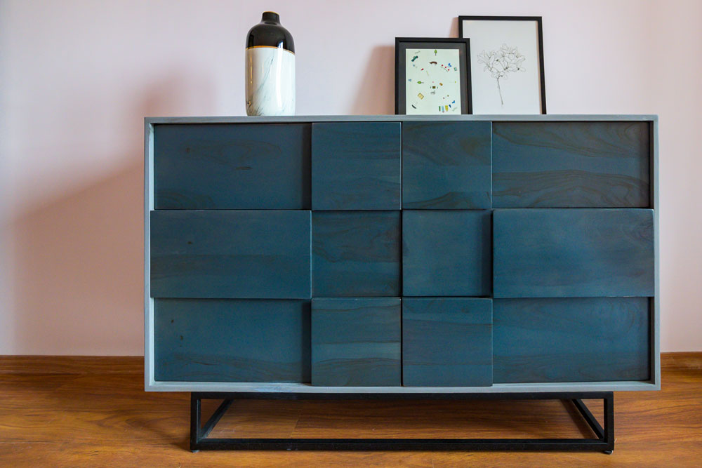
The art again echoes the same sentiment. The tulip print adds a beautiful calm vibe and was the wife’s favorite flower. We added geometric black and white prints from Ikea on the bedsides to bring in the sharp contrast.
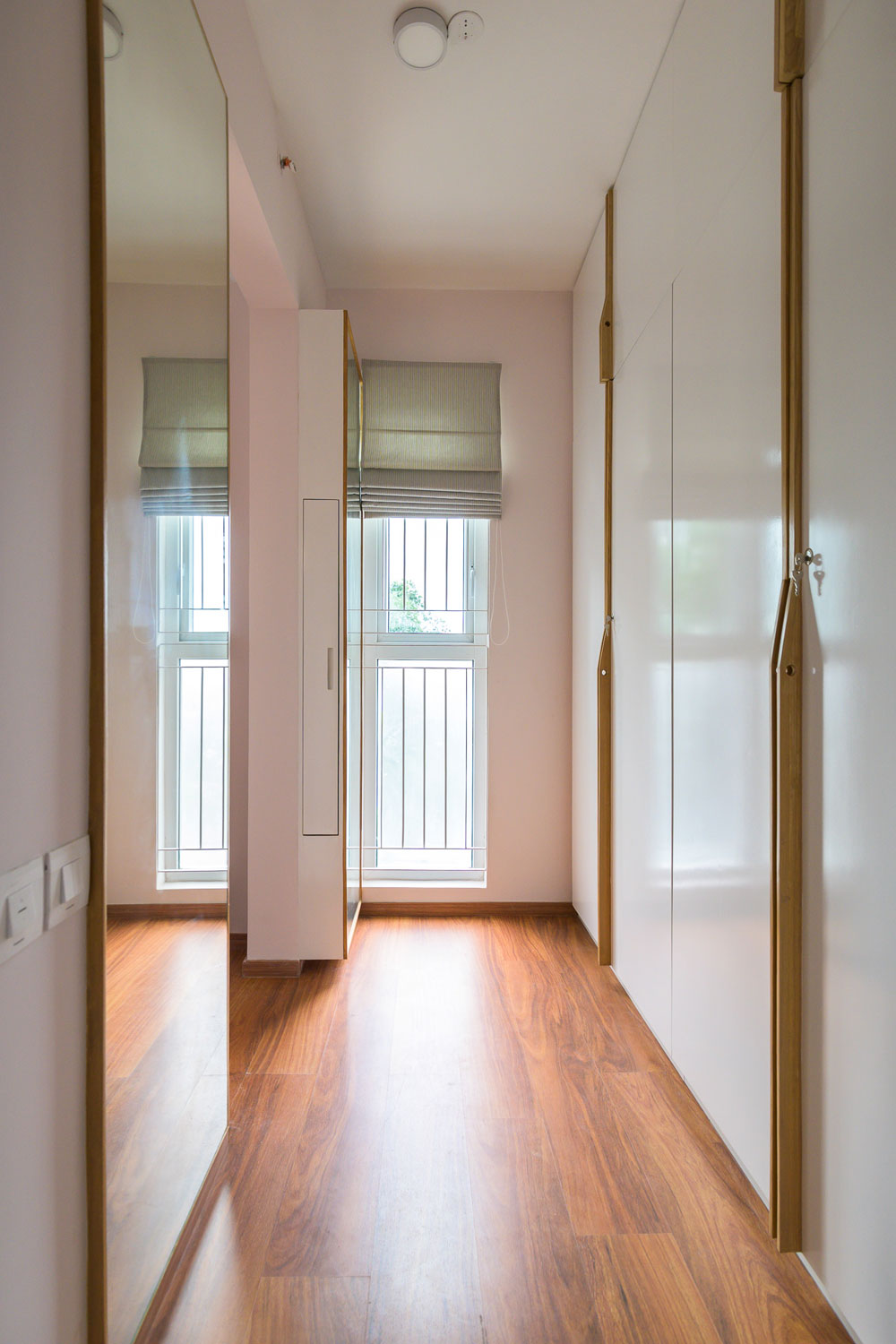
One of the most functional and chic parts of this room is the walk-in closet area where we created a his and hers closet. The wardrobes are white with handmade wood handles that are so chic and simple.
We added double full-length mirrors on either side opposite the wardrobes with a concealed pullout storage on ‘her’ side for storing bottles and accessories.
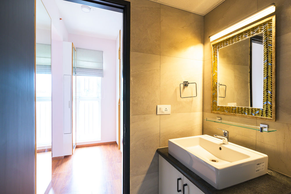
The master bathroom has a beautiful gold and silver mirror from Neter Living and a custom gold bar light on top.
Teen bedroom
The second bedroom in the home belongs to the teen son who is a Manchester United and Soccer fan. When I heard that his favorite color was black, my first reaction was ‘Lets do a black wall!’ 🙂
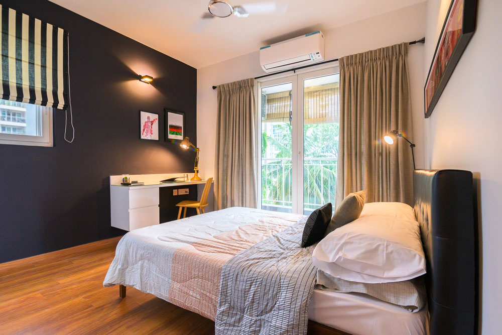
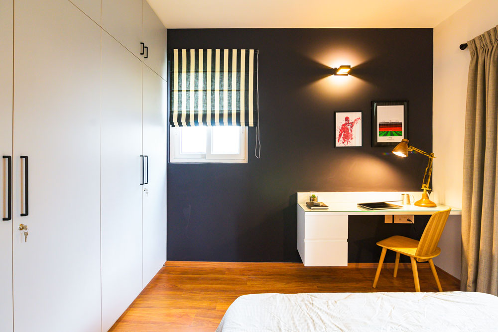
And that is my favorite part in this room! A bold sharp black wall that houses a custom wall mounted white desk. We added some striking Manchester united inspired art to the wall and a beautiful wood desk lamp…..the black, white and wood come together beautifully!
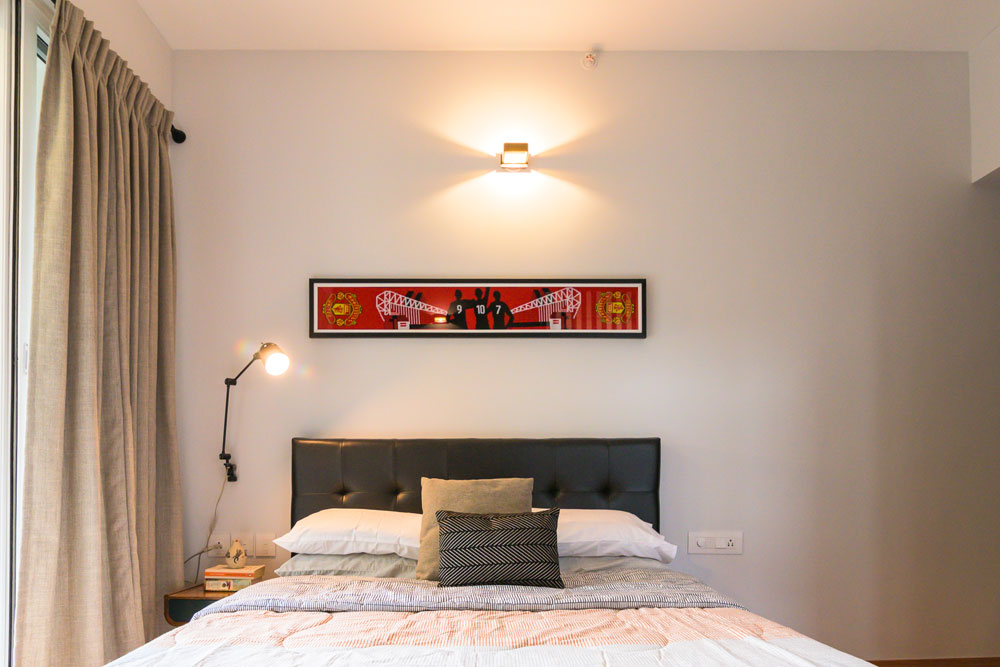
On the other end we have a black leather bed and a small bedside table in teak and black. We framed a Manchester United scarf to hang above the bed and added a black arm sconce on the bedside for extra lighting.
The window treatments are gray curtains that have a small-scale grid pattern and bold striped blinds on the window.
We kept the wardrobes a light gray and added simple black hardware.
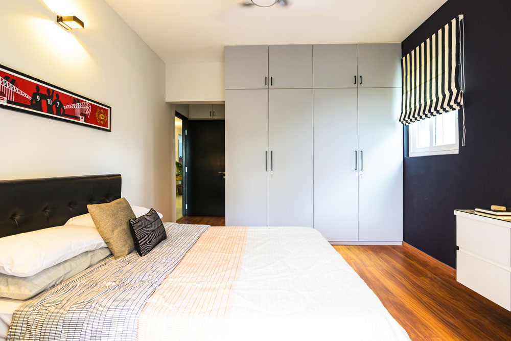
I like how this is a neutral room except for pops of red in the art but still has so much personality!
Kids room
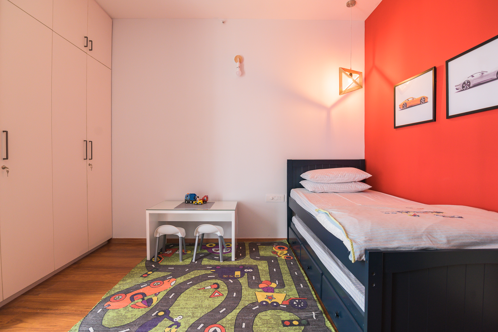
The last bedroom in the house is a little boy’s room. His love for cars and soccer is pretty evident in the room. We did a bold red wall and a race track rug to bring in some fun.
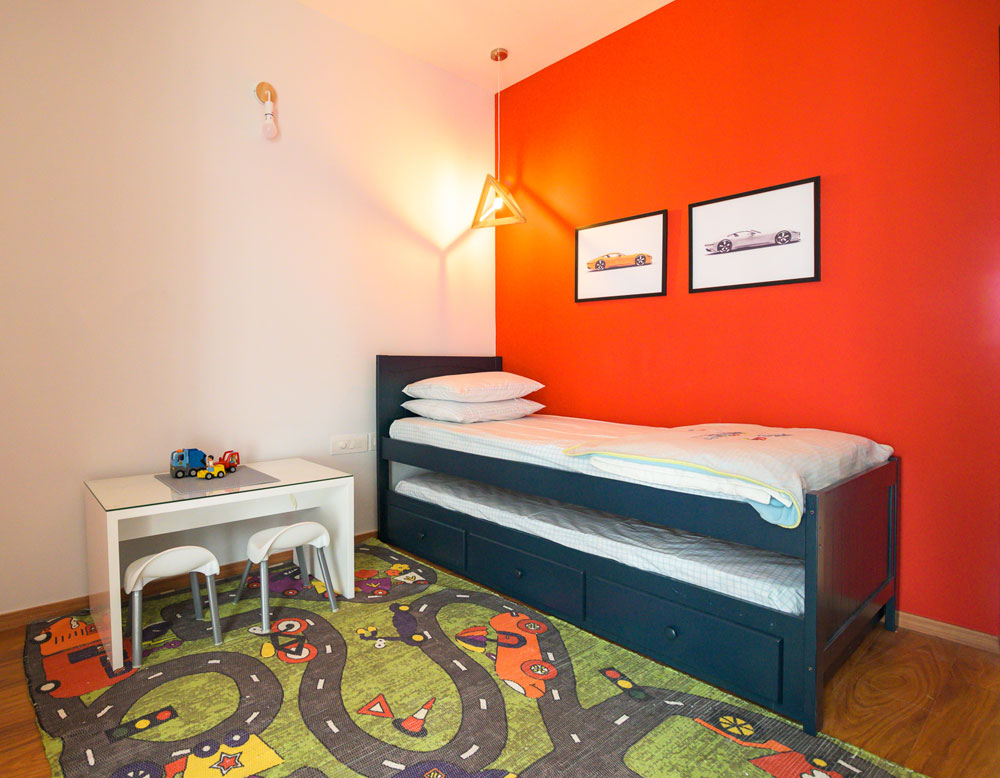
The red wall is balanced by a light blue all through. The room has a navy trundle bed to accommodate guests on occasion and is the perfect color for a boy’s room!
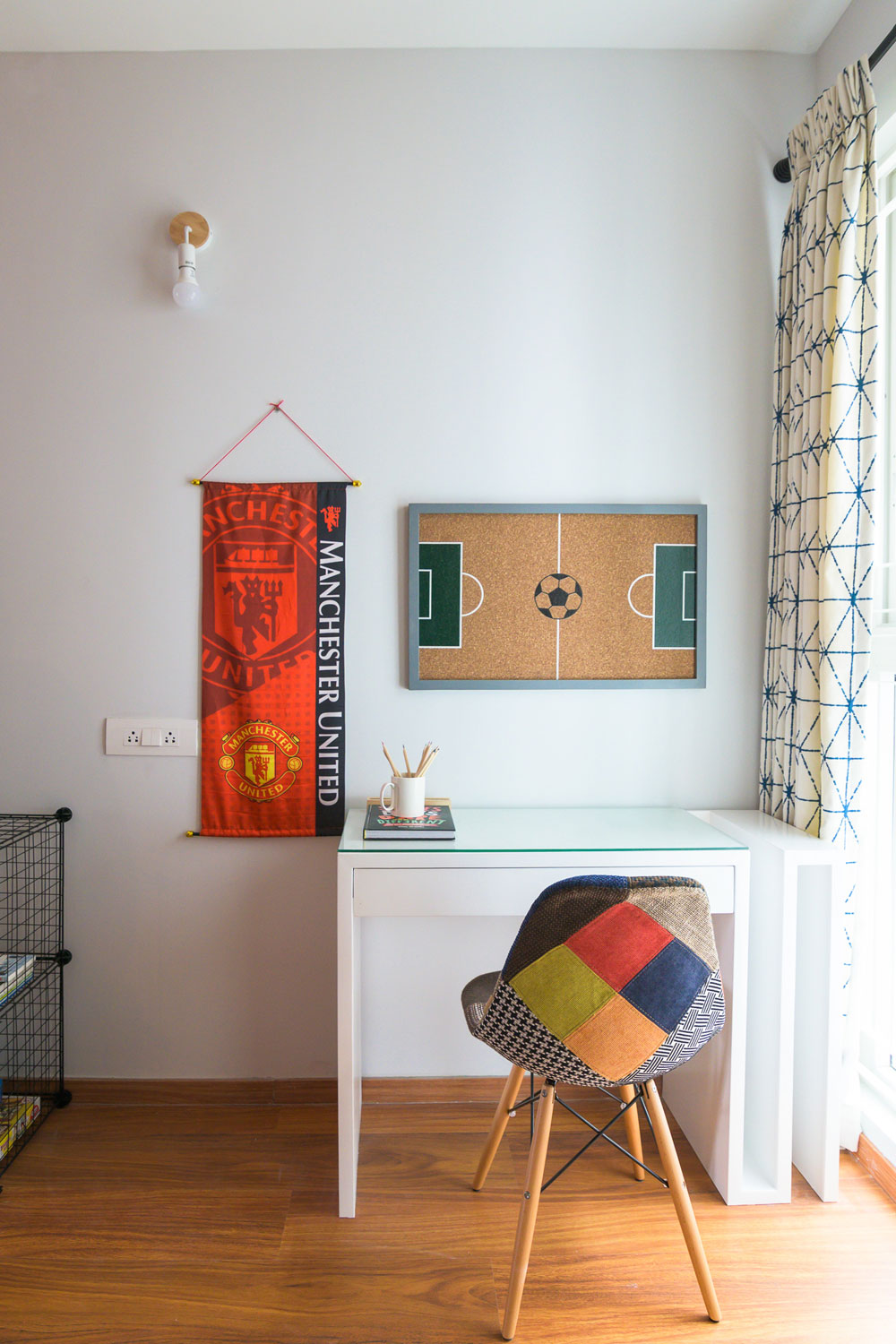
We added a white custom-made desk with an open side storage for large sheets and art that the client wanted to store. A fun patchwork chair and some simple wire storage round up the space.
We added a small white play table and some kids chairs for assembling legos and crafts.
The wardrobes are a simple white and balance out all the color in the space so well.
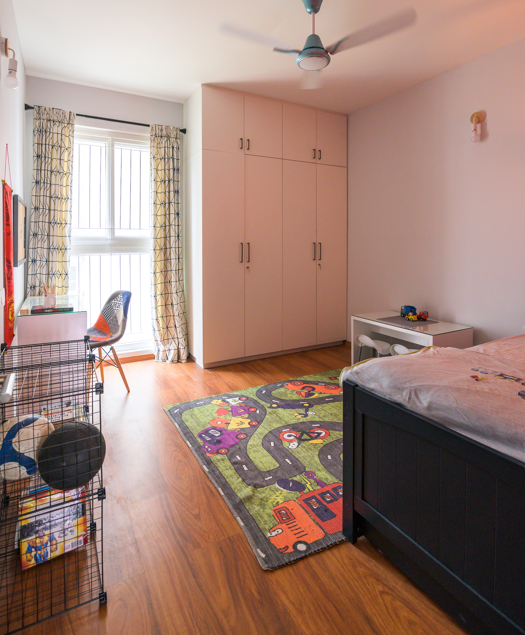
I loved working on this project and bringing personality to each of these spaces. I love how they are so different from each other but stay true to the overall aesthetic of the home!
All pics by Parth Swaminath.
