Project Reveal Part I – The Jewel Tone Inspired Apartment
Created by Vinithra Amarnathan on February 14, 2020
It was July of 2019 and we’d met the homeowners of a space that was going to be one of the most fun projects that we’d design in that year! This apartment is home to a vivacious couple and their delightful young son.
Bold rich color derived from jewel tones, metallic hints and a play of textures from various materials form the DNA of the home and are the design features that give the space its sense of identity. Throw into the mix a penchant for Bollywood and cinema that the couple share and oh it was a ball! 😊
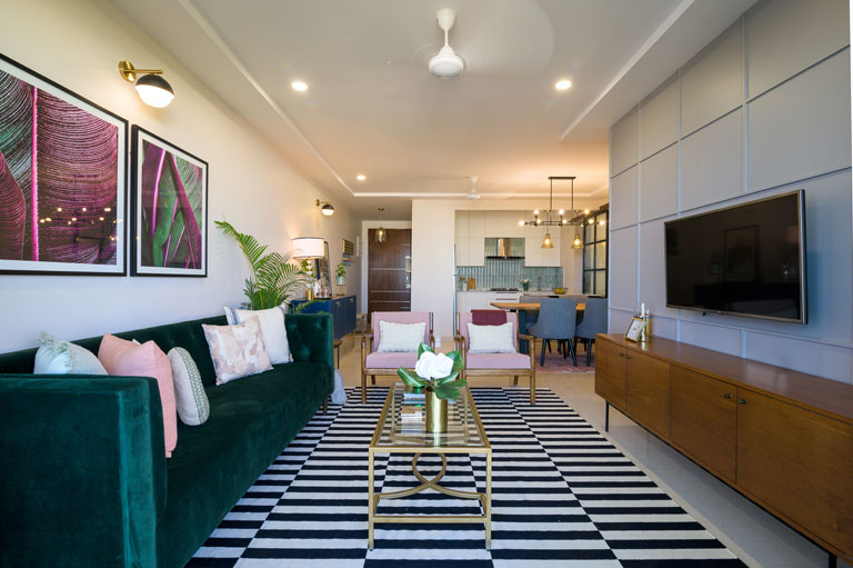
With Part – I of the project’s reveal we take you through the Entryway, Living, Dining, the Kitchen and the Balcony nook. The project encouraged us to step foot into creative territories that are outside our design comfort zone, let us experiment with a healthy dose of color and allowed us to interact with elements of pop culture! This 1760 sq ft home is unafraid of expression, sensitive to its user’s needs and the perfect balance of bold and stated.
So, Lights, Camera, Design!
Entryway
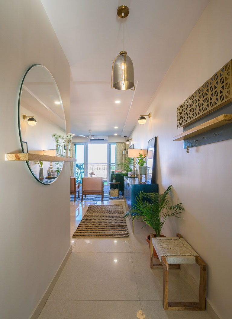
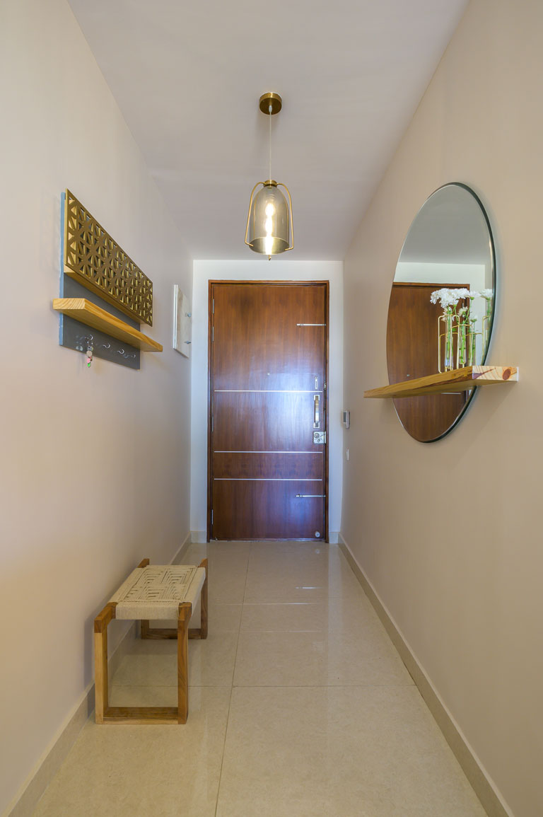
The entryway is a minimal segue with its clean-lined design sensibility that prepares the eye for all that one is about to experience. 😉
We’ve used a large round mirror that has a wooden shelf running across its length which adds that element of unexpected and function to this narrow foyer. A custom key and letter holder unit with latticed details adorns the right-hand side wall. The sleek artsy woven rope bench is our nod to texture and warmth. Not to miss the dark tone amber glass fixture that adds that touch of glam to the entryway area. It’s easy on the eye and just the right welcome into the space.
Living Area
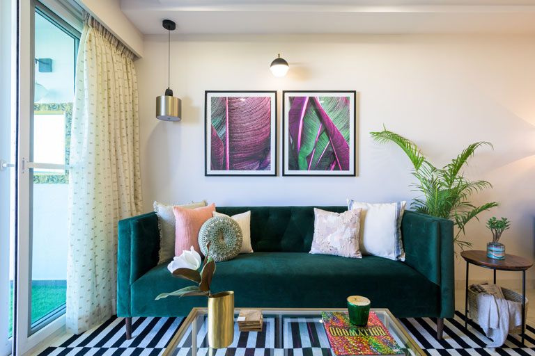
The brief that the clients had at the very beginning always highlighted an inclination towards a statement emerald green sofa that’ll be the pièce de résistance of sorts in their space. So, we ensured that we made that element our muse as we got down to designing this zone. 😊
Blush, emerald green, the classic black & white duo and metallic brass accents give this space a bold yet layered persona. The overall look is modern and elevated and gives the space a chic vibe. The tufted emerald velvet sofa in clean mid-century lines paired with the blush and wood tone chairs make for a great combo now don’t we all agree? 😉 The striking monochrome geometric rug gives the space a sharp but simple departure from all the colour and brings in balance.
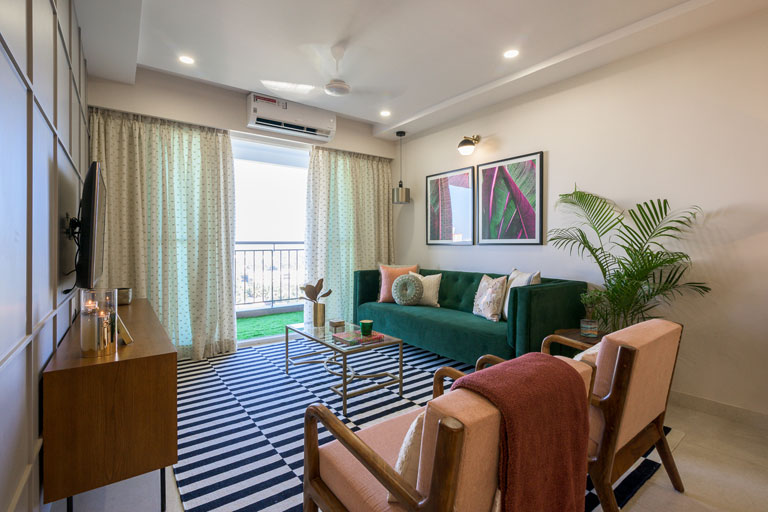
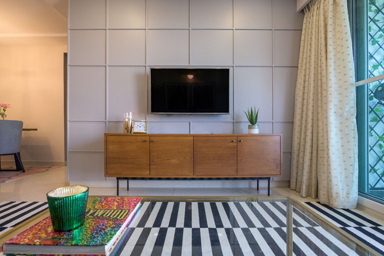
The brass frame coffee table, wood side table with a cane basket and the classic mid-century TV unit clad in a rich teak veneer tie in beautifully with the overall palette. The oversized botanical prints pick effortlessly on the green and pink strains and look like they were meant to be in this space! We added a corner pendant in brass, brought in hints of gold in the coffee table and hardware across the space to bring in the metallic touches.
Another favourite feature of ours in this area has got to be the accent wall. We chose a warm grey hue that bathes the TV wall in conjunction with a grid pattern all over. The battened wall immediately elevates the look of the area and gives the space a sense of contrast and depth!
Dining cum Bar Section
Perfect for a little Friday night shindig or a warm family dinner with loved ones.
The light wood raw edge dining table brings in a touch of modernity with its sleek angular metallic black legs. Custom grey upholstered dining chairs and an all-black metal chandelier with exposed filament bulbs keep the look crisp. The Moroccan patterned rug anchors the space giving it a welcome dose of colour and picks beautifully on the blush tones in the living chairs.
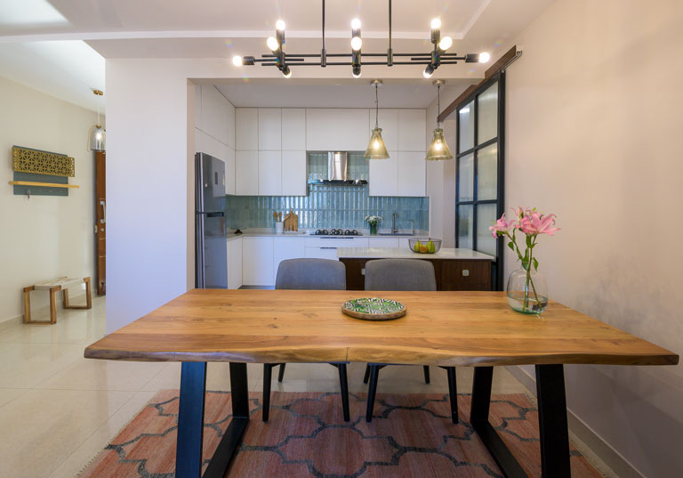
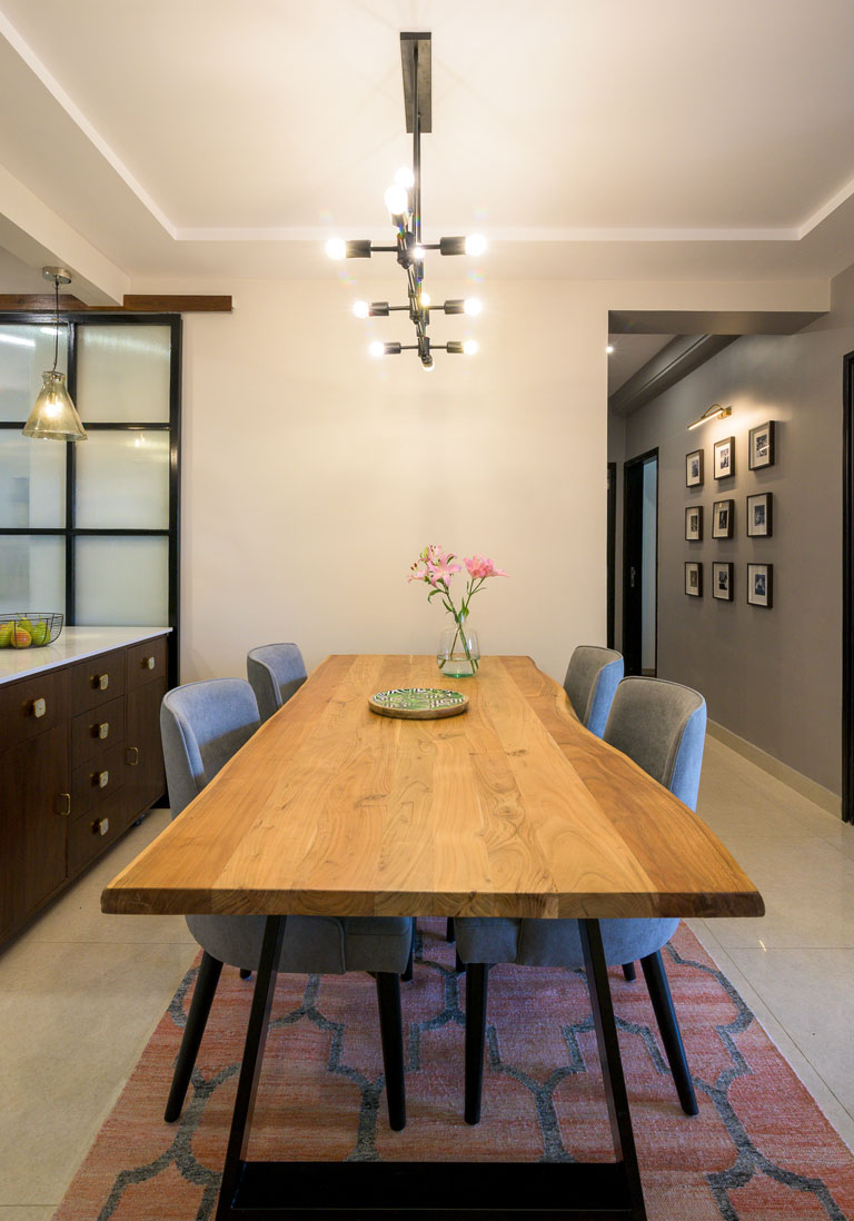
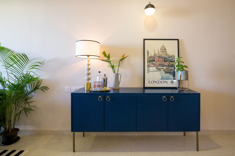
The bar section flanks the dining zone on one side and is a versatile setup. The midnight blue crockery cum bar unit is adorned with an embossed scallop design on its shutters, brass hue legs and dapper brass round hardware – oh so swoon-worthy! We’ve used a top corner of the unit as a makeshift cocktail prep section with a colossal lamp, an opulent bar tray and a leaning London city art print to echo the couple’s love for the destination! 😊
Kitchen
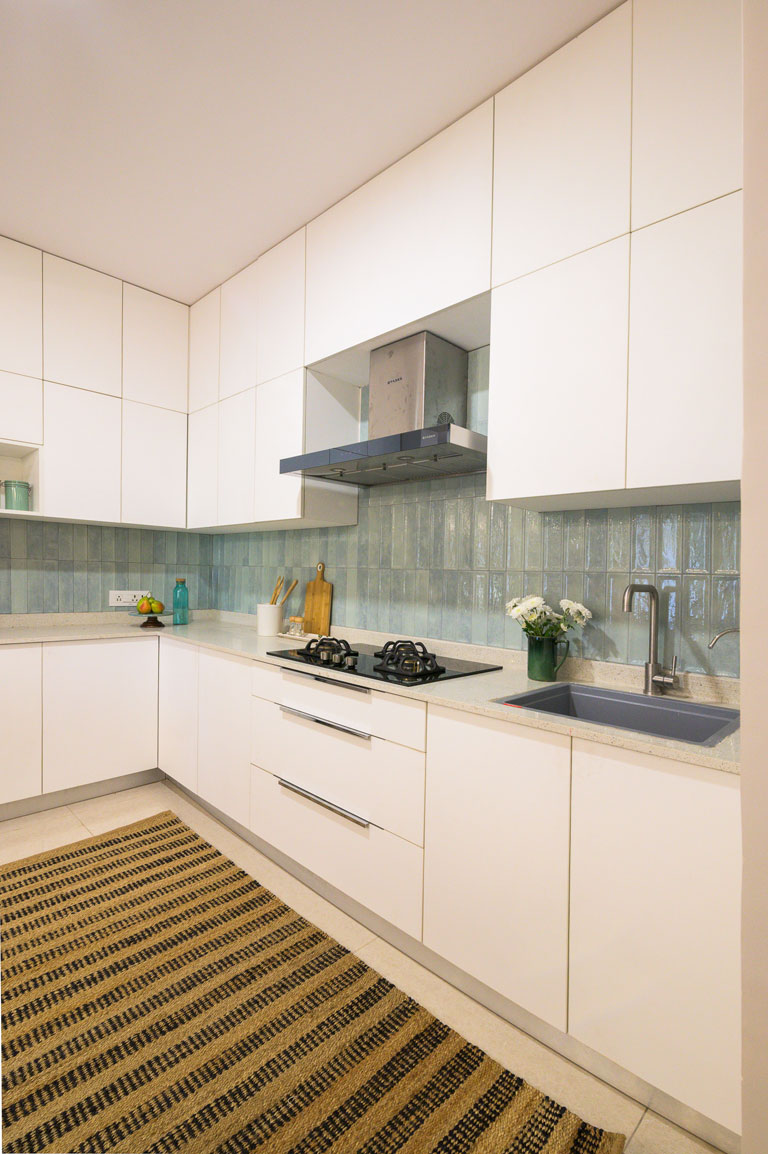
Translucent aqua toned tiles in unison with the simplicity of white. What’s not to love? 😉 The vertical stacking configuration of the tiles adds a sense of increased height to the space and with the all-white cabinetry, it’s a winner!
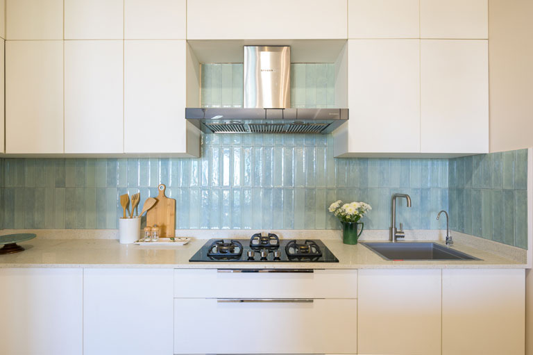
We kept the kitchen cabinetry sans hardware which contributes to the clean simple look of the space. The grey granite vegetable sink fits right into the color story of the kitchen and looks great against the aqua toned tiles.
The black metal and fluted glass barn door connecting the kitchen to the utility section was originall a half-wall between the two areas. We constructed the wall all the way up to demarcate the zones and the barn door made for the perfect addition of privacy while keeping the look so on-trend.
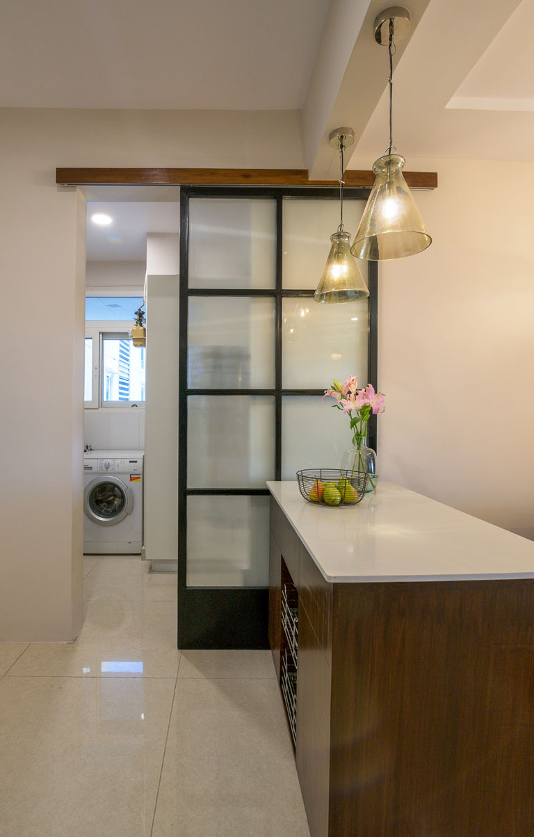
The custom kitchen cart is a functional as well great looking piece! It provides the clients with added counter space in the tight L kitchen floorplan with ample storage. Its body is composed of solid wood that celebrates its natural grain and we’ve paired it with aqua crystal knobs and a white quartz countertop. And oh, this baby has wheels so it makes space-utilization flexible while connecting the kitchen seamlessly with the dining! 😊
Balcony
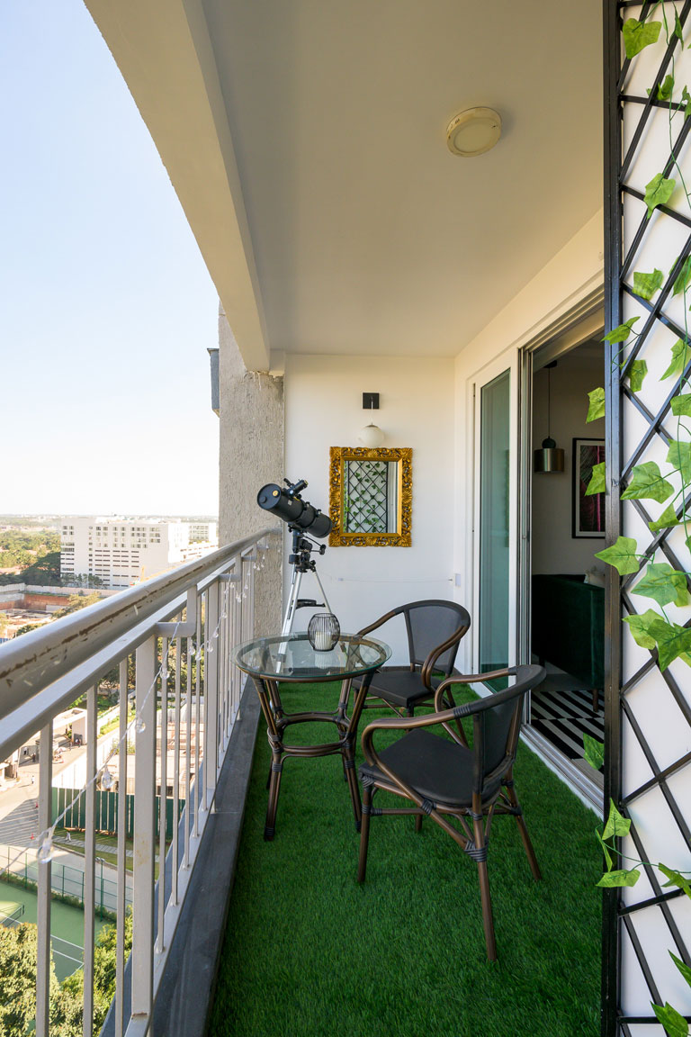
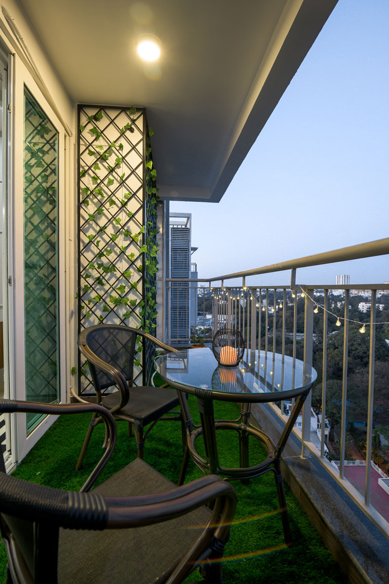
We transformed the balcony niche into a bijou haven. A grass carpet brings in the outdoorsy feel in combination with a compact seating set. String lights in the space exude a whimsical feel and we created a latticed trellis framework with faux creepers to bring in that touch of greenery (that have virtually no maintenance). 😉 The balcony also houses the client’s telescope setup and we also would love to dream of a breezy evening stargazing from this spot.
The Jewel Tone Apartment is all things curated and detailed to the ‘t’! We’re gearing up to bring you a walkthrough of the private bedroom sections very soon. Until then, soak up these sumptuous design details and stay tuned. 😊
All pictures shot by Parth Swaminathan
Content by Lavanya Chopra for Weespaces
