Project Reveal Part I – The Modern Mediterranean Living Areas
Created by Vinithra Amarnathan on December 14, 2019
Back in June of this year I met our clients for the first time in a blank apartment. It was spacious but had a large column in the middle of the house, a big kitchen space but hardly any light and a large area adjoining the kitchen with great natural light!
And that was our starting point to the modern mediterranean home! Its layered, its beautiful and the perfect mix of the modern and the traditional!
Our clients, a young couple had very different aesthetics…..she loved traditional curves, the warmth of wood that reminded her of her childhood home, deep rich colors and lux finishes! He loved modern clean lines, metal, rustic wood and cool colors!
This home effortlessly blends the two aesthetics and develops a layered look that balances both.
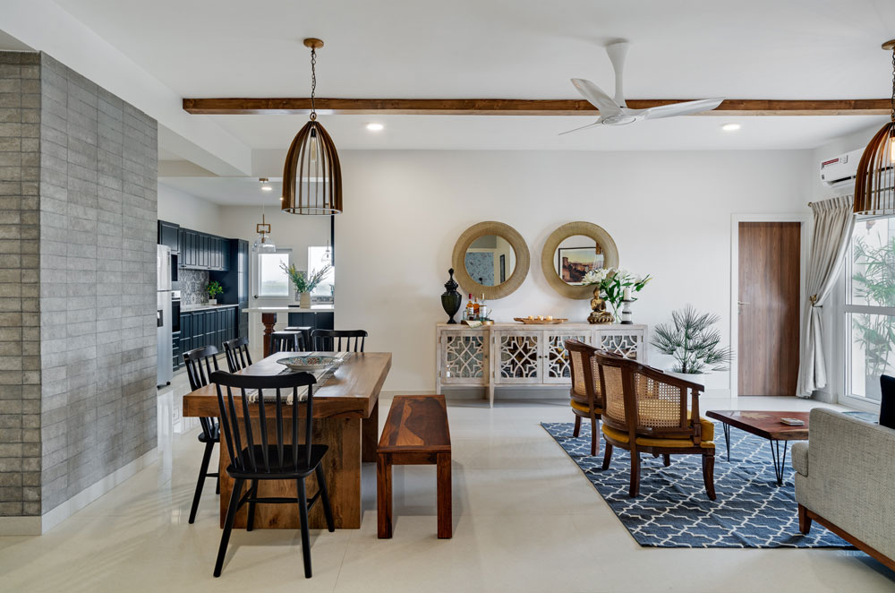
We have a modern formal living room right next to a warm casual lounge! The palette is defined by the mediterranean….blues and whites, earthy terracotta and browns and the warmth of wood.
One of the interesting things in this home is the use of color….the palette is restrained but the colors themselves are rich and bold!
Mustard, navy, forest green, midnight blue all make an appearance, but without distracting or taking away from the individual spaces!
In the first part of the reveal we’re walking you through the large living dining and lounge space that defines the mod med vibe!
Entryway and Living
Even though we had good square footage to work with, this home had many challenges and one of them was the lack of a distinct entryway! The home opened right into the very large space with a column in the middle.
My thought is when you can’t do away with something – in this case the column, make it a feature!
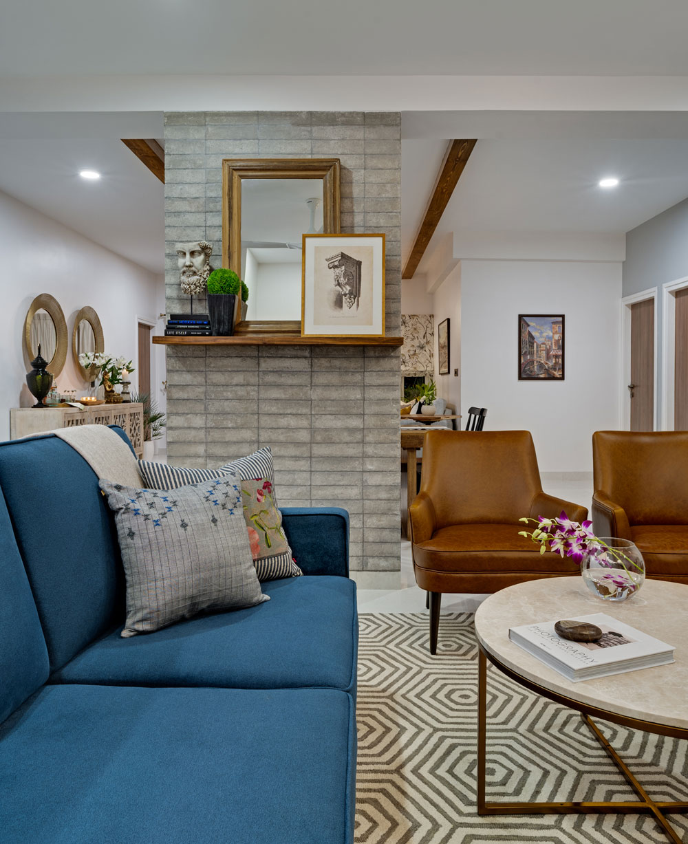
So we decided to wrap the column in a stone tile. The tile itself is a beautiful warm tone of gray with imperfections that give it a textural look. We did a clean horizontal stack to give it a nice modern feel and this stone wall now is one of the best features of this home! The living room side of the stone column has a beautiful mantle ledge we added. A large mirror and some art stacked against it bring in that modern european / mediterranean vibe we wanted. A simple geometric rug and marble coffee table ground the space.
We had the main door opening into a long area that had little natural light and we decided to use this space as the formal living area. A large comfortable sectional flanked by gorgeous custom leather chairs that have my heart and a custom raw edge wood TV console!
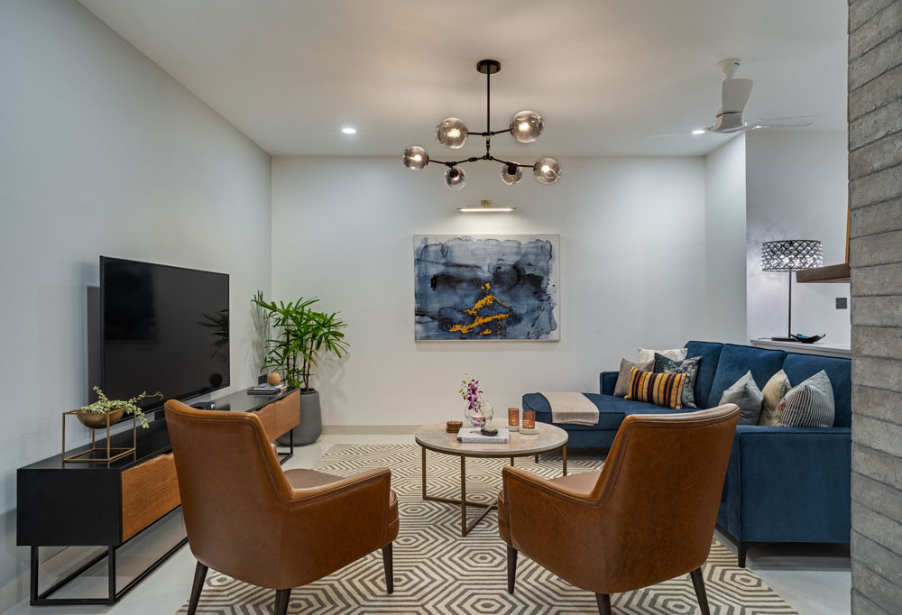
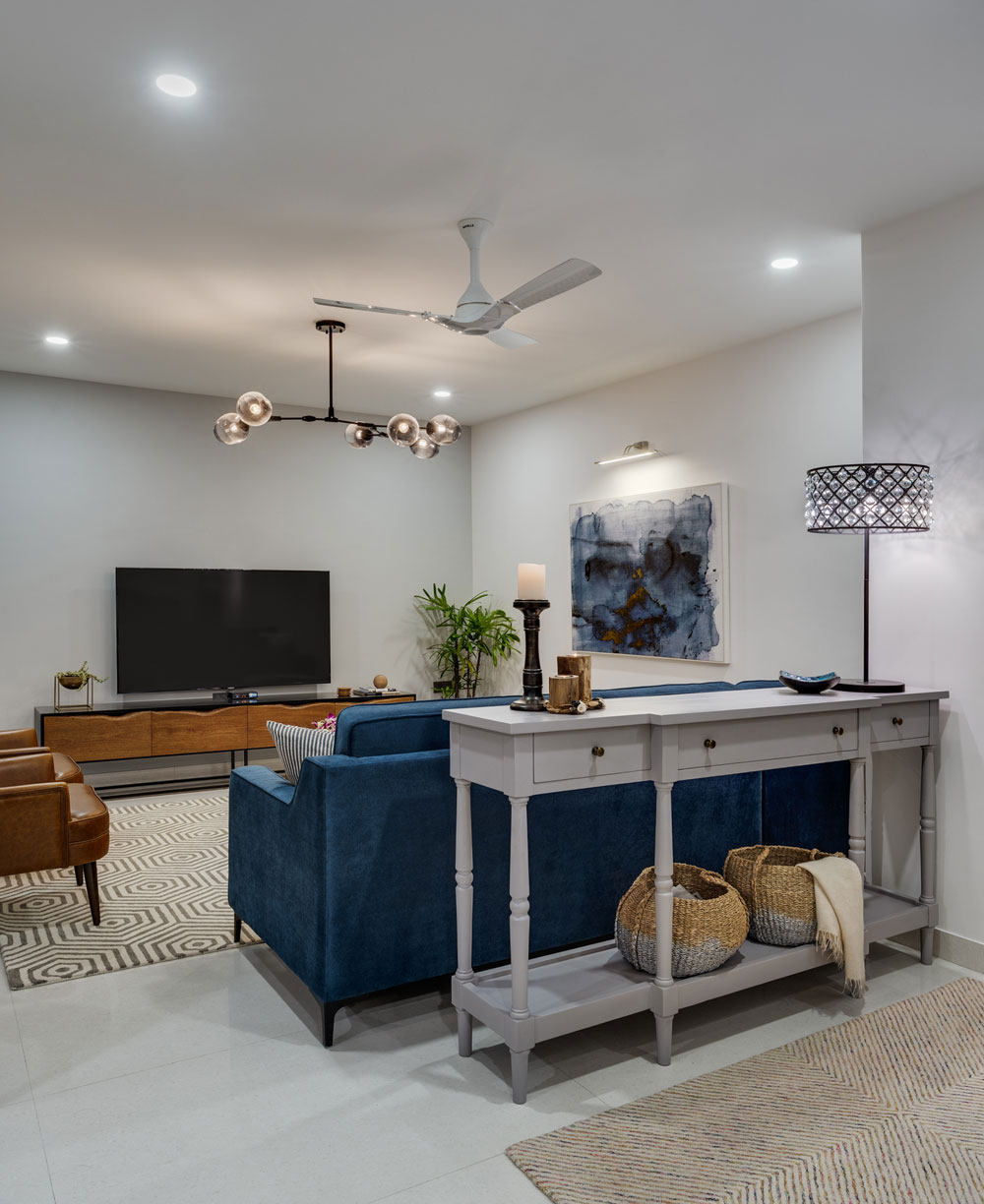
We knew we wanted to have a large piece of art sitting above the chaise of the sectional and we got lucky with this beautiful blue and white modern marble art piece with hints of gold. A striking chandelier and recessed ceiling lights complete the look and add much needed light to this space.
Dining and Lounge
To have the dining sit right off the kitchen in such a way that it opens up to the lounge area as well as the kitchen for easy entertaining was a strategic choice and the stone wall acts as the perfect anchor for that!
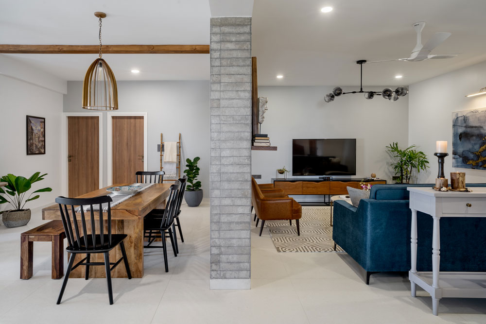
The dining table is a clean modern wood table with black chairs for contrast. The chairs are a modern take on the windsor chairs and I love how the vertical slats sit against the stone wall!
We added two large ceiling beams in the large lounge area to bring definition and to visually bring the dining and lounge together. This feature also takes inspiration from traditional plantation homes that Kaustubha’s childhood home resonated with. Two large two striking bronze caged pendants on either side amplify the length and visually tie these spaces together.
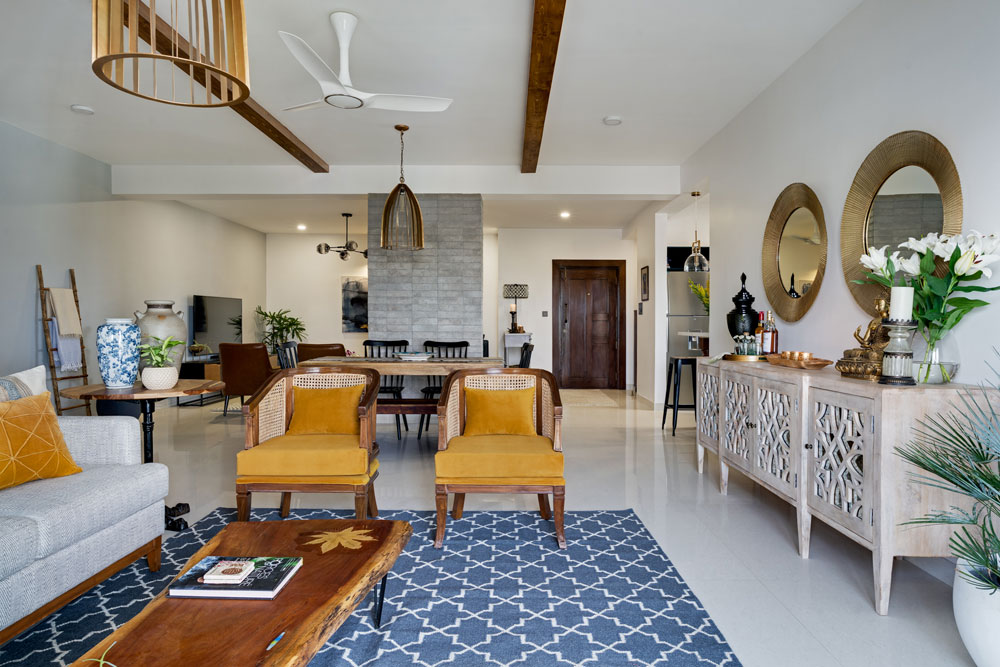
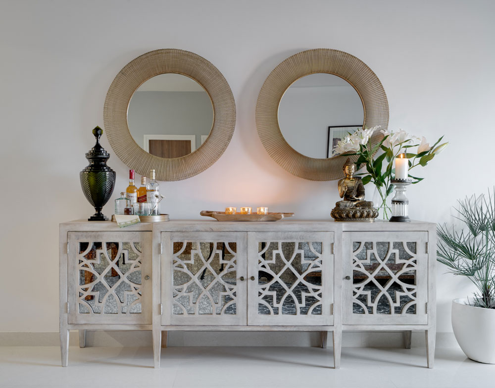
A custom bar and crockery unit with wood fretwork and antiqued mirror glass sits on the wall facing the dining and the lounge. We topped it with two large custom mirrors with a gold wired frame and I love how it instantly brings in the wow factor in this space!
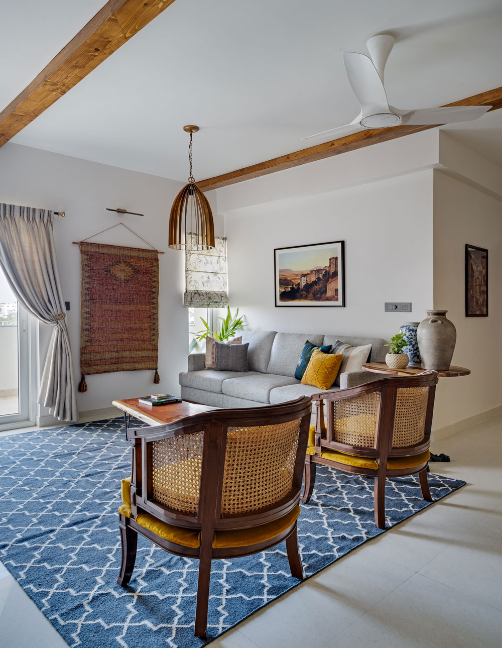
The lounge itself is a cozy comfortable area that’s awash with natural light. We brought in a lot of earth tones here with grays, browns and mustard. The charcoal dhurrie acts as the perfect contrast to the custom chevron fabric couch and the mustard cane back chairs.
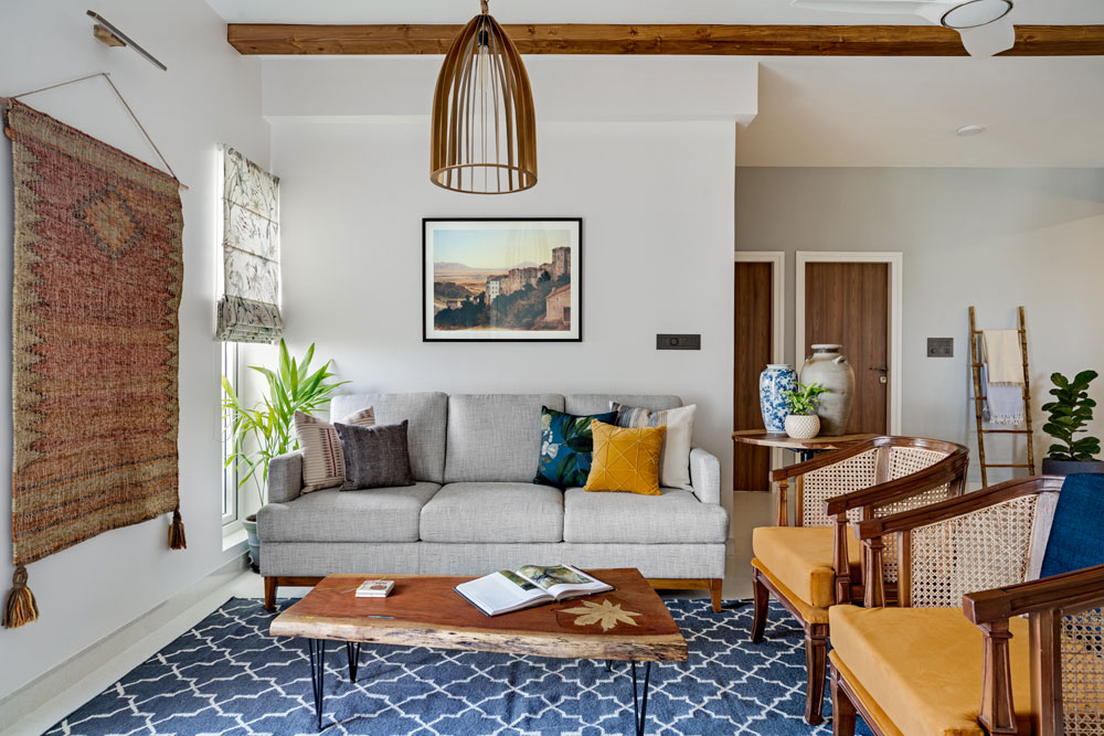
My favorite element in this space is the vintage inspired art print in shades of terracotta and the dhurrie that we hung on the wall. The play of these earth tones and the wood beam along with the bronze lamp does make for a lovely space 🙂
Adjoining the lounge is a little balcony. We wanted to carry through the Mediterranean feel and brought in vibrant green and blue patterned Portuguese tiles to create a custom tile wall! Such a gorgeous punch of color against the greens 🙂
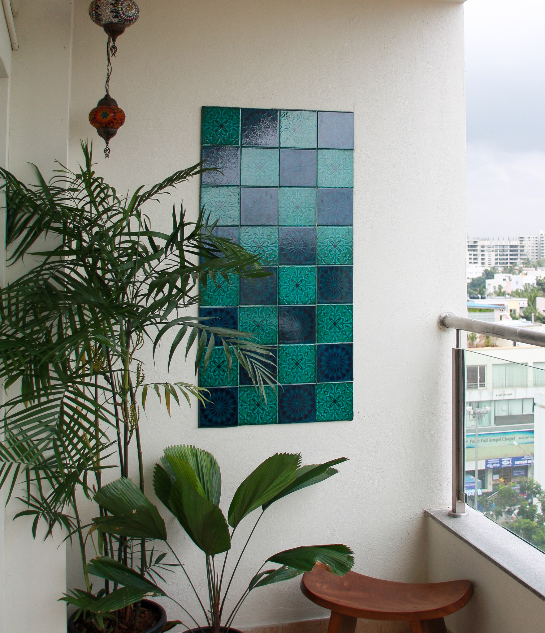
A wood balcony table and chairs make this a simple but striking spot to spend your sunday!
We are so excited to bring to you the next two parts of the reveal as well. The bold kitchen and the bedrooms in the Modern Mediterranean are full of character and an interesting take on color. We’ll be back real soon!
All photographs shot by Shamanth Patil.
