Project Reveal Part II – The Jewel Tone Inspired Apartment
Created by Vinithra Amarnathan on February 26, 2020
Ready to see more of the jewel tones make their way into this home? Come on board as we explore the bedrooms and hallway section of the Jewel Tone Inspired Apartment. The spaces were aimed at being cozy, comfy and representative of what our clients believed echoed their emotion of a ‘home’.
Let us just promise you a satisfying dose of color and a zestful design persona😉
Hallway
The most common assumption regarding small and narrow spaces is that darker colors on the walls will only make it look smaller. Leave it to us to debunk dated design myths!
We’ve carried through the warm grey tone from the living section TV grid-patterned wall into this section of the home. The usage of the same hue to bathe the walls up to the ceiling gives the hallway a sense of connection that links it to the larger living section of the apartment. The grey tone in the constricted space adds visual impact with and brings in the right amount of contrast against the black and white photos we added. An earthy hemp and black striped runner rug visually elongates an otherwise small hallway.
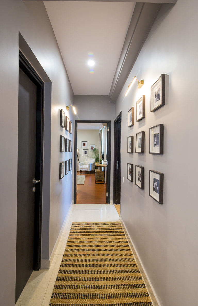
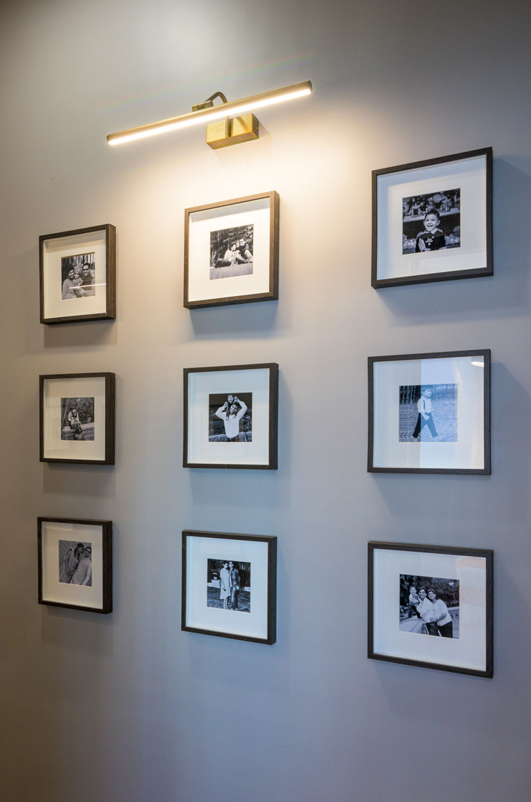
We’ve installed monochrome family photos in simple Ikea frames and antique gold picture lights that build on the emotional connect the space establishes with the home dwellers! It’s a walk down memory lane which allows one to pause and reflect on the things that actually matter in life – Family. 😊
Master Bedroom
The master bedroom was intended to be a personal retreat for the couple and one that embodied the things they most love – books, music, Bollywood and color😉
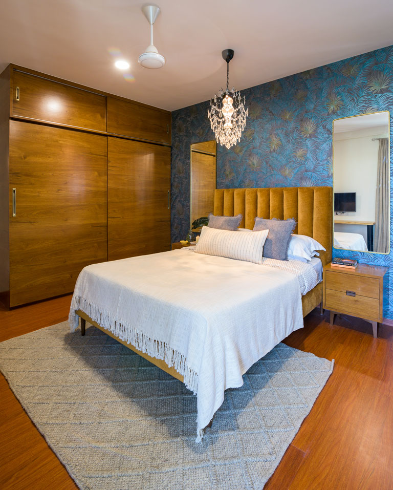
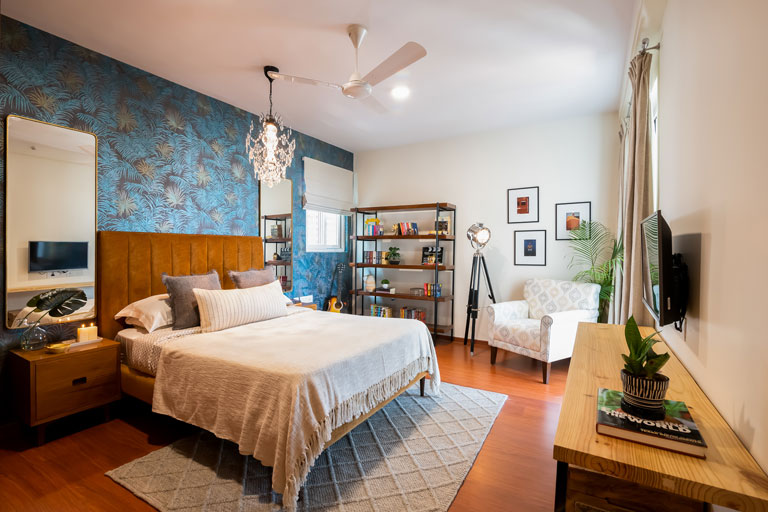
The pièce de résistance in the space is the hands down the Roberto Cavalli Ferns wallpaper that makes for the perfect backdrop to the gorgeous ochre upholstered queen bed that we’re swooning over. The charcoal base of the wallpaper makes the olive and teal toned foliage pattern pop so beautifully especially when paired with the warm tone headboard! The vertical stitch on the headboard gives the bed an impression of increased visual height. Match made in color heaven!
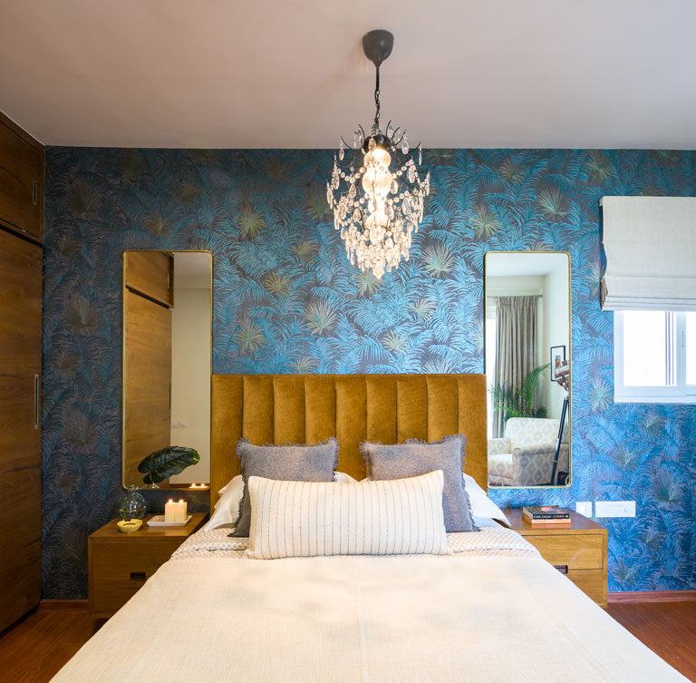
We added a set of midcentury modern inspired bedside tables that are finished in a medium teak tone veneer and rounded edge tall mirrors with brass borders. We ditched the conventional bedside lighting and instead chose a luxe chandelier in black metal with brilliant crystals.
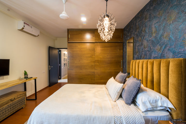
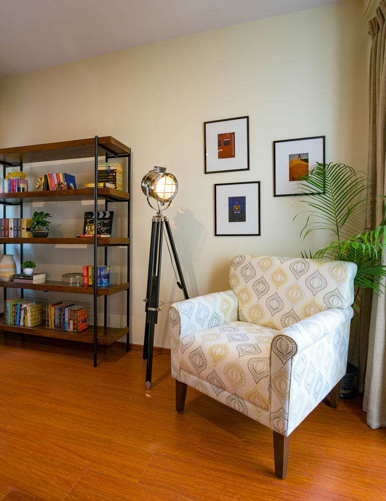
A snug nook with an upholstered reading chair in a soft beautiful pattern, minimal wall prints that speak to the couple’s love for all things Bollywood and a camera light floor lamp which was on the list of must-haves for the lady of the house come together to complete this vignette in the master. The deep wood and black metal modern bookshelf is yet another piece that brings together function and aesthetic into the space as the husband and wife duo are voracious readers. While books took centerstage in the unit, we interspersed the same with curios and knick-knacks that gave the space a more lived-in touch! It’s all in the details. 😉
The rug grounding the room is a light grey geometric tufted one that makes for a neutral base upon which the elements of color come through effortlessly! The custom sliding door wardrobes bring in that elevated look to the bedroom. The antique brass hardware and the warmth of the wood veneer is a sheer winner!
Chic, functional and so full of character.
Kid’s Bedroom
This space was designed for the 6-year-old in-house superhero! May we say it’s probably one of our favorite kid’s spaces in a long time.
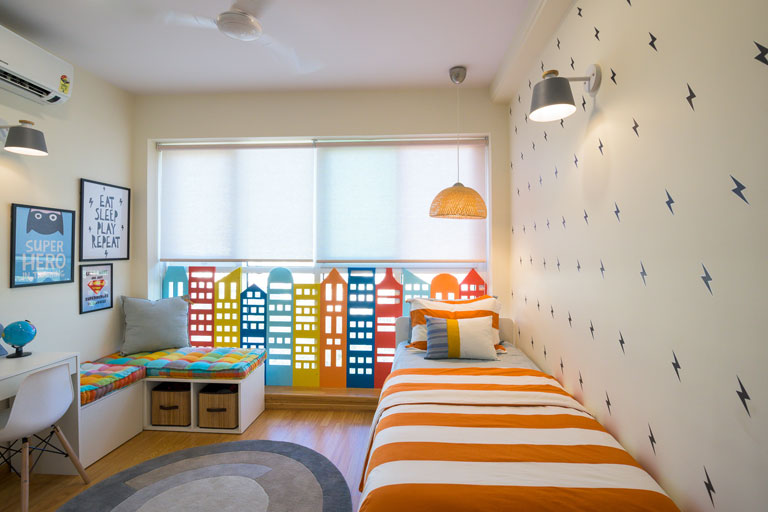
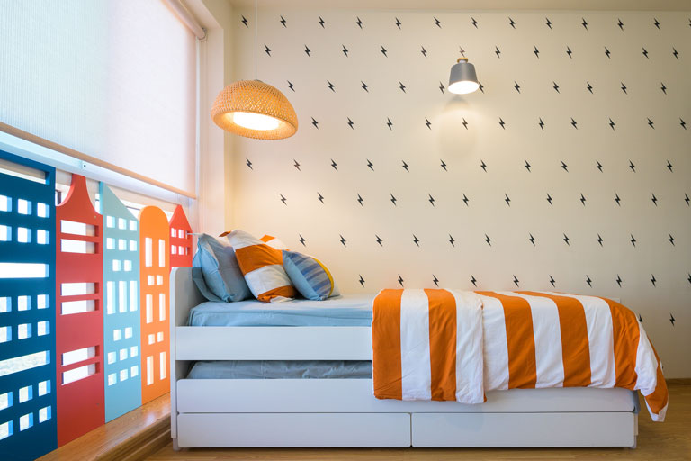
We kept the overall base neutral with pops of color to bring in that vibrancy to the space. The bed is a sleek white Slakt trundle bed by Ikea and is perfect for those sleepovers! The bed wall has been covered in black thunderbolt decals (each stuck with love by hand). 😉 Decals are an inexpensive and quick way to uplift the way a room wall looks instantly!
The other side of the room anchors the custom desk and corner seating nook that has our hearts. The seating space also houses storage in the form of baskets and a concealed drawer that’s essential to put away miscellaneous items. The custom upholstered cushions use the Modish Madras fabric by Freedom Tree and we’re loving how it packs in a punch of color!
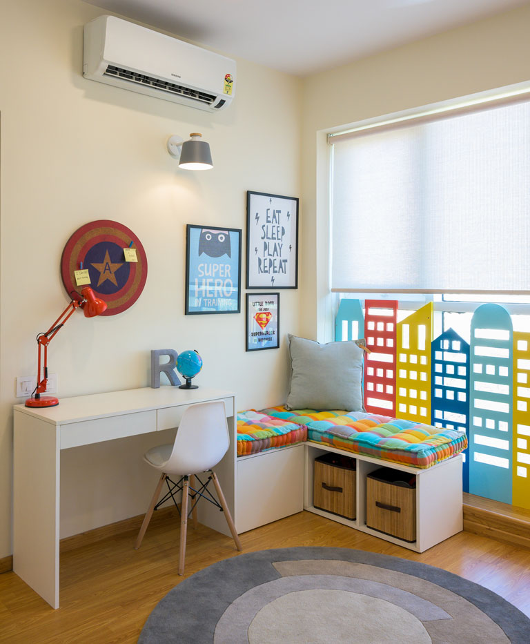
Superhero-inspired prints adorn this corner and give it a fun feel. 😊
The skyline element in the room was a passion project that was designed to the ‘t’ and executed by the team with complete perfection. The room initially had an eyesore for a protection railing which we uprooted and instead replaced it with this custom city skyline installation complete with tiny openings and colors like red, orange, yellow, mint and deep blue! The wardrobe section on the opposite wall in white has wooden hardware and an open section to display items, store books and bric-a-brac that the child can easily access.
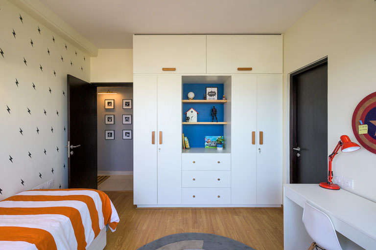
We’d even changed out the flooring here to a lighter wood tone which gives the space a lighter and brighter feel. Not to forget the neutral grey-toned circular rug by Woven Dreams that fits right in! This room was a blank canvas that let our creative juices flow!
Guest Bedroom
This bedroom had a neo-traditional sentiment to it that would be used more frequently by the couple’s parents. The walls have a soft taupe shade that adds warmth to the space instantly.
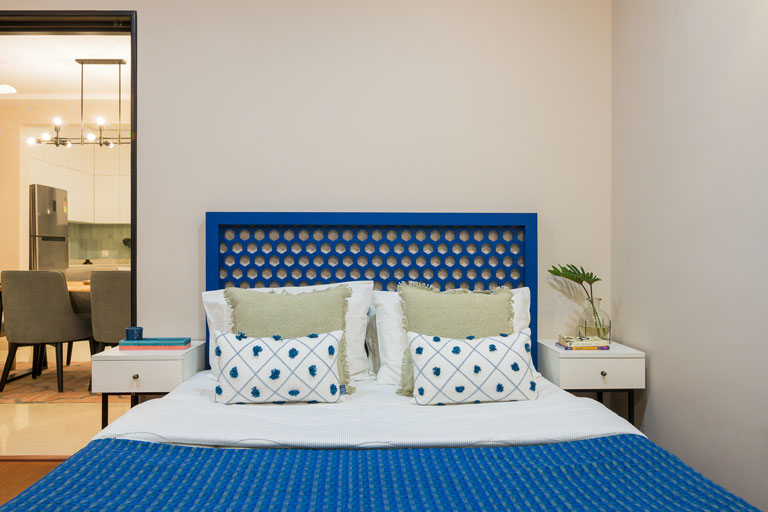
The bed has a hexagonal jaaliwork pattern as a headboard and the whole piece has been painted a deep blue tone which gives the space a common thread of hue. The bedside tables are simple white top, black metal legged units with brass hardware.
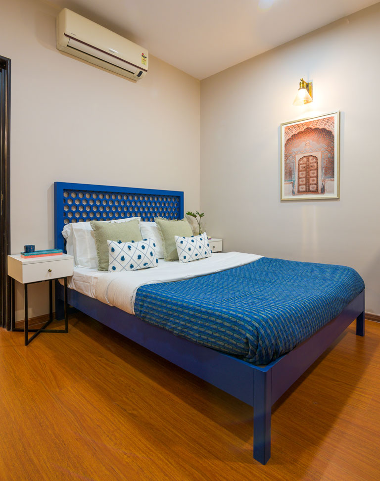
The Puja unit was a custom piece of furniture that was designed in detail to match the client’s needs. Its distressed soft bluish-green filigree latticework doors and ornate legs add to the old-world charm aesthetic of the space. On the same wall you’ll spot a doorway art print inspired from the royal Mughal architecture in the country paired with glass sconces.
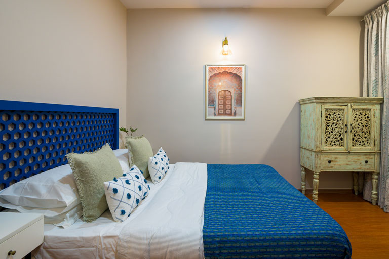
The wardrobes are tall with slim shutters in an ashy-brown finish that add height to this compact space. The tie and dye inspired curtains with mint blue hints fits right into the grammar of this room. We’re feeling anything but blue in this space! 😉
The Modern Jewel Tone Inspired Apartment has been designed with a vision that ensures that the client’s needs have been understood at an intrinsic level. Designing this home has truly been a stimulating experience which was a love affair with color at many levels!
2020 is going to be such a great journey and we hope you can already tell! We’ll see you here soon with yet another design saga! 😊
All pictures shot by Parth Swaminathan
Content by Lavanya Chopra for Weespaces
