Project Reveal – The California Chic Home
Created by Vinithra Amarnathan on October 1, 2021
When interior designers say every project is special it’s true….but some just tug at your heart! This is one such!
Its not always that we come by a project where decisions are effortless, stay true to the original vision and encompass a narrative that’s so close to your personal style! The California Chic is such a nuanced and beautiful home that stays strongly rooted to a vision and a vision that was shared by us and the client from the get go!
And you can see that in every little nook of this home. I’d love to move in….just sayin 😉
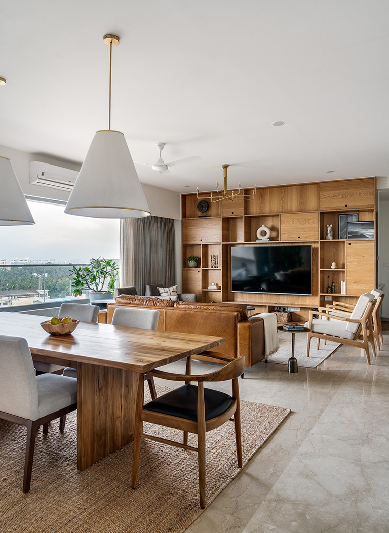
Our clients Sowmya and Vinay wanted a home that reflected their style of a clean modern space with a laid-back luxe aesthetic that is definitive of the California design sensibility! We connected on that and more….the result is a home that feels effortlessly cali chic 🙂
The apartment is approximately 3200 square feet and located in a premium community in South Bangalore. Let me walk you through this lovely home!
Entryway
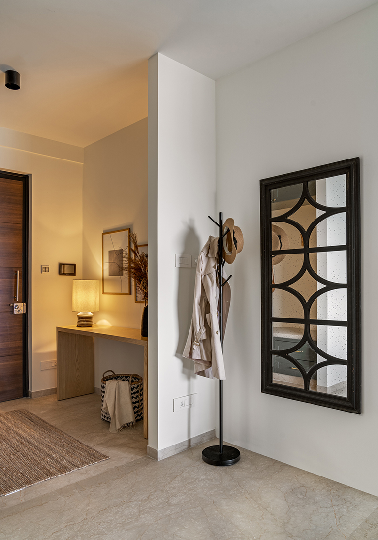
The apartment opens into a small but well-defined foyer area that’s highlighted by a simple waterfall console table clad in oak veneer. Styled with simple earthy elements and a table lamp for lighting it makes for an inviting and cozy entrance.
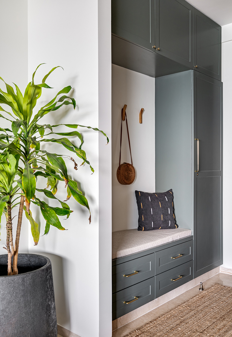
On the opposite side keeping function in mind, we created a small mudroom painted in a tone of deep sage to complement the raw wood console that offers storage for all entryway essentials for a young family. The mudroom has a small bench seat accented with sharp leather strap hooks.
As you walk in through the entryway you catch a first look at the expansive living and dining area with a long balcony sitting afront.
The open plan living, dining and kitchen form the mainstay of this apartment and beautifully reflect the laidback california chic vibe we wanted to bring to the space.
Living
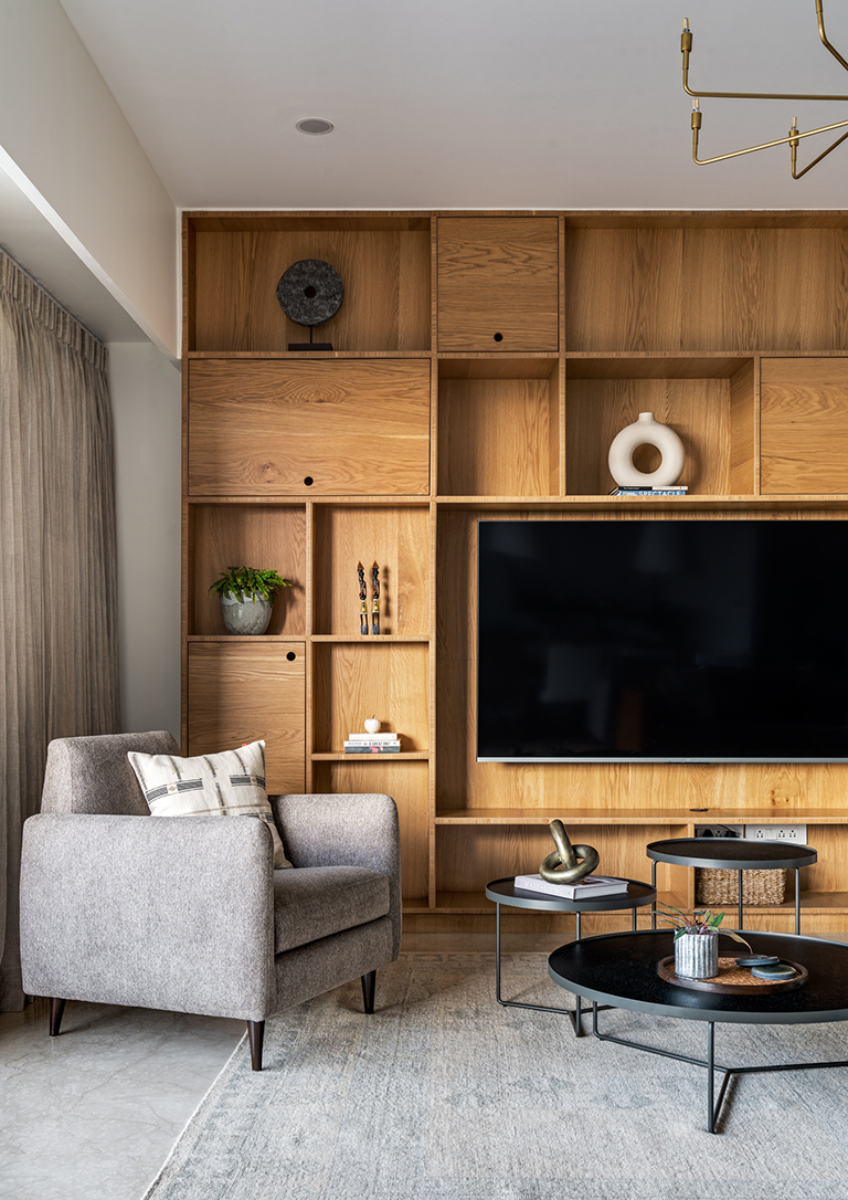
The living room features a built-in wall of cabinetry draped in a beautiful oak veneer all over and houses the TV as well as offers additional niches for display and books. Layered with the natural warm tones of the oak, we brought in distinct pieces of furniture in tones of ivory, gray and classic tan leather.
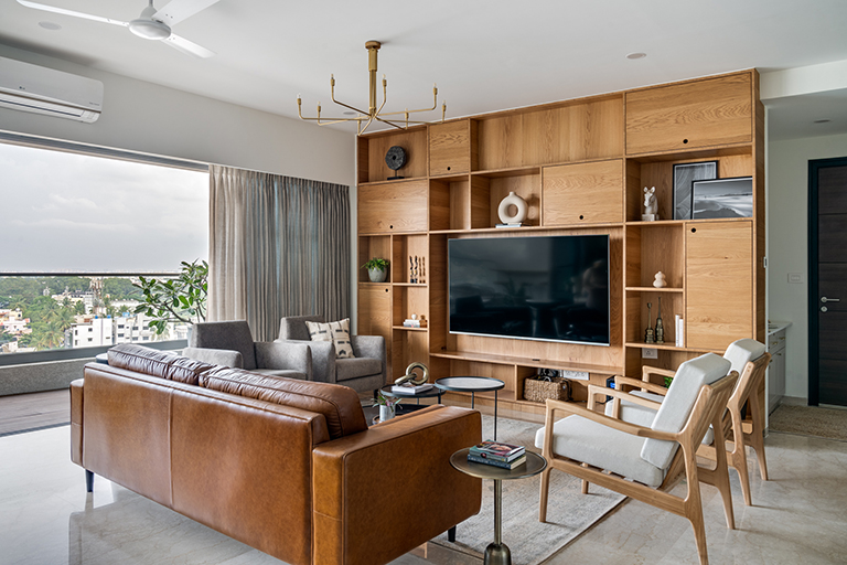
The forms remain classic midcentury inspired clean lines and balance beautifully against the pastel toned rug from Jaipur Rugs. A sharp cluster coffee table in black from Blue Loft complements all the soft tones and offers contrast while a simple brass chandelier rounds off the space.
Dining
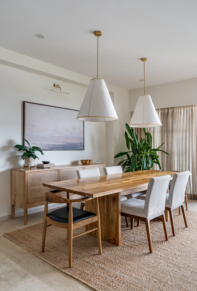
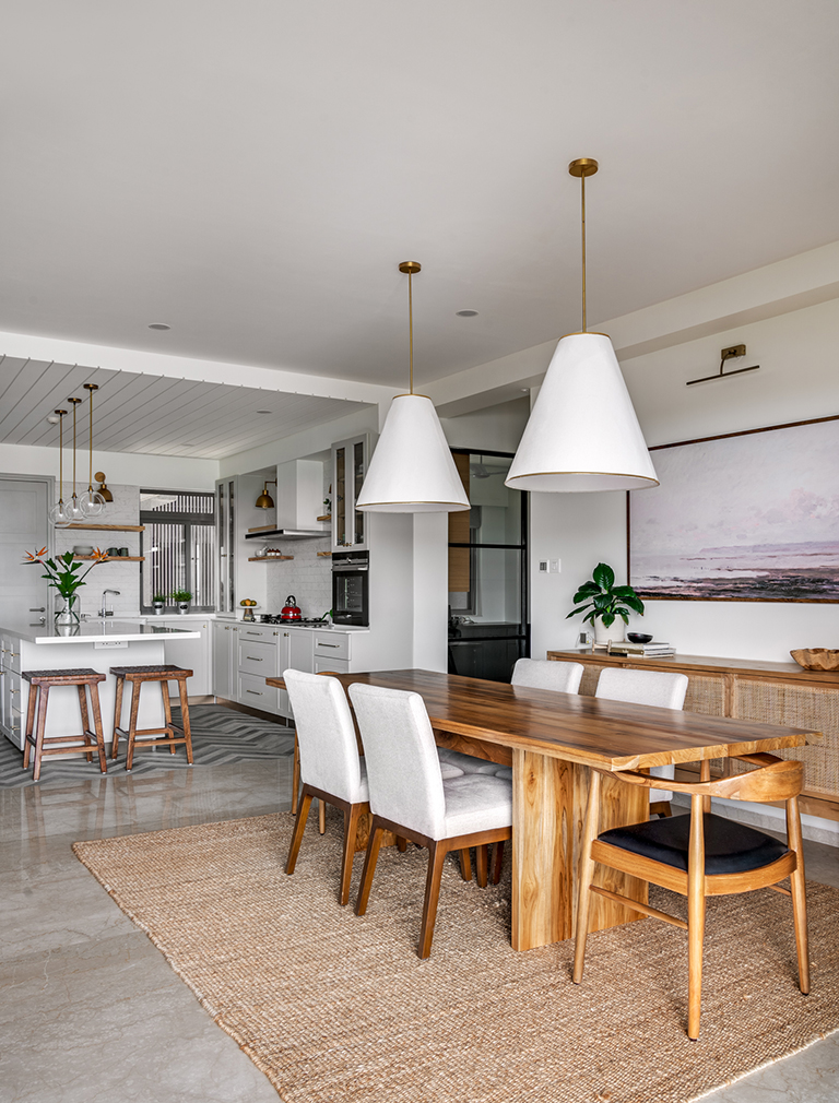
The dining set right next to the living is punctuated by an oversized art print that brings in a California desert feel with muted earthy tones. Two voluminous ivory pendant lamps sit atop a simple oak finished dining table with upholstered chairs and classic bent wood head chairs. A natural wood and cane credenza adds much needed storage to the dining area.
Kitchen
What completes this open plan living area is the beautiful open kitchen! We brought down the wall dividing the kitchen from the living dining areas and created a large expansive open kitchen that now speaks to the living and dining areas which was perfect for the lady of the house who loved to cook and bake!
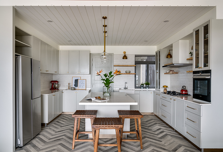
We changed out the flooring in the kitchen to herringbone style gray toned wood tiles. The cabinetry is a soft dove gray and the layout is super functional with an island grounding the center.
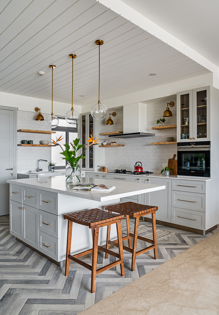
Custom brass sconces sit against veined marble subway tiles creating a beautiful contrast. The island is accentuated by leather strap bar stools and simple brass and glass globe pendants.
We added a simple groove detailing to the ceiling to mimic the look of shiplap and I love how it draws your eye up!
Balcony
The open balcony adjoining the living space has a beautiful live edge wall mounted bar table on the dining side where one can sit with a drink and take in the views and small lounge seating area on the living room side that feels like an extension of the living room!
Private Spaces
As you walk into the foyer to the right is a small and well-appointed puja space clad in a custom Kolam inspired wallpaper that leads into the guest bedroom.
Guest Bedroom
The guest bedroom is designed to be a simple comfortable space for the clients father. The walls are a pastel tone of sage green accented by a warm walnut tone bed and bedside tables. Botanical prints and wall sconces bring in interest to the space.
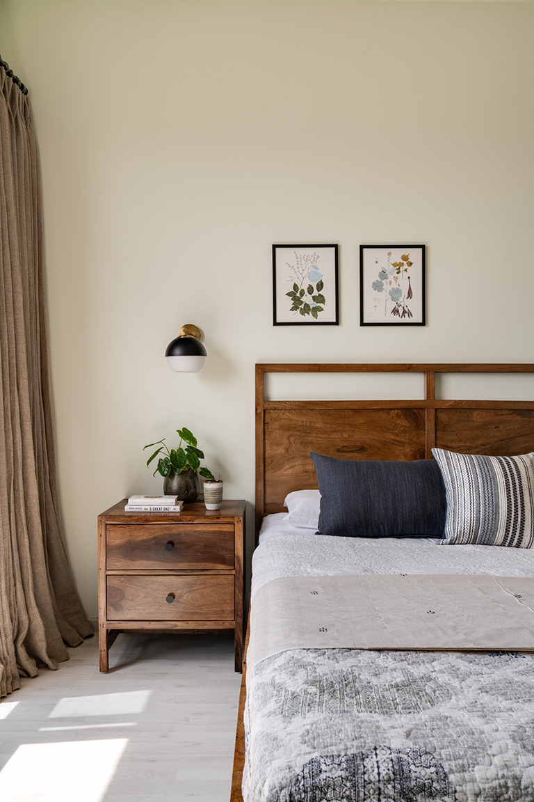
On the opposite wall we have a simple wall mounted built in desk and chair that offers a functional spot to sit and work or write.
Walking along the kitchen into the hallway, the apartment opens into the private spaces. We converted the open family room, into a home office for our client.
Home Office
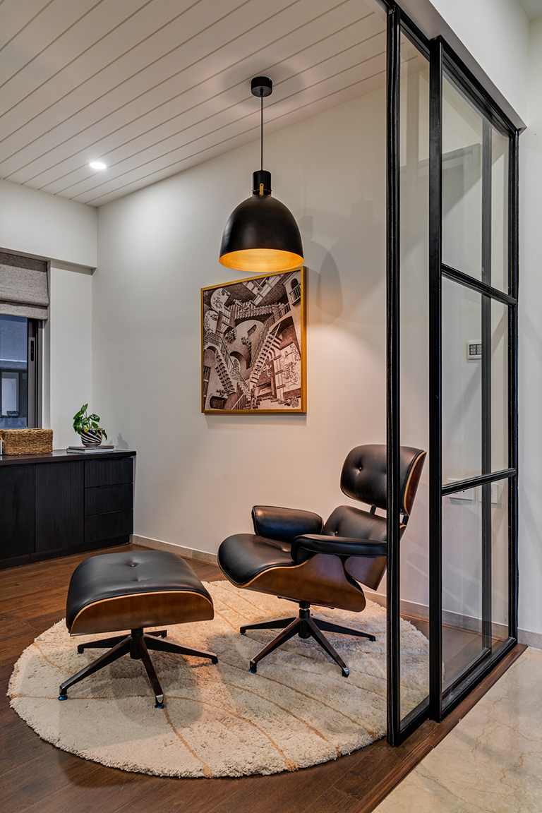
The home office is partitioned off with a custom metal and glass partition and continues the shiplap look ceiling detail from the kitchen. A large L shaped custom desk spans from one end of the room to the other. The desk top is made of black stained pine wood while the bottom shutters show a beautiful fluted front.
The home office has a nook created with an Eames chair replica and an oversized pendant that makes for a perfect spot to sit down with a book and relax!
Kids room
One of my favorite details in the home is the wallpapered ceiling in the kids room. We wanted to bring in a little bit of whimsy without having a pattern overwhelming the space. Adding an oversized floral pattern to the ceiling brought in a sense of scale to the otherwise small room.
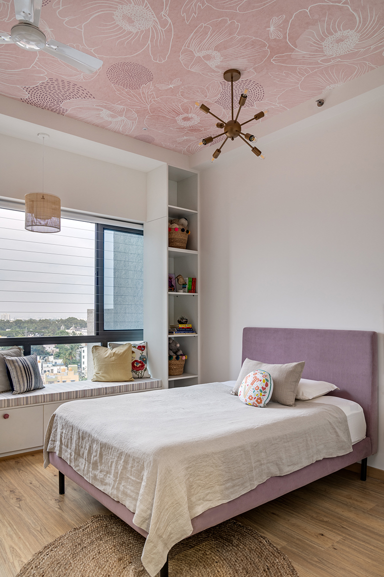
The furniture is simple and has a lavender upholstered bed with white cabinetry all over. We created a beautiful long window bench seat with storage on both sides for the little girls toys and books. A small desk sits opposite the bed.
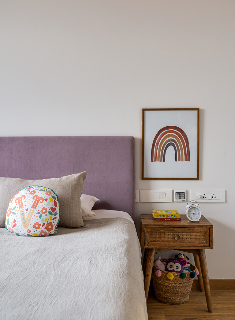
We added a simple yet striking mid century inspired chandelier to the wallpapered ceiling and a rattan pendant to accentuate the window seat.
Primary Bedroom
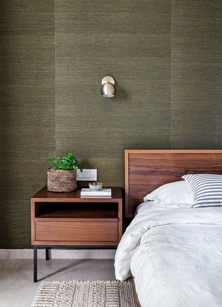
This easily might be one of my favorite bedrooms we have designed in its simplicity and beauty. The wall behind the bed is wrapped all around in a gorgeous Thibaut grasscloth wallpaper and a classic platform midcentury bed grounds the space. Brass sconces from Boconcept bring in a minimal touch to the space.
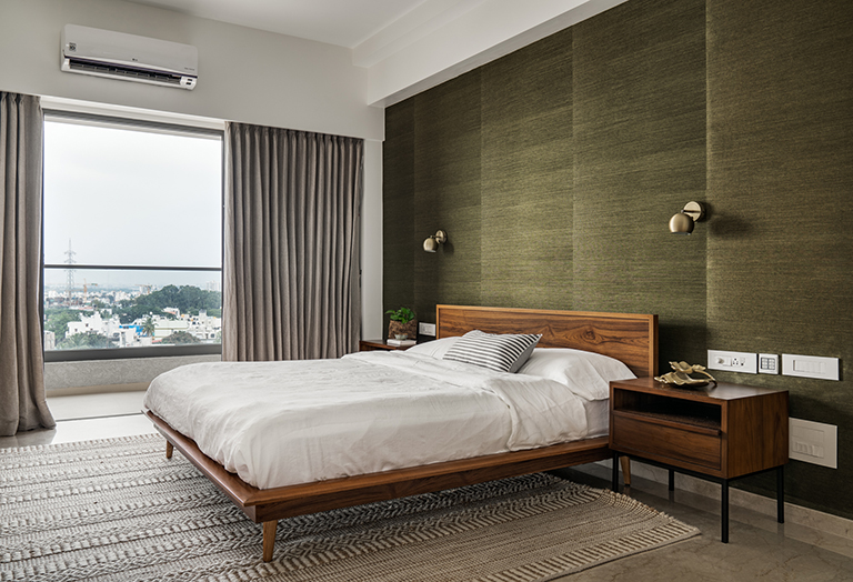
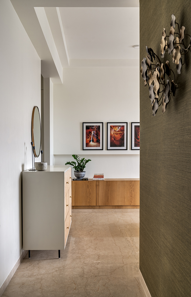
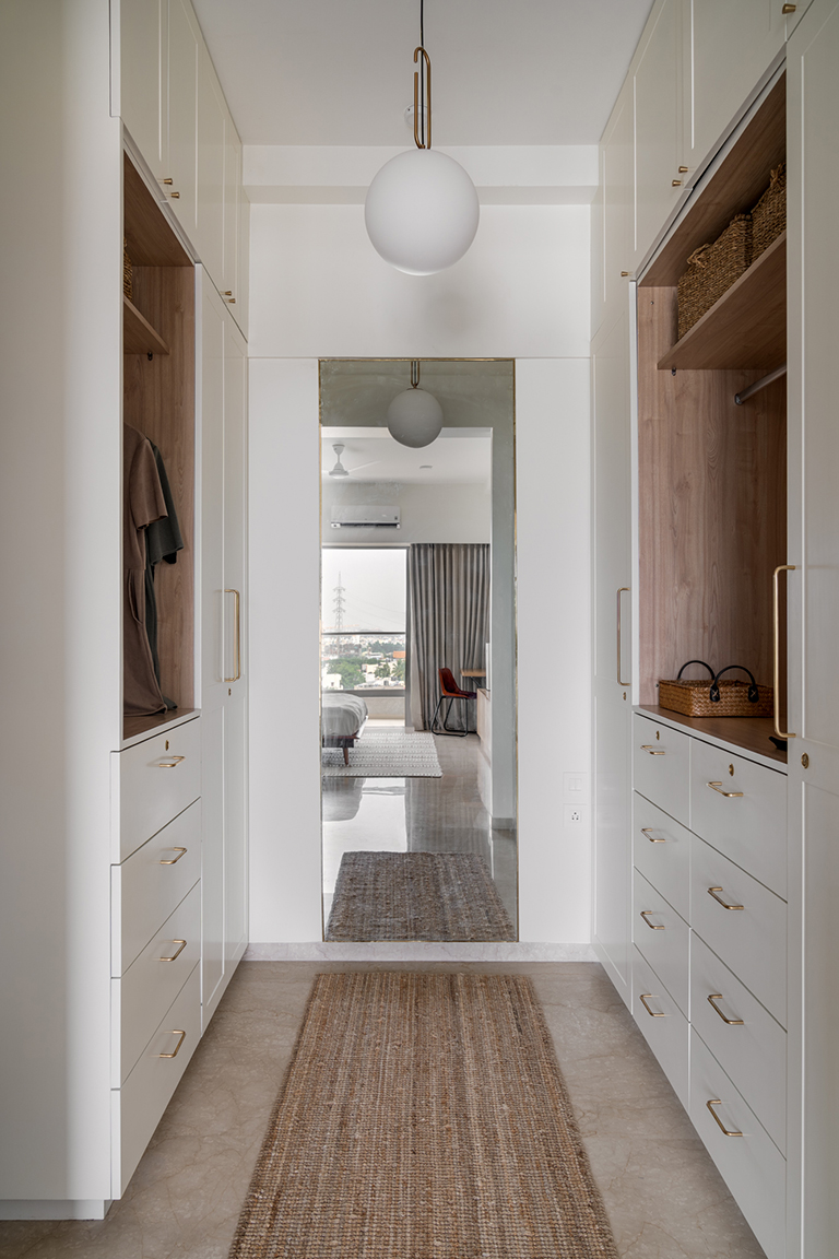
A beautiful fluted wood and white dresser flanks the bedroom wall and leads into an all-white walk in closet. The wall opposite the bed houses the TV and a set of beautiful David Drost prints of the Grand Canyon. The bottom section offers a length of concealed storage for the couple.
The walk in closet is a simple but functional space that has a his and hers closet and a large mirror to ground the space. The look is clean with white, wood and gold creating a beautiful yet simple space.
Master Bathroom
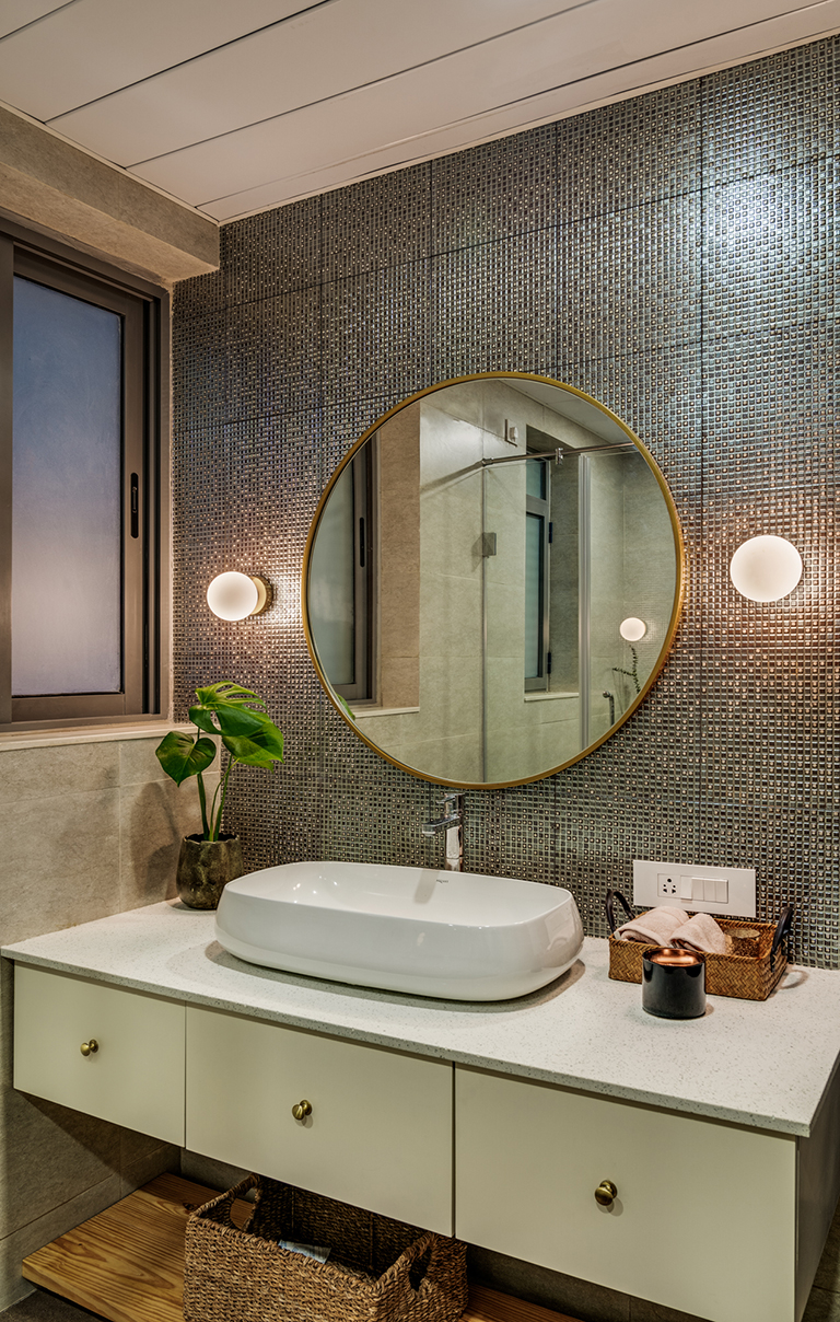
We kept the bathroom simple by adding mosaic tiles in a bronze tone, a round brass mirror and simple brass sconces.
Material and Color Palette
One of the key design elements in the home is the use of warm wood tones complemented by blacks and whites. Warm wood peeks through in the walls and the furniture extensively while rest of the elements play a textural role.
The color palette is composed of warm earthy neutrals juxtaposed with sharp contrasts being offered by the use of blacks and whites. The palette is defined by ivory, grays, sage to olive tones and warmth from the wood and leather.
I hope you enjoyed walking through this home….like they say ‘Home is a feeling’ and this one definitely feels like a sunny california day!
Hope to see you’ll back here soon 🙂
Vinithra
All pics shot by Shamanth Patil.
